Making Tools More Learner-Friendly

I often advise learners to be careful with what tools they choose to spend time learning.  Some powerful ones have steep learning curves, full of jargon and technical hurdles.  Others are simple and self-explanatory, but can’t do more than one thing.  I’ve been trying to find better ways to connect with tool builders and talk to them about how they need to build learner-centered tools.

Catherine D’Ignazio and I put these thoughts together into a talk for OpenVisConf this year.  This is a super-dorky conference for data viz professionals… just the place to find more tool builders to talk to!  We put together an argument that data visualization tool as informal learning spaces.  Watch the video below:

New DataBasic Tool Lets You “Connect the Dots” in Data

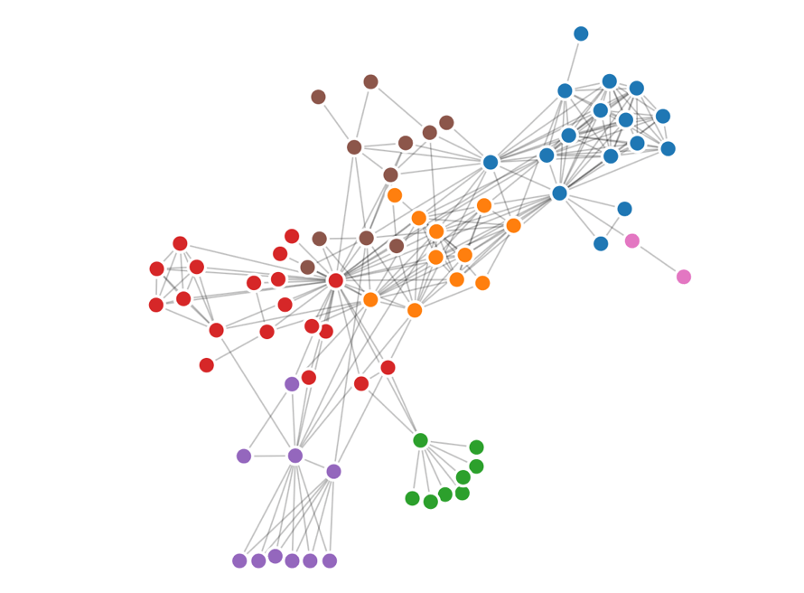
Catherine and I have launched a new DataBasic tool and activity, Connect the Dots, aimed at helping students and educators see how their data is connected with a visual network diagram.

By showing the relationships between things, networks are useful for finding answers that aren’t readily apparent through spreadsheet data alone. To that end, we’ve built Connect the Dots to help teach how analyzing the connections between the “dots” in data is a fundamentally different approach to understanding it.

The new tool gives users a network diagram to reveal links as well as a high level report about what the network looks like. Using network analysis helped Google revolutionize search technology and was used by journalists who investigated the connections between people and banks during the Panama Papers Leak.

Connect the Dots is the fourth and most recent addition to DataBasic, a growing suite of easy-to-use web tools designed to make data analysis and storytelling more accessible to a general and non-technical audience launched last year.

As with the previous three tools released in the DataBasic suite, Connect the Dots was designed so that its lessons can be easily planned to help students learn how to use data to tell a story. Connect the Dots comes with a learning guide and introductory video made for classes and workshops for participants from middle school through higher education. The learning guide has a 45-minute activity that walks people through an exercise in naming their favorite local restaurants and seeking patterns in the networks that result. To get started using the tool, sample data sets such as Donald Trump’s inside connections and characters from the play Les Miserables have also been included to help introduce users to vocabulary terms and the algorithms at work behind the scenes. Like the other DataBasic tools, Connect the Dots is available in English, Portuguese, and Spanish.

Learn more about Connect the Dots and all the DataBasic tools here.

Have you used DataBasic tools in your classroom, organization, or personal projects? If so, we’d love to hear your story! Write to help@databasic.io and tell us about your experience.

Telling Your Story Well

I just hosted a workshop today at the Stanford Do Good Data / Data on Purpose “from Possibilities to Responsibilities” event.  My workshop, called “Telling Your Story Well”, focused on how to flesh out your audience and goals well so that you can pick a presentation technique that is effective.  We did some hands-on exercises to practice using those as criteria for telling your story well.

One key takeway is the reminder to know your audience and your goals before deciding how to tell your data-driven story.

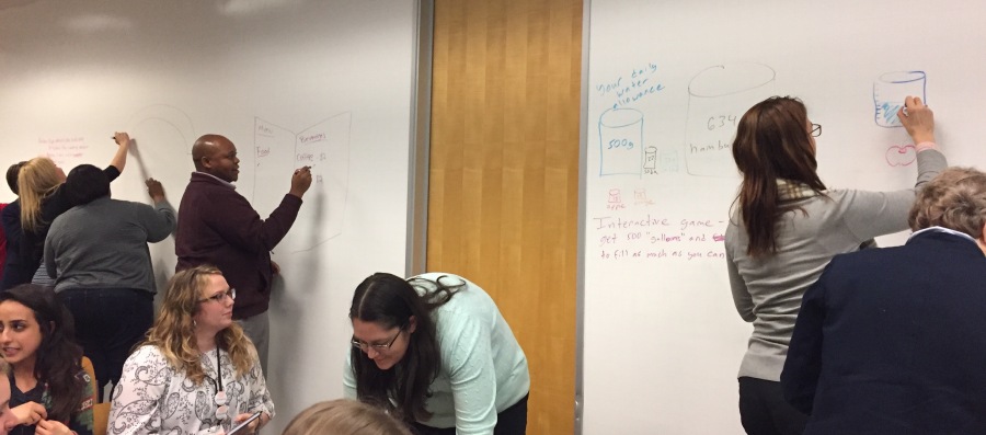
Folks dove into the activity we did – remixing an infographic to target a specific audience and an achievable change.

FullSizeRender.jpg

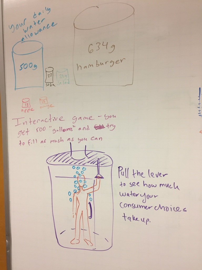
For example, here’s a sketch of one group’s idea of an interactive data sculpture that dumps stuff on you based on how much water your purchases at a grocery store took to generate!

img_5295

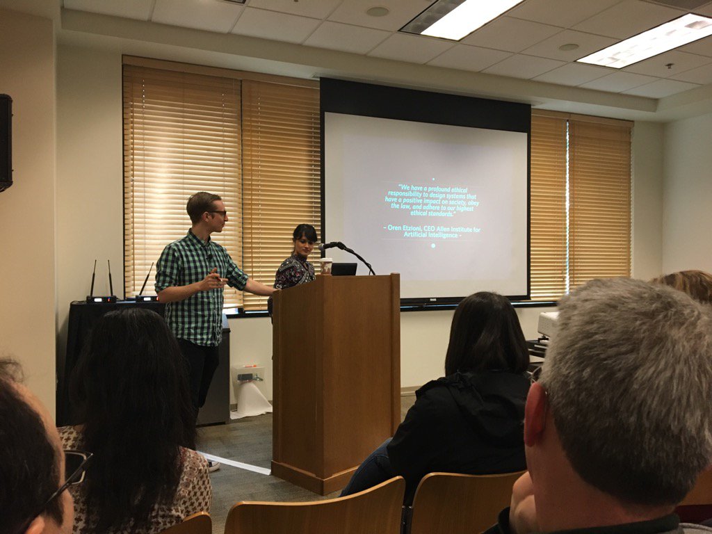
Creating Ethical Algorithms – Data on Purpose Live Blog

This is a live-blog from the Stanford Data on Purpose / Do Good Data “From Possibilities to Responsibilities” event. This is a summary of what the speakers at the talked about, captured by Rahul Bhargava and Catherine D’Ignazio. Any omissions or errors are likely my fault.

Human-Centered Data Science for Good: Creating Ethical Algorithms

Zara Rahman works at both Data & Society and the Engine Room, where she helps co-ordinate the Responsible Data Forum series of events. Jake Porway founded and runs DataKind.

Jake notes this is the buzzkill session about algorithms. He wants us all to walk away being able to critically assess algorithms.

How do Algorithms Touch our Lives?

They invite the audience to sketch out their interactions with digital technologies over the last 24 hours on a piece of paper. Stick figures and word totally ok. One participant drew a clock, noting happy and sad moments with little faces. Uber and AirBnb got happy faces next to them. Trying to connect to the internet in the venue got a sad face.  Here’s my drawing.

Next they ask where people were influenced by algorithms. One participant shares the flood warning we all received on our phones. Another mentioned a bot in their Slack channel that queued up a task. Someone else mentions how news that happened yesterday filtered down to him; for instance Hans Rosling’s death made it to him via social channels much more quickly than via technology channels. Someone else mentioned how their heating had turned on automatically based on the temperature.

What is an Algorithm?

Jake shares that the wikipedia-esque definition is pretty boring. “A set of rules that precisely deinfes a sequence of operations”. These examples we just heard demonstrate the reality of this. These are automated and do things on their own, like Netflix’s recommendation algorithm. The goal is to break down how these operate, and figure out how to intervene in what drives these thinking machines. Zara reminds us that even if you see the source code, that doesn’t help really understand it. We usually just see the output.

Algorithms have some kind of goal they are trying to get to. It takes actions to get there. For Netflix, the algorithm is trying to get you to watch more movies; while the actions are about showing you movies you are likely to want to watch. It tries to show you movies you might like; there is no incentive to show you a movie that might challenge you.

Algorithms use data to inform their decisions. In Netflix, the data input is what you have watched before, and what other people have been watching. There is also a feedback loop, based on how it is doing. It needs some way to figure out it is doing a good thing – did you click the movie, how much of it did you watch, how many star did you give it. We can speculate about what those measurements are, but we have no way of knowing their metrics.

A participant asks about how Netflix is probably also nudging her towards content they have produced, since that is cheaper for them. The underlying business model can drive these algorithms. Zara responds that this idea that the algorithm operates “for your benefit” is very subjective. Jake notes that we can be very critical about their goal state.

Another participant notes that there are civic benefits; in how Facebook can influence how many people are voting.

The definition is tricky, notes someone else, because anything that runs automatically could be called an algorithm. Jake and Zara are focused in on data-driven algorithms. They use information about you and learning to correct themselves. The purest definition and how the word is used in media are very different. Data science, machine learning, artificial intelligence – these are all squishy terms that are evolving.

Critiquing Algorithms

They suggest looking at Twitter’s “Who to follow” feature. Participants break into small groups for 10 minutes to ask questions about this algorithm. Here are the questions and some responses that groups shared after chatting:

  • What is the algorithm trying to get you to do?
    • They want to grow their user base, and then shifted to growing ad dollars
    • Showing global coverage, to show they are the network to be in
    • People name some unintended consequences like political polarization
  • What activities does it use to do that?
  • What data drives these decisions?
    • Can you pay for these positions? There could be an agreement based on what you are looking at and what Twitter recommends
  • What data does it use to evaluate if it is successful?
    • It can track your hovers, clicks, etc. both on the recommendation and adds later on
    • If you don’t click to follow somewhere that could be just as much signal
    • They might track the life of your relationship with this person (who you follow later because you followed their recommendation, etc)
  • Who has the power to influence these answers?

A participant notes that there were lots of secondary outcomes, which affected other people’s products based on their data. Folks note that the API opens up possibilities for democratic use and use for social good. Others note that Twitter data is highly expensive and not accessible to non-profits. Jake notes problems with doing research with Twitter data obtained through strange and mutant methods. Another participant notes they talked about discovering books to read and other things via Twitter. These reinforced their world views. Zara notes that these algorithms reinforce the voices that we hear (by gender, etc). Jake notes that Filter Bubble argument, that these algorithms reinforce our views. Most of the features they bake in are positive ones, not negative.

But who has the power the change these things? Not just on twitter, but health-care recommendations, Google, etc. One participant notes that in human interactions they are honest and open, but online he lies constantly. He doesn’t trust the medium, so he feeds it garbage on purpose. This matches his experiences in impoverished communities, where destruction is a key/only power. Someone else notes that the user can take action.

A participant asks what the legal or ethical standards should be. Someone responds that in non-profits the regulation comes from self-regulation and collective pressure. Zara notes that Twitter is worth nothing without it’s users.

Conclusion

Jake notes that we didn’t talk about it directly, but the ethical issues come up in relation to all these questions. These systems aren’t neutral.

UN Data Forum: Data Journalism (live blog)

This is a liveblog written by Rahul Bhargava at the 2017 UN World Data Forum.  This serves as a summary of what the speakers spoke about, not an exact recording.  With that in mind, any errors or omissions are likely my fault, not the speakers. This was a virtual session, with all the speakers calling in via video.

Introductions 

John Bailer: New & Numbers is an old idea.  Cohn’s book targeted journalists to hep them communicate to a broader community. Alberto Cairo’s Truthful Art book is a more recent example of this.  John runs a Stats & Stories podcast to explore these questions as well.

Trevor Butterworth: Trevor is an Irish journalist with a background in the arts. He wrote for major publications as a freelancer about cultural issues, back when this was called “computer-assisted reporting”.

Rebecca Goldin: Trained as a mathematician, Rebecca worked as a professor of mathematics.  She reconnected to lok at how people talked about numbers and statistics.  Now she supports educational needs of journalists, and how people think and communicate about statistics.

Brian Tarran: A journalist by training, Brian received no training on numbers. He ended up working with the Royal Statistics Society and that’s how he ended up working on stats.

David Spiegelhaler: Coming from a mathematician and medical statisticians, he is now a Professor for the public understanding of risk.  His job is to do outreach to the press and public. David does statistical communication, focused on risk. Number are used to persuade people, so we need to do this better to inform people better to think slowly about a problem (instead of manipulating their emotions).

Idrees Kahloon: Idrees is a praticing data journalist at the Economist, having studied mathematics and statistics. At the Economist he works on building statistical models.

How to make sure what you’re doing will work with statistics?

Idrees: Runs into this quite a bit, sitting between academics and journalists. This means applying rigorous methods, but on a deadline.  Its hard to explain a logistical regression to the lay audience. You have to be statistically sound, but also explainable. The challenge is to straddle this boundary.

David: Influenced by the risk communication field, but there is no easy answer there.  So you decide what you want to do, and then test if it is working the way you want. Use basic visual best practices, and then the crucial thing is to test the materials. Evaluate it.

Brian: At Significance Magazine, a membership/outreach magazine, the goal is to bring people into statistics. There are guidelines to follow, around engagement and ease of reading. The goal is to encourage authors to draw analogies to things they understand.  One example is in an upcoming issue about paleo-climatology; focusing on climate proxies in recent history. The author explains this by comparing it to how Netflix creates recommendations to users. That kind of metaphor is the best way to get these things across.

Rebecca: As David hinted at, you have to know your audience. The first step is to understand who it is you are writing for, and what is their background. So perhaps instead of logistic regression, you might need to focus on explaining the outcome (ie. not the process). With journalists in a workshop, the main challenge for them is around understanding how to express uncertainty.  This is the greatest challenge that people face.  Pictures and stories are often the best techniques here, rather than technical language

Trevor: Our statistical understanding is very nascent. To build a better foundation, surveying journalists helps you understand what journalists do and do not know about science and statistics.  Journalists assume researchers know how to design a study and analyze results. You have to understand that isn’t necessarily the case. You have to ask basic questions about study design, data collection, and data analysis techniques.  One of the goals is to build a network of statisticians to help journalists do this.  So a parallel project is to help researchers understand these statistical concepts.

Examples of successful and/or unsuccessful communication? and why?

Trevor: Science USA created this network of statisticians at academic institutions around the US, and journalists are using this online widget to ask them questions.  That interaction is a great success to build on. Science that supports a policy is taken up by various constituencies, and filtered by values. When studies turn out to be poorly done, communicating that gets really hard. People who have adopted knowledge to promote it are not equipped to make judgements about what process of technique was wrong. So they try to shoot you down, from ad-homnym point of view. In the US talking about policy with evidence without becoming tribal has become too hard. So the question of “is this a good study” gets lost very quickly, replaced by a partisan/political interpretation of who you are, and your motives for critiquing a study.

Rebecca: When a journalist does have more than an hour to sort through a concept is when we have an opportunity for great success. For example, Rebecca worked with a journalist looking at false-postivies vs. false-negatives. The journalist created a graphic that ended up on 538.  The conversation helped her clarify what the mathematics would tell her.  Some failures involve when you’re speaking with a journalist that just can’t wrap their head around an idea.  When they can’t slow down enough to understand something like an inference. This is difference between writing about a certainty (which journalists want to do) and a quanitifed uncertainty. Other times the mathematics are just knowledge disconnects, like explaining a confidence interval without the listener understanding what an interval is. There are lots of requests coming in, which points to a shortage of people with these skills in the newsroom. So lots of people are recognizing this need.

Brian: The expertise didn’t exist in the newsroom 15 years ago.  In his first year, Brian wrote about councils surveying citizens about an issue. This ended up putting citizens and council at odds, because the journalists couldn’t explain what the survey told them, or better ways to do this. We just did a terrible job of explaining the fundamentals in a way that could generate bridges between people. For a success, in magazine for it is too hard to convey the details to help people do statistics themselves.  We need to show people how to think like a statistician.  This is about a process, and questions you ask.  There is an new column called “Ask a Statistician” which tries to get at this directly. Hopefully over time this will build to something great.

David: One success is keeping certain stories out of the news that don’t have good science behind them.   Another one is the translation of relative risk to absolute risk.  If there is a change in risk, you need to show the baseline risk. There was a story about eating a bacon sandwich, how risk of some disease increased it. The morning story was terrible, but in the evening after much promotion the story was told correctly, indicating this would only increase 1 out of 100 cases. Even thought the BBC training introduces this, the journalists cannot do it on their own. Another reported how a study said sex was decreasing in the UK, due to phones and technology. David made a joke about this being due to Game of Thrones, but a journlists didn’t get the joke and wrote up the headling “no sex by 2030 due to Game of Thrones”. This is the danger of clickbait, produced by secondary outlets republishing with a crazy headline.

Idrees: The polls in the last year is a great example of both how to do it well and poorly. There were many models in the US about the election outcome, where some set out what the uncertainty was (like 538 giving Trump a 30% chance of winning), but others did not (like the Princeton election commission). Some think it is ok to just report marginal error, and ignore if the sample is good.  Idrees shares a paper about 50,000 tweets about the death of Joe Cox.  To test this they gathered a population of tweets, sampled it, and measure how many were celebratory.  Their data shows this was an order of magnitude less.

Q&A

Responding to David and Rebecca’s comments, we’ve found that we need to separate percentages and chance. Has anyone come across guidelines about how to describe change? A lot believe you should do it in terms of “1 in 100” type language.

David: This is a disputed area. Using words like “probability” and “chance”, so people use an expected frequency – “of 100 people like you, 5 would have it”.  This is slightly better than “1 in 100” language. There is always metaphor and analogy involved. Using a phrase also depends on the imagery and appropriateness for the audience

Rebecca: When talking about 1 having something, and 99 not having something, you have to say “of people like you”.  This is a critical piece that stops people from arguing against these types of descriptions. You must express what the denominator is… precisely who we are talking about. Visual depictions can help this a lot.  Also comparing risks or frequencies can help. How does each option effect your risks and outcomes.  It is important to pair these.

For Trevor and Rebecca, who have been training journalists: what is the most important single skill for reporters to better work with data?

Trevor: To be pessimistic, most journalists can’t visualize the concepts in statistics.  Especially for probability, uncertainty, and distributions. You have to start with design of the data gathering effort. This leads to a certain approach of doing reporting. The best thing to do is to bring journalists and statisticians together.

Rebecca: In terms of basic numeracy, the most important thing is understanding absolute vs. relative risk.  They understand proportion and percentages, so they could understand this distinction ins a short amount of time.  So many studies do this now, and people know how to interpret it. The intuition is there. This is attainable.

Brian: Read the Tiger that Isn’t book. If everyone read it and appreciated the ways numbers could be misinterpreted, this would improve things a lot.

Idrees: The idea of being able to understand a distribution of outcomes. This is about getting across an expected value and a bell curve.  This is all tangled together though, so it is hard to understand one bit and not another.  Hard to see one silver bullet.

David: To agree with Rebecca, changing relative to absolute risk is vital.  Then doing it in whole numbers, and so on. Journalists are intelligent; they are used to critiquing and their intuition is good.  They often lack to confidence to go with their intuition when data comes in. They should go with their guts.

John: Look at some of the questions in the News & Numbers book mentioned earlier.

A key theme here has been about counting people who aren’t usually counted.  What alternative data sources do you use to capture and explain these populations.

David: Using mobile phone data is probably one piece of the discussion that is relevant.

John: The census in US tried to enumerate populations like homelessness with formal study design… like looking at a proxy of people receiving services related to their status.  Probably the audience is better informed than the panel.

A few years ago, we found that in 40% of journals data was incorrectly presented graphically.  We have to start really young to get people’s brains to start working differently. This goes beyond numeracy.

David: the Teaching Probability book is aimed at 10 to 15 year old.  It uses the metaphor of expected frequency as a basis.  If you do that it leads to probability.  Converting relative to absolute risk is included in this, based on the idea of what does this mean for 100 people.  In the UK probability has been taken out of the primary school curriculum. Recent psychological research says statistical literacy underlies general decision making skills; it is crucial.

Trevor: The kind of information literacy we teach children is quite poor. Cultural change is possible. The News & Numbers book, despite nailing the problems, had little effect on the culture of journalism. New outlets like Wonk blogUpshot, 528, Vox and others say cultural change around the importance of data is happening. There is a danger o naivete, suggesting the wrong idea that we don’t need statistics anymore because we have big data.

John: We need to be training the trainer, the help the teachers to be equipped to communicate these ideas.

Brian: At their local school they discuss improving the teaching of mathematics, but none of the teachers are confident enough to do this.  They need more confidence. People are too willing to accept the idea that you’re “bad at math”; we need to break that down.

Closing Remarks

Rebecca: The takeaway is to tell a story.  Veer a little from the technical truth to try and tell a story that frames the information in a way that is non-technical. Don’t be scared to say something a little bit incorrectly, to better convey what you want to say.  People will remember better what you say, and become more curious.

Idrees: Data journalism is kind of a new thing, so we will have wrinkles. If you write to an editor about something that is egregious, they actually listen.

Brian: We want to be telling a story, like a feature article not an academic paper. Tell a story the way you want to be told a story. Present your work in that way, with a story structure that feels good.

Trevor:Statistical should not be dry; try to have a real conversation.  Numbers don’t speak for themselves.  Also, recognize the limits of your own background. Think like a designer that communicates knowledge. The name of the game is collaboration.

David: Respect a journalistic approach. That means working with them, but at a minimum it means working out the crucial points, develop a story, and try it out with people.

John: This has been an outstanding conversation.


UN Data Forum: Integrating Geospatial Analysis (Live Blog)

This is a liveblog written by Rahul Bhargava at the 2017 UN World Data Forum.  This serves as a summary of what the speakers spoke about, not an exact recording.  With that in mind, any errors or omissions are likely my fault, not the speakers.

UN created the Committee on Geospatial Information Management (GGIM), which brought the topic to the fore within the UN. They’ve worked across countries on standards and solutions.  In addition, they wanted to make sure that this was married to statistics. This panel will talk about the challenges and benefits of this integration in their countries.

SDGs and Geospatial Perspectives – Tim Trainer

Tim Trainer is the Chief Geospatial Scientists for US Census Bureau. SDGs are geospatial, statistical, and require both international collaboration and multi-stakeholder partnerships. There is a IAEG-SDGs that is a working group on geospatial information to support the SDGs. For instance, they are looking at Tier III indicators that could move up to tier II if there were better geospatial information.

Digging into the SDG targets, take target 11.7 as an example, which is about “safe, inclusive, accessible, green and public spaces”.  Each of these doesn’t have a well-agreed upon information. To meet the target within the goal, we need a good definition of each term and we need to know and interrogate the data.  We have to decide if the data is “good enough”.  This pushed us to ask about the preferred state, what we’ve got, what can be helpful, and what is harmful.

Statistical data in the US can be broken down by county, census track, and census blocks (9 million of them).  In Europe they don’t need small area geography like that. On top of that you pull in the statistical measures. To do this type of integration, you need to assess, extract, link, create and develop; all mostly manual processes.

Relaving Unknowns in Statistical Information – Derek Clarke

Dr. Clarke is the National Mapping Organization in South Africa.  Tabular information is very elementary, and often human unfriendly.   Mapping increases that and allows for visual comparison. The level of details (region vs. sub-region) can indicate how useful some data is for development planning

Geospatial information is most commonly represented as a map. Dr. Clarke talks through an example map that show a sparse distrution of schools across a large area, with mountains and rivers between them. Integration reveals unknowns in the statistical information.

South Sudan has both the geospatial and statistical bureaus in the same department.

Distracting Peple with Truth – Greg Mills

Greg Mills works at Vizzuality, a socially conscious data design company. Even though we talk about data and integration, our starting point is with people. Greg shows videos of birds performing a mating dance; expressing its genetics through dance to find a mate.  Another way to think is that it is expressing truth.  At Vizzuality we try to create that dance, but with data. Further, we try to equip others to dance better.  Some people learned to dance not the truth, which has been happening a lot lately.

Greg wants to share a few techniques that they use to help:

  • “Design is to decide” – when you are integrating you make choices, and passive choices don’t turn out too well.  Another idea is pgressive disclosure.  The Global Forest Watch is their example of this.  They start with the pink to show where the forest is gone. Then you can dig into protected areas afterwards. So you hook people and then draw them in.
  • The “one-stop-shop” isn’t necessarily the best way to share your information.   Greg shares a map created with Carto to show where UK tourists spend money in Spain on holiday.  Most of these things are built to be embedded in other places.
  • Maps aren’t the only way to convey information.  The Soy Deforestation map is an example of this. They augment maps with other forms of information.  With a SanKey diagram they see the flow of trade and then people can filter by attributes.
  • A key challenge is to find data, bring it into a workflow, and create things with it.  With the NYC Mayor, they are creating a central place to determine what their priorities are – a data dashboard for NYC. The key was a simple way to connect data across departments. They call this “data highways”.

The Data Revolution – Sharthi Laldaparsad

Sharthi has worked at Statistics South Africa for over 20 years.  Sharthi argues that the data revolution is about connecting geospatial and statistical information. StatsSA has been doing this integration for years now. We’ve got standard geographic frames / building blocks, with reliable sampling frames. South Africa has a national development plan based on a well-functioning statistical system.

The Global Statistical Geopsatial Framework has 5 principles.  These range from standards to usability.  Unfortunately some datasets in South Africa don’t always includes the geographic indicator they have defined.

Policy analysis builds on this integration. Will this tell us what the priorities are? Population maps show how South Africans love the city. Another map, of buildings completed, can show how the pattern of construction has stayed the same – uneven. Looking at new VAT registrations you can see how and where businesses are being created. These are the types of maps you need to know how to grow the economy and create jobs (a policy goal).

Q & A

In terms of governance structure, who is responsible for the data?

There is an issue of cost, accessible, and accuracy. The free satellite data for sub-Saharan Africa is out-of-date, for example.

Is there a plan or project to represent the SDGs spatially?

What about leveraging the private sector data, and citizen-generated data?

Sharthi: The National Spatial Data Infrastructure (NSDI) is under the department of Rural Development in South Africa.

Dr. Clarke: Yes, they wanted it to be more centrally placed.

Tim: In the US our statistical responsibility is distributed.  The Census Bureau is the largest, but for instance the Transportation department has its own. The same is true for Geospatial data.  The census bureau manages the boundary lines, an address list, and the road network.  The last might be surprising, but they need to code every respondent to an address, which is based on the street network. Regarding the GGIM, the expert group on SDGs formed a working group and just met for the first time in August. Then in Dec they met to dig into which Tier III SDG indicators could benefit from geospatial information.  For example, If you need to know the rural population that lives within 2 kms of a road, you have to have some geospatial information like housing units and roads.

Dr. Clarke: In response to mapping sub-Saharan Africa, agreement that Africa is poorly mapped. Often there is better data out-of-country than in-country. The national mapping organizations are poorly funded.  This doesn’t help collect and maintain the geospatial information. For satellite imagery, there are efforts to collect it and provide it to the country. We hope the situation will improve. At the same time, in Equatorial Africa, all you’re going to see clouds for most of the year.  Imagery like a sense in an aircraft will give you better answers there.

Tim: This is an example where partnerships could be a win. The census scanned the web looking for localities that had contracted their own local imagery. After that test they contracted with another organization that had a well-maintained database of this, which is much better.  Engaging with the private sector can benefit you.

Greg: Regarding accessibility of data, just today we’ve been talking about huge numbers of publicly available datasets.  So why are they not used more?  Partially this is because our human structures don’t match data structures. We have to understand those in order to improve this.  There is a gap that needs to be filled.

Empowering People With Data Workshop

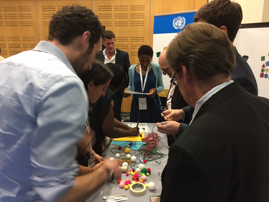
I just ran a workshop for attendees at the 2017 UN World Data Forum in Cape Town, called Empowering People with Data: tips and tricks for creative data literacy”.  This was a great chance to connect my activities, and my work with Catherine D’Ignazio on DataBasic.io, to the non-profits and government statistical bureaus.  We’ll be doing more of this, as NGOs are coming to me more often to talk about helping them build their capacity to tell strong stories with their information.

img_5210
building a data sculpture (most materials were bought locally)

Many in the audience came up afterwards and were excited to bring the activities and approaches back to their organizations! Our fun activities were definitely new and novel for their world, and they immediately saw the value for many of the stakeholders they work with.

img_5221
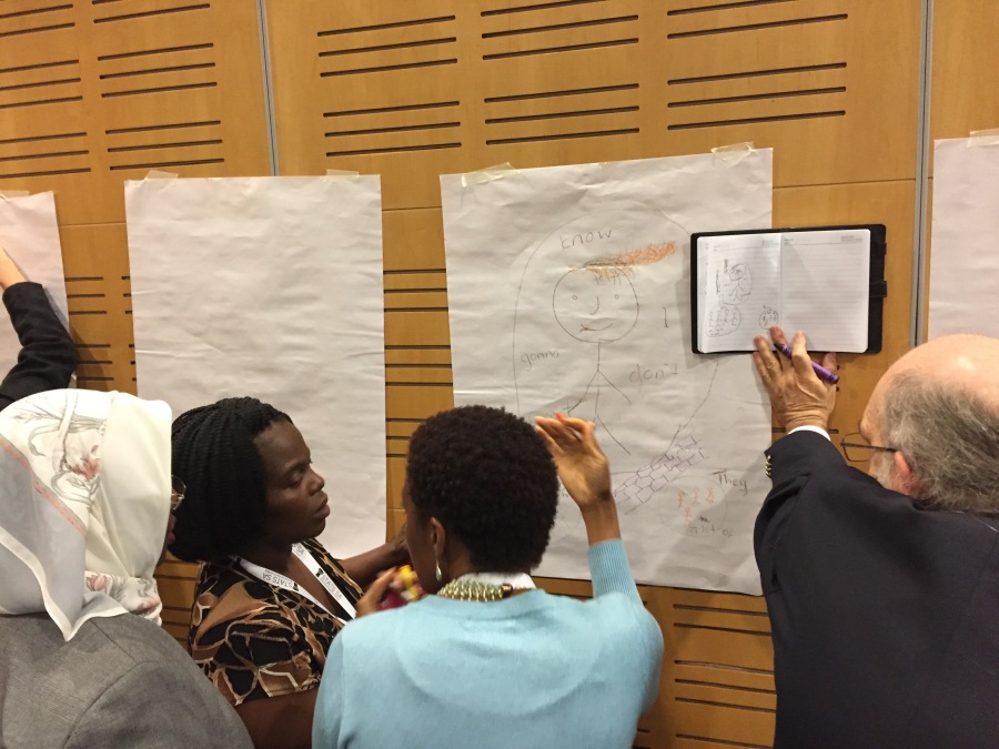
sketching a story about lyrics found using our WordCounter tool

I’ve posted the slides on slideshare.net.  With examples including Praxis India, GoBoston2030, our data murals, and Peabody’s history quilt, I hope they created a richer set of inspirations for how to make working with data participatory and empowering!


UN Data Forum: Data and Algorithm (Live Blog)

This is a liveblog written by Rahul Bhargava at the 2017 UN World Data Forum.  This serves as a summary of what the speakers spoke about, not an exact recording.  With that in mind, any errors or omissions are likely my fault, not the speakers.

Capturing the 21st Century through Data and Algorithm

Dan Runde shares some guiding questions for the panel: Why do we measure stuff?  Do we have the tools to measure the right things? How do we handle changes in technology and methdology?  What about private data? What’s trustable?

Ola and Hans Rosling – President and Co-Founder of Gap Minder

Ola runs the educational non-profit Gap Minder. He begins with a live audience poll to check some facts. They have been asking these fact-based questions across the world. In different places people respond differently. For instance, on average women have far more schooling than people in Sweden, the US, and at a TED event think.  South Africa actually was closest to the real data. They call this the “ignorance project”.  They bring in Hans Rosling

Hans explains that just being famous wasn’t enough to change people’s beliefs. It turns out the big CEOs know the world best. Those that deal with big money have stronger instincts of learning how the world really is. This was shocking. There is no way to communicate the SDGs if we don’t measure the impacts of our communication.  Most women have access to contraceptives.  Most children receive the basic vaccines. The data statistical bureaus generate is to generate investment and GDP growth, not for just political decision making. We have to broaden who is intended to use this data. Media is a bad way to change their world view; they have to be taught it in school.

Pali Lehohla – Statistics South Africa

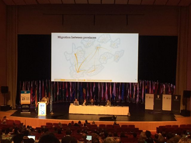
Minister Lehohla is the Statistician General for Statistics South Africa. He will connect migration, death, and longevity in South Africa.  He shares an interactive map of migration across the provinces.  He shows paths such as the Indians who worked at sugar plantations in the south east, moving to Gauteng. The white population makes money in Gauteng, and then moves to the Western Cape to enjoy their money.  These connect to the death rates in each of these provinces; for instance they are lower in Gauteng.  Death is exported from there.  Death rates are a function of how society is organized.

flvikk1l

Minister Lehohla walks through a Gap Minder chart of South African life expectancy. In 2008 or 2009 life expentency in South Africa rose very quickly, though income per person was flat.  In Gauteng and the Western Cape people live longer. You must avoid Free State because you’ll die younger.

Switching to child mortality, Minister Lehohla argues for geographic breakdowns of data to understand it better. In this animation after 2004 a lot of the data dissapears.  This is because municipalities changes, so they can’t compare the data well.  These political decisions cause statistical problems.

Talking about complexity is the task of statisticians. You have to project value-add.  Putting it in a narrative and explaining it is the task of the chief statistician of a country.  We have to organize ourselves in a way that helps us measure the SDGs.

Emmanuel Letouze – DataPop alliance

Manu is the director of the DataPop Alliance.  Manu will talk about statistical measurement and societal development in the age of data abundance and algorithmic analysis. There are number of rationales for measuring things. We think that measuring something means we care about it, and can have an effect on it. Is better data really the problem?

Manu doesn’t really measure his two children directly.  Even when you care deeply about something, it doesn’t mean you measure it. This is an important caveat in the theory of measurement. GDP was invented in the 1930s as a measurement of production.  This is a good example of something you measure because you want to change it. There are negative consequences to this of course. This was invented in an industrial, data-poor era. In the age of algorithm this makes little sense. For instance, GDP doesn’t capture the consumption of free data.

Now we know we need to measure other things. With data like hundreds of millions of credit card transactions you can identify cultures of people who behave similarly (ie. tribes). Manu believes in open algorithms to get around the worry of leaked data.  The OPAL architecture is an attempt to send open algorithms to operate on private sector data.

The outcomes and processes of measurement have to be more meaningful in this day and age.

Anne Jellema – World Wide Web Foundation

Ann is the director of the World Wide Web Foundation.  Gap Minder’s Ignorance Project shows just how disconnected people are from official data.   This can lead to apathy, distrust, resentment. For instance, people overestimate vastly the number of refugees that have entered their countries. It can lead to denial, like in South Africa in relation to the AIDS epidemic.  For instance, one of the outcomes of this conference is to include women’s unpaid care work in counts.  This will value women’s contributions in policy decisions.  Another example is including data on climate change.

Date can help improve people’s lives and improve the SDGs. The experience at the WWW Foundation shows that the benefits are far greater when people participate.  When they are involved in designing, collecting, and using data.  A project in Ivory Coast, with UN, Data2x, and Millennium Foundation showed this. They worked cross-sector to use data to tackle the real problems facing women there.  They not only used existing data, but found gaps in the data that would help if filled and openly available. For example, if clinic and hospitals could share information about shortages they could shift pregnant women to places where resources would be available, so pregnant women wouldn’t be turned away.  In the process of sharing and discussing data trust was built between government and NGO groups.

These are example of how CSOs can engage with government with data to solve problems and meet the SDG goals.  Unfortunately, the collection of data has been monopolized by the state, with no participation. The chief reason is accountability.  Technology allows a shift towards more participatory techniques.  However, the rise of big data could make this worse – Manu’s “elite capture”. The majority of data capture is controlled by the private sector now. This is our data, but it belongs to the companies now, and they are not accountable. This is a challenge we need to confront.

We have to open government data to a data commons.  Only 10% of non personally identifiable government data is fully open (source). The numbers are similarly low for sector-soecific basic data (health and education, environment, etc).  Government spending data is one of the least-open in the world. A lot is abilalbe online, but little of it is “fully open”.

In the US many civic decisions are being left to algorithms now.  We need to be able to interrogate and challenge thse, just as we can for standard governmental statistics.  This is critical for informed citizenship.

What does trust mean?

Manu: This is trust within society between different groups.  Another is the trust you build as you engage in data collection processes.  This is a strong rationale for national statistics.  Third is the trust in statistics themselves; in the outcomes. This allows a democratic debate about a shared agreement.

Pali: Trust is about integrity. Trust is also about justice.  We know we are fallible.  In the statistics community we are too gentle with each other. We need to confront our failures.  That is what builds trust.

Ola: Trust is a feeling, and emotion. I trust Pali, but I’m not sure why. This is also called confidence.  The over-confidence in this room is enormous.  We trust ourselves, even when we shouldn’t.  I know this because, as a white Caucasian male I speak to others and we trust each other.  This group just performed worse on my quiz than chimpanzees.

Anne: The latest Edelman global trust barometer indicate there is a implosion. This is at an all time low.  We have to hold ourselves responsible for starting to restore some of that.  We just saw the damage this can do.  So how do we rebuild trust.  One thing we learn form the open-source community is that the more people can be involved in interrogating something, the greater their trust.   This is the opposite of how statisticians think about process.  We should welcome contributions from others.

If you had a magic wand, what would you want to measure?

Manu: It is a matter of finding out what people care about. We don’t have good processes for this.  This matters as much, or more, than the outcome itself.

Pali: Public opinion is very flimsy, but it counts. It reflects inner-being and skepticism.  We need to understand this. In the last local government election in South Africa they measured physical things. When asked for opinions of satisfaction, they showed deep levels of dissatisfaction, out of line with the growth in physical things.

Ola: Knowledge. We’re not measuring the impact of our communication.  Asking voters how to do it is giving up our responsibility.  Measure yourself and your staff, and what you know. The activist score worse than anyone else in their own fields.  They exaggerate their world view of the problem. In the US 5% got a question about the extreme poverty rate of the world. They didn’t know it was decreasing. We need to point our fingers at ourselves first.

Anne: Gender data is vitally important.  Secondly I’d ask for joining up the existing data we already have.  This is how you unlock the power of data. This is a therapy session for us to confess our mistakes.

Q&A

(Missed it, sorry)


UN Data Forum: Data Advocacy Impact Panel (live blog)

This is a liveblog written by Rahul Bhargava at the 2017 UN World Data Forum.  This serves as a summary of what the speakers spoke about, not an exact recording.  With that in mind, any errors or omissions are likely my fault, not the speakers.

Data Advocacy: What works and what has impact?

This session will try to look at the same issue from different angles.

Shaida Badiie – Open Data Watch

Shaida Badiie is the Managing Director of Open Data Watch.  Defining “data advocacy” is tricky.  Shaida defines data advocacy as both promoting the use of data for a variety of purposes, and encouraging the production of data. Some examples can help.  First, Pali Lehohla, the statistician general of South Africa, is a success story.  His advocacy strives to leave no-one behind in the census.  Another success story is Project Everyone (who designing the SDG logos).  A third is about showcasing the benefits of data via case studies, from a variety of organizations (including Open Data Watch).  A fourth example is to be found in is advocating for institutional change.  A fifth example is people like Hans Rosling, who do an amazing job telling data stories through their passion and communication skills.  How can be develop more of these types of people?  Sixth – there are some champions for data in the political realm.  The last story, seventh, is a failure in funding for statistics.  The gap has been measured, published, and highlighted.  Investment in data is going down.  Shaida leaves us with a challenge – how can we advocate for more funding more effectively.  Data needs to be seen as essential to the effort for the SDGs to succeed.

Heli Mikkelä – Statistics Finland

Heli works for Statistics Finland, which has a history of over 150 years.  Usually these departments are more focused on production, versus how they are used. During the last few years this focus has shifted to more on the usage.  If you don’t produce what is relevant, you won’t get more resources.  This is how you prove you are useful.  You have to produce reliable, relevant, and timely statistics. They deliver a variety of services, from open data, to statistical literacy, to partnerships.  Recently there was a reduction in funding, and they had to choose what datasets to terminate.  At that point many organizations and people outside of the department stood up and advocated for maintaining funding because Statistics Finland produced content that was so useful. We have to recognize when data makes a different, and how it does.  We need to discuss this with those that aren’t so familiar with data.  Real important comes from inside; finding examples where data is relevant to people’s lives.

Dr. Albina Chuwa – Tanzania National Bureau of Statistics

Dr. Shuwa is the director general of the Tanzanian Bureau of Statistics. Our data is for the development of the people.  Data must have its own principles and standards, because it has to be comparable. We want data to operate within existing systems, so we can cut costs.  Each country has signed on the to Africa Data Consensus. Tanzania is setting up a national roadmap for SDGs, aligned with some of the cross-national agreements in regards to data. Data ecosystems help make this word.  Across Africa governments agreed to allocate 0.15% of budget to data production. Tanzania is working on an open-data policy, by default. This includes posting it to a governmental open data portal. With public data, accountability has increased.  Citizens are using data to challenge the government (job creation and tax collection are two examples).

Emily Curie Orio – Data2x

Emily Courey Pryor Is the director Data2x.  Their slogan is “without data equality, there is no gender equality.”  They focus on improving the production, availability, and use of gender focused data.  They want to build an advocacy movement for gender data.  There is a surge of support for this right now, due to longer term work and preparation. They started from a call from Hillary Clinton to address the black-hole of missing gender data.  Starting from that spark, they found that there wasn’t once place where everyone could go to get all the gender data that existed.  Data2x mapped the data gaps and formed partnerships with big agencies to try and fill thos gaps. While doing this they realized that they need an integrated advocacy campaign in parallel to achieve any uptake or sustainability.  The first thing they need is some champions that help to create this campaign – Hillary Clinton, Christine Lagarde, and others.  The second thing needed to create this movement is an engaged and intrigued media as well, with a growing number of articles highlighting the gender data gap. A third is good creative assets, such as their video has been a great tool to advocate to those within this community, and those outside. The fourth thing they need is engaged stakeholders.  Data2x is now working with stakeholders large and small.

From here, they need to:

  • engage data collections and producers
  • bolster policymaking champaigns
  • link gendar data to policy change
  • understand private sector data
  • develop advocacy approaches for multiple audiences

Tariq Khakar – World Bank

Tariq is the Global Data Editor at the World Bank.  The release of the free World Bank open data portal was a big shift, but that was just one piece of what the Bank does. In 2014, they did a study of PDF downloads and found a whole set had no downloads at all. This led to a reconsidering of how people wanted to consume information; there was momentum to repackage the information in more accessible ways. The key to advocacy is to stick in people’s head… like a song you can’t stop humming.  They started looking for nuggets like this. Tariq suddenly found a need to have their communications staff be able to make a good chart and write a good headline – like “Most Refugees don’t live in camps”.  Since training up, they’ve produced thousands of these charts and headlines with simple chart making tools.  That’s doing advocacy with data, specifically for the Bank’s mission to end poverty. Their “my favorite number” video series helps them tackle advocating for better data.  It includes the line that “we believe collecting data is giving voice to the poor”. To get something stuck in your head you need a convincing number ,and a strong and compelling story.

Q & A

They take a few questions, and then afterwards let the panelists respond.

Both Shaida and Dr. Chuwa mentioned the commitment of countries to designate budget for data generation, or data sur-charge.  Is this working? 

In Africa we have networks of women’s groups, like FemNet; are you working with them? Are you helping build their data literacy?

For Dr. Chuwa – how can we advocate for more data from federal statistical bureaus?  Especially datasets that can be politically sensitive.

PWC has done some work showing how businesses are aware of the SDGs, but most don’t know how to respond or act on them. PWC is starting to help national statistical offices respond too.  What can private companies like them do to help?

We have to look at how data impacts the lives of every individual?  How do we move from nicely smelling places and people to where change is needed?  We need to solve the problems today.

Dr. Chuwa tells a story about releasing maternal mortality rate data, where they partnered with a lot of organizations. In terms of funding and production, the government isn’t funding at that rate yet. They got a loan from the World Bank to cover the costs of data production. Tanzania has the OGP, so all the procurement contracts are available on the open data portal, except mining and land. They data visualization based on stakeholder needs.

Heli shares how they need advocacy to make changes on what is released.  Regarding what role private sector actors can take; one is funding, another is to be a consumer and give feedback.

Tariq comments that for private sector actors, partnering on production is good, or analysis and communication. There are more things they can do in the Bank in terms of investing in data in countries.  This doesn’t move up the national agenda for financing.  They even need to build up the commitment to data within themselves at the Bank.

Shaida has a number of examples of working with the private sector to test models.  We need to find some kind of continuous process for collaborating. One of the reasons we haven’t been as successful funding SDGs is that the new donors aren’t as interested in building long-lasting infrastructure for data. In terms of taking data to people – it needs to be a two-way street.  You have to make it clear why people should contribute data, and also how to disseminate it back to them.

Emily begins by mentioning that Data2x is already talking with FemNet and Civicus, on a project tracking SDGs for women and children.  In the private sector, one thing to add is the idea of data corporations investing in that field… namely funding the national statistics bureau or something.

Capacity building is a non-stop process.


UN Data Forum: Making Civil Society Data Literate (live blog)

This is a liveblog written by Rahul Bhargava at the 2017 UN World Data Forum.  This serves as a summary of what the speakers spoke about, not an exact recording.  With that in mind, any errors or omissions are likely my fault, not the speakers.

Developing a Collective Curriculum to make Civil Society Date Literate

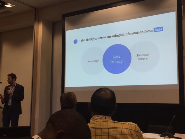
Pim argues that making data meaningful requires interpretation. TO do this, people need to be data literate.  They begin by sharing a number of examples trying to demonstrate this.  For instance, news stories gloss over the important difference between correlation and causation is not grasped by most.   Another discussed how to do regression correctly.  These examples argue for the ability to derive meaning information from data. 

fmx3cphl

Brainstorming

The goal of this workshop is to develop a collective curriculum to make civil society more data literate. After a quick poll of the room, we can see that the room is a mix of policy advisors, statistical bureau staff, NGO workers, educators and more.

Pim Bellinga and Thijs Gillebaart run I Hate Statistics. Their goal is to make statistics sexy again.  They started this because many of thier friends were working on topics that required statistical work, but didn’t want to do it. As teachers, Pim found a need to build a tool to study online to meet individual student needs.  These online activities are then a measurable assessment tool for building data literacy. “This is the first time I get to feeling I am understanding statistics” said one student.  In general courses that use their tools see pass rates go up.  The are using this in universities across the Netherlands.

In addition to university students, they want to serve civil society anyone that reads something that is based on or contains data. Pim asks when civic society might engage with the SDG data.  A few audience responses:

  • In media when trying to tell a story about the current state of affairs we could use SDG data.
  • In governemental burueaus we can use the SDG data to make recommendations
  • In advocacy, we can use the SDG data to hold the government accountable.
  • Organizations can align their strategies to what the data say.

Pim asks who should become more data literate.  We break into small groups to brainstorm groups which you think should be more data literate.

iqnhayxl

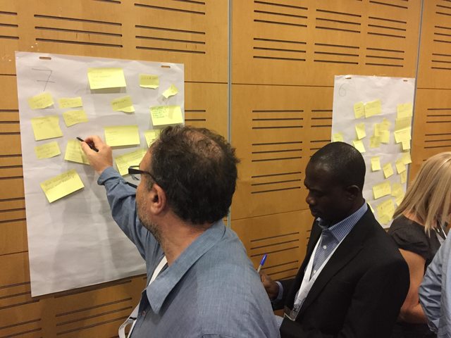
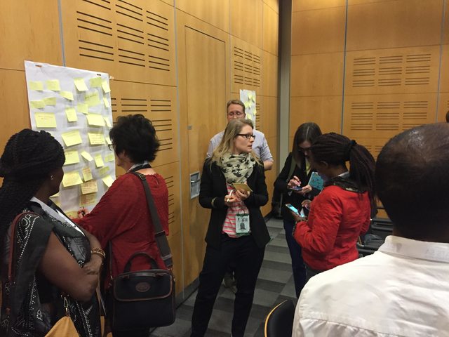
After 10 minutes of grop brainstorming, Pim then asks us to think about 3 top categories – journalists, students and educators, and policy makers.  We split into three large groups to think about what these audiences need to know.  What specific skills or abilities do they need? We breakout again to discuss. The goal is to end up with a draft curriculum of how to build data literacy in each of these sectors.

es4bc4cl

Thijs visited each of the groups to look highlight a few of the specific abilities they came up with.

They have made a knowledge map of a large space of statitstical topics, to help drive the design of curriculum and assessment.

How I Hate Statistics Approaches Building Data Literacy

How does I Hate Statistics think we can best teach these skills at scale.  Explanations should be short, relevant, and at the right place.  Doing it online is a part that can help; it isn’t the whole solution.  You can teach people at their own pace and time.  You can use visuals, interactivity and stories – these are ingredients.

A guest comes up ot review a collaboration.  She works for a membership-driven online journalistic platform.  One of the topics covered is when and why polls can be helpful or hurtful. They are collaborating on that topic with I Hate Statistics on this.

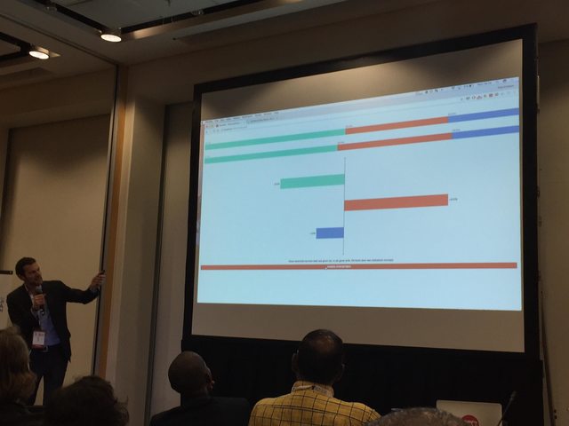
Representation is one issue to pay attention to with polls, as are error margins.  Journalists report poll changes that are within the error margin.  I Hate Statistics is using the ingredients mentioned to build an interactive that conveys these issues to journalists. In three months there will be elections in the Netherlands, so this is relevant.The interactive simulates a random sample of vote polling.  Comparing this to actual results shows that sampling can produce very close results to the actual.  Their next step is to show a number of runs of sampling, each of which produces slight deviations.  These are called the “error margins”.  They hope this helps journalists learn that changes within the error margin don’t deserve big headlines.  This is an example of a short interactive explainer, that attacks one part of how to become data literate.

jejto5xl

Journalists are asking for data literacy education. They have developed visual stories, one example of which is a manager delivering organs to people who need them.  The need to decide between two routes. The manager suggests using GPS data to figure out which route is faster.  This brings in raw data.  Students start by summarizing to get insights.  Looking at the mean and mediam shows route 1 being faster in both.  They choose route 1 and all the drivers take it.

Two or three weeks later, they get a call that the drivers delivered the organ too late.  In fat after the decision there have been many more too-late deliveries.  Going back to the raw data, charting a histogram shows that the spread was bigger on route 1, meaning there were many more late deliveries even thought the medan and median showed it lower.  Variation is as important a summary as mean/median.

These types of stories can motivate people to think about statistical data.

Q & A

Let’s not forget secondary impacts. For instance, what about the driver’s attitude when taking route 1; like perhaps it is the highway and more stressful.  How do we measure and respond to that?

We should try to influence people’s behaviors.

The two examples are short interactives.  Coherence and transparability are two important ideas – how do we bring those in?  Perhaps a next module could ask those questions?  This could get into questions like “how is the data collected?”.   How can your short segments help people increase their understanding?

This is a great question and challenge.  Super short lessons are necessarily neglecting some things.  We need to connect these short ideas together so they become a curriculum.

We can’t build one collective curriculum for everyone. We have to adapt the bits and pieces that exist to each target group.