Data + Design + Impact: A Workshop on Data Sculptures and Civic Change

Teaching data storytelling is difficult. The norms, “canonical” readings, and the cutting edge evolve every month! With such an evolving landscape to work within, I relish the opportunities I have to explore something new and different with students in a focused way. This past week I had the great pleasure of doing precisely that at the invitation of the FHNW Institute of Industrial Design as part of their International Design Workshop. The week, which reminded me of MIT’s IAPsession, is an opportunity to bring in outside instructors to work with undergraduate industrial design students in the week that starts their spring semester.  Fifteen students and I explored designing and building data sculptures based on exploring civic datasets. I’ve been writing about how I want to push the field of physical data storytelling, and I hope these contributions help. Here’s a run down of the project they made, and what I learned to inform my teaching practice.
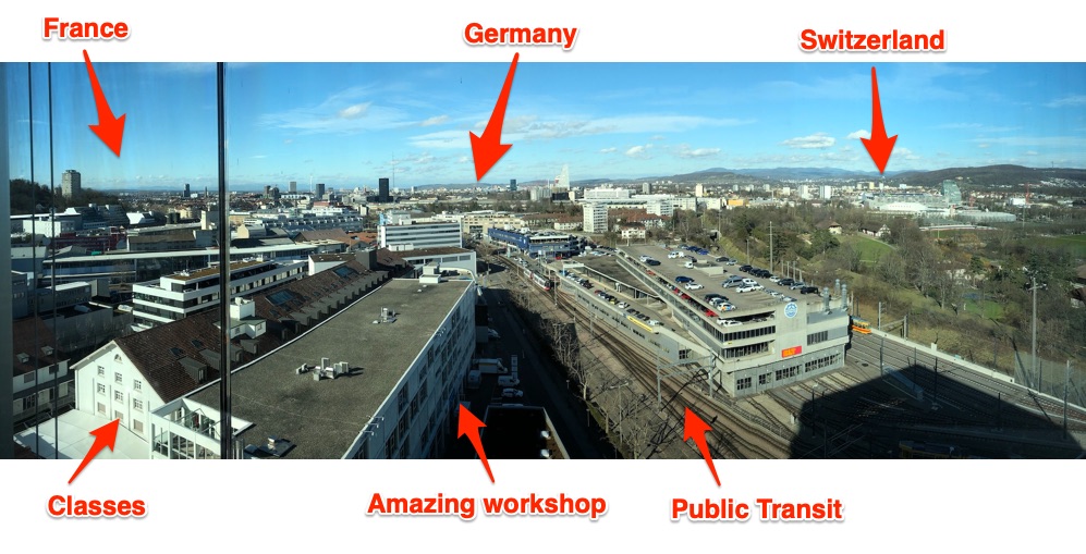
My annotated postcard from the top of FNHW’s beautiful campus library.

recorded unrecorded

By Fiona Beer, Leon Rauscher and Stephan Jäger

Refugee crises around the world are heart-wrenching and complex. Measuring and understanding the scale of the movement is difficult. In Europe ongoing flows across the Mediterranean Sea have been amplifying for the past decade. This group decided to take on the challenge of telling a story about this refugee crisis to their fellow students by making a large data sculpture that you walk through.
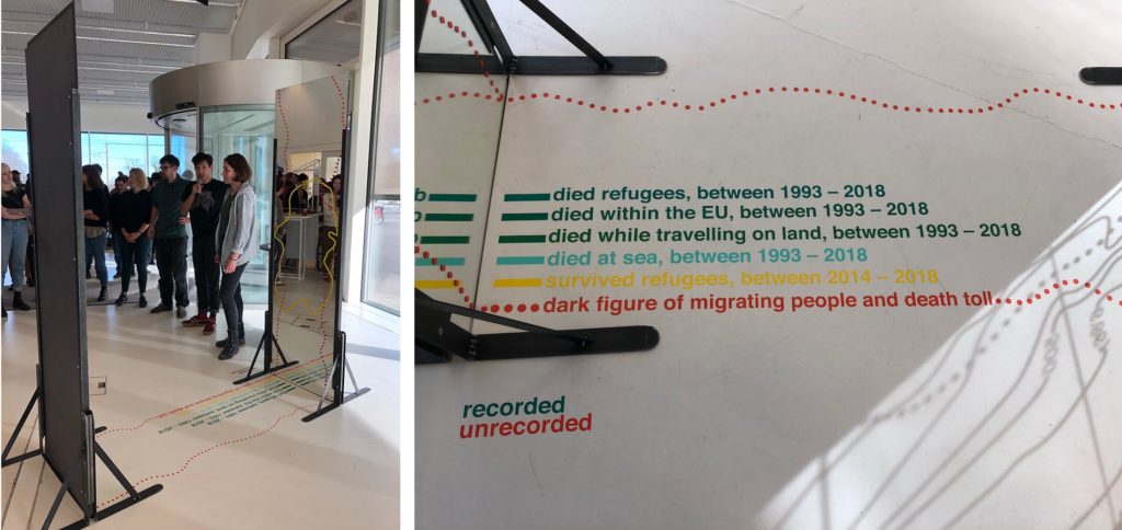
The piece centers around two mirrors facing each other, with lines and text decorating them, and invites the viewer to walk through. As they state:

This installation tries to show the number we know of, but simultaneously to represent the dark figure of deaths, names, age, origins, and causes of death, we have no idea of.

They acknowledge and embrace that reliable and complete data about migration, refugees, and deaths are impossible to come by.

Echoing the aesthetic of topographic map contour lines, they represent the “known” data on the floor and up the glass; one side for the living, the other for the dead. In addition, the dotted line suggests the data we don’t know, and have little way to estimate – the “dark figure of migrating people and death toll.”

This is all fairly readable from outside the sculpture, but stepping in between the mirrors creates an infinitely repeated landscape. The contour lines extend on forever, echoing the endless journey undertaken by so many migrants. The numbers and lines become hard to read, echoing the truly unknowable nature (a creative approach to the problem of visualizing uncertainty the field struggles with).

I think the core metaphor of the contour lines and the reflections that underlie this piece are resonant and memorable. More importantly, for me they pulled off a visual and physical design that embraces the humanity of the data, rather than treating them as abstract numbers that mask the crisis.

Data Sources: 2018 migratory deaths,  UN Refugee Agency Data Portal

Wealth Inequality in Switzerland

By Christina Bocken, David von Rotz and Silvan Häseli

Switzerland is a wealthy (and expensive) country, but there is large income inequality. This group was inspired by a piece from CBS This Morning to explore this inequality in Switzerland. They found, to their surprise, that just 2.5% of the Swiss population holds more than half all of the wealth. They decided to share this story, and what causes it, with a doll-house sculpture and a board game.
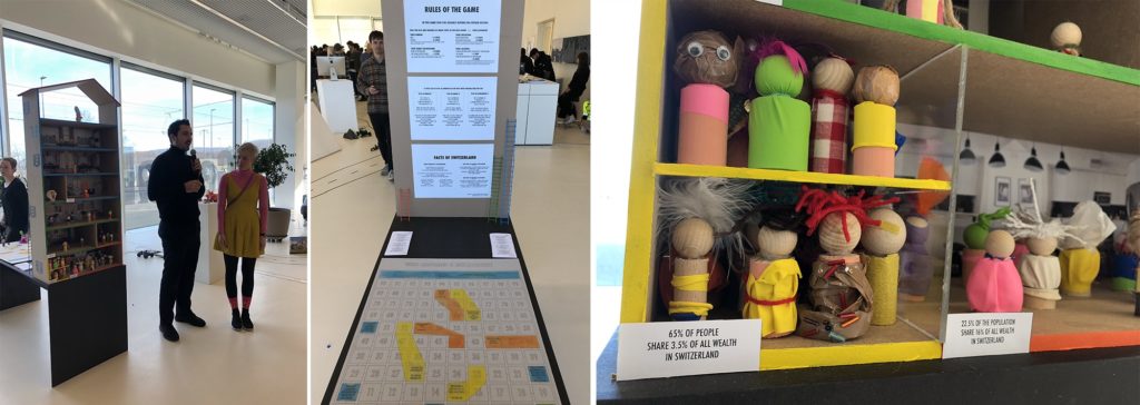
The multi-story dollhouse is divided into 3 sections about wealth ownership, each populated according to how much of the population holds that wealth. As the note on the yellow section states – “65% of people share 3.5% of all the wealth in Switzerland”.

To pull readers into why, they created a modified version of the popular snakes-and-ladders board game – called “Who Becomes a Millionaire”. Walk around back of the dollhouse and you’ll find a large playing board, dice, and instructions. Here’s the thing – the game is rigged. The rules change based on your gender, family background, education, and where you live! Playing as a woman nor born in Switzerland? Sorry, you don’t advance very quickly.

Inequality is hard to tell stories about, so I was excited to see this group take this challenge on. I think the house is a lovely invitation to come investigate the piece, and the board game is a creative pull to get the audience to dig in to the data more deeply. Building around the metaphors of the house, and the rules of the game being rigged, were key “anchors” to their design.

Data Sources: Swiss Federal Statistics Office

Medienkonsum 2020 (Media Consumption 2020)

By Eva Bieli, Valéire Huber and Sofia Leurink

Intrigued by our Media Cloud database of news reporting, and the surge of reporting on coronavirus, this group decided to explore the Swiss news landscape in 2020. News sucks us in; we want to read it, feel responsible to read it, but often end up left feeling powerless and upset by it. They found the top 3 themes written about were all depressing things – fears around coronavirus, aftermath from the assassination of Suleiman in Iran , and the tragedy of the Australian fires. This team asked “How consciously do you consume media? How do you digest bad news?”
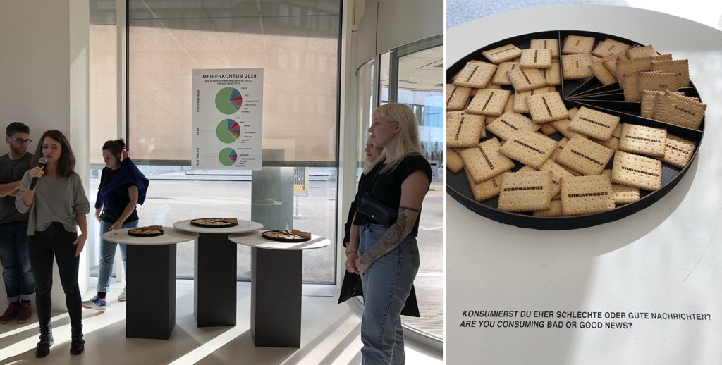
This piece is built around a visual and explanatory pun – the idea of “consuming media” like one does food. Mapping each topic onto a pie-chart style plate, they laser-cut words into biscuits based on their frequency of use when discussing each of those top three topics. This is a literal representation of the news we consume, and I can tell you that picking up a cookie etched with “coronavirus” certainly does give you pause!

I think this piece is a delightful provocation to think about the news we consume each day. The representation in food is an inviting way into a thoughtful topic, hopefully breaking down barriers the audience might have to reflecting about their own news consumption. The 3 plates are playful, pulling you over to understand why they are different sizes.

Data Sources: Media Cloud (Swiss national and local media source collections)

The True Cost

By Nathan Blain, Rino Schläfli and Daniel Mankel

The true environmental cost of the goods we produce and purchase is almost impossible to comprehend – there are just too many variables. This group rose to this explanatory challenge, creating an immersive multi-sensory piece that assaults your senses when you choose an environmentally unfriendly option.
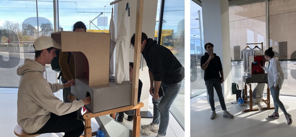
The piece present you with a choice between two identical-looking shirts, sit down and press the button associated with the one you want. Once your choice is made, three things happen that represent the environmental cost of the object:

  1. The animation and sound of water on a screen increase based on the amount of water used to produce the shirt.
  2. Smoke pours out at you (from a fog machine), obscuring your vision and making you pull back, based on the how many greenhouse gases are emitted in the production and transport of the shirt.
  3. Your other hand, inserted (trustingly) into a dark box, is sprayed with water based on the amount of water used to produce the shirt. Well, it doesn’t actually spray your hand yet… they almost had it working by the opening so hopefully they’ll get it working in another day.

I’m delighted by their idea of creating a multi-channel assault on your senses. We don’t have good approaches to communicating the un-captured costs of these goods. This piece is a provocation to consider the physical impacts of those choices on your own body, rather than in some far-off rain forest or ocean.

Data Sources: TBD (I’m not sure what they used)

The Mask Collection

By Jasmin Schnellmann, Jasmin Vavrecka and Timo Lanz

This group was struck by the public reaction and news reporting about coronavirus. While certainly it is cause for concern, they realized that global air pollution is a far more serious problem right now, in terms of deaths and scope. Trying to find a way to communicate this risk, they struck on the symbolic power of the medical face mask.
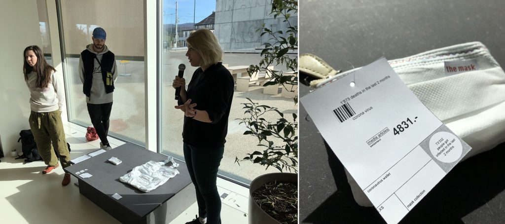
They created two objects for the mythical fashion show about “the mask collection”. The first is a small wallet made out of masks and sized based on the deaths due to Corona virus. The second is a large purse made of sewn together masks, sized by deaths due to air pollution. The viewer reading more closely is likely to be surprised by the “price tags” on each, with the small one having a higher one while the bigger one has a lower cost. These price tags show more detailed information about deaths and media coverage – which are inverses of each other. Air pollution has far more deaths but far less coverage (in 2020).

The objects they created speak very strongly to me. They make you look twice to understand how they are made, with strong red thread echoing a sense of importance and dread. It is a simple visual mapping, but presented as a collection of daily use objects they speak to the choices we make, and the risks we face, each day.

Data Sources: Media CloudGuardian UK and NYTimes articles, World Health Organization data portal

My Takeaways

I was impressed by the students creativity, fortitude, and craftsmanship. They created these in just one week(!) with no previous experience with data storytelling. I continuously challenged them to think beyond simple tricks like physical bar charts and such, and I think they rose to the challenge.

From this one week I can picture expanding my approach into a semester-long course that explores the aesthetic principles of physical variables of data sculptures. Externalizing these models and stories creates an opportunity to communicate around and about them, and affords me the opportunity to revisit back on my training in the pedagogy of constructionism

This builds on earlier thoughts I captured in a paper with Catherine D’Ignazio at the Pedagogy and Physicalization workshop at DIS 2017. It also has links to projects from many other academics working on these questions of data storytelling and 3d physical materials:

I look forward to exploring these techniques with students and building my own data sculpture practice more. I hope they inspire, resonate, and challenge you as well! If you happen to be in Basel this Feb or March, these are on display for a few weeks.

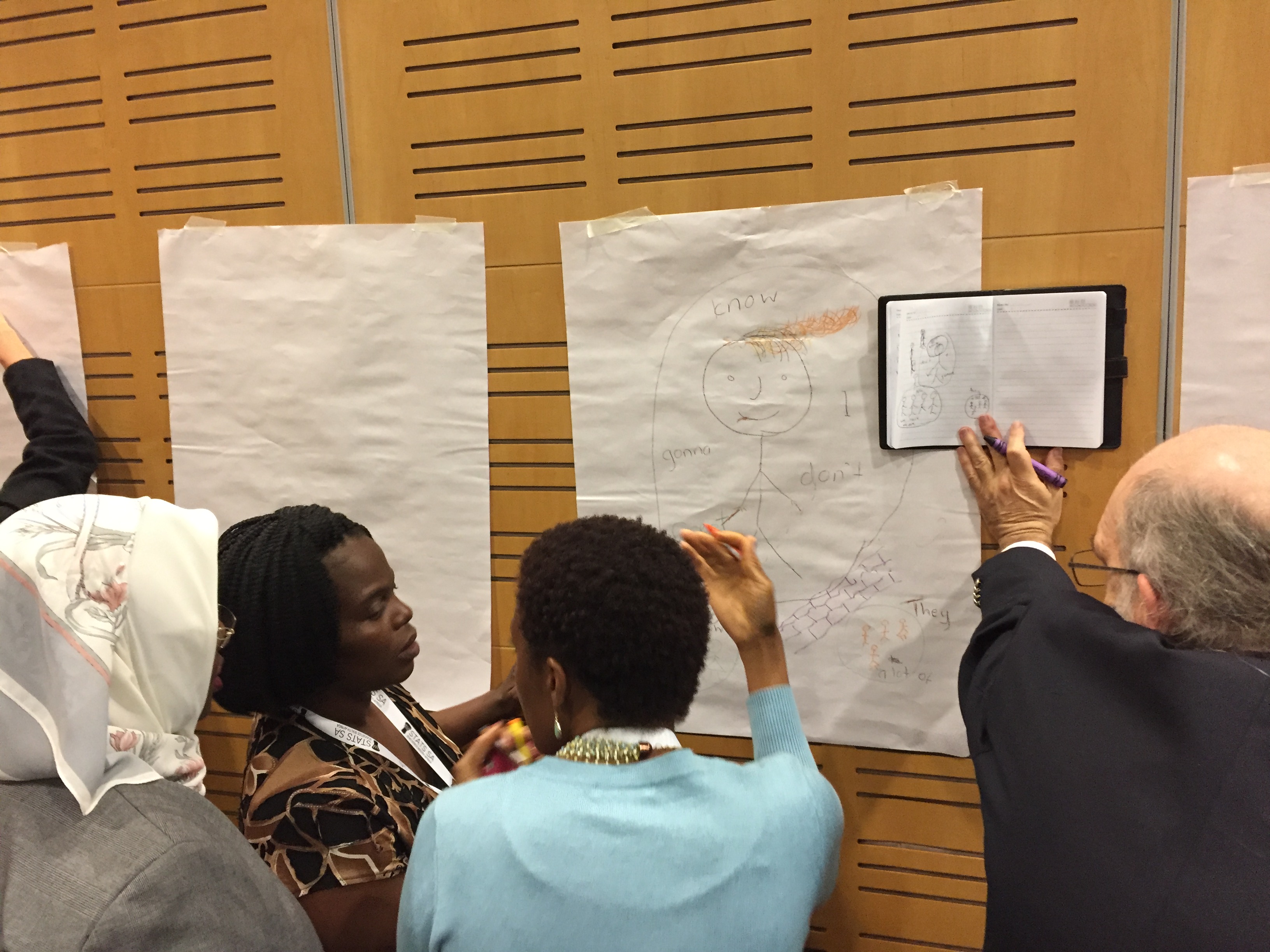
Workshop at the 2018 UN World Data Forum

A few years ago I went to the first UN World Data Forum and made some amazing connections with non-profits large and small (read more about that here).  A common theme at that event was how to help organizations and governments get the data they needed to start work on the Sustainable Development Goals.

dt6wkqgx0aak6ux

I just returned from the 2018 event, and found a new message repeated over and over – how can we help those who have data communicate about its potential and its impact? I’ll write more about that later.  For now I want to share a bit about the session I ran with my collaborator Maryna Taran from the World Food Program (WFP).  It was a pleasure to return to the event where we first met and speak to the impact we’ve had at WFP, and how the Data Culture Project has grown to a suite of 7 hands-on activities you can use for free right now.

Empowering Those That Don’t “Speak” Data

Our session was designed to focus on bringing the non-data literate into the data-centered conversation.  The idea is that we can help these folks learn to “speak” data with playful activities that try to meet them where they are, rather than with technical trainings that focus on specific tools.

We introduced our arts-centric approach to creating participatory invitations through the data cycle – from data collection, to story-finding, to story-telling.  Specifically, we ran our Paper Spreadsheets activity and our Data Sculptures activity.  Maryna also shared how the WFP has rolled out a data program globally, where the Data Culture Proect activities fit into it, and some of the impacts they’ve seen already.

dqhypxtwsaakt1j
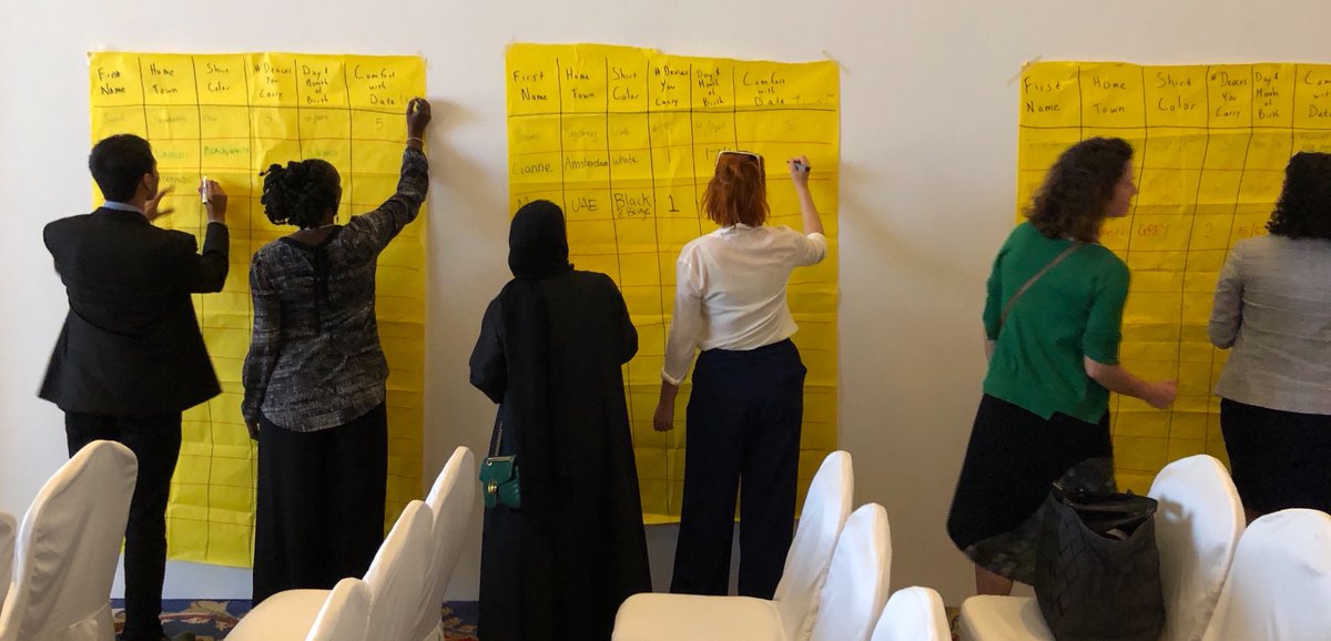
Participants filling in a paper spreadsheet.

The Paper Spreadsheet activity led to a wonderful discussion of data types, survey question create, and security concerns. The Data Sculptures folks created were a great mix of different types of stories, so I highlighted some of the scaffolding we’ve created for finding stories in data.

One of the most rewarding comments at the end was from a woman who worked on the data analysis side creating charts and such for her team.  She noted that she often will share a chart with others on the team and they’ll say “tell me the story”, much to her frustration – she just didn’t understand what they meant.  What more did they want than the chart showing them the evidence of the claim or pattern? She was pleased to share that after this session, she finally had a way to think about the difference between the charts she was making and the story that her colleagues might be looking for!  Such a wonderful comment that resonated with a lot of the points Maryna was making about how and why WFP is rolling out the Data Culture Project activities in parallel with their more technical data trainings.

Here are the slides we used, for reference:

Data Literacy as a STEAM Activity for Youth

I’ve been connecting with more and more educators that want to take a creative approach to building data literacy with their students. Schools traditionally introduce data with in-class surveys and charting. This approach to generating their own data can be a wonderful way to empower learners to collect and represent data themselves. A more recent movement has centered around the STEAM movement – including the Arts along with the Science, Technology, Engineering, and Math curricular focus.  I’m seeing a pattern at the intersection of these two approaches – educators are seeing strong engagement and results when they introduce their students to working with data through arts-based activities. Here’s a case study from a collaboration with the MIT Museum to flesh out how this can work.

Environmental Data Mosaics at the MIT Museum

This case-study was contributed by Brian Mernoff, one of my collaborators at the MIT Museum.

Each February, during Massachusetts school break, the MIT Museum runs a week of hands-on activities and workshops called Feb Fest. This year, the event was themed around our temporary exhibit, Big Bang Data, which explored how the increasing use of data affects technology, culture, and society. The purpose of the workshop was to let students view data sets of interest, understand these data sets, and share what they have learned with others in a creative and accessible way; all pieces of building their data literacy.

Data Sculptures as a Quick Introduction

As soon as students entered the classroom, they were asked to create a data sculpture based upon one of the sets of data placed at on their table. This is an activity the MIT Museum Idea Hub has already been running regularly. These data sheets contained relatively straightforward data sets to analyze, such as happiness in Somerville, and the cost of college over time. Art supplies were on the table, and the students worked with each other to create these sculptures while getting to know one another. After about half an hour each team  presented how they decided to represent their data to the class. This activity was a great way to get them to get used to talking about data with each other and representing it in a novel way.

steam-data-literacy1
Data sculptures created by participants

Building a Collaborative Data Mosaic

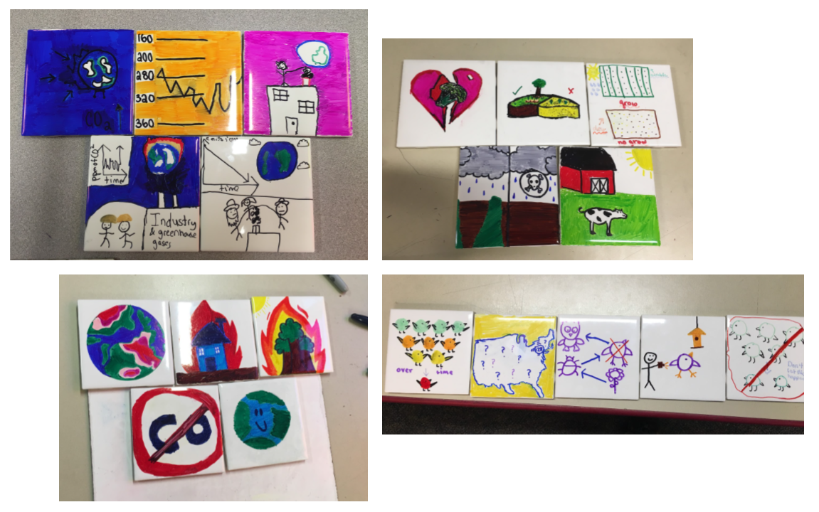
After presenting the data sculptures, we began the main activity for the day. Students were given a list of websites (see below) that they could visit containing environmental data in either graphical or numeric form (see the Environmental Data Search worksheet). Once they had explored the websites, they discussed these websites with a second group of two at their table and determined which one of the links was most interesting to them to explore for the remainder of the project. Once the website was chosen, they again worked in their original group of two to find a story in one of the data sets on the website using the “Finding a Data Story” worksheet. After doing so, the two smaller groups recombined and chose which of the two stories they would like to tell in the final project.

In their story, students needed to explain the problem the data connects to, what the data is and shows, why the data is important, what the audience of the story should do about it, and what would happen in the long run if the reader did what was suggested (see the Data Story Mosaic Layout worksheet).

steam-data-literacy2
Some of the tiles participants made for the data mosaic

Learning Outcomes

Beyond these physical artifacts, the students’ discussions about data were particularly impressive. One group brought up a very interesting question about rare bird sightings and proceeded to debate it for about 15 minutes. They noticed that certain areas of the United States had more overall sightings of rare birds. At the same time, they looked at another data set on the same website showing the number of reporting bird observers across the country. Combining these graphs, they noticed that more rare birds are spotted where there are more reporters. This brought up the question of whether or not rare birds are actually as rare as shown by the data if there is such a close relationship between the two data sets. Both sides of the debate made good arguments and they eventually settled on the idea that the data was still valid, but incomplete. They would need more experiments in order to say anything conclusively.  This demonstrates that the learners were in the “data headspace”, thinking about standard questions of representation, outliers, and normalization.

A second group, studying data on arable land, was trying to combine their data set with information on organic farming. This brought up good questions about what the terms “organic” and “GMO”  actually meant, as well as whether or not it is related to the ability to reuse land over time. To their surprise, the students did some more research and realized that genetically modified foods and some types of “non-organic” farming actually increase what land can be farmed. Again, the activity pulled the learners into a space where they were curious and driven to understand the real-world approaches and impacts the data might be representing; making sure they understood what they had in front of them before finding a story to tell with it.

Overall, these projects allowed students not just to analyze data to find trends, but to think about why data is important and it can be used to find solutions to problems. Through their mosaics, students explored and discussed different potential solutions to determine which one they wanted to communicate with a larger audience.

The Opportunity of STEAM

Brian’s workshop is a wonderful example of how a creative arts-based approach to working with data can engage and proboke students in novel ways. It matches results we’ve seen in previous work on creating data murals with youth in Brazil, and working with a network of school on data challenges. These workshops are starting to help us build an evidence base for using the arts as an introduction to working with data. This can meet a larger set of students where they are.  The physical artifacts and conversations around them are assets we use for evaluation and assessment. Are you an educator? We’d enjoy hearing how you are approaching this.

References

Websites with Environmental Data


Data Culture Project Webinar 4/12

We’ve officially launched the Data Culture Project and are excited to introduce you all to it! Our collaborators at Stanford’s Digital Impact program are hosting a virtual roundtable for us on April 12th.  Join it to learn more about creative approaches to building a data culture within your organization!

As part of it, we’ll be trying a hands-on activity online, and feature real stories from staff at two of our pilot partners – the World Food Program and El Radioperiódico Clarín.

The Data Culture Project: Building Data Capacity with Confidence

Register Now

Data-Culture-Project-864x432

You don’t need complicated software to learn how to work with data

Most data trainings are focused on computer-based tools. Excel tutorials, Tableau trainings, database intros – these all talk about working with data as a question of learning the right technology. I’m here to argue against that. Building your capacity to work with data can be done without becoming a “magician” in some software tool.

Data literacy is not the same as computer literacy. This is an important distinction, because there are lots of people that are intimidated by computer technologies; but many of them are otherwise ready and excited to work with data. In my workshops with non-profits I find that this technological focus excludes far too many people.  Defining data literacy in technological terms doesn’t welcome those people to learn.

To support this argument, let me start by describing what I mean by the skills needed to work with data. In my workshops we focuses on:

  • Asking good questions
  • Acquiring the right data to work with
  • Finding the data story you want to tell
  • Picking the right technique to tell that story
  • Trying it out to see if your audience understands your story

With Catherine D’Ignazio, I’ve been creating hands-on, participatory, arts-based activities to support each of these. Some involve simple web-based tools, but none are about mastering those tools as the skill to learn. They treat the technology as a one-button means to an end. The activity is designed to work the muscle.

Curious about how those work? If you want to learn how to start working with a set of data to ask good questions, use our WTFcsv activity. Struggling to learn about the types of stories you can find in data?  Try our data sculptures activity to quickly build some mental scaffolding you can use.

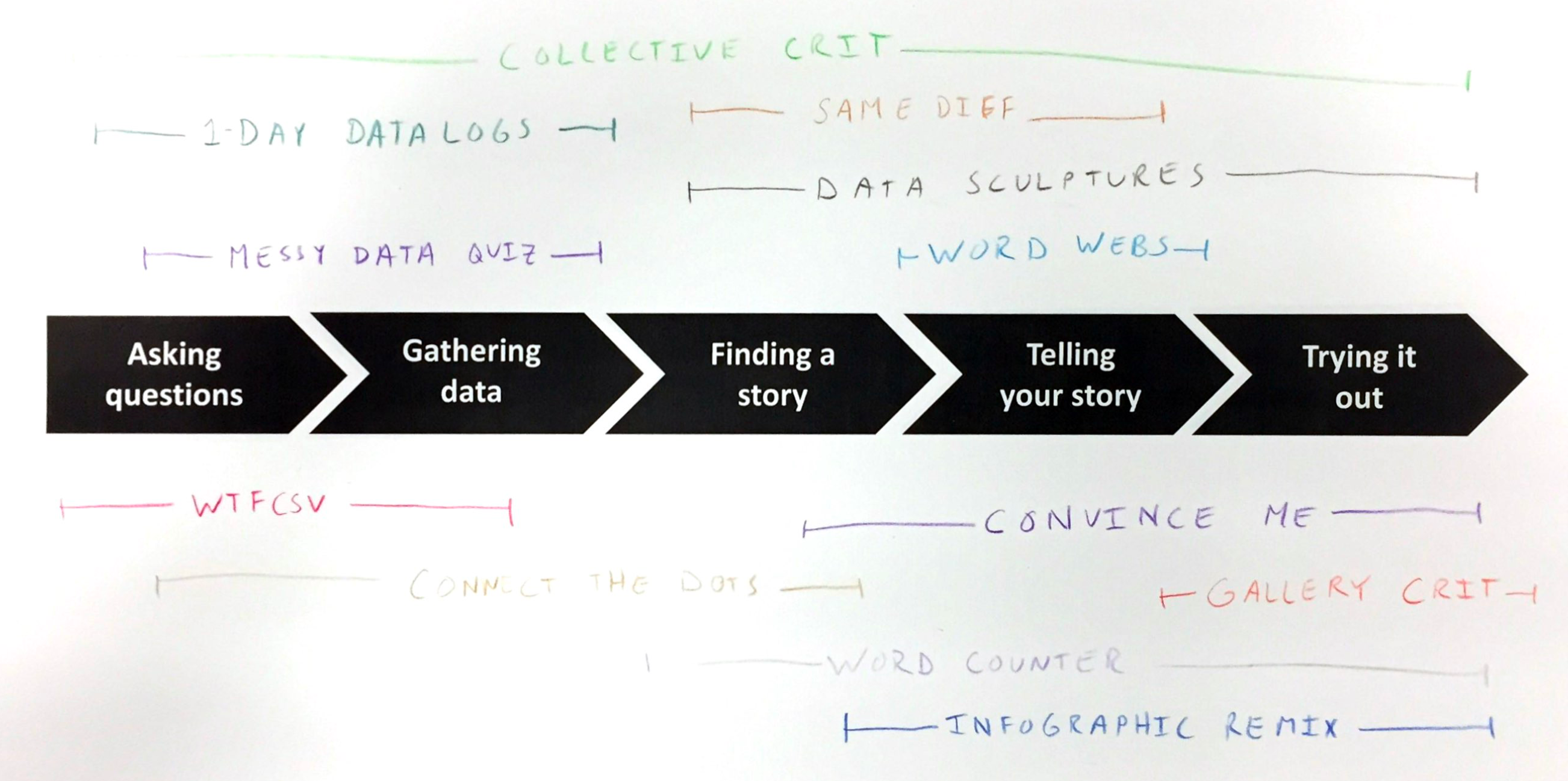
Those are two quick examples. Here’s a sketch of all the activities we are building out and how they fit into the process I just described:

DataBasic_activity_diagram_pdf__1_page_.png

Some of these are old, and well documented on DataBasic.io; others are new and lightly sketched out on my Data Therapy Activities page; the rest are still nascent. We’re trying to build a road for many more people to learn to “speak” data, before they even touch tools like Excel or Tableau. These activities support this alternate entry point to data literacy; one that is fun and engaging to everyone!

Don’t get me wrong – there is certainly a place for learning how to use these amazing software tools. My point is that technology isn’t the only way to build data literacy.

You don’t need to be a computer whiz to work with data; you can exercise the muscles required with hands-on arts-based activities. We’re trying to build and document an evidence base demonstrating how the muscles you develop for working with data outside of computers easily transfer to computer based tools. Stay tuned for future blog posts that summarize that evidence…

Telling Your Story Well

I just hosted a workshop today at the Stanford Do Good Data / Data on Purpose “from Possibilities to Responsibilities” event.  My workshop, called “Telling Your Story Well”, focused on how to flesh out your audience and goals well so that you can pick a presentation technique that is effective.  We did some hands-on exercises to practice using those as criteria for telling your story well.

One key takeway is the reminder to know your audience and your goals before deciding how to tell your data-driven story.

Folks dove into the activity we did – remixing an infographic to target a specific audience and an achievable change.

FullSizeRender.jpg

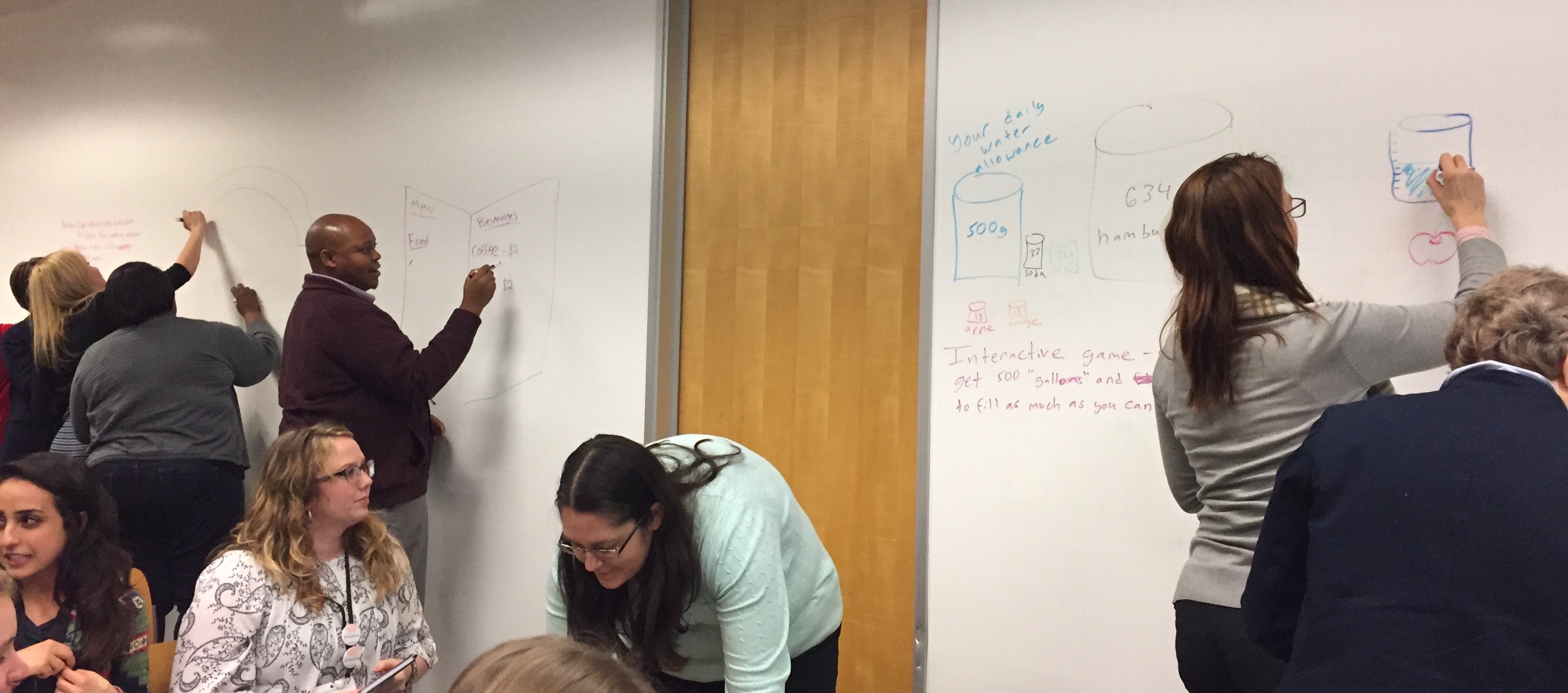
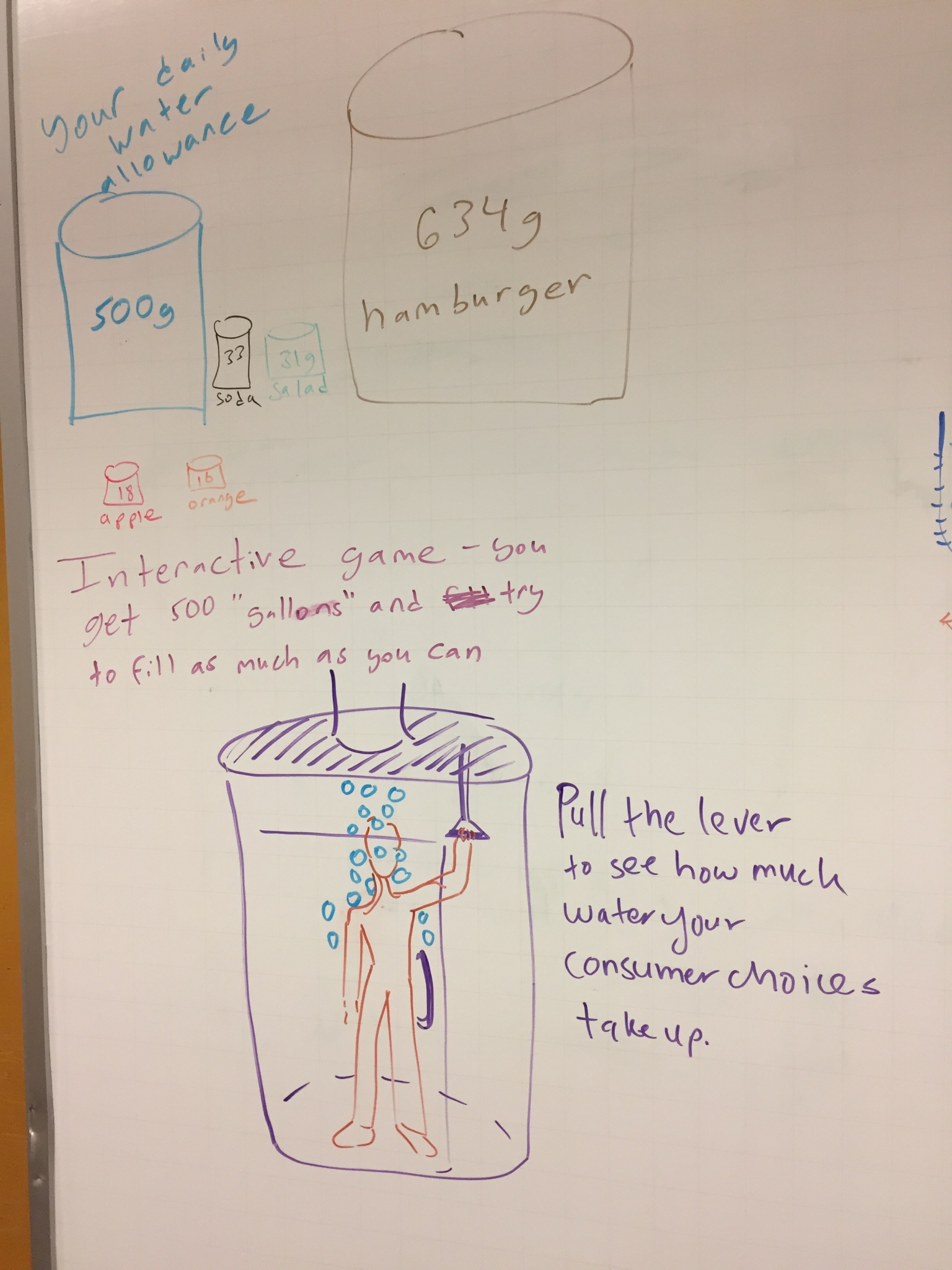
For example, here’s a sketch of one group’s idea of an interactive data sculpture that dumps stuff on you based on how much water your purchases at a grocery store took to generate!

img_5295

Empowering People With Data Workshop

I just ran a workshop for attendees at the 2017 UN World Data Forum in Cape Town, called Empowering People with Data: tips and tricks for creative data literacy”.  This was a great chance to connect my activities, and my work with Catherine D’Ignazio on DataBasic.io, to the non-profits and government statistical bureaus.  We’ll be doing more of this, as NGOs are coming to me more often to talk about helping them build their capacity to tell strong stories with their information.

img_5210
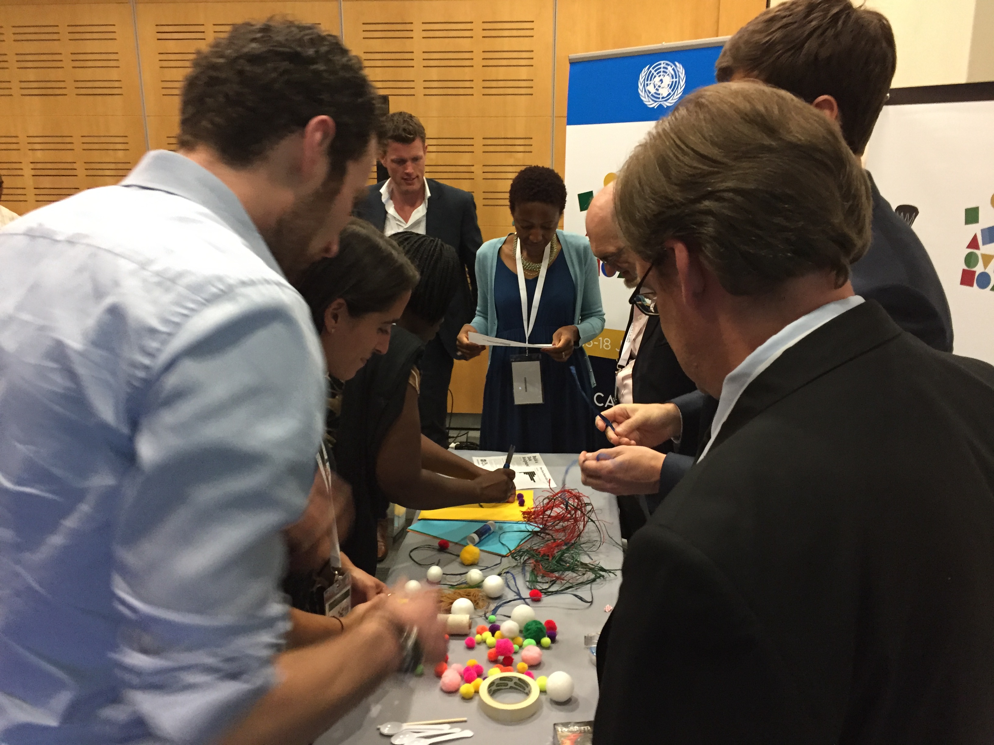
building a data sculpture (most materials were bought locally)

Many in the audience came up afterwards and were excited to bring the activities and approaches back to their organizations! Our fun activities were definitely new and novel for their world, and they immediately saw the value for many of the stakeholders they work with.

img_5221
sketching a story about lyrics found using our WordCounter tool

I’ve posted the slides on slideshare.net.  With examples including Praxis India, GoBoston2030, our data murals, and Peabody’s history quilt, I hope they created a richer set of inspirations for how to make working with data participatory and empowering!


Data Haves and Data Have-Nots

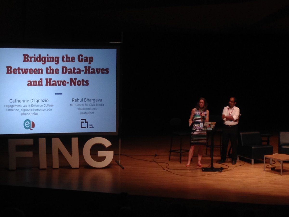
This week I’m at the Data Literacy Conference in France. One of the reasons I’m super excited about this because it is a gathering of people I’ve been wanting to talk to for years! Although there are tons of conferences about data, they are few conferences focused on the literacy aspect, so I thank Fing for putting this together.  Catherine D’Ignazio and I both presented a talk and workshop.  You see can see our slides for our talk about Bridging the Gap Between Data Haves and Data Haven-Nots.  It focused on describing how to help two audiences:

  1. We want to help those in power, the “Data-Haves”, learn how to present their data in more appropriate ways.
  2. We want to help those that don’t usually have power, the “Data Have-Nots”, build their capacity to use data to create change in the world around them.

Too often we focus on just the second goal, ignoring the needs of those that have the data.

ctcbz-bxyaauulw

We also ran a workshop for about 20 attendees, focused on how our DataBasic activities can help build data literacy in a variety of ways.

Overall the conference was a wonderful gathering of like-minded individuals.  Catherine and live-blogged the plenary talks: