Data + Design + Impact: A Workshop on Data Sculptures and Civic Change

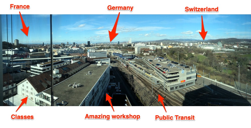
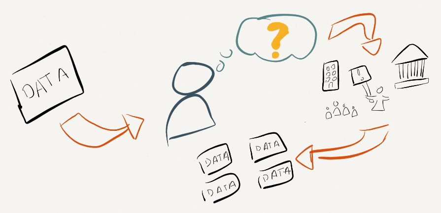
Teaching data storytelling is difficult. The norms, “canonical” readings, and the cutting edge evolve every month! With such an evolving landscape to work within, I relish the opportunities I have to explore something new and different with students in a focused way. This past week I had the great pleasure of doing precisely that at the invitation of the FHNW Institute of Industrial Design as part of their International Design Workshop. The week, which reminded me of MIT’s IAPsession, is an opportunity to bring in outside instructors to work with undergraduate industrial design students in the week that starts their spring semester.  Fifteen students and I explored designing and building data sculptures based on exploring civic datasets. I’ve been writing about how I want to push the field of physical data storytelling, and I hope these contributions help. Here’s a run down of the project they made, and what I learned to inform my teaching practice.

My annotated postcard from the top of FNHW’s beautiful campus library.

recorded unrecorded

By Fiona Beer, Leon Rauscher and Stephan Jäger

Refugee crises around the world are heart-wrenching and complex. Measuring and understanding the scale of the movement is difficult. In Europe ongoing flows across the Mediterranean Sea have been amplifying for the past decade. This group decided to take on the challenge of telling a story about this refugee crisis to their fellow students by making a large data sculpture that you walk through.

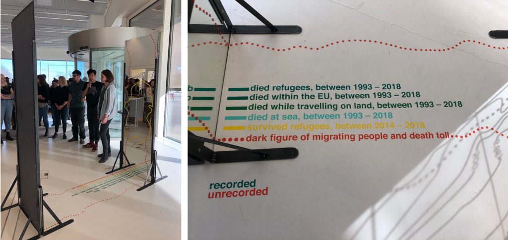
The piece centers around two mirrors facing each other, with lines and text decorating them, and invites the viewer to walk through. As they state:

This installation tries to show the number we know of, but simultaneously to represent the dark figure of deaths, names, age, origins, and causes of death, we have no idea of.

They acknowledge and embrace that reliable and complete data about migration, refugees, and deaths are impossible to come by.

Echoing the aesthetic of topographic map contour lines, they represent the “known” data on the floor and up the glass; one side for the living, the other for the dead. In addition, the dotted line suggests the data we don’t know, and have little way to estimate – the “dark figure of migrating people and death toll.”

This is all fairly readable from outside the sculpture, but stepping in between the mirrors creates an infinitely repeated landscape. The contour lines extend on forever, echoing the endless journey undertaken by so many migrants. The numbers and lines become hard to read, echoing the truly unknowable nature (a creative approach to the problem of visualizing uncertainty the field struggles with).

I think the core metaphor of the contour lines and the reflections that underlie this piece are resonant and memorable. More importantly, for me they pulled off a visual and physical design that embraces the humanity of the data, rather than treating them as abstract numbers that mask the crisis.

Data Sources: 2018 migratory deaths,  UN Refugee Agency Data Portal

Wealth Inequality in Switzerland

By Christina Bocken, David von Rotz and Silvan Häseli

Switzerland is a wealthy (and expensive) country, but there is large income inequality. This group was inspired by a piece from CBS This Morning to explore this inequality in Switzerland. They found, to their surprise, that just 2.5% of the Swiss population holds more than half all of the wealth. They decided to share this story, and what causes it, with a doll-house sculpture and a board game.

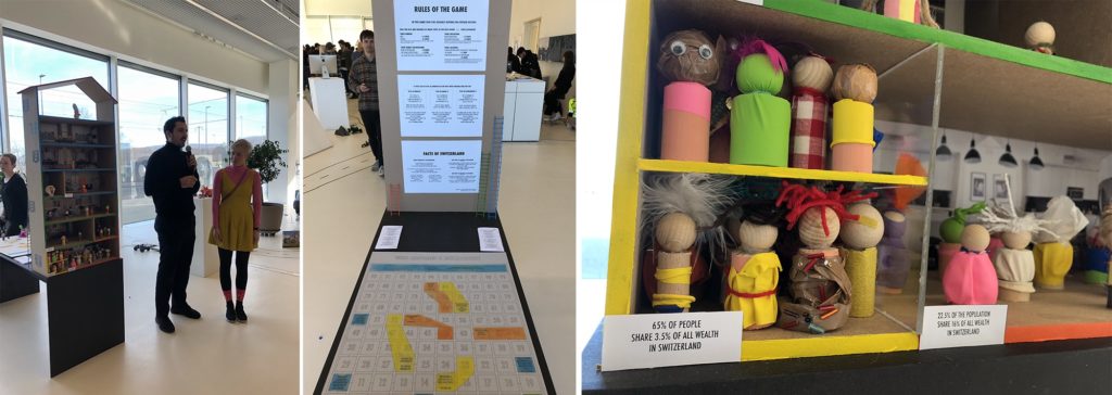
The multi-story dollhouse is divided into 3 sections about wealth ownership, each populated according to how much of the population holds that wealth. As the note on the yellow section states – “65% of people share 3.5% of all the wealth in Switzerland”.

To pull readers into why, they created a modified version of the popular snakes-and-ladders board game – called “Who Becomes a Millionaire”. Walk around back of the dollhouse and you’ll find a large playing board, dice, and instructions. Here’s the thing – the game is rigged. The rules change based on your gender, family background, education, and where you live! Playing as a woman nor born in Switzerland? Sorry, you don’t advance very quickly.

Inequality is hard to tell stories about, so I was excited to see this group take this challenge on. I think the house is a lovely invitation to come investigate the piece, and the board game is a creative pull to get the audience to dig in to the data more deeply. Building around the metaphors of the house, and the rules of the game being rigged, were key “anchors” to their design.

Data Sources: Swiss Federal Statistics Office

Medienkonsum 2020 (Media Consumption 2020)

By Eva Bieli, Valéire Huber and Sofia Leurink

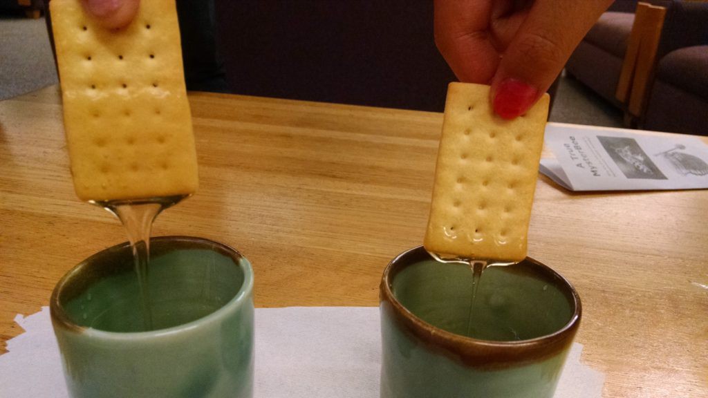
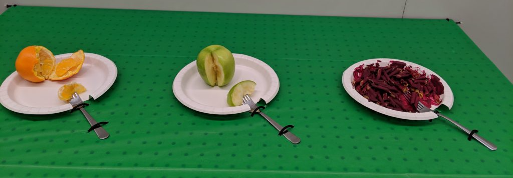
Intrigued by our Media Cloud database of news reporting, and the surge of reporting on coronavirus, this group decided to explore the Swiss news landscape in 2020. News sucks us in; we want to read it, feel responsible to read it, but often end up left feeling powerless and upset by it. They found the top 3 themes written about were all depressing things – fears around coronavirus, aftermath from the assassination of Suleiman in Iran , and the tragedy of the Australian fires. This team asked “How consciously do you consume media? How do you digest bad news?”

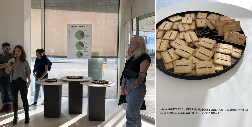
This piece is built around a visual and explanatory pun – the idea of “consuming media” like one does food. Mapping each topic onto a pie-chart style plate, they laser-cut words into biscuits based on their frequency of use when discussing each of those top three topics. This is a literal representation of the news we consume, and I can tell you that picking up a cookie etched with “coronavirus” certainly does give you pause!

I think this piece is a delightful provocation to think about the news we consume each day. The representation in food is an inviting way into a thoughtful topic, hopefully breaking down barriers the audience might have to reflecting about their own news consumption. The 3 plates are playful, pulling you over to understand why they are different sizes.

Data Sources: Media Cloud (Swiss national and local media source collections)
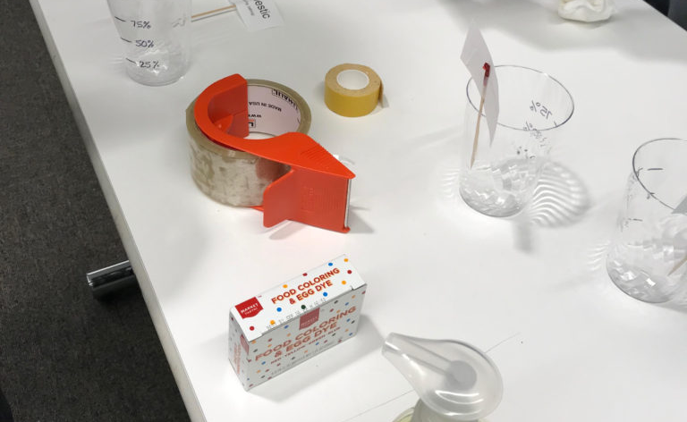
The True Cost

By Nathan Blain, Rino Schläfli and Daniel Mankel

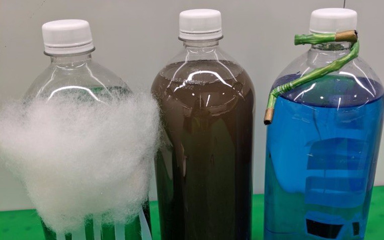
The true environmental cost of the goods we produce and purchase is almost impossible to comprehend – there are just too many variables. This group rose to this explanatory challenge, creating an immersive multi-sensory piece that assaults your senses when you choose an environmentally unfriendly option.

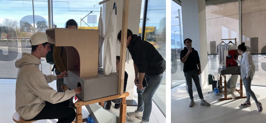
The piece present you with a choice between two identical-looking shirts, sit down and press the button associated with the one you want. Once your choice is made, three things happen that represent the environmental cost of the object:

  1. The animation and sound of water on a screen increase based on the amount of water used to produce the shirt.
  2. Smoke pours out at you (from a fog machine), obscuring your vision and making you pull back, based on the how many greenhouse gases are emitted in the production and transport of the shirt.
  3. Your other hand, inserted (trustingly) into a dark box, is sprayed with water based on the amount of water used to produce the shirt. Well, it doesn’t actually spray your hand yet… they almost had it working by the opening so hopefully they’ll get it working in another day.

I’m delighted by their idea of creating a multi-channel assault on your senses. We don’t have good approaches to communicating the un-captured costs of these goods. This piece is a provocation to consider the physical impacts of those choices on your own body, rather than in some far-off rain forest or ocean.

Data Sources: TBD (I’m not sure what they used)

The Mask Collection

By Jasmin Schnellmann, Jasmin Vavrecka and Timo Lanz

This group was struck by the public reaction and news reporting about coronavirus. While certainly it is cause for concern, they realized that global air pollution is a far more serious problem right now, in terms of deaths and scope. Trying to find a way to communicate this risk, they struck on the symbolic power of the medical face mask.

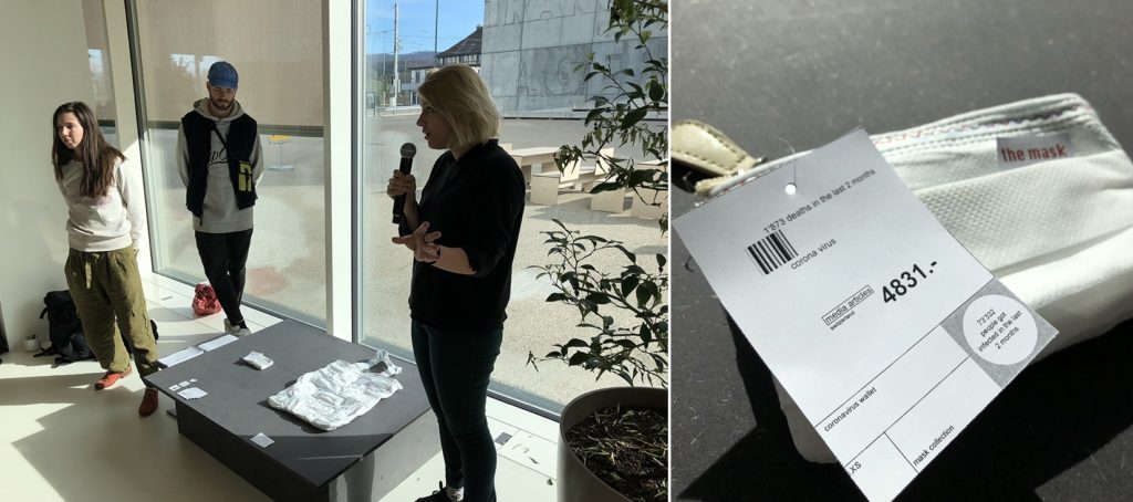
They created two objects for the mythical fashion show about “the mask collection”. The first is a small wallet made out of masks and sized based on the deaths due to Corona virus. The second is a large purse made of sewn together masks, sized by deaths due to air pollution. The viewer reading more closely is likely to be surprised by the “price tags” on each, with the small one having a higher one while the bigger one has a lower cost. These price tags show more detailed information about deaths and media coverage – which are inverses of each other. Air pollution has far more deaths but far less coverage (in 2020).

The objects they created speak very strongly to me. They make you look twice to understand how they are made, with strong red thread echoing a sense of importance and dread. It is a simple visual mapping, but presented as a collection of daily use objects they speak to the choices we make, and the risks we face, each day.

Data Sources: Media CloudGuardian UK and NYTimes articles, World Health Organization data portal

My Takeaways

I was impressed by the students creativity, fortitude, and craftsmanship. They created these in just one week(!) with no previous experience with data storytelling. I continuously challenged them to think beyond simple tricks like physical bar charts and such, and I think they rose to the challenge.

From this one week I can picture expanding my approach into a semester-long course that explores the aesthetic principles of physical variables of data sculptures. Externalizing these models and stories creates an opportunity to communicate around and about them, and affords me the opportunity to revisit back on my training in the pedagogy of constructionism

This builds on earlier thoughts I captured in a paper with Catherine D’Ignazio at the Pedagogy and Physicalization workshop at DIS 2017. It also has links to projects from many other academics working on these questions of data storytelling and 3d physical materials:

I look forward to exploring these techniques with students and building my own data sculpture practice more. I hope they inspire, resonate, and challenge you as well! If you happen to be in Basel this Feb or March, these are on display for a few weeks.

Thoughts On Designing Data Sculptures

Making Charts in 3D

‘The Humans of the Hackathon’ — created by Pratap, Richie & Sainath is a physical visualization of participation at the July hackathon conducted at Gramener, Inc.

Heatmap of injuries from fireworks between 2009 and 2014 in the US. Darker red represents parts ofthe body that had more injuries. Created by Judy Chang, Gary Burnett, and Andrew Mikofalvy.

Edible comparison of honey produced in the US in 2016 vs. 2017. Note the cracker on the left is covered in much more honey than the one on the right, and is thus more delicious data to consume! Created by Olivia Brode-Roger, Mitchel L Myers, Alicia Ouyang. Learn more.

Take Advantage of Your Material

Pieces of an interactive physical exploration of water use data. Created by Lily Xie, Sarah Caso, and Tanaya Srini.

Edible data brownies used to represent air quality in various cities. The salt level increased with air pollution levels (using a taste-based perceptual scale based on their in-kitchen experimentation). Created by Tina Quach, Margaret Tian, Tony Zeng, and Aina Martinez Zurita.

Support Deeper Investigation

A pile of Monopoly houses, used to represent the number of households in the US. Screenshot of a New York Times article.

Continuing the visual pun — Monopoly hotels used to represent households in a comparison by party affiliation. Screenshot of a New York Times article.

Data sculpture with hidden water underneath the table. Picking up each fork surprised you because it was connected to the heavy water load underneath. You can see the small black strings tying the fork to the water bucket beneath. Created by Sarah Von Ahn, Amy Vogel, and Theresa Machemer.

The second piece used the idea of colored water in 2-liter bottes to dig beyond total volume of water and into the type of water.

Conclusion

Visualizing with Food

I’m fascinated by food and data.  I’ve been doing food security data murals, my Data Storytelling Studio class in 2015 focused on food security data, and I’ve been laser-cutting data onto veggies for public events.

70-30-sps-cuke.jpg
One of my laser-cut veggies showing local food security data.

So not surprisingly I was excited to see Data Cuisine coming to Boston for a workshop by Suzanne Jaschko and Moritz Stefaner! Sadly I’m out of town and can’t make the workshop, but it sparked me thinking about food and data, and creative data representation a bit.

When doing data presentation in a creative medium, you have to choose your mappings and datasets carefully.  I’m often introducing people to more creative techniques for data presentation for the first time, and argue the strongest stories come when the message matches the medium well.  For example, one of their participant projects maps tomato and basil in a dish to the amount of Italian speakers.  This is a fairly culturally loaded mapping, that many would understand.  However, others are more abstract.  One mapped people to noodles to discuss sexual habits. A stronger mapping is the project that makes a joke about “death by chocolate” by creating small caskets to tell the story of common causes of death in Belgium.

Data_Cuisine___Data_dishes.png
Examples from a recent data-cuisine workshop

Another intriguing example is Dan Barber’s red pepper egg (featured in an episode of Netflix’s Chef’s Table show).

Dan_Barber_on_Twitter___a_“red_pepper_egg”_from_laying_hens_fed_high-carotenoid_peppers__bred_by_Michael_Mazourek___bluehillfarm___nofilter_http___t_co_qMaLjLKPBK_.png
Dan Barber’s red pepper egg

He worked with a farmer to breed super colorful red peppers, then fed a mash of them to chickens to create the red yolk you see above!  Why?  All to start a person about to eat the egg wondering how it got that red.  What did the chicken eat to make that happen?  Why have I never thought about the supply chain going into this egg before?

To me, Barber’s red pepper egg is a wonderful example of data representation as food.  The food chain data in beautifully captured in the red yolk, and it prompts you to ask questions directly aligned with his goals in presenting it.  Wonderful!

More abstract representations of data in food are like a missed opportunity to me.  The artistic merit can be there, but leaves the viewer hungry for more.  A strong mapping between the medium of your data presentation, and the data and story itself, is key to creating a lasting impression.


Talking Data & Uncertainty with Patrick Ball

Recently at the Responsible Visualization event put on the by the Responsible Data Forum I had a wonderful chance to sit down with the amazing Patrick Ball from the Human Rights Data Group and talk through how we help groups learn about working with incomplete data.

With my focus on capacity building, I’m trying to find fun ways for NGOs to learn about accuracy and data at a very basic level. Patrick agues that in fact you need rigorous statistical analysis to do this well, from his background in human rights data. I pushed a bit, asking him is there was a 80/20 shortcut. His response was to paint a great distinction between homogenous and heterogenous observability of data. For instance, there are many examples of questions that don’t require quantitative rigor – case existence, case history, etc.  This sparked a fun conversation about visual techniques for conveying uncertainty.

Watch the video to see the short conversation, or just catch the audio below.

Architectures for Data Use

This is a summary of one section of my workshop on Data Architectures at the SSIR Data on Purpose workshop.

Data can be used for a variety of things.  In thinking about setting up architectures for data use within your organization, you need to focus on two main questions:

  • Does the data we have align with our goals?
  • How can we use data to further our mission?

Alignment with Your Goals

People see data everywhere now, and get overly excited about it. When you think about using data within your organization, you have to return to the roots of what your organization is all about and make sure the data is in alignment with that.

There are a few common patterns organizations fall into when using data. First, many collect data simply because it is easy to collect, without considering whether and how it can be used.  Second, many tend to focus on quantitative over qualitative data, when in fact the strongest arguments are often made using both.  You have to understand what kind of data you have before you can use it effectively:Data_Architecures_Workshop___SSIR_Data_on_Purpose

All these types of data need to align with your goals.  You can use data in a wide variety of your efforts, from inspiring more activism to changing behavior.  The key piece is your use of data must support those activities.

Using Data to Further Your Mission

Your data is not an end in itself.  It is an asset you can use to do your work more effectively.
Data_Architecures_Workshop___SSIR_Data_on_Purpose


You can use data in lots of ways to further your mission.  Three quick examples:

  • improve operations: you can monitor engagement on social media campaigns
  • spread the message: you can use data in your communications materials to advocate for change in new ways
  • bring people together: you can gather around the data to find stories (and paint murals)

Of course there are loads of other things you can do as well. The key here is that This framing encourages you to be goal-centric, rather than technology-centric (which is a big danger when working with data). You don’t want to get lost in the hype around the latest and greatest tools. That approach does help you advance your mission. A beautiful external-facing infographic that doesn’t fit into your ladder of engagement, or includes no call to action, is useless.  A dashboard showing key indicators doesn’t mean much if they aren’t the right key indicators.

I hope this quick intro helps ground some of the hype out there around data use, and help you figure out what architectures to support for data use within your organization.

Getting Data to Answer Your Questions

I often introduce the idea that when you start with a dataset you should first start by asking your data some questions.  For instance, in this dataset about food waste in Massachusetts, students in my Data Storytelling Studio course brainstormed a number of questions they wanted ask:

  • if there more food waste in rich areas?
  • do more expensive restaurants waste more food?
  • do restaurants with more waste go out of business at a higher rate?
  • are certain towns more wasteful than others?

This process of asking questions help you move beyond the data you have, to getting the data you need to answer the questions you have.  This question-centric approach is critical to make sure you don’t fall victim to having your dataset in hand be a constraint that stops you from finding an interesting story.

askingn data questons

An Example of Getting More Data

So how do you go from these questions to more data?  I encourage folks to go “data shopping” (a term I enjoy stealing from my colleagues at the Tactical Technology Collective).  This involve taking each of your questions and thinking about what other data you need to answer it, and where you might get that data.  Returning to the food waste example above, to answer the question of whether more expensive restaurants waste more food, you need to categorize restaurants as expensive or not.  My students remembered that most restaurant review sites, like Yelp, have a dollar-bill scale that tells you how expensive a restaurant is.

How could you get that data? You could do it by hand, but that would take a while for all the restaurants in the food waste spreadsheet.  Instead, they pointed out that Yelp has an API, and you could write some software to query that and ask Yelp for the dollar-rating of each restaurant on the list.

Types of Data Sources

This examples uses one source of data – a private company.  There are, of course, others. Here’s the list I tend to introduce:

  • Private Companies – There is tons of data collected and stored by private companies, and sometimes they will give or sell it to you.
  • Governments – There is loads of official data collected by government agencies, and you have a right to the vast majority of it (depending on where you live).
  • Non-Profits or Advocacy Groups – Interest groups typically collect datasets to back up and inform the advocacy they are doing.
  • Crowdsourcing / Do-It-Yourself – Sometimes the data isn’t there, so you need to make it yourself!

That’s the list I use.  Am I missing a category?

Ways to Get Data

Fine, so there is data in a lot of places… how do we get it?  Here’s my list of techniques:

  • Download Open Data – Yes, sometimes the data is just out there waiting for you to find and download it.  This doesn’t mean it is usable, but it is often there.  Usually large non-profits and governments have big data repositories you can poke around.  Sometimes it will be stuck in a PDF or HTML table, but you can still get it out.
  • Ask For It – I mean it. Sometimes you just need to make a phone call and ask. A little social engineering goes a long way!
  • Scrape It – Far too often the data is out there, but not in a nicely usable form… you need to scrape it from a website.  Scraping involves taking taking data is scattered around a website and using a process to get it all in one place in the same format. Nowadays there are lots of tools to help you scrape websites.
  • Manually Collect It – If the data isn’t there, you gotta make it yourself.  This might involve crowd-sourced data collection, a focus group, or asking of social media.

Answering Your Questions

I introduce these two lists, of data sources and ways to get data, in order to support the data shopping process.  With a richer set of data in hand, you’re better positioned to find the most interested and meaningful stories in your data.

Lasers, Food & Data (Telling a Story About Food Security)

Can a vegetable tell a story about food access in Somerville?  Yep.

"70% of Somerville Public School students receive free or reduced lunch" - laser-cut onto a cucumber
“70% of Somerville Public School students receive free or reduced lunch” – laser-cut onto a cucumber

In public settings, it can be quite hard to get folks walking by interested in a data-driven argument about your cause.  We often argue that a creative data sculpture can grab their attention… like maybe a vegetable laser cut with some data about food security!

We’ve worked with the Somerville Food Security Coalition a few times, including for our first data mural pilot project!  Recently, we had a chance to come together again around their local data about food security at the Somerville Arts Council’s 2014 Ignite Festival.  The festival celebrates fire and food, which inspired us to laser cut some data onto food and see how people reacted!

ignite-food-data-table

Here’s all the veggies we cut – eggplant, cucumber, zucchini, bread, and watermelon:

laser-cut-veggies

In addition, we prompted folks to interact with two questions – both of which they could answer with M&Ms and raisins.  Asking folks to take an M&M survey is a highly effective way to get them to interact with their data!

https://twitter.com/rahulbot/status/498880294226001920

https://twitter.com/rahulbot/status/498883181714882560

Here’s a behind-the-scenes video showing the laser cutter in action:

This is cross-posted to the Civic Media blog.

Being the Data (ie. data & body syntonicity)

Recently I’ve seen a number of new examples of physically-embodied data presentations – examples where each person participates with their body representing the data that they are.  Using your body to act as the data in this way is not only fun, but reminds me of the work I used to do with the concept of “body syntonicity” here at the MIT Media Lab’s Lifelong Kindergarten group.  Seymour Papert coined this term to describe how children would program and predict a LOGO Turtle’s motion by imagining they were the Turtle (1).

Some kids kick it old school with a real LOGO Turtle at the MIT AI Lab!

A Corporate Example

The first connection I saw recently was a video ad for Prudential while I listened to Pandora Radio.  They are trying to tell a data story about how long people live after retirement, with the goal of getting them to set up a retirement plan with Prudential. The campaign is very appealing from a data-presentation point of view.  In one ad they asked people how much money they thought they needed for retirement, then gave each a length of ribbon, and had them walk from the center of a circle to the length of the ribbon:

Another let people put a sticker on a big chart to build a histogram of the oldest person they knew:

These are cool, and look fun.  Letting people be the data connects them with the information in a real, body-syntonic way.  I’m sure this makes the people more likely to be interested in Prudential’s product offerings and planning services.

An Academic Example

In the academic realm – my colleague Nathan recently went to the Computer Support Collaborative Work conference, where he learned about the MyPosition project from Nina Valkanova, Robert Walker and others.  Her recent work revolves around concepts of presenting information in public spaces.  Here’s an academic paper describing the MyPosition project.  It allows people stand in front of a projected poll and add their vote by holding up their hand:

Their findings in the paper around social pressure are interesting, as is the fact that people got around the fancy tech to actually engage in the question they were polling.  Also the idea that people used it more when it showed real people’s faces is interesting.  All in all, it presents a fascinating example and some usable insights into how to design these types of public interactive data presentations.

A Community Example

My colleague Sasha Costanza-Chock recently pointed me at the Crossing Boundaries project from the local Urbano Project.  Artists Alison Kotin and Risa Horn worked with 10 local high school students to gather data about local transit and create art pieces that told the data stories they found.

Their pieces are embodied data sculptures – wearable objects that represented the data story they want to tell.  This example is fantastic empowerment, data literacy, and art work.  I enjoy it in so many ways and look forward to talking with the creators sometime in the future.

Be the Turtle

So what’s the takeaway?  As a young participant in a robotics workshop I ran years ago said – “Be the turtle”.  Think about ways you can engage people to actively be the data in the story you’re trying to tell.

(1) Papert built on Freud’s notion of “ego syntonicity”, which concerned the mind.  This presentation I found online digs into this more in relation to computer programming.

Building Your Toolbox of Techniques

One of the things I emphasize in my workshop is building a toolbox of presentation techniques.  With a toolbox ready at hand, it is a lot less intimidating to pick an appropriate technique for a specific audience and goal.  I’ve defined my own list of techniques, but it by no means the only way to slice up the space.

One other particularly useful list comes from a classic academic paper called “Narrative Visualization:  Telling Stories with Data” by Edward Segel, Jeffrey Heer (download it here).  The paper meticulously reviews about 60 online visualization, mostly from newspapers, to define some recurring genres.  If you can stomach the academic prose, the paper is worth a read.

genres-of-narrative-vis

Their “genres” focus on 2-d visual presentations of data stories, to be expected based on the title of the paper and the examples they pull from.  However, within that space it is a particularly wonderful list:

  • magazine style: “an image embedded in a page of text”
  • annotated chart: a traditional chart of graph with textual callouts highlighting specific data points
  • partitioned poster: a “multiple view visualization”
  • flow chart: a directed series of pieces of information
  • comic strip: multiple frames in a linear path
  • slide show: a series of visuals presented one at a time to assemble a narrative
  • film/video/animation: fairly self-descriptive

These vary based on the number of “frames” (visuals) presented, and how they are shown over time.  This list breaks down the set of techniques differently than I usually do, and that’s a nice thing so I thought I’d share it!

From there they move to a discussion of author- vs. reader-driven approaches.  That’s a wonderful reminder to decide early on whether you are building an exploratory or explanatory presentation.  Are you trying to tell a strong narrative, or showing information and letting the viewer take away a story?

Finding Data Stories

Many people have written about techniques for telling data driven stories (1).  However, I’m struggling to find a similar list of techniques to help people in finding stories in their data.  To do that you need to have a sense of what kind of data stories can be told. Here’s my current take at a few categories of data stories that can be told (expanding on earlier thoughts I had written about).  I use this list to help community groups find stories in their data that they want to tell.  Each includes a real example based on data scraped from the Somerville tree audit (the town I live in). All of these techniques benefit from existing statistical techniques that can be used to back up the pattens they illustrate.  You can find stories of factoids, connections, comparisons, changes over time, and personal connections in your data.

Factoid Stories

There’s only one Eastern Redbud tree in all of Somerville! What’s the story of that tree?  Turns out the leaves change to bright pink in fall, but everything else it yellow and orange.

An Eastern Redbush tree (from Wikipedia – not the actual tree in Somerville)

Sometimes in large sets of data you find the most interesting thing is the story of one particular point.  This could be an “outlier” (a data point not like the others) like the Redbush example above, or it could be the data point that is most common (can we tap more of the Maple trees that dominate Somerville?).  Going in depth on one particular piece of your data can be a type of data story that fascinates and surprises people.

Connection Stories

How come Somerville Ave has some many trees in the best condition? Oh, it was recently renovated… that is why those are all new trees.  There’s a story about more aesthetic outcomes of big street resurfacing projects.

a map of somerville with healthy trees in green (created in TableauPublic)
A map of somerville with healthy trees in green (created in TableauPublic)

When two aspects of your data seem related, you can tell a story about their connection.  The fancy name for this is “correlation“, and you of course need to be careful attributing causes for the connection.  That said, finding a connection between two aspects of your data can lead to a good story that connects things people otherwise don’t think about together.

Comparison Stories

Walking down Somerville Ave. gives you a good sense of the most populous trees across the city.  That street is a good representative of the tree population in the city as a whole.  Is your street different?

Comparison of tree populations in the city and along one street (large bubbles mean more trees)

Comparing between sections of your data can a good way to find an illustrative story to tell.  Often one part of your data tells one story, but another part tells a totally different story. Or, as in this example above, maybe there is a more human slice of your data that serves as an exemplar of an overall pattern.

Stories of Change

Turns out there was a big die-off of trees in 2008.  Was the climate weird that year? (I made this up since I don’t have any time-based data)

People like thinking about things changing over time.  We experience and think about the world based on how we interact with it over time.  Telling a story a story about change over time appeals to people’s interest in understanding what caused the change.

“You” Stories

You live on Highland Rd? Did you know that ALL 9 Spruce trees in Somerville are on Highland Rd? Maybe we should rename it “Spruce Rd”?

Map of spruce trees on Highland Rd, colored by tree health (created in TableauPublic)

Another way to find a story in data is to think about how it relates to your life.  People with map literacy like maps because they can place themselves on it.  This personalization of the story creates a connection to the real world meaning of the data and can be a powerful  type of story for small audiences.  Stories about your personal experiences can be grounding and real.

In Conclusion…

This is just one take on the type of data stories that can be told.  Please let me know how you think about this! Telling that story effectively is a whole different topic, but I find the story finding exercise much easier when I introduce a bunch of categories like this.  Most of these benefit from multiple sets of data, so remember to go data “shopping” during your story finding process.

Footnotes:

(1) For instance, I’m a huge fan of Seger and Heer’s Narrative Visualization paper, where they give a catalog of visual storytelling techniques.  Also good is Marije Rooze’s thesis work (particularly the tagged gallery of visualizations from the Guardian and New York Times).