
I’m seeing an increase of the number of people trying physical data visualizations, which I tend to call “data sculptures”, and I’m very excited about this! As more of our society is shaped by data-driven systems it is up to us to come up with more relatable and comprehensible representations of those data and processes. I believe data sculptures have a unique power in this response because of the way they engage people in space with data. They use the power of spectacle and novelty to catch attention, provide novel ways for people to relate to data they don’t know, and to bring regular people together to create things based on data.
What do data sculptures look like? The wonderful team at dataphys.org has been cataloging, thinking through, and writing about this for years. I could do no better background than they do in their paper about Opportunities and Challenges for Data Physicalization, so just start by reading that.
Ok, welcome back. So what is a data sculpture to me? It is a representation of data created using physical objects in the real world. While charts and graphs in 2D map data onto classical visual variables (size, color, shape, position, etc), data sculptures map data on to an additional set of things — smell, texture, 3D shape, taste, scale, etc. This media gives you a new toolbox with which to create data representations, and requires a new set of skills for creating with.
What I want to do is share some lessons and ideas from my ten years of helping people design and make data sculptures, in a variety of educational settings. Warning: I’m going to put on my Professor hat and share some of my strong opinions about what I think works and what I think doesn’t. I look forward to your constructive disagreements.
This posts teases out three themes I’ve seen with concrete examples from my teaching and beyond. These themes are:
- Making charts in 3D just scratches the surface;
- Choosing your materials wisely is critical to your physical data mappings;
- Moving beyond gimmicks lets you flesh out how to support multiple levels of reading.
Making Charts in 3D
Most folks approach the idea of data sculptures with their existing vocabulary of data visualizations; they simply render an existing chart type in 3D using some physical material. This is all well and good, but I think making 3D charts misses the potential for data sculptures to attract and interact with audiences in memorable and provocative ways. Here are a few examples that went, or could have gone, a little further along that path.
Parallel Coordinates
One of the sparks for this post was a wonderful piece from two folks at Gramener, who wrote about their experience creating a physical data visualization in support of hackathons they run (thanks to Allen Downey for pointing me at this). They created a parallel coordinates chart with bamboo sticks and string to show metadata about the participants at these events.
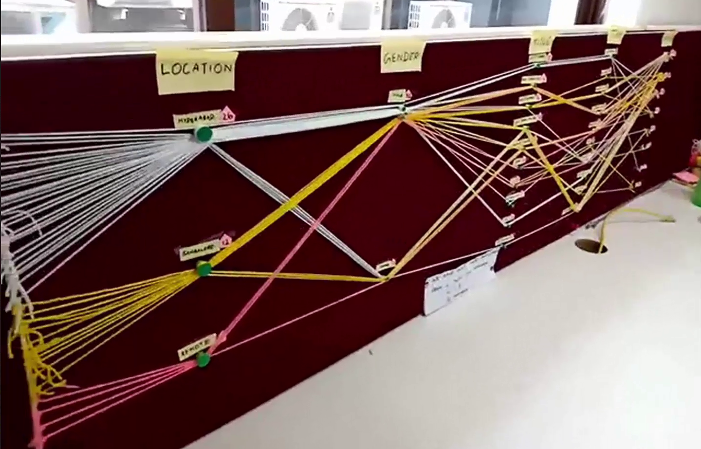
Parallel coordinates are hard to read, but are powerful because they can show both trends and individual data points (see the great writeup on datavizcatalog.com for more details). Rendering them as a physical spectacle is a wonderful idea to both attract attention and do get to know the data. However, I’m left wondering about missed opportunities in the creation based on the physicality of the sculpture itself.
This project immediately brought to mind earlier work by the Domestic Data Streamers, who prompted attendees of a 2014 arts event to create a similar chart (they called it “Data Strings”). They key difference here is that they asked the participants themselves to create their data points. I think that addresses the main criticism I’d have of the Gramener example — it helped the authors understand and represent the data, while the Data Strings example took advantage of the idea to engage participants more fully.
If you’re going to make a chart in 3D, make sure it is in 3D for a reason. The Domestic Data Streamers participatory invitation is a strong reason.
Fireworks: Fun & Dangerous
Lets tackle another example of a very chart-like data sculpture. A team of students in my 2016 Data Storytelling Studio course decided to analyze fireworks-related injuries in the US. As they thought about how to best represent this in a quick data sculpture prototype, they landed on the idea of painting a mannequin to show where injuries occurred most.

This repurposing of a heat map in 3d form was a clever idea, especially since it used the human body itself in a very relatable way; you couldn’t help but feel the impact of the dark red hands (good color choice). It was a simple comparison story rendered in an emotionally evocative way, clearly intended to caution the audience about being reckless with fireworks! Yes, it is an old technique rendered in 3D, but the physical scale of the body standing in front of you fundamentally changed how you read it — you related to it.
It’s a Mysterbee
Let’s move on to the classic bar chart. A team of students from my 2018 class were digging into data about bee colony collapse across the US. Thinking of how to get people interested in a topic they might not otherwise be engaged with, the students decided to tell a high-level comparison story in honey itself by filling two cups with honey. Each represented a different year, and the amount of honey was based on the total production in each year. They invited the hypothetical audience to dip a cracker in each cup and compare — essentially creating drippy and delicious bar charts.
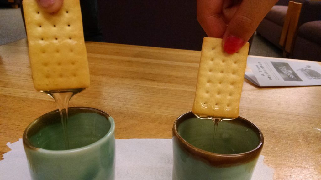
When was the last time you ate your bar chart? This invitation used a familiar method of reading that would make sense to people, but playfully used the subject of the data itself (the honey) to represent the data in a simple way. They had follow-up material that could support a longer conversation for folks that did stop and try the experiment, so it wasn’t just a one-trick show that ended with questions. The bar chart in 3D supported a comparison, and the cracker lent itself to being a barchart. Their use of the bar chart had a reasoning to it.
Closing Thoughts on Charts in 3D
I’ve been thinking about this theme for a while, because I see it so often. In fact in class, and in our Data Sculptures activity, I explicitly caution against doing this. I don’t mean to say it is never appropriate. In fact a 2013 study from Jansen dug into 3D bar charts to explore if they supported investigation and inquiry more. I took away the lesson that when people physically touched the 3d objects representing the data they did a better job understanding the data. A more recent paper they wrote, from 2016, investigated different approaches to mapping size as a physical variable and how people perceived it. It has a range of interesting findings, such as how spherical surface area was more accurately perceived than volume, but mostly point out that we don’t understand yet how physical variables are perceived.
Take Advantage of Your Material
The second theme I want to flesh out is how much the material matters. Cardboard is light and folds easily; balloons grow and shrink, float and pop; water flows, drips, quenches your thirst and gets you wet. If you’re using any of those materials, take advantage of how people use the material and what it can do. The creators of the Gramener graph acknowledge this for themselves, noting the power of how “feeling every data point was an experience in itself”. Choose your material intentionally to design the look, feel, smell, and taste of your data sculpture. Here are a few examples that flesh out what I mean.
Where is Your Water From
Water is used in a variety of ways across the globe — agriculture, industrial operations, human consumption. A group in my 2019 course used data about this breakdown to create an interactive piece about the future water available to us. They called it Where is Your Water From?. Their interaction was built around people’s perceptions of what water is used for and comparing that to the data.
They key point I want to emphasize with this example is how the invitations they crafted for participants centered around the “wateriness” of water. When asking people to guess how much water is used for different categories, they ask participants to pour the water from one container to another. When looking at data about how much water might be available in the future for us to consume directly, participants were invited to drink the tiny amounts. These two actions are strong examples of using the properties of water to help support the narrative they are trying to tell. They used the physical affordances and human behaviors around water to represent the data story.
Tasting Air Pollution
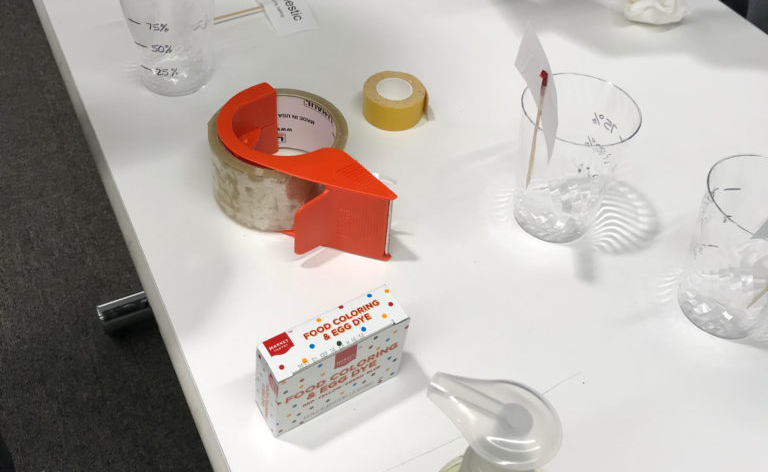
Taste is a wonderful sense to explore, and playful thing too map data to! Data Cuisine has been leading workshops doing this since around 2014 — their gallery has some wonderful examples of data rendered in food. Many are visual representations, but others alter flavor based on the data. A group of students in my 2017 course were inspired by this idea to sketch out an idea that mapped air quality data onto flavor in a project called Tasting Air Pollution.
Air quality is hard to experience; we don’t see subtle changes and don’t have a good sense of what an abstract air quality number means in terms of our daily experience. Stephanie Posavec and Mariam Quick’s “Air Transformed” piece gets at this in a concreate way. They literally created a set of glasses that obscured what you could see more based on how much pollution was in the air.
This group of students in my class decided to experiment with flavor as a way to represent air quality data. They were particularly curious about how we perceive intensity of flavor, and how gagging or couching on surprising or bad flavors feels like the response you have to polluted air.
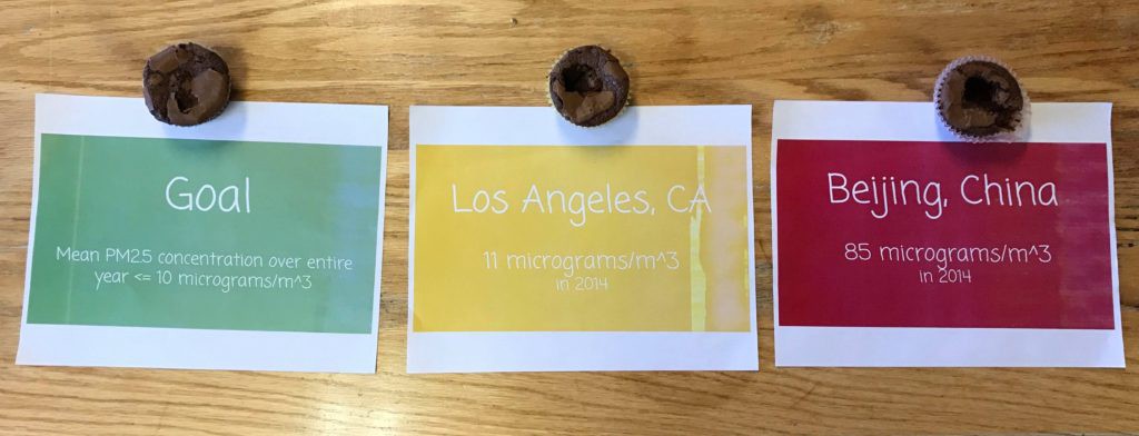
To surprise the audience they invite participants to taste different brownies but didn’t telling them that the amount of salt had been increased based on how much pollution in the air there is in different cities. The “goal” brownie has the right amount of salt to make it delicious, while the Beijing brownie tastes horrible. Trust me, I was the test subject when they presented it in class!
Closing Thoughts on Materials
Data sculptures are more than just ink and paper or pixels on a screen. Data sculptures are made of something, and you have to think about what that smoething should be. Be conscious and intentional in your choice of the material you make your data sculpture out of. Consider the affordances, limitations, common uses, and interaction patterns of your material. Choose your material wisely.
Support Deeper Investigation
In my workshops and classes I encourage participants to support many “layers of reading” in their pieces. What dose that mean? Viewers should be able to quickly scan the piece and understand the main story, but should also be able to dig deeper to see more nuance and detail associated with the narrative.
Here’s the thing — most data sculptures I see don’t have many layers of reading. They use some kind of clever gimmick or tongue in cheek pun to make their point. I want to encourage you to move beyond these simple tricks and flesh out a multi-layered story that can be told with multiple uses of your physical mappings. There is a richness in your material and form that you should take advantage of.
Monopoly and Elections
One of the few examples in print that I showcase often is an article published in the New York Times in 2016, entitled The Families Funding the 2016 Election. The narrative focuses on the small number of obscenely wealthy families that were responsible for most of the campaign donations. To tell this story they use the visual metaphor of houses and hotels from from the board game Monopoly; a symbol instantly recognizable to any American kid.
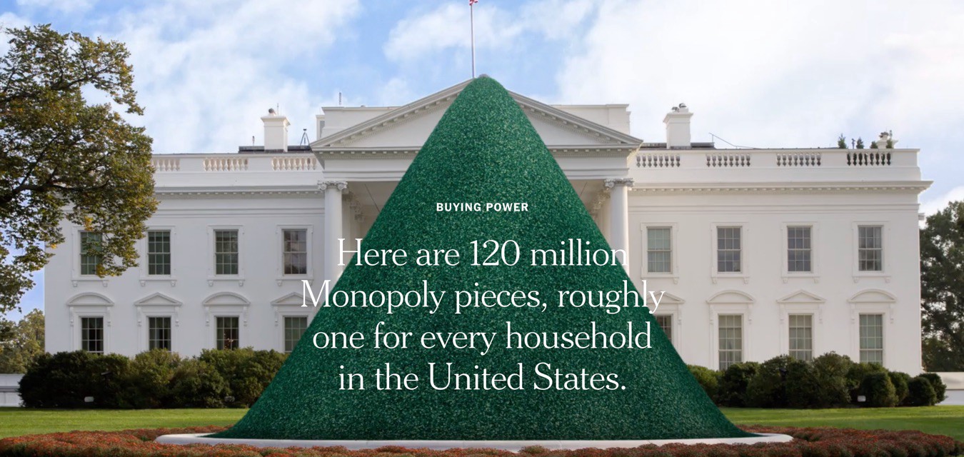
The article opens with a visual pun. They show a mocked up photo of a huge pile of green Monopoly houses blocking the White House, then quickly zoom in to a tiny pile of red Monopoly hotels on top (as the reader scrolls). The whole pile literally obscures the White House and the contrast between the number of red and green pieces instantly reveals the story arc (along with the text superimposed on top). This is playful, effective, and a good example of a data sculpture presented in 2D.
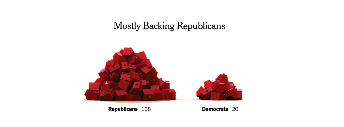
Keep scrolling down the piece the reader discovers why this is even more powerfully used. First off, they continue to represent data with these same physical symbols to compare things like party affiliation of the donors.
Continuing event further down the piece one fnids that they bridge from house satellite imagery to maps showing their locations, and real photos of the houses themselves. This progression of representations is a wonderful example of really pulling all the power out of the physical symbol that you can. They support digging deeper and deeper into the data and the narrative, utilizing this physical representation in different ways throughout.
The Hidden Weight of Food
The water used in food production is becoming a larger topic of discussion as droughts become longer and more frequent. Another group of students in my 2019 course used the data about water cost of foods to create a series of sculptures — the hidden weight of food. They describe the interaction like this:
The hook is a long table with plates of food. Each plate has a fork with a bite-sized piece of food on it, such as a slice of apple. When you lift the fork, you realize it’s much heavier than a slice of apple should be. Upon being surprised and interested to learn more from the exhibit, you read the sign and realize that the weight you are lifting is the weight of the water used to produce that bite of food. For a slice of apple, that’s a full 27 pounds.
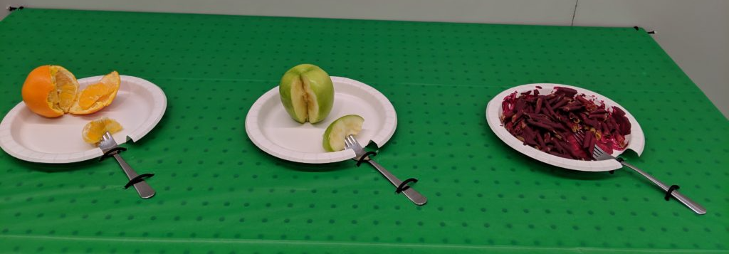
I can tell you from experience that it is a very surprising and effective trick, even in the rough prototype form that they build. They took advantage of the fact that we eat food, and that water is heavy. This comparison, between the expected weight of a bite of food vs. the far larger weight of the water used to produce that bite, is a super compelling and surprising story. It tries to capture that surprise and turn it into interest. They considered the subjects of the data (water and food), and used their affordances to design a delightful and evocative data sculpture.
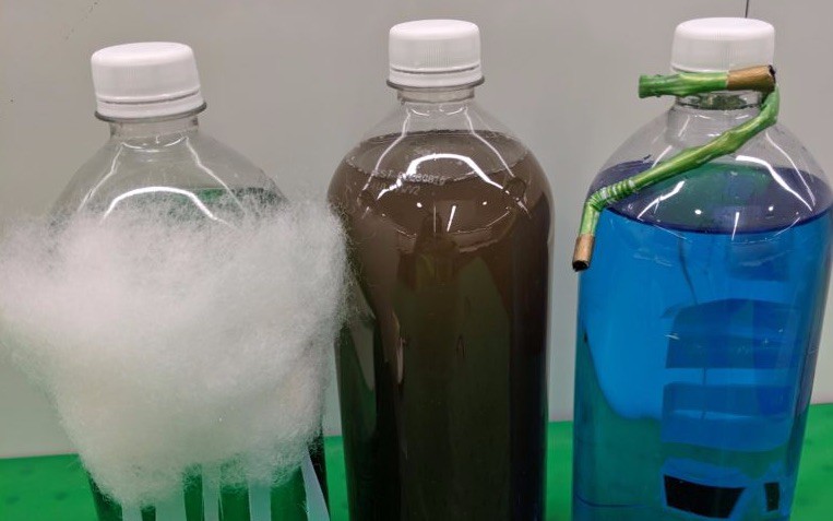
They expanded on this simple and surprising interaction by adding another sculpture that provides more detail. After lifting the forks and becoming engaged with the topic, viewers can walk to the next sculpture, which breaks down the types of water used in the production of an orange, to complement the total volume of water presented in the first sculpture. They use the familiar shape of 2-liter bottles to make a pyramid with colored water representing different types of water. This constructs another physical invitation, digging into the story of water along a different dimension.
Closing Thoughts on Layers of
The lesson? Don’t stop with your initial idea; tease out how you can support your longer narrative using spark that you’ve got. Thee power in these examples is that they used the data sculptures approach to present multiple dimensions of the data story.
They expanded on this simple and surprising interaction by adding another sculpture that provides more detail. After lifting the forks and becoming engaged with the topic, viewers can walk to the next sculpture, which breaks down the types of water used in the production of an orange, to complement the total volume of water presented in the first sculpture. They use the familiar shape of 2-liter bottles to make a pyramid with colored water representing different types of water. This constructs another physical invitation, digging into the story of water along a different dimension.
They power here is that they used the data sculptures approach to present multiple dominions of the data story.
Conclusion
Curious to hear more about my approach to data scultpures? Check out the lecture slides, with notes, from the data sculptures session in my Data Storytelling Studio class on MIT’s Open Courseware site. My thoughts have evolved more since then, but it is a good set of sparks, prompts, and reflections.
Curious to hear more about my approach to data scultpures? Check out the lecture slides, with notes, from the data sculptures session in my Data Storytelling Studio class on MIT’s Open Courseware site. My thoughts have evolved more since then, but it is a good set of sparks, prompts, and reflections.


You must be logged in to post a comment.