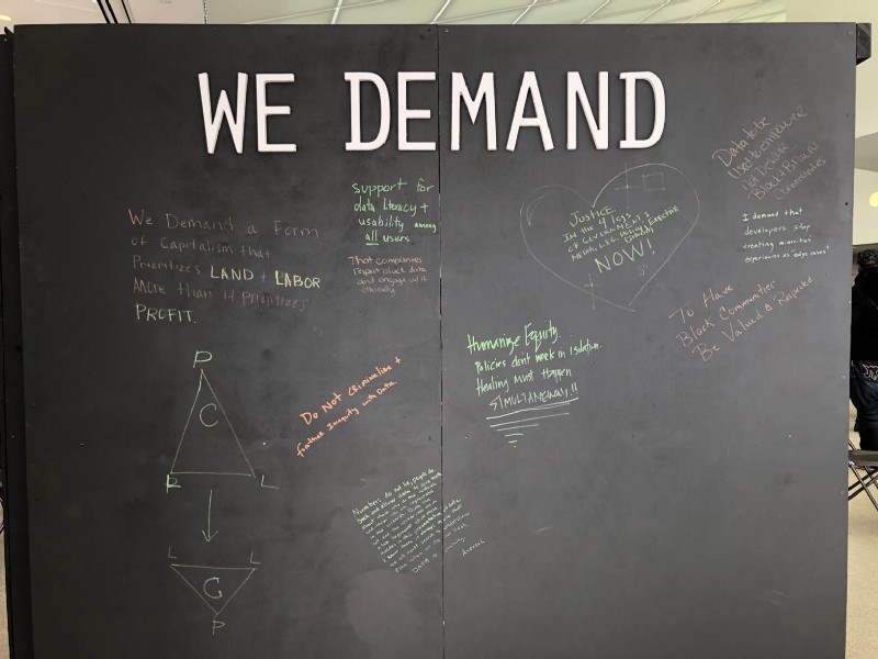
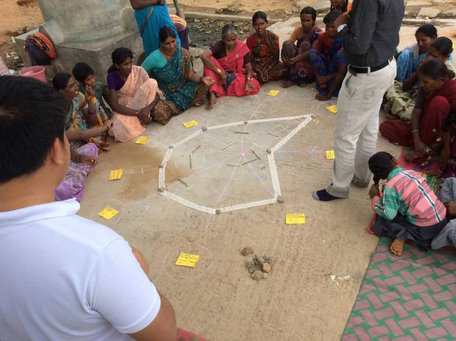
Just yesterday at I was in a room of amazing friends, new and old, talking about what responsible data visualization might be. Organizing by the Engine Room as part of their series of Responsible Data Forums (RDF), this #RDFViz event brought together 30 data scientists, community activists, designers, artists and visualization experts to tease apart a plan of action for creating norms for a responsible practice of data visualization.
Here’s a write up of how we tackled that in the small group I led about what that means when building visual literacy.
Building Literacy for Responsible Visualization
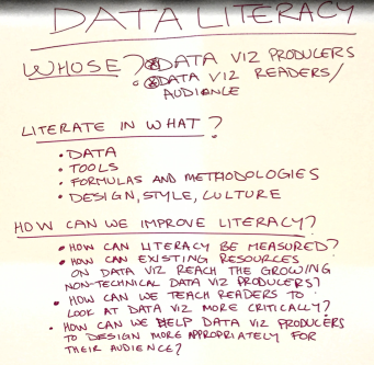 I’ve written a bunch about data literacy and the variety of ways I try to build it with community groups, but we received strict instructions to focus this conversation on visualization. That was hard! So we started off by making sure we understood the audiences we were talking about – people who make visualizations and people who see/read them. So many ways to think about this… so many questions we could address… we were lost for a bit about where to even start!
We decided to pick four guiding questions to propose to ourselves and all of you, and then answer them by sketching about quick suggestions for things that might help.
- How can visual literacy for data be measured?
- How can existing resources for data visualization read the growing non-technical data visualization producers?
- How can we teach readers to look at data visualization more critically?
- How can we help data visualization producers to design more appropriately for their audiences?
A difficult set of questions, but our group of four dove into them unafraid! Here’s a quick run-down on each. For the record, I only worked on two of these, so I hope I do justice to the other two I didn’t directly dig into.
Measuring Visual Literacy
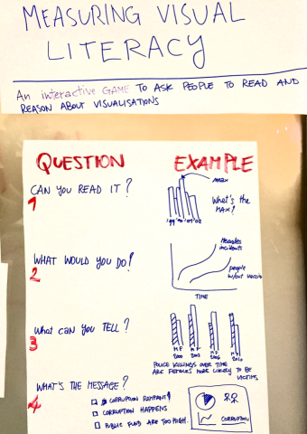
This is a tricky task, fraught with cultural assumptions. We began by defining it down to the dominant visual form for representing data – namely classic charts and graphs. This simplified the question a little, but of course buys into power dynamics and all that stuff that comes along with it.
Our idea was to create an interactive survey/game that asks people to read and reason about visualizations. Of course this draws on a lot of existing research into visual- and data-literacy, but in that body of work we don’t have an agreed-upon set of questions to assess this. So we came up with the following topics, and example questions as a thing to think about.
- Can you read it? This topic tried to address the question of basic visual comprehension of classic charting. The example question would show something like a bar chart and ask “What is the highest value?”.
- What would you do? This topic digs into making reasoned judgements about personal decisions based on information show in a visual form. The example question is a line chart showing vaccination rates over time going down and people getting measles going up; asking “Would you vaccinate your children?”.
- What can you tell? Another topic to address is making judgements about whether data shows a pattern or not. The example question would show a statement like “Police kill women more than men – true or false?” and the answers could be “true”, “false” and “can’t tell”.
- What’s the message? More complex combinations of charts and graphs are often trying to deliver a message to the reader. Here we could show a small infographic that documents corruption somewhere. Then we’d ask “What is the message on this graphic?” with possible answers of “corruption is rampant”, “corruption happens” and “public funds are too high”.
There are just four topics, and we know there are more. We’re excited about this survey, and hope to find time and funds to review existing surveys that assess various types of literacies so we can build a good tool to help people measure these types of literacies in various communities!
Choosing the Right Visualization for Your Audience
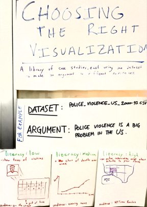 We have a vast, and growing array of visualization techniques available to us, but few guidelines on how to use them appropriately for different audiences. This is problematic, and a responsible version of data visualization should respect where and audience is coming from and their visual literacy. With that in mind, we propose to create a library of case studies where each one creates different visualizations from the same dataset, making the same argument, for different audiences.
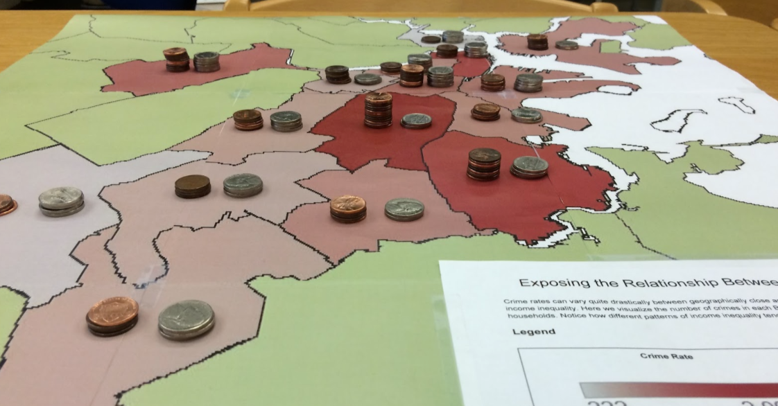
For example, we sketched out ways to argue that police violence is endemic in the US, based on a theoretical dataset that captures all police-related killings. For a low visual literacy individual (maybe a 10-year old kid) you could start by showing a face of one victim, and then zoom out to a grid of all the victims to show scale of the problem while still humanizing it. For the medium literacy audience (those that watch the evening news each night on tv), you could show a line chart of killings by year. For a high literacy audience (reading the New York Times) you could do an interactive map that shows killings around the reader’s location as they compare to nation-wide trends.
You could imagine a library of many of these, which we think would help people think about what is appropriate for various audiences. I’m excited to assign this to students in my Data Storytelling Studio course as an assignment!
Learning to Read A Data Visualization
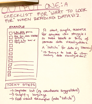 Our idea here was to create a quick how-to guide that lists things you should ask when reading a data visualization. Imagine a listicle called “15 Things to Check in any Data Visualization”! The problem here is that people aren’t being introduced to the critical techniques for reading visualization, to identify when one is being irresponsible.
Some things that might on this list include:
- Is the data source identified?
- Are the axes labelled correctly?
- What is the level of aggregation?
This list could expose some of the common techniques for creating misleading visualizations. Next steps? We’d like to crowd source the completion of the list to make sure we don’t miss any important ideas.
Helping Non-Experts Learn to Make Data Visualizations
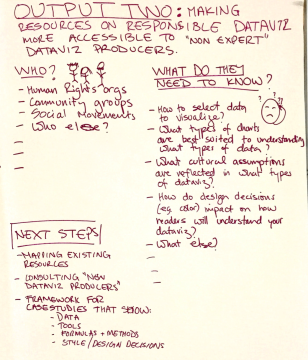 This is a huge problem. The hype around data visualization continues to grow, and more and more tools are being created to help non-experts make them. Unfortunately, the materials we use to help these newcomers into the field haven’t kept pace with the huge rise in interest!
We proposed to address this by better defining what these new audience need to know. They include:
- human rights organizations
- community groups
- social movements
And more! A brief brainstorm resulted in this list of things they are trying to learn:
- how to select the right data to visualize?
- what types of charts are best suited to understand what types of data?
- what cultural assumptions are reflected in what types of dataviz?
- how do design decisions (eg. color) impact on how readers will understand your data visualization?
This is just a preliminary list of course.
Rounding it Up
Problem solved!
Just kidding… we have a lot of work to do if we want to build a responsible approach to literacies about data visualization. These four suggestions from our small working group at the RDFViz event are just that – suggestions. However, the space to approach this from a responsible point of view, and the conversations and disagreements were invaluable!
Many thanks to the organizers and funders, including our facilitator Mushon Zer-Aviv, our organizers at the Engine Room, our hosts at ThoughtWorks, Data & Society and Data-Pop Alliance, and our sponsors at Open Society Foundations and Tableau Foundation. This is cross-posted to the MIT Center for Civic Media website.


You must be logged in to post a comment.