
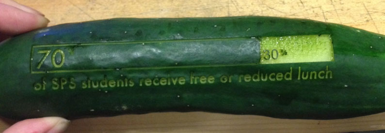
I’m fascinated by food and data. I’ve been doing food security data murals, my Data Storytelling Studio class in 2015 focused on food security data, and I’ve been laser-cutting data onto veggies for public events.
So not surprisingly I was excited to see Data Cuisine coming to Boston for a workshop by Suzanne Jaschko and Moritz Stefaner! Sadly I’m out of town and can’t make the workshop, but it sparked me thinking about food and data, and creative data representation a bit.
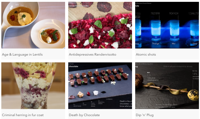
When doing data presentation in a creative medium, you have to choose your mappings and datasets carefully. I’m often introducing people to more creative techniques for data presentation for the first time, and argue the strongest stories come when the message matches the medium well. For example, one of their participant projects maps tomato and basil in a dish to the amount of Italian speakers. This is a fairly culturally loaded mapping, that many would understand. However, others are more abstract. One mapped people to noodles to discuss sexual habits. A stronger mapping is the project that makes a joke about “death by chocolate” by creating small caskets to tell the story of common causes of death in Belgium.
Another intriguing example is Dan Barber’s red pepper egg (featured in an episode of Netflix’s Chef’s Table show).
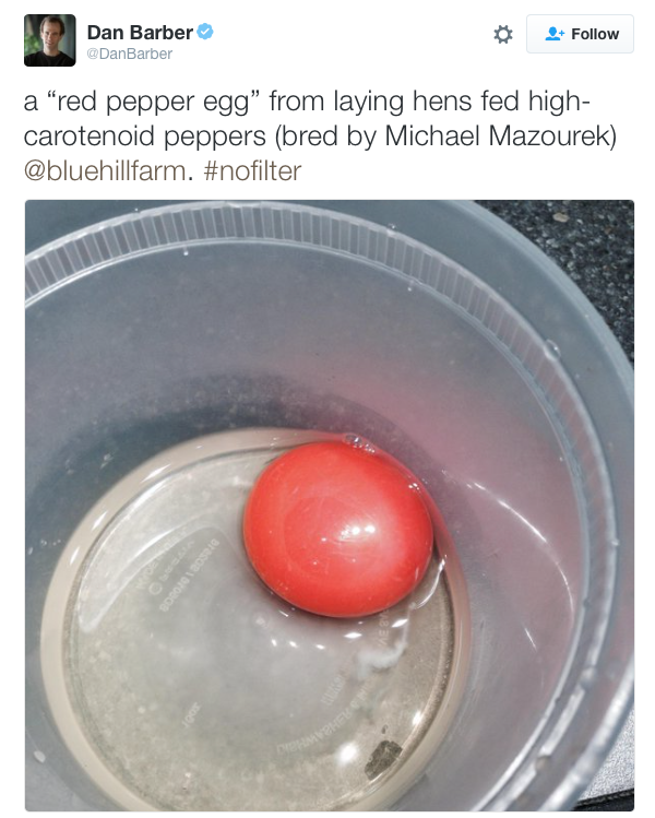
He worked with a farmer to breed super colorful red peppers, then fed a mash of them to chickens to create the red yolk you see above! Why? All to start a person about to eat the egg wondering how it got that red. What did the chicken eat to make that happen? Why have I never thought about the supply chain going into this egg before?
To me, Barber’s red pepper egg is a wonderful example of data representation as food. The food chain data in beautifully captured in the red yolk, and it prompts you to ask questions directly aligned with his goals in presenting it. Wonderful!
More abstract representations of data in food are like a missed opportunity to me. The artistic merit can be there, but leaves the viewer hungry for more. A strong mapping between the medium of your data presentation, and the data and story itself, is key to creating a lasting impression.

You must be logged in to post a comment.