Aligning Your Data Methods and Your Mission

This blog post is based on a keynote I gave recently at the 2019 SSIR Data on Purpose event.

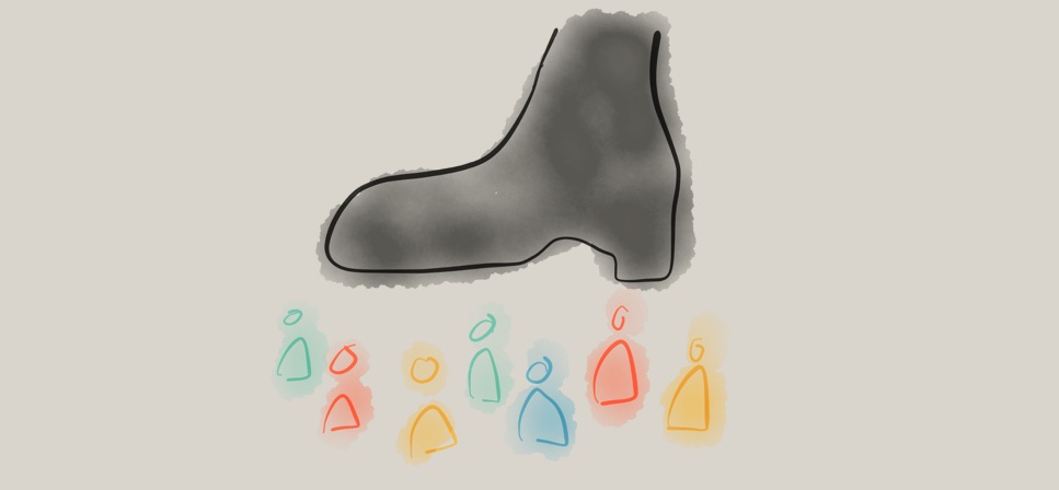
Are you optimistic or pessimistic about data as a tool for good in the world? Over the last few years I’ve seen the shift in answers to this questions. People used to answer “optimistic”, but now most people indicate some mix of emotions. You’ve probably seen the Gartner hype cycle with its suggestion that a technology receives inflated expectations and then is overused to the point of disillusionment. I’d argue that the over-hyping and the disappointment happen at the same time… that time is now for social good organizations that are trying to use data to further their missions.

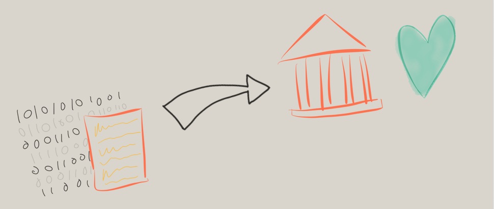
The response I’ve been crafting focuses on acknowledging the damaging history of the data practices we routinely employ, taking a step back from hype-driven roll-out of data programs, and working to align your data and your mission. The Data Culture Project, my collaboration with Catherine D’Ignazio, works with organizations large and small across the world to help make that happen.

One of the core problems in creating a data culture that aligns with your mission is the history we are fighting against. Data has been a tool for those in power to consolidate that power for centuries. For organizations working in the social good sector, this shouldfeel problematic! If you’re deploying some tool or process, you need to be wary of any pieces that reinforce that history. They can cultivate the opposite of the empowerment, engagement, and ownership goals that are probably at the heart of your mission.

Warning: In this post I’m going to depress you by reviewing some of that history. Don’t worry, I’ll close with some inspirations so it isn’t all doom and gloom.  Make sure not to stop reading in the middle, otherwise you might walk away feeling pretty bad about the world!

A Depressing History of Data

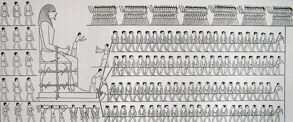
I won’t surprise anyone by talking about human history as full of stories of those in power seeking to oppress others. However, I want to highlight a few of those instances that were data-driven. Going back as far as the ancient Egyptians, we can find evidence that they tabulated and tracked populations to determine how much labor they would use to construct their giant monuments to themselves (read more at the UK Office for National Statistics). They created census data to drive massive construction projects in their own likeness.

lots of egyptian laborers pulling a large sculpture
Source – A Popular Account of the Ancient Egyptians, Sir John Gardner Wilkinson (1854)

Fast forward to Britain in the 1700s and you find the horrors of the slave trade via cross-atlantic shipping; all cataloged in stunning details by the shopping industry and the strict regulations they were under. Many of these  massive data records are still available today. This economic data numerically catalogues the human suffering of tens of millions at the hands of those in power across the western world.

Next consider another of the darkest times in recent history – the Nazi regime. Their massive atrocities were informed and guided by the tabulations of their census, driven by IBM’s custom manufactured counting machines (read more on Wikipedia). This is a history IBM would like us to forget with their new Watson AI initiatives, but Watson was in fact the one that oversaw all this work as CEO at the time.

A few decades later we find another example in South America, recipient of massive investment and development packages from large multi-national UN-style agencies. All this drove numbers that showed enormous economic growth, while in fact huge populations were suffering. As famed author Eduardo Galeano writes – “the more watched and desperate the people, the more the statistics smiled and laughed”.

As for our current times? You can barely throw a stone without hitting another story of a large centralized technology company using some data in morally questionable ways. Amazon pitching facial recognition to ICE here in the US to keep migrants and asylum seekers out (The Verge), Facebook building massive datasets about non-users to improve their invasive advertising targeting (Reuters), China creating a “social credit score” to control and guide citizen norms (Bloomberg) – the dystopia is here. We are all quantized without any meaningful consent in the massive databases of the big tech corporations.

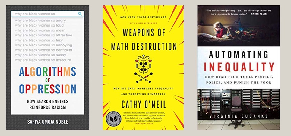
I trust you’re on board now with the idea that data has a dark history full of examples like these ones that I’ve quickly touched on. Want more? Read Algorithms of Oppression, Weapons of Math Destruction, Automating Inequality, or one of the other recent books about this.

A Disempowering Process

I know, that was pretty depressing. Usually I don’t pull in forced labor, slavery, and the Nazi holocaust into one blog post. Sorry. This thing is, this is the past and present that your data process is living within. We can’t ignore it. You have to work hard to make sure you’re not part of it. To fight this history, first we have to understand the patterns that drove it.

All of these examples showcase a problematic pattern of data use that we can characterize in four ways:

  • Opaque processes– the subjects of the data aren’t given any insight into what happens to the data about them
  • Extractive collection– the data is pulled from the subjects and their community by those outside of it
  • High technological complexity– the mechanisms used to analyze the data, digital and non-digital, have a steep learning curve
  • Control of impact– the people the data is about have no say in the impacts of the decisions being made with the data

From my point of view, these are process problems(read more in my paper on with Catherine D’Ignazio). Ok, in some of the more egregious examples above these wouldn’t be described as “problems”, because clearly their goals were to actively oppress and kill the subjects of the data. However, that isn’t the goal of most data endeavors!

The thing is, even many well-meaning, pro-social data efforts use this problematic process. Consider the history of public health and epidemiology to start. In 1663 you have John Graunt carrying out the first recoded experiments in statical data analysis; the ancestor of epidemiology (learn more on Wikipedia). By recoding information about mortality, he theorized that he could design an early warning system for the bubonic plague ravaging Europe. Definitely working for the social good, but in a position of power with no engagement with the effected populations. Extractive dart collection, a complicated statistical process, and no control of impact for the population in mind.

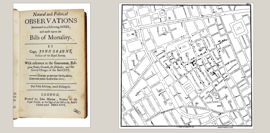
Or how about the famed maps of John Snow, used to discover the origins of cholera in the early 1800s (learn more on Wikipedia). A noble, impactful, and meaningful example of data usage for sure – literally saving lives. The same process criticisms hold – a person of privilege mapping data about “the poor” to discover something without any role of the people that were the data themselves.

When we quickly read these two stories, they sound like amazing historical examples of using data for good! However, when you examine them more deeply, you find the same four criticisms weighed above. Their data methods didn’t match their mission.

Some Inspirations

Knowing this history, how do you make sure you’re not doomed to repeat it? So how do you avoid these pitfalls?  You build a data culture within your organization that can do better. You empower staff up and down your org chart to identify problems data can help solve and them support them solving the those problems. You open up your process, you bring people together, you help them make decisions with data. You don’t need data scientists to to this, you need a data culture. This is what our Data Culture Project is all about. Here are some examples to help explain what I mean.

Two images from the “The Exhibit of American Negroes” exhibit created by W.E.B. Du Bois (source)

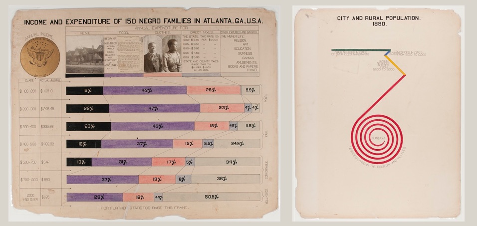
A wonderful historical example is the recently re-discovered works of W.E.B. Du Bois. He pulled census data, among other sources, to create a catalog of “the African American” in 1900. He brought the inventive and novel infographics to the world’s fair in Paris to showcase the work that needed to happen to create true freedom in the US post-slavery (work that is still being done today). He worked with African American students at the university to repurpose this census data to tell their story. These graphics are an example of self-determination – highlighting the problems the subjects of the data themselves have chosen. His statistical techniques were detailed, but he invented new ways to communicate them to a larger, less data-literate audience.

A data mural created by the Created by the Collaborate for Healthy Weight Coalition (August 2013)

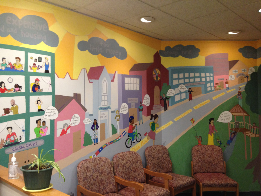
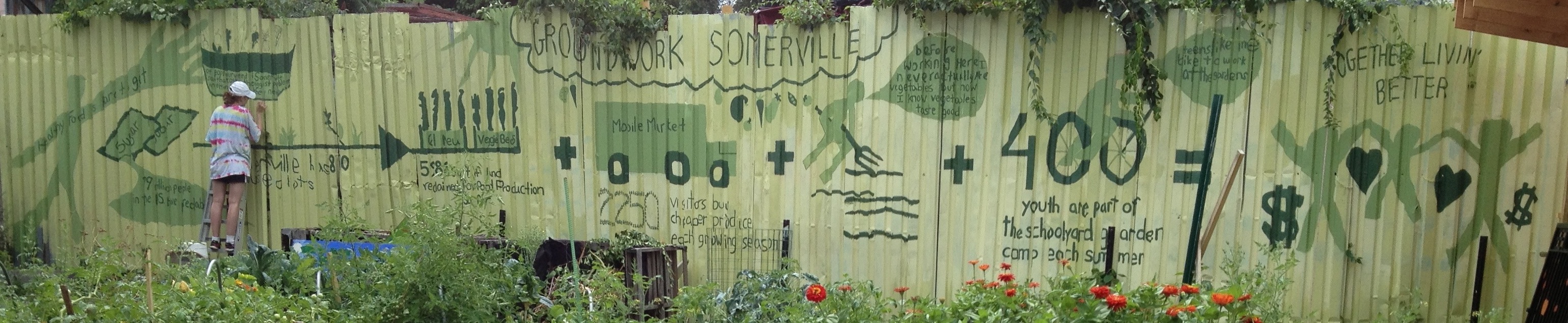
A general theme in my work is using the arts as an invitation to bring people together around data to tell their own story. My work on data murals, a collaboration with my wife Emily Bhargava, is a prime example of this. We bring a group of people together around some data about them, help them find a story they want to tell, and then collaboratively design a mural to tell it. This puts the ownership of the data analysis and the data story in their hands, flipping the standard process on its head. The subjects of the data are empowering to tell the data story, with invitations to analyze the data that build their capacity and meet them where they are in skills and interests.

Data 4 Black Lives founders Yeshimabeit Milner, Lucas Mason-Brown, and Max Clermont

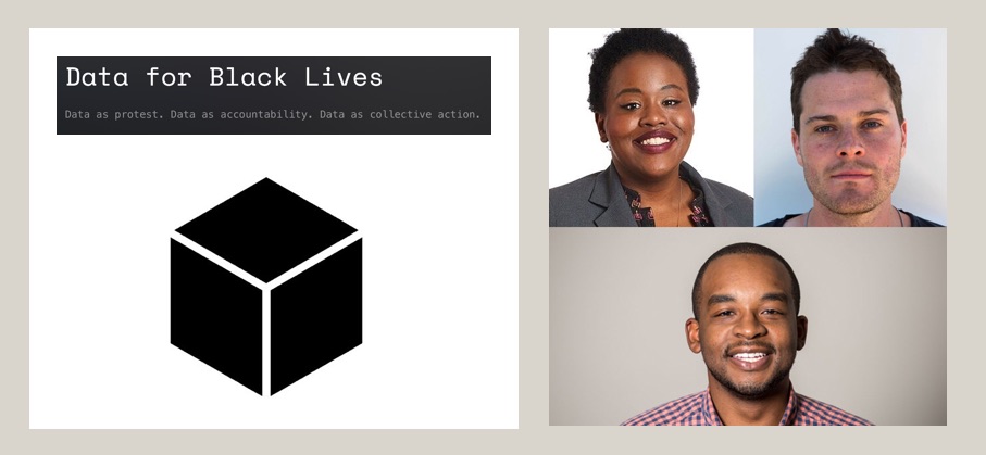
A more community-focused example comes from the Data 4 Black Lives organization(D4BL). The brutal legacy of slavery in the US permeates our culture, so it should be no surprise that it continues to poison the datasets we use as well. D4BL is working to highlight these problems, bring together organizers, data scientists, and students, and also influence policy to put data in service of the needs of black lives in the US. This is a traditionally marginalized community empowering themselves with the language of those in power (data) and trying to build community in service of their own goals.

hearts and a woman seeming to be in pain, half the hearts are filled in, half are empty
1st place winner Danford Marco and his Khanga design

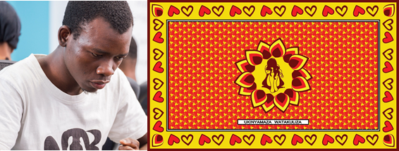
For a non-US example, we can look to the work done by the Tanzania Bhora Initiative and Faru Arts and Sports Development Organizatio as part of the Data Zetu Intiaitive in Tanzania. They ran a competition for designers to create khanga cloth patterns based on data (the khanga is a traditional cotton clothoften adorned with sayings or shout-outs). The project built the capacity of designers to speak data, and ended with a fashion show showcasing the winning designs (read more in their blog post). The first place winner (Danford Marco) created a design to reflect that 1 out of every 2 married women have faced some kind of abuse from their husband. A staggering statistic, and a stunning design to bring attention to the problem. This kind of creative approach to building data capacity is an example of a very different process, one that is inclusive, builds capacity, and gives ownership of the data to the people it is about.

Match your Mission and Methods

an arrow connecting data to a building with a heart
Align your data methods and your mission

I’m hoping by now that I’ve convinced you that you need to think harder about the data methods you use in order to avoid re-creating the terrible historical practice associated with data. I’m focused on organizations that work for the social good, but this argument holds true for anyone using data. The inspirational examples I highlight all paint a path forward that lets us match our mission and our methods. Which path will you follow?

Workshop at the 2018 UN World Data Forum

A few years ago I went to the first UN World Data Forum and made some amazing connections with non-profits large and small (read more about that here).  A common theme at that event was how to help organizations and governments get the data they needed to start work on the Sustainable Development Goals.

dt6wkqgx0aak6ux

I just returned from the 2018 event, and found a new message repeated over and over – how can we help those who have data communicate about its potential and its impact? I’ll write more about that later.  For now I want to share a bit about the session I ran with my collaborator Maryna Taran from the World Food Program (WFP).  It was a pleasure to return to the event where we first met and speak to the impact we’ve had at WFP, and how the Data Culture Project has grown to a suite of 7 hands-on activities you can use for free right now.

Empowering Those That Don’t “Speak” Data

Our session was designed to focus on bringing the non-data literate into the data-centered conversation.  The idea is that we can help these folks learn to “speak” data with playful activities that try to meet them where they are, rather than with technical trainings that focus on specific tools.

We introduced our arts-centric approach to creating participatory invitations through the data cycle – from data collection, to story-finding, to story-telling.  Specifically, we ran our Paper Spreadsheets activity and our Data Sculptures activity.  Maryna also shared how the WFP has rolled out a data program globally, where the Data Culture Proect activities fit into it, and some of the impacts they’ve seen already.

dqhypxtwsaakt1j
Participants filling in a paper spreadsheet.

The Paper Spreadsheet activity led to a wonderful discussion of data types, survey question create, and security concerns. The Data Sculptures folks created were a great mix of different types of stories, so I highlighted some of the scaffolding we’ve created for finding stories in data.

One of the most rewarding comments at the end was from a woman who worked on the data analysis side creating charts and such for her team.  She noted that she often will share a chart with others on the team and they’ll say “tell me the story”, much to her frustration – she just didn’t understand what they meant.  What more did they want than the chart showing them the evidence of the claim or pattern? She was pleased to share that after this session, she finally had a way to think about the difference between the charts she was making and the story that her colleagues might be looking for!  Such a wonderful comment that resonated with a lot of the points Maryna was making about how and why WFP is rolling out the Data Culture Project activities in parallel with their more technical data trainings.

Here are the slides we used, for reference:

Data Literacy Workshop @ PDC 2018

All our data literacy and data culture work is grounded in real workshops with community groups, non-profits, governments and businesses. However, I am an academic working at a university, so I also publish papers and go to conferences and such.  For any others in that vein, below is information about a Data Literacy workshop I’m planning with Catherine D’Ignazio and Firaz Peer at the Participatory Design Conference this August.  This is part of larger our efforts to build a larger group of peers working on these topics, and translate our collective learnings for use with a non-academic audience!

Learn more at http://firazpeer.lmc.gatech.edu/pdcworkshop/ 

Data Literacy Workshops as Participatory Design

A workshop at the Participatory Design Conference, Belgium, Aug 21, 2018.

About the workshop

Big Data analysis and data-driven decision-making are buzzwords that are quickly becoming aspirational goals within industry and government settings. This so called data revolution has resulted in what some have called a data divide, where those with privileged access and knowledge about such data are given a seat at the bargaining table, while the voices of those who lack such skills, continue to be ignored. The data literacy workshop we are proposing is designed to work with the data newcomers within our communities, to give them a chance to use publically available data as a resource to advocate for change. Grounded within the Participatory Design goals of equalizing power relations through democratic practices, the workshop activities allow data newcomers to engage constructively with issues that they care about. Our goal in proposing these sets of activities as a workshop is to generate discussions around data literacy, engagement, empowerment, access, power and privilege that are typically associated with data and cities, and build connections between the PDC audience and the data literacy practitioners so they can take this research forward in innovative ways

Our goal in proposing this interactive data literacy workshop to the PDC audience is to offer it as a method that they can use to engage with those who are new to data and analysis. We hope to create connections between the PD discipline and practitioners within the data literacy space to learn from each other and inform this emerging field, to try to move the needle away from boring spreadsheet trainings conducted in dry online settings. We are interested in learning how our attendees define the term ‘data literacy’ within their own research and practice, and the tools, methods and techniques they use to operationalize it. In addition to demonstration of our methods, our workshop schedule also sets aside time for discussions and brainstorming of additional activities/techniques within this pedagogical realm. We would like to get a sense of what empowerment through data means to our participants and the communities they collaborate with. How can designers negotiate power and privilege differentials in relation to access and skills of working with data?

To participate

We invite researchers, practitioners, activists, educators and designers who are interested in furthering the state of data literacy within their communities to submit short position papers (upto 1500 words). We invite researchers, practitioners, activists, educators and designers who are interested in furthering the state of data literacy within their communities to submit short position papers (up to 1500 words). We are open to a range of paper topics. For example, your paper might discuss how you conceive of data literacy or your research methods of choice. Your paper might discuss examples of data literacy and raise questions over what constitutes ethical engagement and empowerment. Your paper might outline uncharted territory in relation to identity, power and data literacy – including challenging the concept and emerging norms of data literacy. Or, finally, the paper might talk about interesting approaches to data literacy and how they might be made part of the workshop activities.

Papers should be in the ACM format as suggested by the PDC organizers and should be submitted to the organizers before May 10, 2018. Final decision on acceptance will be communicated to the applicants by May 25th, 2018.

Please email your position papers to firazpeer@gatech.edu. We expect to select a minimum of 10 and a maximum of 20 participants to take part in this workshop. Accepted participants will need to register for the workshop through the conference website.

Conference website: https://pdc2018.org/

Workshop website: http://firazpeer.lmc.gatech.edu/pdcworkshop/

Organizers

  • Firaz Peer, Georgia Institute of Technology
  • Rahul Bhargava, MIT Media Lab
  • Catherine D’Ignazio, Emerson College

Building Data Capacity Roundtable (Video Available)

Our partners at the Stanford’s Digital Impact initiative recently invited us to host a virtual roundtable discussion focused on building data capacity. In case you missed it, the recording and transcript are now online!

We gave a quick background on the Data Culture Project. Then we tried a quick online data sculpture activity; asking participants to make and share a photo of a physical data story just using things they found around their office. From there we pivoted into a discussion of how the World Food Programme and El Radioperiódico Clarín are building capacity to work with data in creative ways.

Panelists included:

Data Culture Project Webinar 4/12

We’ve officially launched the Data Culture Project and are excited to introduce you all to it! Our collaborators at Stanford’s Digital Impact program are hosting a virtual roundtable for us on April 12th.  Join it to learn more about creative approaches to building a data culture within your organization!

As part of it, we’ll be trying a hands-on activity online, and feature real stories from staff at two of our pilot partners – the World Food Program and El Radioperiódico Clarín.

The Data Culture Project: Building Data Capacity with Confidence

Register Now

Data-Culture-Project-864x432

You Don’t Need a Data Scientist, You Need a Data Culture

Most of the larger non-profit organizations we work with are scrambling to figure out how to deploy complex technologies like machine learning and “AI” in service of the social good. These include inspiring examples that range from poverty alleviation, to home fire prevention, to self-harm risk reduction.  These stories have spread widely and have come to define what a data-centric organization should be doing – namely complicated data science.  However, if you’re an organization thinking about how to use data better, this is not where you should start.  You don’t need a data scientist, you need a data culture.

Catherine D’Ignazio and I have built the DataBasic.io tools to focus on helping people creatively build their data literacy.  As more and more organizations have started using them, we’ve been pushed to think more deeply about what it means to take this approach to building a data culture.  This post lays out our latest thinking abut the building a data culture, and how to overcome barriers you’re likely to run into.

The key problem we see is that organizations working for the social good don’t feel empowered to work with data in a variety of ways. This is a rank-and-file staff problem, not a data scientist problem. We’ve come to work on this in three ways:WFP_DMC_building_a_data_culture.png

Organizations don’t feel confident that they can work with data at all, so to build a data culture we prioritize building confidence through small, focused activities. The technology that they think they need to work with data is daunting, expensive, and requires technical expertise, so our approach focuses on approaches that don’t rely on complex technology.  Organizations don’t have a good process for starting to work with data, so we introduce a step-by-step approach with hands-on activities.

We’re trying to help here by creating the “Data Culture Project” – you can expect to hear more about that early next year.  This gives organizations a lightweight, self-service curriculum or video-facilitated activities.  We’re piloting that with 30 organizations right now, to learn from how they approach running these over three months within their organizations.

What is a “Data Culture”?

This phrase is becoming a bit of a buzz-word right now. So what does it mean? After lots of conversations, with organizations big and small, we’ve narrowed down to this list:

  • Leadership prioritizes and invests in data collection, management and analysis/knowledge production.
  • Leadership prioritizes creative data literacy for the whole organization, not just IT and Evaluation.
  • Staff are encouraged and supported to access, combine and derive insight from the organization’s data.
  • Staff recognize data when they see it. They offer creative ways to use the organization’s data to solve problems, make decisions and tell stories.

This four-part definition focuses on leadership and staff responsibility very intentionally.  You need buy in across the organization to really make this work. We also focus on making sure data doesn’t get siloed into one department or another. Working with data is a core skill that can be valuable across an organization.

Why Build a Data Culture?

Why bother with building a data culture?  Over the last 10 years we’ve seen a lot of data projects in our workshops and partners. These tend to cluster around three purposes.

WFP_DMC_building_a_data_culture.png

Data is most often used to improve operations;  doing things like measuring delivery performance, changing how it works, and them measuring it again to see if it improved.  One the last years we see more and more uses of data to spread a message, giving rise to infographics and other formats where data is used to show impact of programs.  Data is less-often used to bring people together, which is the focus of my work on arts-based hands-on activities, data murals, and more.  We think this third purpose is central to building a strong data culture across your organization.


Barriers to Building a Data Culture

Of course, like any organizational change, there are barriers. We’ve listed 6 that we think are useful to have in mind while thinking about any efforts you are taking to build a data culture.

Barrier #1: Confusion

Most introductions to data are confusing and overly technical.

Complicated words can alienate people that are just entering the field of working with data.  Pick your words carefully to welcome them.  For instance, you could introduce the idea of “correlation” by talking about “connections” between pieces of data that move together.

Piaget, the great educational psychologist, introduced us to the idea that people will absorb new information by “assimilating” it into their existing mindset, or change their mental model to “accommodate” it.  If you know people’s background you can make your outreach more effective. You have to understand their existing mental models if you want to introduce new information. Your goal is not to turn everyone in the organization into data scientists. A data culture means people recognize data and are able to pinpoint new opportunities for deriving knowledge and insight from it.

Tips:

  • Avoid technical jargon
  • Meet people where they are

Barrier #2: Not Knowing Your Data

Sometimes you don’t even know the data you have.

At a recent workshop we were talking with a medium-sized environmental advocacy group and they lamented not having any data about participation at recent public events.  I mentioned that I had seen photos on facebook, and how that was data they could use. They were surprised and had ignored this set of data, yet it contained exactly the data they wanted.

Remember that data can be qualitative or quantitative.  If your development director shares photos and a headcount from your last fundraiser, that’s all data. Be creative about recognizing the data you have already.

It is hard to keep track of datasets within your organization that might be related to each other.  Identify a person and a technology that can be a central clearinghouse for data.  This could be as simple as a Word document with a bulleted list, or as complex as a internal data portal.

Tips:

  • Keep your eyes and ears open
  • Build a data catalogue, or library

Barrier #3: Organizational Silos

People will fight efforts to work across silos.

We were working with a large nonprofit to build a data culture across their organization, but they were stymied by people that thought they owned the data, and were hoarding it from others as a form of job security.  The only way we found to work on it was risky – to sneakily use it and then credit its successful use to the owner retroactively.  It helped, but we can do better than that.

Most organizations suffer from these silos – independent functional units that take pains to control a slice of the overall work. You have to acknowledge these walls in order to break them down.

When you have an example of a data-centric project that cuts across existing silos, hold it up as an example to success.  This is an opportunity to have leadership show buy-in and backing for a cross-sectional approach to data.

Tips:

  • Acknowledge your weaknesses
  • Highlight successes

Barrier #4: IT-Centric Thinking

Data gets locked away in the IT department.

Over and over we hear from organizations where IT is running Tableau trainings regularly and they just can’t understand why people aren’t adopting the tool and approach.  I’m like a broken record telling them that you need to separate the tool and the process – the tool training can be owned by IT, but the process training doesn’t need to be.

You need to make sure people don’t have to go to IT to pull out the latest numbers they need. Building a data culture means making sure every part of your organization can use data, for a variety of reasons.

Just because IT owns the data technology, it doesn’t mean they should own the process of creating a data culture.  Building this capacity is better housed across multiple departments, or within the office of a Chief Data Scientist.  That can lead to invitations to build data capacity that are more fun that just boring spreadsheet trainings.

Tips:

  • Data is for everyone
  • Create more invitations to work with data

Barrier #5: Irrelevance

Staff don’t connect to many high-level data dashboards.

High-level data summaries are great for leadership, but staff can’t always connect to them.  You need to integrate data into their day-to-day operations.  You can try ideas like mainstreaming quarterly data-reports from each department, or attaching data outcomes to program reviews. If staff don’t understand and the utility and use of data they are collecting, it just becomes boring homework they have to do. This hurts not only your data culture, but also the data quality!

Showing a number of summary of some data is great, but is just the start.  Asking “so what?” is when the real culture starts to emerge.  Actionable data can help you drive your organizational goal.  If people can’t answer the “so what” question, then they don’t have the right data. Engage staff in figuring out why the data they collect is useful; they are best positioned to answer the “so what?” question.

Tips:

  • KPIs aren’t for everyone
  • Remember to ask “So What?”

Barrier #6: Boredom

Data is seen as a boring chore.

Spreadsheet-driven activities are boring to the majority of people.  Use more fun activities, in novel settings, to bring a more creative approach to data. Make data sculptures in the lobby, or paint a data mural at your next retreat.  These approaches create multiple pathways into learning how to work with data.

Communicating in charts and graphs is the default for presentations.  However, these don’t tell a story.  Encourage your organization to put the data in context, and talk about impact, but focusing on how to tell a story with your data rather than just introducing how to do Pivot Tables. People like telling stories, and get interested and engaged in hearing them.

Tips:

  • Use creative data-centric activities
  • Tell stories with your data

Building Your Data Culture

Each organization is different.  Hopefully this high-level summary of some of our latest thinking helps inspire ideas what might work for you.  In future posts we’ll dig into more concrete ways to build a data culture, the motivations behind them, and how they are working for various partner organizations we work with.

This post is based on a presentation Catherine D’Ignazio and I gave to non-profit leaders convened by the Stanford Social Innovation Review. Thanks to Catherine D’Ignazio and Ethan Zuckerman for feedback and edits.

Making Tools More Learner-Friendly

I often advise learners to be careful with what tools they choose to spend time learning.  Some powerful ones have steep learning curves, full of jargon and technical hurdles.  Others are simple and self-explanatory, but can’t do more than one thing.  I’ve been trying to find better ways to connect with tool builders and talk to them about how they need to build learner-centered tools.

Catherine D’Ignazio and I put these thoughts together into a talk for OpenVisConf this year.  This is a super-dorky conference for data viz professionals… just the place to find more tool builders to talk to!  We put together an argument that data visualization tool as informal learning spaces.  Watch the video below:

Telling Your Story Well

I just hosted a workshop today at the Stanford Do Good Data / Data on Purpose “from Possibilities to Responsibilities” event.  My workshop, called “Telling Your Story Well”, focused on how to flesh out your audience and goals well so that you can pick a presentation technique that is effective.  We did some hands-on exercises to practice using those as criteria for telling your story well.

One key takeway is the reminder to know your audience and your goals before deciding how to tell your data-driven story.

Folks dove into the activity we did – remixing an infographic to target a specific audience and an achievable change.

FullSizeRender.jpg

For example, here’s a sketch of one group’s idea of an interactive data sculpture that dumps stuff on you based on how much water your purchases at a grocery store took to generate!

img_5295

Data, What is it Good For?

I recently led a short session at the inspiring Southern Poverty Law Center called “Using Data to Create Change: Real World Examples”.  Here is a short write-up of some of the examples I shared.

The hype around data has reached such heights that it is in danger of going into low-earth orbit! Being drenched in stories about the potentials for data to change your organization and your work, it is sometimes hard to pick apart the motivations and reasons to using data.  Unlike my blog title suggests, I’m not here to argue that data is good for “absolutely nothing”. I like to look at data as an asset for your organization, but focus in and talk about how it can help you in three concrete ways:

  • You can use data to improve internal operations
  • You can use data to spread the message
  • You can use data to bring people together

Here are four short stories to help pick these apart.  I live and work here in the US, so these case studies are all American.

Designing a Mural

Groundwork Somerville is a organization that works in my hometown here in Somerville, Massachusetts in the US.  One of their big projects involves reclaiming unused urban lots and helping youth build and maintain raised beds to grow vegetables.  They then sell these vegetables at cheap prices from a mobile market that visits multiple local sites weekly. For those of you in other countries, this is a big problem here in the US, where unhealthy food is generally far cheaper than healthy fresh food.

Created by Growndwork Somerville (August 2013)

To build skills in their youth programs, share their work, argue for more support, and have fun, we worked with local youth to design and paint a Data Mural.  They looked at the urban landscape, quotes from youth in the program, public health data, and participation in the mobile market to craft a story and mural speak to the internal and externals impacts the program has.

We used this kind playful engagement of data to bring people together and spread the message.

Using Metrics to Drive Engagement 

Here I’m going to retell a story that is often pointed to, most succinctly in Beth Kanter’s Measuring the Networked Nonprofit.  This is the story of how online news site Grist.com uses social media metrics and other data to move people up their ladder of engagement.  Grist tries to bring a light, playful, and new framing to issues that are important to folks who care about the environment. Folks that might not self-identify as “environmentalists” per say.

5981701957_534d51bac6
The Grist.org ladder of engagement

Grist does deep dives into their web and social metrics to understand what is important to their readers from a short-tem and long-term point of view.  They try to respond to these interests with editorial decision-making and sometimes in near-realtime content generation. Grist uses a strong ladder of engagement to prompt people to engage and own the narratives of stories about environmental issues, knowing that that will make them more likely to act to solve problems.

This attention to metrics and constant checks of their ladder of engagement is a great example of using data to improve internal operations and spread the message.  Read more about this in the book Measuring the Networked Nonprofit (by Kanter and Paine).

Creating Insights and Action

Their third story I want to share is about a small company in Detroit called LoveLand Technologies.  Over the last few years Detroit has been a city in crisis, recording record foreclosure rates, stuck with barely functioning public utilities, and having to file for bankruptcy protection.  In this context LoveLand stared making some simple maps of property in tax-related distress and foreclosure.  These were maps of people losing their homes.

The LoveLand map of foreclosures in Detroit (circa 2014)

Before they knew it, their maps were being used in a variety of unforeseen ways. Government officials were relying on them as the data source of record.  Churches were using them to raise funds for their neighbors in need.  Folks with deep pockets were ready to give them money to do even more work around urban blight in the city.

Their data was being used to improve internal operations, spread the message, and bring people together!  If you want to learn more read Ethan Zuckermen’s liveblog of a talk Mike Evans did recently at the MIT Center for Civic Media.

Guiding Program Decisions

My last story is the most high tech. It comes from DataKind, and organization that pairs data scientists with nonprofits to think through and implement projects focused on data analysis.  GiveDirectly started working with DataKind to get help targeting their unconditional cash transfers to those the money could help the most.  They’re a very data-centric organization already, so working with DataKind volunteers on some advanced topics just made sense!

GiveDirectly-600x340
A screenshot of their UI identifying roof types from satellite images (from the DataKind blog)

Data scientists Kush Varshney and Brain Abelson worked with GiveDirectly to understand how satellite imagery could be analyzed by computers to identify areas where aid funds would best be directed.  Based on the existing research showed a strong correlation between a villages wealth and the number of iron (vs. thatch) roofs, they created an algorithm that attempts to count iron and thatch roofs in satellite imagery. It is important to note that it doesn’t quite work yet, but it is important to think about novel applications for data mining that can create new types of data to help your work. Hopefully they can continue to tune the algorithm to improve their results and turn into a useful tool.

This analysis and tool building is trying to improve internal operations so GiveDirectly can do their work better.  Watch their technical talk to learn more.

Wrapping Up

There are just a handful of my favorite stories to illustrate the variety of ways you can use data to help you make change in the world.  Are their counter-examples illustrating the perils and pitfalls of using data in any of these ways.  Of course. I strive to highlight those stories just as often… but that’s a list for a different blog post!  I hope these four help you start to think about creative and new ways your organization might be able to turn all the data hype into something useful.

For reference, here’s a link to the presentation that went along with this talk:

Screenshot_7_26_15__5_42_PM

Architectures for Building a Data Culture

This is a summary of one section of my workshop on Data Architectures at the SSIR Data on Purpose workshop.

Organizations all around the world are asking themselves how to build a data culture within their walls.  Of course, this means something different for each of them.  However, I want to introduce you to my process for answering that question.  I rely heavily on Beth Kanter’s amazing work in this space, specifically her book Measuring the Networked Nonprofit (co-written with KD Paine).

There are three guiding questions you can use to lead you through this process. I’ll go into each one in detail in this blog post.

  • What is a data culture?
  • What is our existing data culture?
  • How do we build a data culture?

What is a Data Culture?

data-what

First off, it is important to define what a data culture means to you.  We toss around a lot of phrases to tease that out, so I find these little comics illustrative of the differences between some of these labels.

  • We you’re data-centric, you bring people together around data as the central driver to help make decisions
  • When you’re data-informed, you take the data and it’s context as inputs to your conversation and decision make process
  • When you’re data-driven, you look at the data to find out what to do or how to approach something

Sure, these are kind of caricatures of those terms, but they’re helpful.  As with most things, I like Beth Kanter’s description of some of these differences.  Not surprisingly, I agree with her and advocate that organizations take a data-informed approach.

What is Our Existing Data Culture?

Before coming up with a plan for building the data culture you want to see in our organization, you have to understand the culture that is already there.  Looking internally at your organization structures and practices can feel tiring, but it is a necessary time to put on your anthropologist hat.  Here are some questions that might help:

  • Are there data champions already using data in good ways that you can celebrate as models to duplicate?
  • Are the roles in your organization aligned with your data needs?
  • Is there a central person setting policies and best practices when it comes to your data-related work?
  • Do you have a data group? A Chief Data Officer? A Data Scientist?  Or are those labels too much for your small organization?
  • Who owns the data being collected, and do they have incentives to share it across the organization?

How do we Build a Data Culture?

Changing the internal culture of any organization is slow work.  Beth’s crawl-walk-run-fly model (borrowing from the MLK quote) is a fantastic approach to this.

cwrf-kanter
slide from Beth Kanter, used here with her permission

She is, of course, focused on internal processes and measurement for social media (that’s what she does), but the approach is valid for various types of data work.  There are a multitude of strategies she suggests for building this kind of culture:

  • look for internal advocates / experts
  • look for key exemplars
  • build external relationships
  • lead from the top and from below
  • baby steps are ok

Seriously, just go buy and read the book already.

Pitfalls

Of course, there are dangers and barriers you will have to overcome.  First off, remember that people tend to measure what is easy to measure, not necessarily what is important to measure.  The way to overcome this is to create a critical data culture that constantly asks questions like “what does this data help us do?” and “what is missing from this data?”.  Another common barrier is organizational fiefdoms that don’t want to share their data with other.  You can respond to this by incentivizing sharing of data and highlighting examples that do.

There will be other challenges on your path to building a data culture, but remember your goal.  Data-informed decision making and communication has already emerged as a key skill you need to have to help you create the change you want to make.  You need to build a data culture within your organization to advance your work. I hope these tips help!