Civic Visualization: Student Sketches

I just wrapped up teaching a 3-week, 5 session module for MIT undergraduates on Data Scraping and Civic Visualizations (read more posts about it).  As their final project I asked students to use some Boston-centric data to sketch a civic visualization.  Here’s a quick overview of their final projects, which I think are a wonderful example of the diversity of things folks can produce in a short amount of time.  Remember, these are sketches the students produced as their final projects… consider them prototypes and works-in-progress.  I think you’ll agree they did amazing work in such a short amount of time!

1.5 Million Hubway Trips

Inforgraphics_02

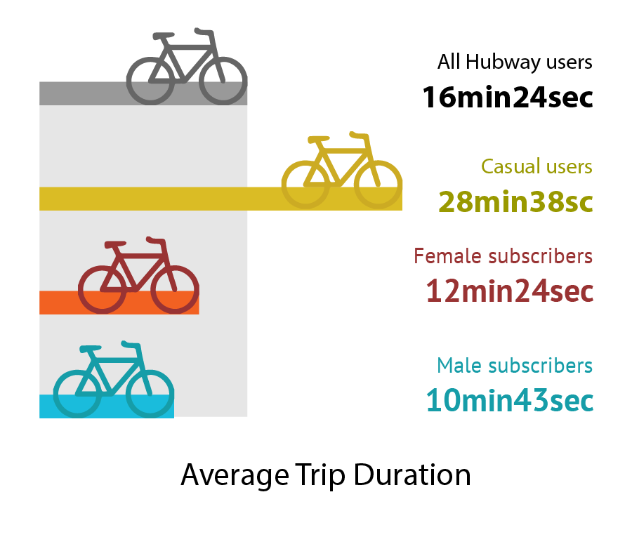
Ben Eysenbach and Yunjie Li dove into the Hubway bicycle sharing data release.  They wanted to understand how people perceive biking and help planners and bike riders make smart decisions to support the urban biking system. Ben and Yunjie found that Google bicycle time estimates are significantly off for female riders, and built some novel warped maps to show distances as-the-bike-rides across the city.  See more on their project website.

The Democratic Debate on Tumblr

Project_2_Presentation_-_Google_Slides

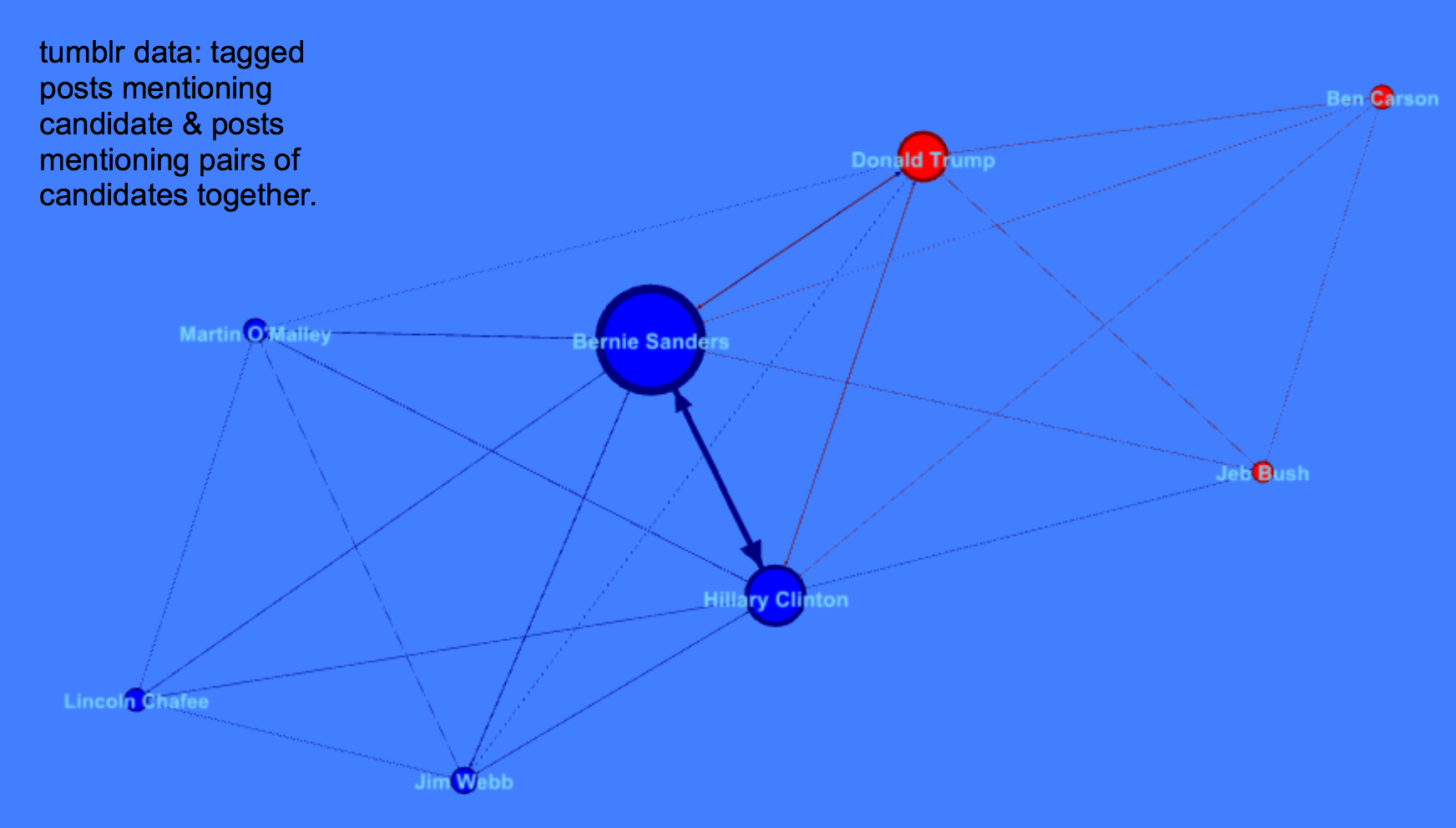
Alyssa Smith, Claire Zhang, and Karliegh Moore collected and analyzed Tumbler posts about the first 2015 Democratic presidential debate.  They wanted to help campaigns understand how to use Tumblr as a social media platform, and delve into how tags are used as comments vs. classification.  Alyssa, Claire and Karliegh found Bernie Sanders, Hillary Clinton, and Donald Trump were the most discussed, with a heavy negative light on Trump.

Crime and Income Rates in Boston

Final_Report_-_Google_Docs

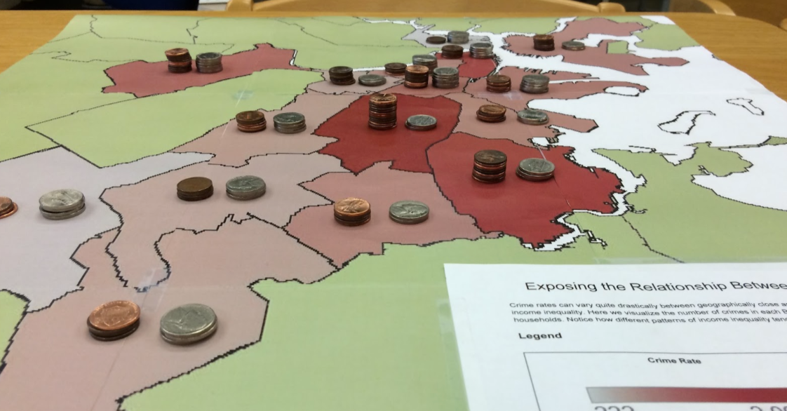
Arinze Okeke, Benjamin Reynolds and Christopher Rogers explored data sets about crime and income in Boston from the city’s open data portal and the US Census.  They wanted to motivate people to think harder about income disparity and inform political debate to change policies to lower crime rates.  Arinze, Ben and Chris created a novel map and data sculpture to use as a discussion piece in a real-world setting, stacking pennies to represent income rates on top of a printed heatmap of crime data.

Should Our Children Be in Jail?

Children_in_Jail___Piktochart_Infographic_Editor

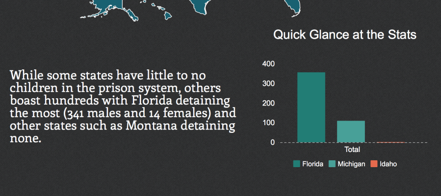
Andres Nater, Janelle Wellons and Lily Westort dug into data about children in actual prisons.  They wanted to argue to people that juveniles are being placed in prisons at an alarming rate in many states in the US.  Andres, Janelle and Lily created an inforgraphic that told a strong story about the impact of the cradle-to-prison pipeline.

Visualizing to *Find* Your Data Story

I consistently run across folks interested in visualizing a data set to reveal some compelling insight, or tell a strong story to support an argument.  However, the inevitably focus on the final product, rather than the process to get there.  People get stuck on the visual that tells their story, forgetting about the visuals that help them find their story.   The most important visualizations of your data are the ones that help you find and debug your story, not the final one you make to tell your story.  This is why I recommend Tableau Public as a great tool to learn, because its native language is the visual representation of your data.  Excel’s native language is the data in a tabular form, not the visuals that show that data.

Here are some other tools I introduce in the Data Scraping and Civic Visualization short course I teach here at MIT (CMS.622: Applying Media Technologies in Arts and Humanities).

  • Use word clouds to get a quick overview of your qualitative text data (try Tagxedo)
  • Tools Overview:find all of these on netstories.org website
  • Use Quartz ChartBuilder to make clean and simple charts, without all the chartjunk
  • Use timelines to understand a story over time (try TimelineJS)
  • Experiment with more complicated charting techniques with Raw (a D3.js chart generator)
  • Make simple maps with Google Maps, analyze your data cartographically with CartoDB, or make your own with Leaflet.js
  • Test your story’s narrative quickly with a infographic generator like Infogram

Curios for more?  See own netstories.org website for more tools that we have reviewed.

What You Should Use to Scrape and Clean Data

I am currently teaching a short module for a class at MIT called CMS.622: Applying Media Technologies in Arts and Humanities.  My module focuses on Data Scraping and Civic Visualization.  Here are a few of the tools I introduce related to scraping and cleaning.

Tools for Scraping Data

As much as possible, avoid writing code!  Many of these tools can help you avoid writing software to do the scraping.  There are constantly new tools being built, but I recommend these:

  • Copy/Paste: Never forget the awesome power of copy/paste! There are many times when an hour of copying and pasting will be faster than learning any sort of new tool!
  • Chrome Scraper Extension: This bare-bones plugin for the Chrome web browser gives you a right-click option to “scrape similar” and export in a number spreadsheet formats.
  • Import.io: This is a radical re-thinking of how you scrape.  Point and click to train their scraper.  It’s buggy, but on many simple webpages it works well!
  • Jquery in the browser: Install the bookmarklet, and you can add the JQuery javascript library to any webpage you are viewing.  From there you can use a basic understanding of javascript and the Javascript console (in most browsers) to pull parts of a webpage into an array.
  • Software Development: If you are a coder, and the website you need to scrape has javascript and logins and such, then you might need to go this route (ugh).  If so, here are some example Jupyter notebooks that show how to use Requests and Beautiful Soup to scrape and parse a webpage.  If your source material is more complicated, try using Mechanize (or Watir if you want to do this in Ruby).

Tools for Cleaning Data

If you start with garbage, you end with garbage.  This is why clean data is such a big deal. I’ve written before about what clean data means to me, but here are some tools I introduce to help you clean your data:

  • Typing: Seriously.  If you don’t have much data to clean, just do it by hand.
  • Find/Replace: Again, I’m serious.  Don’t underestimate the power of 30 minutes of find/replace… it’s a lot easier than programing or using some tool.
  • Regular Expressions: Install a text editor like Sublime Text and you get the power of regular expressions (which I call “Super Find and Replace”).  It lets you define a pattern and find/replace it in any large document.  Sure the pattern definition is cryptic, but learning it is totally worth it (here’s an online playground).
  • Data Science Toolkit: This Swiss-army knife is a virtual machine you can install and use via APIs to do tons of data science things.  Go from address to lat/lng, quantify the sentiment of some text, pull the content from a webpage, extract people mentioned in text, and more.
  • CLIFF-CLAVIN: Our geo-parsing tool can identify places, people, and organizations mentioned in plain text.  You give it text and it spits out JSON, taking special effort to resolve the places to lat/lngs that makes sense.
  • Tabula: Need to extra a table from a PDF? Use Tabula to do it.  Try pdftables if you want to do the same in Python.  A web-based option is PDFTables (made by the ScraperWiki people).
  • OpenRefine: It has a little bit of a learning curve, but OpenRefine can handle large sets of data and do great things like cluster and eliminate typos.
  • Programming: If you must programming can help you clean data.  CSVKit is a handy set of libraries and command line tools for managing and changing CSV files.  Messytables can help you parse CSV files that aren’t quite formatted correctly.

I hope those are helpful in your data scraping and data cleaning adventures!