Building Data Capacity Roundtable (Video Available)

Our partners at the Stanford’s Digital Impact initiative recently invited us to host a virtual roundtable discussion focused on building data capacity. In case you missed it, the recording and transcript are now online!

We gave a quick background on the Data Culture Project. Then we tried a quick online data sculpture activity; asking participants to make and share a photo of a physical data story just using things they found around their office. From there we pivoted into a discussion of how the World Food Programme and El Radioperiódico Clarín are building capacity to work with data in creative ways.

Panelists included:

Data Culture Project Webinar 4/12

We’ve officially launched the Data Culture Project and are excited to introduce you all to it! Our collaborators at Stanford’s Digital Impact program are hosting a virtual roundtable for us on April 12th.  Join it to learn more about creative approaches to building a data culture within your organization!

As part of it, we’ll be trying a hands-on activity online, and feature real stories from staff at two of our pilot partners – the World Food Program and El Radioperiódico Clarín.

The Data Culture Project: Building Data Capacity with Confidence

Register Now

Data-Culture-Project-864x432

Launching the Data Culture Project

Learning to work with data is like learning a new language — immersing yourself in the culture is the best way to do it. For some individuals, this means jumping into tools like Excel, Tableau, programming, or R Studio. But what does this mean for a group of people that work together? We often talk about data literacy as if it’s an individual capacity, but what about data literacy for a community? How does an organization learn how to work with data?

About a year ago we (Rahul Bhargava and Catherine D’Ignazio) found that more and more users of our DataBasic.io suite of tools and activities were asking this question — online and in workshops. In response, with support from the Stanford Center on Philanthropy and Civil Society, we’ve worked together with 25 organizations to create the Data Culture Project. We’re happy to launch it publicly today! Visit datacultureproject.org to learn more.

Update: Join our webinar on April 12th to learn more!

The Data Culture Project is a hands-on learning program to kickstart a data culture within your organization. We provide facilitation videos to help you run creative introductions to get people across your organization talking to each other — from IT to marketing to programs to evaluation. These are not boring spreadsheet trainings! Try running our fun activities — one per month works as a brown bag lunch to focus people on a common learning goal. For example, “Sketching a Story” brings people together around basic concepts of quantitative text analysis and visual storytelling. “Asking Good Questions” introduces principles of exploratory data analysis in a fun environment. What’s more, you can use the sample data that we provide, or you can integrate your organization’s data as the topic of conversation and learning.

Developing Together

We built DataBasic.io to help individuals build their data literacy in more creative ways. We’ve baked in design principles that focused on learners (read our paper), argued to tool designers that their web-based tools are in fact informal learning spaces (watch our talk video), documented how our activities are particularly well suited to data literacy learners (read another paper), and focused them on building a data mindset (read our opinion piece).

These activities and tools were designed and iterated on with interested users (with support from the Knight Foundation). We develop all our tools based on the problem organizations bring to us. Our latest grant was a partnership with Tech Networks of Boston, who brought years of experience working with organizations to develop their capacity and skills in a variety of ways. We prototyped a first set of videos, for the WordCounter “Sketch a Story” activity with them, and tried it out in a local workshop with some of their partners and clients.

Trying Out a Model — the Data Culture Pilot

Based on how that went, we recruited 25 organizations from around the world to help us build the Data Culture Project. Non-profits, newsrooms, libraries, community groups were included in this cohort, and we created a network to help us guide our prototyping. Over the last 6 months, each group ran 3 activities within their organizations as brown-bag lunches.

It was wonderful to have collaborators that were willing to try out some half-baked things! After each workshop, they shared how it went on a group mailing list. Then each month we hosted an online chat to get feedback and share insights and common points from the feedback.

Even in these prototype sessions, the participants shared some wonderful insights. Here are just a few:

  • “It did lead to a pretty significant rethink fo the communications director for what is coming out in the spring.”
  • “I hear back from participants regularly about how much they enjoyed the activities and wondering what comes next.”
  • “As they were working through their data sets, they kept coming up with more questions it made them wonder about and more things to consider about those questions.”
  • “They can relate everything back to their own situations / data / organizations.”

We were heartened and excited to see that our design partners were able to see impacts already!

How to Join the Community

We are launching the Data Culture Project today. Here’s how to make the best use of the project and the community:

  • Read about why you don’t need a data scientist; you need a data culture to understand why data literacy needs to be understood as a community capacity, in addition to an individual capacity.
  • Run one or more of the activities listed on the Data Culture Project home page. We found in the pilot that running one per month (and providing pizza) can work to bring people together.
  • Remix and modify the activity to work for you and tell us about it! At the bottom of each activity page, you’ll see a “Learn With Others” comment box where you can tell others what worked for you (á la Internet food recipe sites).
  • Join our mailing list to connect with others working on creative approaches to building capacity in their organizations (and be the first to hear about new activities and projects).

Remix and modify the activity to work for you and tell us about it! At the bottom of each activity page in the Data Culture Project, you’ll see a “Learn With Others” comment box where you can tell others what worked for you (á la Internet food recipe sites).

We are grateful to the Stanford Center on Philanthropy and Civil Society for supporting the development of the Data Culture Project. The Data Culture Project is headed by Rahul Bhargava and Catherine D’Ignazio, undertaken as a collaboration between the MIT Center for Civic Media and the Engagement Lab@Emerson College, and with the assistance of Becky Michelson (project manager) and Jon Elbaz (research assistant).

The algorithms aren’t biased, we are

Excited about using AI to improve your organization’s operations? Curious about the promise of insights and predictions from computer models? I want to warn you about bias and how it can appear in those types of projects, share some illustrative examples, and translate the latest academic research on “algorithmic bias”.

First off – language matters. What we call things shapes our understanding of them. That’s why I try to avoid the hype-driven term “artificial intelligence”. Most projects called that are more usefully described as “machine learning”. Machine learning can be described as the process of training a computer to make decisions that you want help making. This post describes why you need to worry about the data in your machine learning problem.

This matters in a lot of ways. “Algorithmic bias” is showing up all over the press right now. What does that term mean? Algorithms are doling our discriminatory sentence recommendations for judges to use. Algorithms are baking in gender stereotypes to translation services. Algorithms are pushing viewers towards extremist videos on YouTube. Most folks I know agree this is not the world we want. Let’s dig into why that is happening, and put the blame where it should be.

Your machine is learning, but who is teaching it?

Physics is hard for me. Even worse – i don’t think I’ll ever be good at physics. I attribute a lot of this to a poor high school physics teacher, who was condescending to me and the other students. On the other hand, while I’m not great at complicated math, I like trying to learn it better. I trace this continued enthusiasm to my junior high school math teacher, who introduced us to the topic with excitement and playfulness (including donut rewards for solving bonus problems!).

My point in sharing this story? Teachers matter. This is even more true in machine learning – machines don’t bring prior experience, contextual beliefs, and all the other things that make it important to meet human learners where they are and provide many paths into content. Machines only learn from only what you show them.

So in machine learning, the questions that matter are “what is the textbook” and “who is the teacher”. The textbook in machine learning is the “training data” that you show to your software to teach it how to make decisions. This usually is some data you’ve examined and labeled with the answer you want. Often it is data you’ve gathered from lots of other sources that did that work already (we often call this a “corpus”). If you’re trying to predict how likely someone receiving a micro-loan  is to repay it, then you might pick training data that includes previous payment histories of current loan recipients.

The second part is about who the teacher is. The teacher decides what questions to ask, and tells learners what matters. In machine learning, the teacher is responsible for “feature selection” – deciding what pieces of the data the machine is allowed to use to make its decisions. Sometimes this feature selection is done for you by what is and isn’t included in the training sets you have. More often you use some statistics to have the computer pick the features most likely to be useful. Returning to our micro-loan example: some candidate features could be loan duration, total amount, whether the recipient has a cellphone, marital status, or their race.

These two questions – training data and training features – are central to any machine learning project.

Algorithms are mirrors

Let’s return to this question of language with this in mind.. perhaps a more useful term for “machine learning” would be “machine teaching”. This would put the responsibility where it lies, on the teacher. If you’re doing “machine learning”, you’re most interested in what it is learning to do. With “machine teaching”, you’re most interested in what you are teaching a machine to do. That’s a subtle difference in leanguage, but a big difference in understanding.

Putting the responsibility on the teacher helps us realize how tricky this process is. Remember this list of biases examples I started with? That sentencing algorithm is discriminatory because it was taught with sentencing data for the US court system, which data shows is vey forgiving to everyone except black men. That translation algorithm that bakes in gender stereotypes was probably taught with data from the news or literature, which we known bakes in our-of-date gender roles and norms (ie. Doctors are “he”, while nurses are “she”).  That algorithm that surfaces fake stories on your feed is taught to share what lots of other people share, irrespective of accuracy.

All that data is about us.

Those algorithms aren’t biased, we are! Algorithms are mirrors.

They reflect the biases in our questions and our data. These biases get baked into machine learning pejects in both feature selection and training data. This is on us, not the computers.

Corrective lenses

So how do we detect and correct this? Teachers feel a responsibility for, and pride in, their students’ learning. Developers of machine learning models should feel a similar responsibility, and perhaps should be allowed to feel a similar pride.

I’m heartened by examples like Microsoft’s efforts to undo gender bias in publicly available language models (trying to solve the “doctors are men” problem). I love my colleague Joy Buolamwini’s efforts to reframe this as a question of “justice” in the social and technical intervention she calls the “Algorithmic Justice League” (video). ProPublica’s investigative reporting  is holding companies accountable for their discriminatory sentencing predictions. The amazing Zeynep Tufekci is leading the way in speaking and writing about the danger this poses to society at large. Cathy O’Neil’s Weapons of Math Destruction documents the myriad of implications for this, raising a warning flag for society at large. Fields like law are debating the implications of algorithm-driven decision making in public policy settings.  City ordinances are started to tackle the question of how to legislate against some of the effects I’ve described.

These efforts can hopefully serve as “corrective lenses” for these algorithmic mirrors – addressing the troubling aspects we see in our own reflections. The key here is to remember that it is up to us to do something about this. Determining a decision with an algorithm doesn’t automatically make it reliable and trustworthy; just like quantifying something with data doesn’t automatically make it true. We need to look at our own reflections in these algorithmic mirrors and make sure we see the future we want to see.

You don’t need complicated software to learn how to work with data

Most data trainings are focused on computer-based tools. Excel tutorials, Tableau trainings, database intros – these all talk about working with data as a question of learning the right technology. I’m here to argue against that. Building your capacity to work with data can be done without becoming a “magician” in some software tool.

Data literacy is not the same as computer literacy. This is an important distinction, because there are lots of people that are intimidated by computer technologies; but many of them are otherwise ready and excited to work with data. In my workshops with non-profits I find that this technological focus excludes far too many people.  Defining data literacy in technological terms doesn’t welcome those people to learn.

To support this argument, let me start by describing what I mean by the skills needed to work with data. In my workshops we focuses on:

  • Asking good questions
  • Acquiring the right data to work with
  • Finding the data story you want to tell
  • Picking the right technique to tell that story
  • Trying it out to see if your audience understands your story

With Catherine D’Ignazio, I’ve been creating hands-on, participatory, arts-based activities to support each of these. Some involve simple web-based tools, but none are about mastering those tools as the skill to learn. They treat the technology as a one-button means to an end. The activity is designed to work the muscle.

Curious about how those work? If you want to learn how to start working with a set of data to ask good questions, use our WTFcsv activity. Struggling to learn about the types of stories you can find in data?  Try our data sculptures activity to quickly build some mental scaffolding you can use.

Those are two quick examples. Here’s a sketch of all the activities we are building out and how they fit into the process I just described:

DataBasic_activity_diagram_pdf__1_page_.png

Some of these are old, and well documented on DataBasic.io; others are new and lightly sketched out on my Data Therapy Activities page; the rest are still nascent. We’re trying to build a road for many more people to learn to “speak” data, before they even touch tools like Excel or Tableau. These activities support this alternate entry point to data literacy; one that is fun and engaging to everyone!

Don’t get me wrong – there is certainly a place for learning how to use these amazing software tools. My point is that technology isn’t the only way to build data literacy.

You don’t need to be a computer whiz to work with data; you can exercise the muscles required with hands-on arts-based activities. We’re trying to build and document an evidence base demonstrating how the muscles you develop for working with data outside of computers easily transfer to computer based tools. Stay tuned for future blog posts that summarize that evidence…

You Don’t Need a Data Scientist, You Need a Data Culture

Most of the larger non-profit organizations we work with are scrambling to figure out how to deploy complex technologies like machine learning and “AI” in service of the social good. These include inspiring examples that range from poverty alleviation, to home fire prevention, to self-harm risk reduction.  These stories have spread widely and have come to define what a data-centric organization should be doing – namely complicated data science.  However, if you’re an organization thinking about how to use data better, this is not where you should start.  You don’t need a data scientist, you need a data culture.

Catherine D’Ignazio and I have built the DataBasic.io tools to focus on helping people creatively build their data literacy.  As more and more organizations have started using them, we’ve been pushed to think more deeply about what it means to take this approach to building a data culture.  This post lays out our latest thinking abut the building a data culture, and how to overcome barriers you’re likely to run into.

The key problem we see is that organizations working for the social good don’t feel empowered to work with data in a variety of ways. This is a rank-and-file staff problem, not a data scientist problem. We’ve come to work on this in three ways:WFP_DMC_building_a_data_culture.png

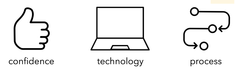
Organizations don’t feel confident that they can work with data at all, so to build a data culture we prioritize building confidence through small, focused activities. The technology that they think they need to work with data is daunting, expensive, and requires technical expertise, so our approach focuses on approaches that don’t rely on complex technology.  Organizations don’t have a good process for starting to work with data, so we introduce a step-by-step approach with hands-on activities.

We’re trying to help here by creating the “Data Culture Project” – you can expect to hear more about that early next year.  This gives organizations a lightweight, self-service curriculum or video-facilitated activities.  We’re piloting that with 30 organizations right now, to learn from how they approach running these over three months within their organizations.

What is a “Data Culture”?

This phrase is becoming a bit of a buzz-word right now. So what does it mean? After lots of conversations, with organizations big and small, we’ve narrowed down to this list:

  • Leadership prioritizes and invests in data collection, management and analysis/knowledge production.
  • Leadership prioritizes creative data literacy for the whole organization, not just IT and Evaluation.
  • Staff are encouraged and supported to access, combine and derive insight from the organization’s data.
  • Staff recognize data when they see it. They offer creative ways to use the organization’s data to solve problems, make decisions and tell stories.

This four-part definition focuses on leadership and staff responsibility very intentionally.  You need buy in across the organization to really make this work. We also focus on making sure data doesn’t get siloed into one department or another. Working with data is a core skill that can be valuable across an organization.

Why Build a Data Culture?

Why bother with building a data culture?  Over the last 10 years we’ve seen a lot of data projects in our workshops and partners. These tend to cluster around three purposes.

WFP_DMC_building_a_data_culture.png

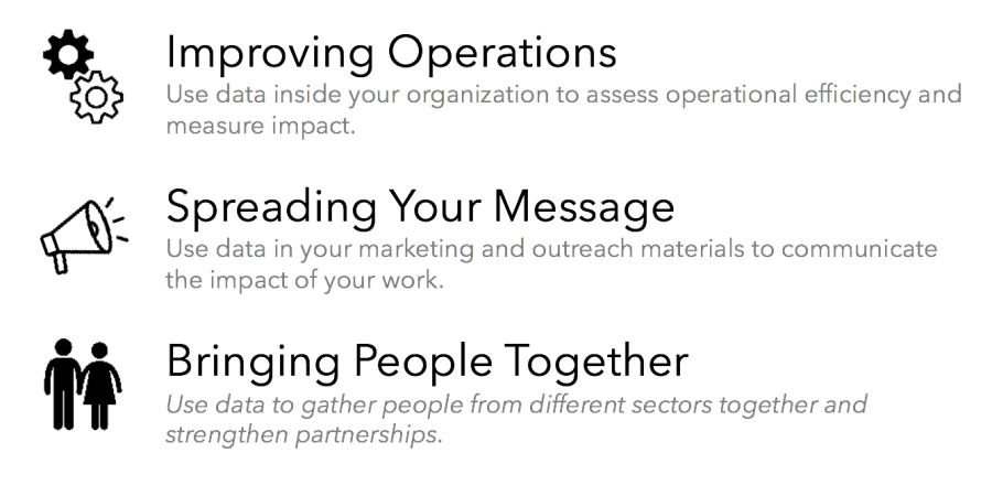
Data is most often used to improve operations;  doing things like measuring delivery performance, changing how it works, and them measuring it again to see if it improved.  One the last years we see more and more uses of data to spread a message, giving rise to infographics and other formats where data is used to show impact of programs.  Data is less-often used to bring people together, which is the focus of my work on arts-based hands-on activities, data murals, and more.  We think this third purpose is central to building a strong data culture across your organization.


Barriers to Building a Data Culture

Of course, like any organizational change, there are barriers. We’ve listed 6 that we think are useful to have in mind while thinking about any efforts you are taking to build a data culture.

Barrier #1: Confusion

Most introductions to data are confusing and overly technical.

Complicated words can alienate people that are just entering the field of working with data.  Pick your words carefully to welcome them.  For instance, you could introduce the idea of “correlation” by talking about “connections” between pieces of data that move together.

Piaget, the great educational psychologist, introduced us to the idea that people will absorb new information by “assimilating” it into their existing mindset, or change their mental model to “accommodate” it.  If you know people’s background you can make your outreach more effective. You have to understand their existing mental models if you want to introduce new information. Your goal is not to turn everyone in the organization into data scientists. A data culture means people recognize data and are able to pinpoint new opportunities for deriving knowledge and insight from it.

Tips:

  • Avoid technical jargon
  • Meet people where they are

Barrier #2: Not Knowing Your Data

Sometimes you don’t even know the data you have.

At a recent workshop we were talking with a medium-sized environmental advocacy group and they lamented not having any data about participation at recent public events.  I mentioned that I had seen photos on facebook, and how that was data they could use. They were surprised and had ignored this set of data, yet it contained exactly the data they wanted.

Remember that data can be qualitative or quantitative.  If your development director shares photos and a headcount from your last fundraiser, that’s all data. Be creative about recognizing the data you have already.

It is hard to keep track of datasets within your organization that might be related to each other.  Identify a person and a technology that can be a central clearinghouse for data.  This could be as simple as a Word document with a bulleted list, or as complex as a internal data portal.

Tips:

  • Keep your eyes and ears open
  • Build a data catalogue, or library

Barrier #3: Organizational Silos

People will fight efforts to work across silos.

We were working with a large nonprofit to build a data culture across their organization, but they were stymied by people that thought they owned the data, and were hoarding it from others as a form of job security.  The only way we found to work on it was risky – to sneakily use it and then credit its successful use to the owner retroactively.  It helped, but we can do better than that.

Most organizations suffer from these silos – independent functional units that take pains to control a slice of the overall work. You have to acknowledge these walls in order to break them down.

When you have an example of a data-centric project that cuts across existing silos, hold it up as an example to success.  This is an opportunity to have leadership show buy-in and backing for a cross-sectional approach to data.

Tips:

  • Acknowledge your weaknesses
  • Highlight successes

Barrier #4: IT-Centric Thinking

Data gets locked away in the IT department.

Over and over we hear from organizations where IT is running Tableau trainings regularly and they just can’t understand why people aren’t adopting the tool and approach.  I’m like a broken record telling them that you need to separate the tool and the process – the tool training can be owned by IT, but the process training doesn’t need to be.

You need to make sure people don’t have to go to IT to pull out the latest numbers they need. Building a data culture means making sure every part of your organization can use data, for a variety of reasons.

Just because IT owns the data technology, it doesn’t mean they should own the process of creating a data culture.  Building this capacity is better housed across multiple departments, or within the office of a Chief Data Scientist.  That can lead to invitations to build data capacity that are more fun that just boring spreadsheet trainings.

Tips:

  • Data is for everyone
  • Create more invitations to work with data

Barrier #5: Irrelevance

Staff don’t connect to many high-level data dashboards.

High-level data summaries are great for leadership, but staff can’t always connect to them.  You need to integrate data into their day-to-day operations.  You can try ideas like mainstreaming quarterly data-reports from each department, or attaching data outcomes to program reviews. If staff don’t understand and the utility and use of data they are collecting, it just becomes boring homework they have to do. This hurts not only your data culture, but also the data quality!

Showing a number of summary of some data is great, but is just the start.  Asking “so what?” is when the real culture starts to emerge.  Actionable data can help you drive your organizational goal.  If people can’t answer the “so what” question, then they don’t have the right data. Engage staff in figuring out why the data they collect is useful; they are best positioned to answer the “so what?” question.

Tips:

  • KPIs aren’t for everyone
  • Remember to ask “So What?”

Barrier #6: Boredom

Data is seen as a boring chore.

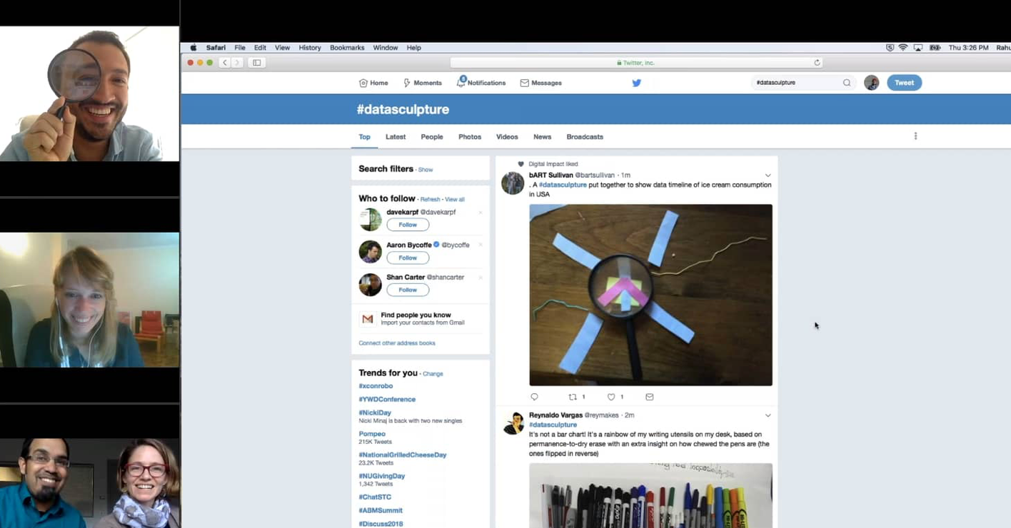
Spreadsheet-driven activities are boring to the majority of people.  Use more fun activities, in novel settings, to bring a more creative approach to data. Make data sculptures in the lobby, or paint a data mural at your next retreat.  These approaches create multiple pathways into learning how to work with data.

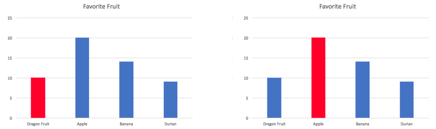
Communicating in charts and graphs is the default for presentations.  However, these don’t tell a story.  Encourage your organization to put the data in context, and talk about impact, but focusing on how to tell a story with your data rather than just introducing how to do Pivot Tables. People like telling stories, and get interested and engaged in hearing them.

Tips:

  • Use creative data-centric activities
  • Tell stories with your data

Building Your Data Culture

Each organization is different.  Hopefully this high-level summary of some of our latest thinking helps inspire ideas what might work for you.  In future posts we’ll dig into more concrete ways to build a data culture, the motivations behind them, and how they are working for various partner organizations we work with.

This post is based on a presentation Catherine D’Ignazio and I gave to non-profit leaders convened by the Stanford Social Innovation Review. Thanks to Catherine D’Ignazio and Ethan Zuckerman for feedback and edits.

Fight the Quick Chart Buttons

I despise the “quick chart” buttons. This post explains why, and tries to help you go from making charts to telling stories.

Here’s an example of the quick chart buttons in Excel:

CreateHorizontalBarChart_png_733×514_pixels.png
Excel’s list of chart buttons doesn’t help you pick the right chart to show your data.  Caveat: newer versions try to help with a “Recommended Charts” option.

Most of our chart-making tools don’t help us pick the best chart to tell our data story, and this is a big problem for chart makers. They just offer up a set of options to let you quickly make a chart. That doesn’t help you put together a data story! We just end up with lots of bar charts and line charts 😦

I love chart picker guides like the PolicyViz’s Graphic Continuum, Abela’s Chart Suggestions, and the FT’s Visual Vocabulary.  These guides reframe the question of picking a chart as a question of identifying your story. That is a crucial distinction.

The visual depiction of information in a chart is an editorial process, not some objective representation of the data. The visual mapping of the data onto shape, color, position, and size are all subjective choices you should be making make. These should be conscious decisions, not at the mercy of some tytranical default button. The result of all these decisions should be a chart that is closer to a story then simple raw data.

Look at the difference between these two charts for an example:

compare-charts.png
Same data; different story.

The chart on the left might tell a story about Dragon Fruit underselling as compared to other fruits.  The chart on the right might tell a story about apples being a dominant player in the market that needs to be fought.  These are two very different stories; and all I did was change the color of one bar!

The key question is: what is your story? what chart can help you tell that story?

Anyway, back to the quick chart buttons. They don’t help you pick which chart to make! Bar charts are good for showing comparisons between a few categories within a dataset. What about when you want to show changes over time (line chart)? Or a distribution of two variables (scatter plot)?  Or the promotional share of one category compared to the total (pie chart)?

Different stories demand different charts.  So next time you’re putting a chart together, start by thinking about the type of data story you’re trying to tell. Then use a guide to find the right chart to show it. Don’t be seduced by the promised simplicity of the “quick chart” button!

Approaches to Teaching Data for Non-Profits

Recently The National Neighborhood Indicators Partnership and Microsoft Civic Technology Engagement Group launched a project to expand training on data and technology to improve communities.  I’m pleased they’ve included Data Therapy as one of the resources they highlight to help you think about building your data culture.  Check out their training guide and their catalog of resources!

training_pic

On a related note, if you are someone that does a lot of training and capacity building, or an organization that wants to be doing that, checkout the podcast and recording of a conversation about enabling learning with School of Data.