Tools Won’t Write Your Data Story For You

When people think about working with data, they usually think about the technologies that help us capture, manipulate, and make arguments with data. Over the last decade we’ve seen radical growth and innovation in the toolchains available to do this, leading to a huge increase in the number of people that have started working with data in some capacity. For data literacy learners, it is tempting to let the tool dictate the outcomes. Need to make a chart? Let the tool recommend one. The problem is that these tools don’t help you with the process of working with data. The tools won’t write your data story for you — you have to run that process yourself. Here are a couple of examples that help illuminate this gap that I see, and how my work with Catherine D’Ignazio on the Data Culture Project helps address it.

Excel doesn’t help you ask the right questions

When you’re first starting to work with a dataset on some problem, it is critical to frame a good set of questions aligned with your goals. Do you have a hypothesis that you are trying to test? Is there a specific audience you are trying to engage with the data? What assumptions do you bring to the data? Tools like Excel help you dive in to a dataset with low friction, but can’t help you identify the right questions to ask. Sometimes you need to take a step back and think about what you’re trying to achieve.

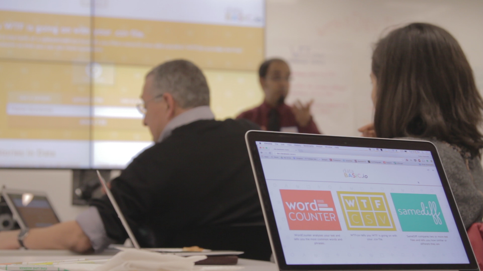
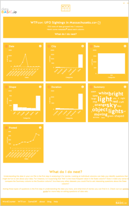
We created our “Ask Good Questions” activity to introduce this idea. You use our WTFcsv tool to browse quick visual summaries of columns in your dataset, and then brainstorm questions that could be interesting to ask it, other datasets that might help you answer those questions, and how you’d get those datasets. You don’t try to answer the questions at this initial phase, you just capture them all as potential roads to follow.

A photo a from workshop in Boston, MA, USA where we tested some of these activites.

Diving into one dataset can be like putting on blinders; it limits your ability to see the possibilities outside of that single dataset. You have to take a step back to consider questions that might require you to pull in and use other datasets. Tools can’t do this for you; it is up to you to make the effort to distance yourself from where you start in order to make sure you stay on target for you goals with the data.

Tableau won’t write you a strong narrative arc

Humans think and understand the world through stories. Background context, strong characters, a clear flow from start to end — these are the key elements of story that help engage us all. Telling stories and making arguments with data is no different. Tools like Tableau can be very powerful for helping us debug the visual representation of our data stories, but they don’t scaffold the process of coming up with the narrative arc. Which characters appeal to the audience we have in mind? What resolution of our data story will drive action towards the goals we want?

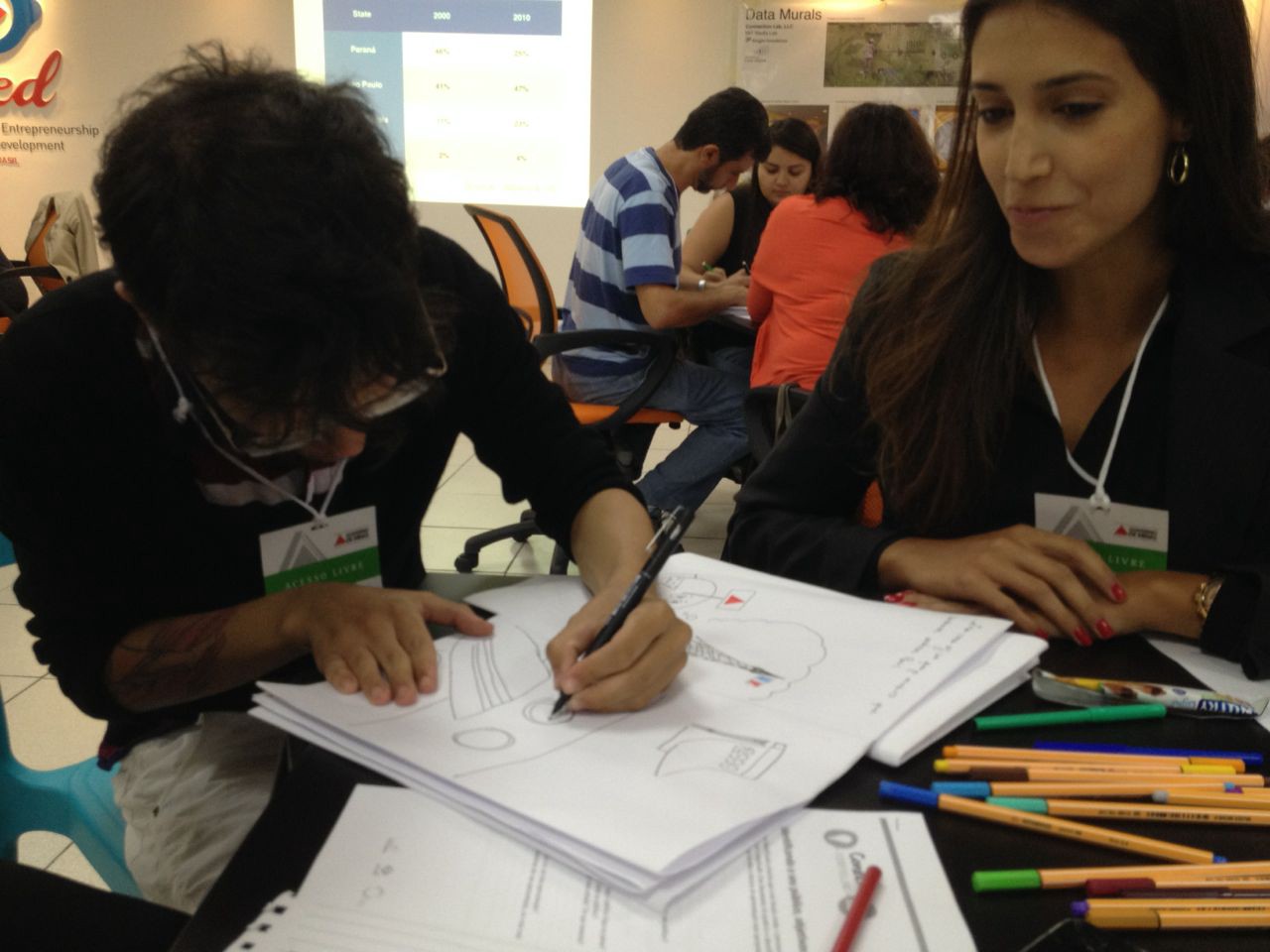
Our “Data Storybook” activity helps you prototype your data story’s narrative arc. Once you’ve got a story to tell, follow our instructions to fold a big piece of paper into a small storybook. Then use comic-book or children’s-book style illustrations to tell your story over three page flips. Your book has to say “once upon a time” on the front cover, and say “the end” on the back cover. There is something magical about the page turn… it forces you to think about the beginning, middle and end of your story. This is how you work on a strong narrative arc.

Participants at a workshop in Belo Horizonte, Brazil, writing a data storybook.

When you’re telling a data story, you have to make sure the flow is supported at each point by the data you include. Any data you include must reinforce and connect to the main narrative arc, no matter how detailed it is, otherwise you’re going to lead your intended audience astray and lose them in a confusing non-central plot-line. The tools can’t do this process for you.

R can’t help you pick the right way to tell your story

Once you’ve got a strong narrative with your data, how do you decide what format to tell it in? This decisions has to be driven by strong definitions of your audience and goals. Tools like R can’t make those connections for you; you have to consider the constraints yourself. Will readers have the visual literacy and geographic awareness that it takes to read a map visualization? Are they pre-disposed to agree or disagree with you? Are you presenting in a formal setting to an engaged audience, or on the street at a festival? These kinds of questions are critical for making an informed decision about what medium to tell your data story in.

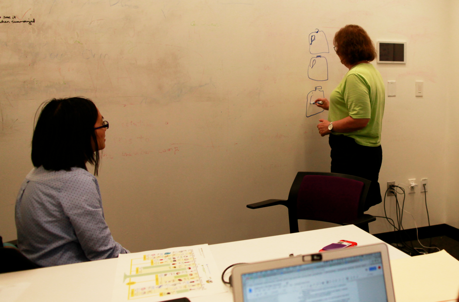
We built our “Remix an Infographic” and “ConvinceMe” activities to help you work on this skill. The first invites you to look at the argument an infographic is making and then try to “remix it” — telling the same story as a data sculpture, creative map, personal story, or data game. Understanding the affordances of each media is critical for picking an appropriate one for your audience and goal. The second activity, ConvinceMe, helps you practice brainstorming data arguments that can drive different audiences to action. You identify stakeholders that can effect change on the system your dataset represents, invite volunteers to role play them, and then collectively try to drive them to action with creative data-informed arguments.

Workshop participants in Boston, MA, USA planning out their remix on a whiteboard.

Any dataset contains a multitude of potential stories, all of which can be told in a variety of ways. The digital tools that exist don’t help you navigate that space to pick the best story, nor tell it in the more appropriate way.

Working with Data Relies on Strong Processes and Strong Tools

People think about technology as soon as you mention data. I hope these example help illustrate why I think it is so important to separate the issues of the processes and technological tools for working with data. The innovative tools can only help you so much.

Organizations around the world are using these activities I mentioned to work on the process pieces, often in parallel with their work introducing technological platforms. Non-profits, newsrooms, libraries — these are some of our many partners on the Data Culture Project.

Do you want to try these activities out in your organization or classroom? Visit http://datacultureproject.org now to see our free suites of tools for working with people in creative, arts-based ways at every point of the process of going from data to story.

New DataBasic Tool Lets You “Connect the Dots” in Data

Catherine and I have launched a new DataBasic tool and activity, Connect the Dots, aimed at helping students and educators see how their data is connected with a visual network diagram.

By showing the relationships between things, networks are useful for finding answers that aren’t readily apparent through spreadsheet data alone. To that end, we’ve built Connect the Dots to help teach how analyzing the connections between the “dots” in data is a fundamentally different approach to understanding it.

The new tool gives users a network diagram to reveal links as well as a high level report about what the network looks like. Using network analysis helped Google revolutionize search technology and was used by journalists who investigated the connections between people and banks during the Panama Papers Leak.

Connect the Dots is the fourth and most recent addition to DataBasic, a growing suite of easy-to-use web tools designed to make data analysis and storytelling more accessible to a general and non-technical audience launched last year.

As with the previous three tools released in the DataBasic suite, Connect the Dots was designed so that its lessons can be easily planned to help students learn how to use data to tell a story. Connect the Dots comes with a learning guide and introductory video made for classes and workshops for participants from middle school through higher education. The learning guide has a 45-minute activity that walks people through an exercise in naming their favorite local restaurants and seeking patterns in the networks that result. To get started using the tool, sample data sets such as Donald Trump’s inside connections and characters from the play Les Miserables have also been included to help introduce users to vocabulary terms and the algorithms at work behind the scenes. Like the other DataBasic tools, Connect the Dots is available in English, Portuguese, and Spanish.

Learn more about Connect the Dots and all the DataBasic tools here.

Have you used DataBasic tools in your classroom, organization, or personal projects? If so, we’d love to hear your story! Write to help@databasic.io and tell us about your experience.

What Would Mulder Do?

The semester has started again at MIT, which means I’m teaching a new iteration of my Data Storytelling Studio course.  One of our first sessions focuses on learning to ask questions of your data… and this year that was a great change to use the new WTFcsv tool I created with Catherine D’Ignazio.

wtf-screenshotThe vast majority of the students decided to work with our fun UFO sample data.  They came up with some amazing questions to ask, with a lot of ideas about connecting it to other datasets.  A few focused in on potential correlations with sci-fi shows on TV (perhaps inspired by the recent reboot of the X Files).

One topic I reflected on with students at the close of the activity was that the majority of their questions, and the language they used to describe them, came from a point of view that doubted the legitimacy of these UFO sightings.  They wanted to “explain” the “real” reason for what people saw.  They were assuming that the sightings were people imagining what they saw was aliens, which of course couldn’t be true.

Now, with UFO sightings this isn’t especially offensive.  However, with datasets about more serious topics, it’s important to remember that we should approach them from an empathetic point of view.  If we want to understand data reported by people, we need to have empathy for where the data reporter is coming from, despite any biases or pre-existing notions we might have about the legitimacy of the what they say happened.

This isn’t to say that we shouldn’t be skeptical of data; by all means we should be!  However, if we only wear our skeptical hat we miss a whole variety of possible questions we could be asking our dataset.

So, when it comes to UFO sightings, be sure to wonder “What would Mulder do?” 🙂

Visualizing to *Find* Your Data Story

I consistently run across folks interested in visualizing a data set to reveal some compelling insight, or tell a strong story to support an argument.  However, the inevitably focus on the final product, rather than the process to get there.  People get stuck on the visual that tells their story, forgetting about the visuals that help them find their story.   The most important visualizations of your data are the ones that help you find and debug your story, not the final one you make to tell your story.  This is why I recommend Tableau Public as a great tool to learn, because its native language is the visual representation of your data.  Excel’s native language is the data in a tabular form, not the visuals that show that data.

Here are some other tools I introduce in the Data Scraping and Civic Visualization short course I teach here at MIT (CMS.622: Applying Media Technologies in Arts and Humanities).

  • Use word clouds to get a quick overview of your qualitative text data (try Tagxedo)
  • Tools Overview:find all of these on netstories.org website
  • Use Quartz ChartBuilder to make clean and simple charts, without all the chartjunk
  • Use timelines to understand a story over time (try TimelineJS)
  • Experiment with more complicated charting techniques with Raw (a D3.js chart generator)
  • Make simple maps with Google Maps, analyze your data cartographically with CartoDB, or make your own with Leaflet.js
  • Test your story’s narrative quickly with a infographic generator like Infogram

Curios for more?  See own netstories.org website for more tools that we have reviewed.

Announcing DataBasic!

I’m happy to announce we received a grant from the Knight Foundation to work with Catherine D’Ignazio (from the Emerson Engagement Lab) on a new suite of tools called DataBasic!  Expect to see more here as we build out this suite of tools for Data Literacy learners over the fall.  Follow our progress over on DataBasic.io.

Knight_Prototype_Fund_-_Knight_Foundation

We propose to create a suite of focused and simple tools for journalists, data journalism classrooms and community advocacy groups. Though there are numerous data analysis and visualization tools for novices there are some significant gaps that we have identified through prior research. DataBasic is designed to fill these gaps for people who do not know how to code and provide a low barrier to further learning about data analysis for storytelling.

In the first iteration of this project we will build three tools, develop three training activities and run one workshop with journalists and students for feedback. The three tools include: (1) WTFcsv: A web application that takes as input a CSV file and returns a summary of the fields, their data type, their range, and basic descriptive statistics. This is a prettier version of R’s “summary” command and aids at the outset of the data analysis process. (2) WordCounter: A basic word counting tool that takes unstructured text as input and returns word frequency, bigrams (two-word phrases) and trigrams (three-word phrases) (3) TuffyDuff: A tool that runs TF-IDF algorithms on two or more corpora in order to compare which words occur with the most frequency and uniqueness.

“Tidying” Your Data

Recently I’ve been giving more workshops about cleaning data.  This step in the data cycle often takes 80% of the time, but is seldom focused on in a systematic way.  I want to address one topic that keeps coming up – what is clean data?

When I ask, I usually get answers all over the map.  I tend to approach it from four topics:

  • consistency: are observations always entered the same way?
  • completeness: do you have full coverage of the topic?
  • usability: is your data human readable, or machine readable, in the ways you need it to be?
  • atomicity: do the rows hold the correct basic units for your analysis?

The last topic, atomicity, is one I need a better name for.  In any case, I want to tease it apart a bit more because it is critical.  Wickham’s Tidy Data paper has a great way of talking about this:

each variable is a column, each observation is a row, and each type of observational unit is a table

Yes, someone wrote a whole 24 page paper on how to make sure your columns are right.  And yes, I read it and enjoyed it.  You should go read it too (at least the first few pages). The key point is that far too many tabular datasets have column headers that are, in fact, part of the data.  For instance if you are keeping track of how many times something happens each year, each year shouldn’t be a column header; “year” should be a column and you should have one row for each year.  For you excel junkies, this means your raw data shouldn’t be in cross-tab format.

This process of cleaning your data to make it tidy can be annoying, buy luckily there are tools that can help.  Tableau has a handy plugin for Excel that “reshapes” your data to prep it for analysis.  If you are an R wizard, here is a presentation on how do tidying operations in R.  If you use Google Sheets, there is a Stack Overflow post that has some details on a plugin someone wrote to normalize data in Google Sheets.

I hope that helps you in your next data-cleaning task.  Hooray for tidy data!

Architectures for Data Security

This is a summary of one section of my workshop on Data Architectures at the SSIR Data on Purpose workshop.

Data security is a tricky concept for for organizations large and small.  In this post I’m going to lay out how I approach helping these groups come up with a comprehensive strategy that meets their needs.

Core Questions

There are a few questions you need to ask yourself before you can think about what security means for data and organization:

  • what does security mean for us?
  • what level for data security is right for us?
  • what kind of protections do we need in place?

These focus as much on technological solutions as social processes.  Security is fraught with problems, and I’m by no means an expert.  However, I want to share some frameworks that might help you get started.  I’ll use two ways to think about security – access and longevity.

Access as a Security Issue

Most folks approach security from this perspective.  Who is allowed to add, see, and manage the data?  You can think about four issues within this:

  • technical vulnerabilities – This is about software and hardware systems you put in place to protect your data.  Can your systems be broken into?
  • social vulnerabilities – This issue about about how the social dimension of people can create problems for security.  How can someone be tricked into giving their key that gets past the technical defenses?
  • external threats – This issue is about the classic model definition of someone “hacking” into your systems to get your data.  You need to understand who the threats might come from, and how they might try to get in.
  • internal threats – This is about understanding your organization.  What’s the risk that someone inside your organization will, due to ignorance or malice, give out some of your sensitive data?

The conversations tend to revolve around technical vulnerabilities from external threats… so I’ll focus on the opposite.  You need to remember that sometimes your data can get out by accident!

For instance, the Basecamp project management software had an accidental leak a few years ago. They wanted to celebrate their 100 millionth file upload so one of their staff shared the name of the file.  That might, at first, seem innocuous, however this symbolic release of information that should be private led to outrage from their community of users. If they released this simple filename, what might they release next?  This social vulnerability form an internal staff member created a serious breach of trust.  You need to think about these less-commonly considered security issues to really understand what security means for you.

Longevity as a Security Issue

Working with social change organizations, I find it is useful to remind folks that data has a lifespan.  The longevity of your data is a big security issue that you need to consider.  Who manages it in the long term?  What are your commitments to honor data retention and access policies over time? You need to consider:

  • secondary uses: What future uses might your data lend itself too?
  • data validity: Is the time of your data collection clear?  What should people who try to use it in the future be aware of?
  • data integrity: Does your data change over time?  Do you have a way to tell when it was last updated?  Are you clear about its context?
  • data ownership: Who owns your data? Is there a period of time after which you plan to release it? What happens to it if you organization disappears?

Here’s an example: a 1980s research paper looked back at the archives of the 1964 Freedom Summer project.  The researchers looked back at the enrollment forms for the people who volunteered to try and determine what the best predictors of participation were.  This kind of re-use of data 20 years after the fact is the kind of usage you need to consider.

Policies & Practices

So how do you craft policies and put them into place.  The key consideration is that they need to match your needs.  You have to take stock of the existing patterns people have and try to accomodate and build off of them.  It’s best to engage the key players in your data’s lifecycle early, so they have ownership of the system you put in place.  This “meeting people where they are” approach doesn’t mean you can’t create a strict policy about data use, but it does create an environment where your policies are more likely to succeed.


Paper on Designing Tools for Learners

On an academic note, I just published a paper in for the Data Literacy workshop at the WebSci 2015 conference.  Catherine D’Ignazio and I wrote up our approach to building data tools for learners, not users.  Here’s the abstract, and you can read the full paper too.

Data-centric thinking is rapidly becoming vital to the way we work, communicate and understand in the 21st century. This has led to a proliferation of tools for novices that help them operate on data to clean, process, aggregate, and vi- sualize it. Unfortunately, these tools have been designed to support users rather than learners that are trying to develop strong data literacy. This paper outlines a basic definition of data literacy and uses it to analyze the tools in this space. Based on this analysis, we propose a set of pedagogical design principles to guide the development of tools and activities that help learners build data literacy. We outline a rationale for these tools to be strongly focused, well guided, very inviting, and highly expandable. Based on these principles, we offer an example of a tool and accom- panying activity that we created. Reviewing the tool as a case study, we outline design decisions that align it with our pedagogy. Discussing the activity that we led in aca- demic classroom settings with undergraduate and graduate students, we show how the sketches students created while using the tool reflect their adeptness with key data literacy skills based on our definition. With these early results in mind, we suggest that to better support the growing num- ber of people learning to read and speak with data, tool de- signers and educators must design from the start with these strong pedagogical principles in mind.

Tools for Data Scraping and Visualization

Over the last few weeks I co-taught a short-course on data scraping and data presentation for.  It was a pleasure to get a chance to teach with Ethan Zuckerman (my boss) and interact with the creative group of students! You can peruse the syllabus outline if you like.

In my Data Therapy work I don’t usually introduce tools, because there are loads of YouTube tutorials and written tutorials.  However, while co-teaching a short-course for incoming students in the Comparative Media Studies program here at MIT, I led two short “lab” sessions on tools for data scraping, interrogation, and visualization.

There are a myriad of tools that support these efforts, so I was forced to pick just a handle to introduce to these students.  I wanted to share the short lists of tools I choose to share.

Data Scraping:

As much as possible, avoid writing code!  Many of these tools can help you avoid writing software to do the scraping.  There are constantly new tools being built, but I recommend these:

  • Copy/Paste: Never forget the awesome power of copy/paste! There are many times when an hour of copying and pasting will be faster than learning any sort of new tool!
  • Import.io: Still nascent, but this is a radical re-thinking of how you scrape.  Point and click to train their scraper.  It’s very early, and buggy, but on many simple webpages it works well!
  • Regular Expressions: Install a text editor like Sublime Text and you get the power of regular expressions (which I call “Super Find and Replace”).  It lets you define a pattern and find it in any large document.  Sure the pattern definition is cryptic, but learning it is totally worth it (here’s an online playground).
  • Jquery in the browser: Install the bookmarklet, and you can add the JQuery javascript library to any webpage you are viewing.  From there you can use a basic understanding of javascript and the Javascript console (in most browsers) to pull parts of a webpage into an array.
  • ScraperWiki: There are a few things this makes really easy – getting recent tweets, getting twitter followers, and a few others.  Otherwise this is a good engine for software coding.
  • Software Development: If you are a coder, and the website you need to scrape has javascript and logins and such, then you might need to go this route (ugh).  If so, here’s a functioning example of a scraper built in Python (with Beautiful Soup and Mechanize).  I would use Watir if you want to do this in Ruby.

Data Interrogation and Visualization:

There are even more tools that help you here.  I picked a handful of single-purpose tools, and some generic ones to share.

  • Tabula: There are  few PDF-cleaning tools, but this one has worked particularly well for me.  If your data is in a PDF, and selectable, then I recommend this! (disclosure: the Knight Foundation funds much of my paycheck, and contributed to Tabula’s development as well)
  • OpenRefine: This data cleaning tool lets you do things like cluster rows in your data that are spelled similarly, look for correlations at a high level, and more!  The School of Data has written well about this – read their OpenRefine handbook.
  • Wordle: As maligned as word clouds have been, I still believe in their role as a proxy for deep text analysis.  They give a nice visual representation of how frequently words appear in quotes, writing, etc.
  • Quartz ChartBuilder: If you need to make clean and simple charts, this is the tool for you. Much nicer than the output of Excel.
  • TimelineJS: Need an online timeline?  This is an awesome tool. Disclosure: another Knight-funded project.
  • Google Fusion Tables: This tool has empowered loads of folks to create maps online.  I’m not a big user, but lots of folks recommend it to me.
  • TileMill: Google maps isn’t the only way to make a map.  TileMill lets you create beautiful interactive maps that fit your needs. Disclosure: another Knight-funded project.
  • Tableau Public: Tableau is a much nicer way to explore your data than Excel pivot tables.  You can drag and drop columns onto a grid and it suggests visualizations that might be revealing in your attempts to find stories.

I hope those are helpful in your data scraping and story-finding adventures!

Curious for More Tools?

Keep your eye on the School of Data and Tactical Technology Collective.

Map-Making for the Masses

Here’s a short story about helping my friends at the Metrowest Regional Center for Healthier Communities create some maps, and my reflections about existing efforts to make map-making easier.  Short story – it worked, but being a big computer dork helped.

The issue at hand was their desire to create a map of the Community Health Network Areas (CHNAs) in Massachusetts, colored by a variety of data indicators.  They had various goals and audiences in mind.  Many Eyes makes it easier to map towns in Massachusetts, but these CHNA borders don’t line up with towns so we couldn’t use that.  I decided to try another tool, Google Fusion Tables, because I knew it could import arbitrary geographic shapes.  After some digging I found that the Massachusetts Oliver online GIS tool had a layer for CHNA boundaries.  Even better, Oliver has KML output! Bingo. After looking through the various files I downloaded from the Oliver website, I was able to guess which one I needed to upload to Fusion Tables.  With that, and some text changes in the resulting table, I was able to create a template my colleagues could use to create colored map visualizations for the CHNAs.  Here’s an example map with some random fake data.  Success!

So what’s the point?  Well, I like to talk about how the barrier to entry for creating data presentations has been lowered by new technologies.  Mapping is one area where this is particularly true – the idea that anyone can make and share a map using tools like Google Maps is truly astounding.  That said, there is often a rocky transition when you try to deal with real data.  This map was much easier to generate thanks to Fusion Tables, but still required me:

  • learning the Fusion Tables model and user interface for data and visualizing
  • understanding what GIS layers are
  • navigating the GIS-centric Oliver website to find the CHNA layer that I cared about
  • understanding the difference between the GIS files to know which KML to import into Fusion Tables

….and more.  So it was convenient that I’m a computer geek who didn’t have too hard of a time figuring that stuff out.

Tools have made it easier, but as I’ve pointed out before you still need to learn a lot.  This is why I don’t call tools like Fusion Tables “easy to use” on my tool matrix.  When the rubber hits the road for map-making, sometimes you need to put on your GIS hat and pretend you know what you’re doing.