
I despise the “quick chart” buttons. This post explains why, and tries to help you go from making charts to telling stories.
Here’s an example of the quick chart buttons in Excel:
Most of our chart-making tools don’t help us pick the best chart to tell our data story, and this is a big problem for chart makers. They just offer up a set of options to let you quickly make a chart. That doesn’t help you put together a data story! We just end up with lots of bar charts and line charts 😦
I love chart picker guides like the PolicyViz’s Graphic Continuum, Abela’s Chart Suggestions, and the FT’s Visual Vocabulary. These guides reframe the question of picking a chart as a question of identifying your story. That is a crucial distinction.
The visual depiction of information in a chart is an editorial process, not some objective representation of the data. The visual mapping of the data onto shape, color, position, and size are all subjective choices you should be making make. These should be conscious decisions, not at the mercy of some tytranical default button. The result of all these decisions should be a chart that is closer to a story then simple raw data.
Look at the difference between these two charts for an example:
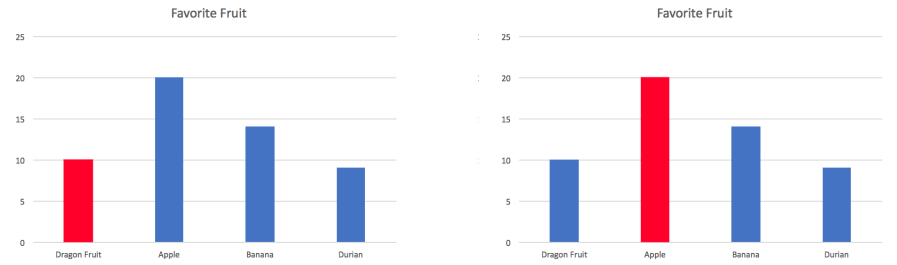
The chart on the left might tell a story about Dragon Fruit underselling as compared to other fruits. The chart on the right might tell a story about apples being a dominant player in the market that needs to be fought. These are two very different stories; and all I did was change the color of one bar!
The key question is: what is your story? what chart can help you tell that story?
Anyway, back to the quick chart buttons. They don’t help you pick which chart to make! Bar charts are good for showing comparisons between a few categories within a dataset. What about when you want to show changes over time (line chart)? Or a distribution of two variables (scatter plot)? Or the promotional share of one category compared to the total (pie chart)?
Different stories demand different charts. So next time you’re putting a chart together, start by thinking about the type of data story you’re trying to tell. Then use a guide to find the right chart to show it. Don’t be seduced by the promised simplicity of the “quick chart” button!

You must be logged in to post a comment.