Play the video below to see my 5 minute talk about Data Therapy. It shares some of my latest thinking about why we need to focus more on capacity building with community organizations.
Category: meta
Thanks to the provocation of a Boston Hacks/Hackers MeetUp, I tried out a new way of talking about the a process for Data Therapy. Most children in American learn about the five Ws in the context of how to report a story like a journalist – discuss the who, what, when, where and why. This provides a nice metaphor for the way that I talk about the process of making a creative presentation of your data!
- The Who – identify your audience as well as you can
- The What – find and characterize your data-driven story so you understand it fully
- The When & Where – respect the context your audience will be in when seeing your presentation
- The Why – be clear to yourself about your goals, and try to identify your audience’s
- The How – pick an appropriate technique for your presentation and try it out
I know, the last one isn’t a W, but according to Wikipedia that has historical precedent!
The key problem here is that few resources exist to help you pick the How based on the who/what/when/where/why! I’ll expand on this more later, but we need to build scaffolding to help people pick appropriate data presentation techniques based on their data, audience and goals. Is a heat-map or bar graph better for my data? Should I use a stand-up / sit-down physically activity or a pie-chart? These are the central questions I’m trying to help people solve with my Data Therapy workshops.
Like many organizations, we continue to work on how to best evaluate the impact of the trainings we do. As a baseline at any workshop we do a pre/post survey asking people about their comfort with presenting their data. Here are the results of our recent webinar and summer workshops.
November Webinar
This is a little crayon chart of people’s answers to the question “How comfortable do you feel right now with your ability to present your data?”. Their response before the webinar is on top, and their answers after the webinar are below.
You can see that a lot of people moved from the “I’m lost” side towards the “I’m an expert side”! So our webinar increased people’s comfort level in their ability to creatively present their data. This is really helpful feedback for us. Longer term impacts are harder to judge, because folks haven’t taken the ideas back to their data presentation problems yet.
July Workshops
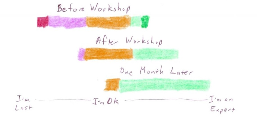
That said, after holding the July workshops we followed up with the same question in August – so got people’s answers to the same question before the workshop, after it, and one month later. Here are those results, again to the question “How comfortable do you feel right now with your ability to present your data?”:
Same result – people were more comfortable with the idea of presenting their data after the workshop. On top of that, we are seeing the impact being “sticky” – even one month later people still feel more comfortable.
Concrete Examples of Impact?
Of course, measuring people’s confidence is just one way to think about this. I’m particularly interested in it because other data tells me that comfort and confidence is a big barrier to trying out some of these techniques. However, this question doesn’t address the concrete impacts of the training.
Towards that goal we tried to collect some success stories to hear about the impact on real data presentations… but we only got a few response. One participant got inspiration from the evocative image technique, saying:
I was struck by the example in the workshop where the boring health pamphlet stand was juxtaposed with the attractive ice cream machine, and used a similar approach for designing our advocacy piece. This piece will involve showing sets of side-by-side pictures comparing the environments of housed and homeless children, punctuated each time by a line graph that progressively shows how each environmental factor widens the gap in educational preparedness.
Doing assessment is always a challenge, but we feel like we’re off to a good start by integrating a variety of simple forms into our work already. If we think of other novel ways to collect and present this you’ll hear about it for sure!
PS: for reference, here is my diverging-data crayon color pallet of choice:
- I’m an expert – shamrock
- I’m pretty good – magic mint
- I’m ok, but could use more help – orange
- I’m a little lost – purple pizazz
- I’m completely lost – maroon
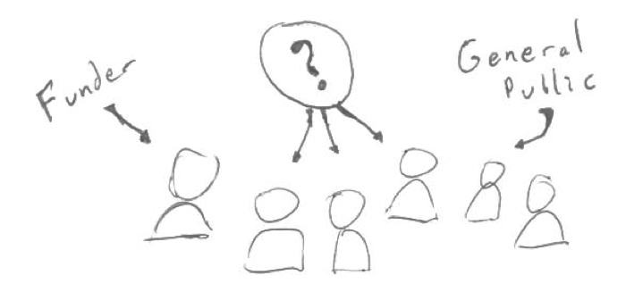
Defining your audience is 90% of what it takes to create an effective data presentation. This is hard to do. Sometimes there are multiple audiences you’re trying to talk to at the same time. One of the key ideas that can help you define your audience is to think about their literacy.
I’m using the word in more than it’s typical “I can read well” kind of way. Here are some questions you should ask yourself:
- How literate is my audience about the issue I’m presenting?
- What pictures or graphs are most appropriate for their visual literacy level?
- How literate is the audience about me and where I’m coming from as a presenter?
The answers to these questions should inform what data presentation technique you pick. When talking about creative data presentation options, a common comment I hear is that some parts of the audience want to see the “real” data – where real means “numbers in a table.” To that I say fine, all well and good. Supply a handout or an appendix that includes the data in tabular form. That lets you please the traditional numbers people, but doesn’t stop you from engaging the rest of us that get bored by long lists of numbers.
What You Should Do:
Flesh out the definition of your audience(s) by thinking about their literacy. Use different and/or multiple techniques based on their background and knowledge. Remember that their literacy will increase as you present, so don’t be complexity-phobic.
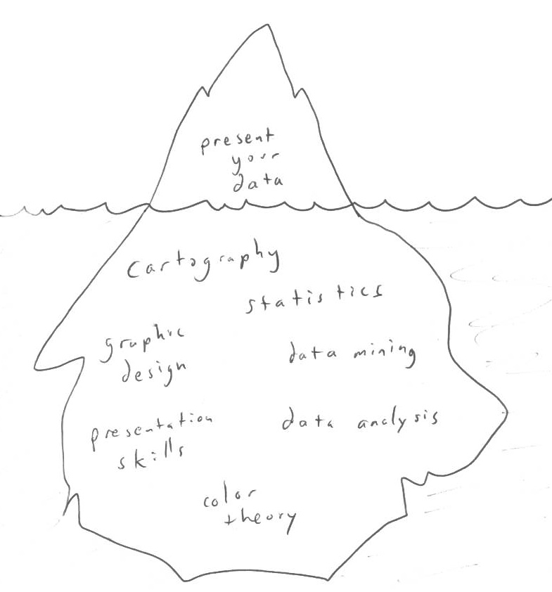
I think many approaches to psychotherapy are about revealing what lies under the surface, so lets carry on in that tradition… when you think about presenting your data, don’t ignore all the fields of study you are building on – the presentation is just the tip of the iceberg.

Cartography, graphic design, statistics, color theory – you will leverage pieces from all these domains to build your creative data presentations. Each of these is a discipline on its own, so don’t expect yourself to be in an expert in them all. Just remember to appreciate all the topics that lie under the surface. Acknowledging them can be helpful when you’re frustrated, because it will remind you that there is a reason this stuff is hard!
A few people have asked me for the presentations I used at the workshops I ran in July. Here are the two Prezi presentation I used at the workshop. These aren’t designed to live on their own without me narrating them, but I’ve included them here in case you want them as a reference for something:
This blog will share processes, tools and tutorials to help you present and share your data in simple and creative ways.
There is much talk right now about how we live in a time of data and visualization. There are lots of pretty pictures generated everyday by amazing coders, statistics gurus, and so on. Then there are normal people. Normal people aren’t statisticians, software developers, or graphic design experts. Normal people don’t have a budget to pay consultants. Normal people in regular jobs have data that they know can help them, and they want to use it. Normal people need Data Therapy.
This blog is the next step in the MIT Center for Civic Media’s Data Therapy project. We’ve been trying to address this need for assistance on data presentation because people are asking us for help. I’ve worked with small community groups on this for the last three years, trying to build their capacity to do their own data visualization and presentation. There are some low-hanging fruit here – we hope to introduce you to them in this blog.
Of course, being from the MIT Media Lab, I think new computers can help. Web-based tools are lowering the barriers of entry for making engaging and creative presentations of data. Rather than encouraging partnerships with epidemiologists, statisticians, or programmers, we see an opportunity to empower community organizations by building their capacity to do this work themselves. You should be the one that knows your data best, and these new tools can help you tell your story with data in exciting and creative ways.
Does this sound relevant to you? If so, welcome to Data Therapy. Please, have a seat on the couch. Tell me about your relationship with data 🙂


You must be logged in to post a comment.