Like many organizations, we continue to work on how to best evaluate the impact of the trainings we do. As a baseline at any workshop we do a pre/post survey asking people about their comfort with presenting their data. Here are the results of our recent webinar and summer workshops.
November Webinar
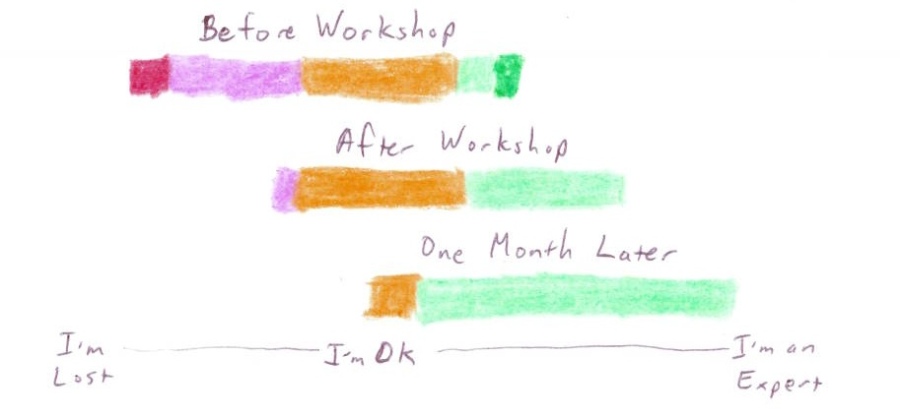
This is a little crayon chart of people’s answers to the question “How comfortable do you feel right now with your ability to present your data?”. Their response before the webinar is on top, and their answers after the webinar are below.
You can see that a lot of people moved from the “I’m lost” side towards the “I’m an expert side”! So our webinar increased people’s comfort level in their ability to creatively present their data. This is really helpful feedback for us. Longer term impacts are harder to judge, because folks haven’t taken the ideas back to their data presentation problems yet.
July Workshops
That said, after holding the July workshops we followed up with the same question in August – so got people’s answers to the same question before the workshop, after it, and one month later. Here are those results, again to the question “How comfortable do you feel right now with your ability to present your data?”:
Same result – people were more comfortable with the idea of presenting their data after the workshop. On top of that, we are seeing the impact being “sticky” – even one month later people still feel more comfortable.
Concrete Examples of Impact?
Of course, measuring people’s confidence is just one way to think about this. I’m particularly interested in it because other data tells me that comfort and confidence is a big barrier to trying out some of these techniques. However, this question doesn’t address the concrete impacts of the training.
Towards that goal we tried to collect some success stories to hear about the impact on real data presentations… but we only got a few response. One participant got inspiration from the evocative image technique, saying:
I was struck by the example in the workshop where the boring health pamphlet stand was juxtaposed with the attractive ice cream machine, and used a similar approach for designing our advocacy piece. This piece will involve showing sets of side-by-side pictures comparing the environments of housed and homeless children, punctuated each time by a line graph that progressively shows how each environmental factor widens the gap in educational preparedness.
Doing assessment is always a challenge, but we feel like we’re off to a good start by integrating a variety of simple forms into our work already. If we think of other novel ways to collect and present this you’ll hear about it for sure!
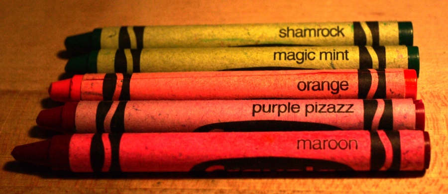
PS: for reference, here is my diverging-data crayon color pallet of choice:
- I’m an expert – shamrock
- I’m pretty good – magic mint
- I’m ok, but could use more help – orange
- I’m a little lost – purple pizazz
- I’m completely lost – maroon


One thought on “Measuring Our Impact”
Comments are closed.