The Case for Informal Visualization

Data visualization is all over the place. On the hype curve, we’re clearly up in the area of inflated expectations. If you listen to the reporting, you wouldn’t be blamed for thinking dataviz is going to bring world peace! I’m writing to beat the drum in favor of more informal presentations.  You can tell better data stories, and engage your audience more, by creating less formal data presentations.

Some Examples

What do I mean by “informal visualization”?  To start, toss out your computer, printer and graph paper. Pull our your crayons, big paper, tape, and your imagination.

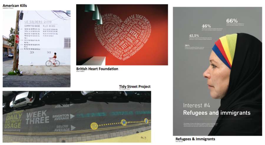
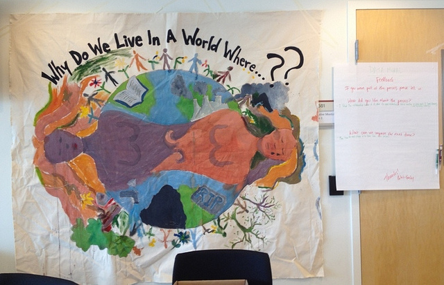
From top-left, clockwise:

Another example is the Data Mural pilots I’ve been doing with artist, facilitator (and my wife) Emily Bhargava.  We’re leading groups through finding a story in their data, creating a collaborative visual design for a mural, and then painting it! (read more on my Data Therapy blog and Emily’s Connection Lab blog).

Stuff Academics Say

I work at a university, so I have to mention some of the research in this area.  First up – there is a great paper out of the City University of London, called “Sketchy Rendering for Information Visualization“.  Basically, they get a computer to draw graphs as if they had been drawn by hand.  My main takeaway was that their “sketchy” graphs engaged people more than the more “official” looking ones with straight lines.

Secondly, the Data Stories podcast had a recent episode called “Data Sculpture” in which they spoke with people investigating physical data presentations.  If you listen to it, be prepared for a lot of academic jargon – their audience is not the general public.  My main takeaway from the paper referenced (“Evaluating the Efficiency of Physical Visualizations“) was that when people physically touched the 3d objects representing the data they did a better job understanding the data.

It’s Arts & Crafts Time

Beyond these examples, and academic rationale, making informal visualizations is just flat out more fun.  As with most things, I think there is a cultural issue involved here.  Western culture has an inexplicable (to me) emphasis on professionalism and looking like an expert. When I’ve worked in Central America, South America, and India I’ve found the professions more welcoming to informal data presentations like those I show above.  Perhaps this was due to resource constraints, but it almost always led to better sessions.

Whie doing my master’s in the Lifelong Kindergarten group here at the MIT Media Lab, I fully joined the tribe that talks about how making physical things is the best way to communicate your ideas. This “constructionism” approach has feuled all my work since then, and I see this call for informal visualization as a way to bring it to the dataviz world.

So what does this mean in practice?  For me, I’ve taken to doing less on the projector and more on paper.  I encourage community groups I work with in Data Therapy sessions to partner with local artists and schools. I push businesses and organizations to thing about their audience and goals harder before jumping into making data presentation.  (PLUG: come to my “Fight the Bar Chart” meetup here in Boston to learn more about that)

If you want to look like a “sage on the stage”, by all means be as formal as you can.  However, if you want to engage your audience around a data story, try having some art and crafts time before your next data presentaton.

 Cross-posted to the MIT Civic for Civic Media Blog

Story Finding in Food Security Data

This post is about our first Data Mural pilot project.  Read more about our Data Mural idea for some background context.

Our first Data Mural pilot is in collaboration with the Community Action Board for Food Security in Somerville, MA.  I’m excited about this because that’s the town I live in, and food access is an issue I care a lot about!  After looking at all the data they sent us, we collected together a few pages of data that we used to hold a story-finding workshop last week. Here’s a summary of the workshop.

Introductions

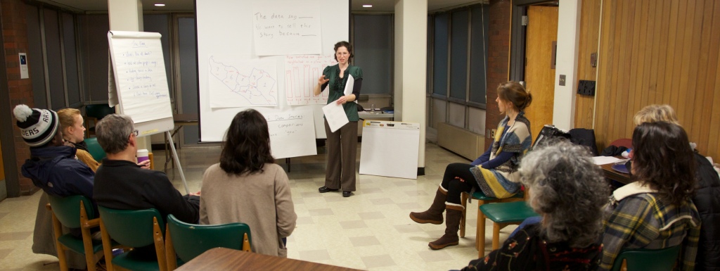
We started with a discussion of the Data Mural process we have in mind, and then went through the agenda for the evening.   My collaborator (and wife) Emily led this part of the workshops.

HE3C6801
photo by Anand Varma

Inspirations

Then I introduced some striking examples of mural-like data presentations.  I pulled together four examples from the the pinterest board I’ve been using to track inspirations.

data mural inspirations

We discussed what stories they were telling, and why they were powerful or not.  The participants had some great thoughts about the power of these presentations, based on the audiences they were intended for.  We thought it was important to give us all a shared understanding of what kind of result the workshops are leading towards.

Finding stories in data

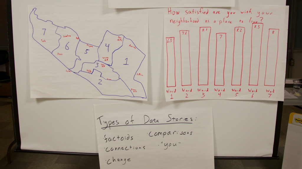
To develop a shared language and process for finding a story in data, I brought one chart from the Somerville Well-Being Survey for discussion.  It is a fun dataset, about how happy people in Somerville are.

HE3C6804
photo by Anand Varma

We talked about various types of stories that can be found in data, and discussed each in the form of:

The data say _____.  We want to tell this story because ____.

Our Food Security Data

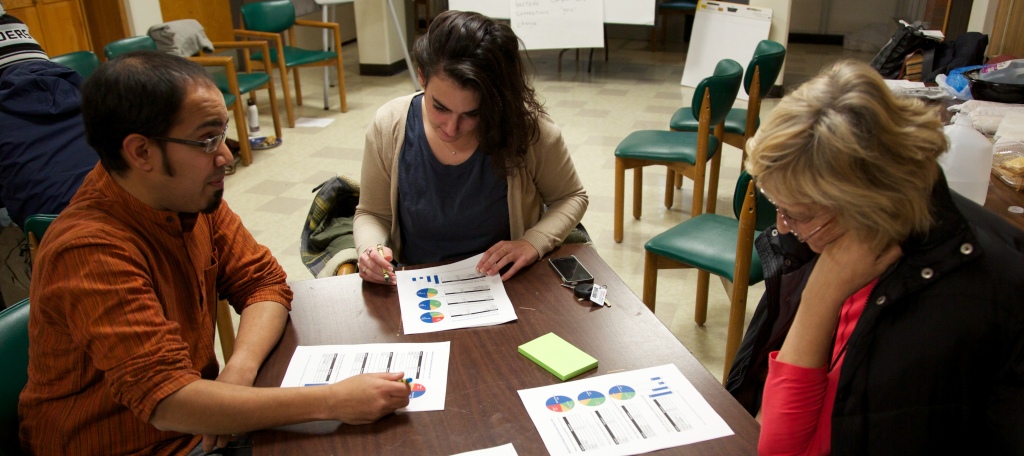
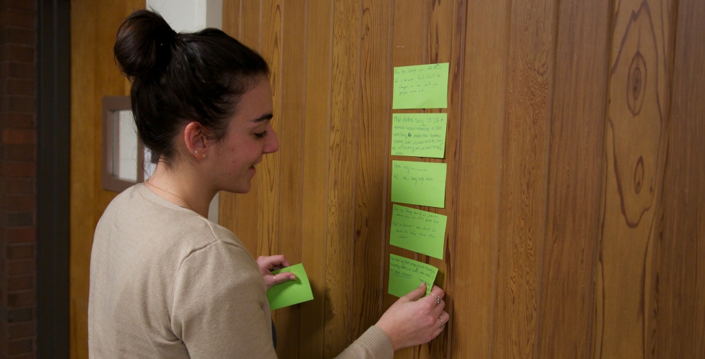
This quick exercise led right into examining the data at hand, about food security and related issues in Somerville.  Emily introduced our dataset, which we had trimmed down to a 5 page handout.  We broke out into groups and looked over the data.  We asked people to write down stories they found on stickies, in the “data say ___, want to tell because ___” format.

HE3C6809
photo by Anand Varma

People definitely struggled with the limited data set we provided.  A consistent issue is the balance between giving a full picture and telling a compelling story.  Some participants wished they had more data, to have a richer picture of the real world situation.  Others highlighted problems in the data collection methodology.  That said, everyone understood the need to work with a smaller set of data to find striking stories to tell.

Story Selection

We all stuck our post-its on the wall and Emily led us in a discussion to find similarities and narrow in on one story to tell.

HE3C6827
photo by Anand Varma

We came up with three categories:

  • stories about vulnerable groups
  • stories about people using SNAP, but more needing to sign up
  • stories about existing barriers to food security (and how we have solutions to offer)

After collaboratively coming up with a set of criteria for the best story, the group narrowed in on the last set of stories.  Focusing on barriers to food security, they came up with this data driven story to tell:

The data say that for many people food is not affordable and accessible because of the number of people living in poverty (or undocumented).  We want to tell this story because there are resources in Somerville to help.

Next Steps

We’re still reading our pre-post evaluations and suggestions from the participants, so I don’t have much to say about that for now (read some more about our approach to evaluation on Emily’s blog).  Meanwhile, we’ve got our next session scheduled for Jan 17th, and now we have a great story to turn into a compelling visual!

Curious to learn more about food security in Somerville?

Here are a few links if you are interested in this topic

Data as Disempowerment

Data is hot. That isn’t exactly a radical statement. I doubt I could find anyone to disagree. Unfortunately, using data often disempowers far too many people.

The three phases of data therapy

Most of the work on data right now is happening in the realm of “transparency” – opening up previously hidden data for others to use. I talk about all this work as the first phase of Data Therapy. It is a necessary precursor, but of course not an end in itself.

The second phase of Data Therapy involves taking data and effectively telling a story with it, based on your audience and goals. Most of my Data Therapy work has focused on this phase. I try to assist by identifying techniques for data story-telling and providing case studies to help decide when to use each technique.

The third phase of Data Therapy is about taking data full circle – helping the communities described by the data take ownership of the stories being told. This is why we’re so excited about the Data Mural that just got started!

Excuse me, do you speak data?

The thing is, the second phase (effectively telling data stories) often makes assumptions about data literacy, and ends up disempowering large swaths of the population. As we move into a world where more and more civic decisions are data-driven, those in power are becoming more data-literate. They are becoming more agile with the language of data. This approach can quickly disempower those without any data literacy.

Language has a tradition of being used to deny one class access to empowerment. The Roman Catholic Church resisted an english language bible. Techies (like me) purposefully use technical jargon to stay aloof about our wizardly. Lawyers to this day speak an unidentified language that they spend years learning in special schools!

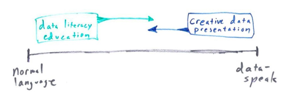
The thing is, it doesn’t have to be that way. I take two approaches to empowering people with data:

  • Present data creatively
  • Educate the public in the language of data

Being a graph nerd, I think about this on an axis. One end is “data speak”, the other “regular language”.

data axis

I’m trying to do both. Every data presentation is a trojan horse, holding within its false belly a chance to address the problem of data literacy. We need to be explicit about this if we want to overcome data’s natural tendency to disempower.

Getting Started in Data Journalism

My friends at PenPlusBytes asked me to speak at their second annual bootcamp for student journalists.  There are many people doing great work in this field, so I drew on their experience to build a short talk. I gave my thoughts, examples of techniques for data-driven journalism, and some tips & tricks.  Working with journalists has always been part of the Data Therapy project, but it was nice to get a chance to focus on it more!

Here is an audio recording of the talk, and the Prezi I used to show visuals.


What’s a Data Murals?

I want to flesh out what we have in mind for this Data Mural a bit.  We just ran our first tiny pilot, collaborating with Doctors for Global Health to create a portable mural (read more in my blog post in the Civic Media site).  I want to write here a bit more here about the larger Data Mural project we’ve just started.

Our goal is to work with community members to pilot the collaborative creation of public art pieces that represent and explore health data about their communities.

Vibrant data about community health too often sits on computers and in the hands of academics.  This project will put data in the hands of the people who live the information.  We want to work with people to create pieces of art that generate ongoing public conversation and catalyze action to improve health.

Murals are used to inspire political change all over the world and data visualizations are created regularly by academics and news agencies to share large sets of information with the public in digestible ways.  Our project seeks to harness the history and power of public murals and experiential learning to engage community members directly in public data presentation for the first time.

The process we envision involves:

  • a facilitated set of conversations that leads a small group through the exploration of existing data to identify stories that the data tell
  • narrowing the list of possible stories to choose one that the group feels should be told publicly
  • exercises to generate visual images that can help tell the story
  • collaborative creation of a single visual image that will become a mural
  • a series of group painting sessions involving the large community
  • an unveiling of the mural, accompanied by a public discussion of the mural and the data-driven story it tells


In short, we’re not quite sure what a Data Mural is yet, but we like the direction we’re going!  We’re reaching out to local community groups to find an excited partner to try out this richer version of the pilot we just did.  Drop me a line if you’re interested!

Map-Making for the Masses

Here’s a short story about helping my friends at the Metrowest Regional Center for Healthier Communities create some maps, and my reflections about existing efforts to make map-making easier.  Short story – it worked, but being a big computer dork helped.

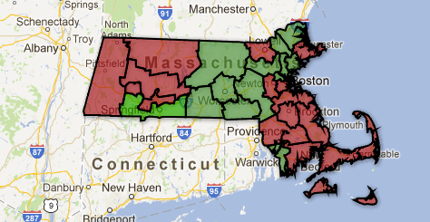
The issue at hand was their desire to create a map of the Community Health Network Areas (CHNAs) in Massachusetts, colored by a variety of data indicators.  They had various goals and audiences in mind.  Many Eyes makes it easier to map towns in Massachusetts, but these CHNA borders don’t line up with towns so we couldn’t use that.  I decided to try another tool, Google Fusion Tables, because I knew it could import arbitrary geographic shapes.  After some digging I found that the Massachusetts Oliver online GIS tool had a layer for CHNA boundaries.  Even better, Oliver has KML output! Bingo. After looking through the various files I downloaded from the Oliver website, I was able to guess which one I needed to upload to Fusion Tables.  With that, and some text changes in the resulting table, I was able to create a template my colleagues could use to create colored map visualizations for the CHNAs.  Here’s an example map with some random fake data.  Success!

So what’s the point?  Well, I like to talk about how the barrier to entry for creating data presentations has been lowered by new technologies.  Mapping is one area where this is particularly true – the idea that anyone can make and share a map using tools like Google Maps is truly astounding.  That said, there is often a rocky transition when you try to deal with real data.  This map was much easier to generate thanks to Fusion Tables, but still required me:

  • learning the Fusion Tables model and user interface for data and visualizing
  • understanding what GIS layers are
  • navigating the GIS-centric Oliver website to find the CHNA layer that I cared about
  • understanding the difference between the GIS files to know which KML to import into Fusion Tables

….and more.  So it was convenient that I’m a computer geek who didn’t have too hard of a time figuring that stuff out.

Tools have made it easier, but as I’ve pointed out before you still need to learn a lot.  This is why I don’t call tools like Fusion Tables “easy to use” on my tool matrix.  When the rubber hits the road for map-making, sometimes you need to put on your GIS hat and pretend you know what you’re doing.

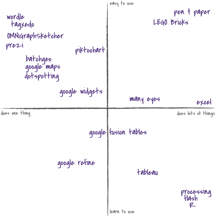
Tool Evaluation Matrix

There are a lot of tools being created to help novices create data presentations.  Honestly it is hard to evaluate which are worth learning, and which are just too cumbersome.  To give a sense of this space, for the last few years I’ve been using this tool matrix as a way to navigate that space with community organizations.

I’ve got it on two axes – the vertical is about how easy the tool is to learn, the horizontal is about how many things the tool does.  This is an incomplete on purpose – my goal isn’t to measure each tool by some arbitrary units of “ease of use”.  I want to have a representative map of the space that helps people figure out what a tool can do for them.

I’d appreciate any feedback on the utility, or futility, of this map!

The Five Ws of Data Presentation

Thanks to the provocation of a Boston Hacks/Hackers MeetUp, I tried out a new way of talking about the a process for Data Therapy.  Most children in American learn about the five Ws in the context of how to report a story like a journalist – discuss the who, what, when, where and why.  This provides a nice metaphor for the way that I talk about the process of making a creative presentation of your data!

  • The Who – identify your audience as well as you can
  • The What – find and characterize your data-driven story so you understand it fully
  • The When & Where – respect the context your audience will be in when seeing your presentation
  • The Why – be clear to yourself about your goals, and try to identify your audience’s
  • The How – pick an appropriate technique for your presentation and try it out

I know, the last one isn’t a W, but according to Wikipedia that has historical precedent!

The key problem here is that few resources exist to help you pick the How based on the who/what/when/where/why!  I’ll expand on this more later, but we need to build scaffolding to help people pick appropriate data presentation techniques based on their data, audience and goals.  Is a heat-map or bar graph better for my data? Should I use a stand-up / sit-down physically activity or a pie-chart? These are the central questions I’m trying to help people solve with my Data Therapy workshops.