
This post is about our first Data Mural pilot project. Read more about our Data Mural idea for some background context.
Our first Data Mural pilot is in collaboration with the Community Action Board for Food Security in Somerville, MA. I’m excited about this because that’s the town I live in, and food access is an issue I care a lot about! After looking at all the data they sent us, we collected together a few pages of data that we used to hold a story-finding workshop last week. Here’s a summary of the workshop.
Introductions
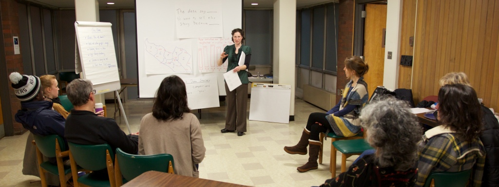
We started with a discussion of the Data Mural process we have in mind, and then went through the agenda for the evening. My collaborator (and wife) Emily led this part of the workshops.
Inspirations
Then I introduced some striking examples of mural-like data presentations. I pulled together four examples from the the pinterest board I’ve been using to track inspirations.
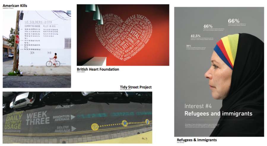
We discussed what stories they were telling, and why they were powerful or not. The participants had some great thoughts about the power of these presentations, based on the audiences they were intended for. We thought it was important to give us all a shared understanding of what kind of result the workshops are leading towards.
Finding stories in data
To develop a shared language and process for finding a story in data, I brought one chart from the Somerville Well-Being Survey for discussion. It is a fun dataset, about how happy people in Somerville are.
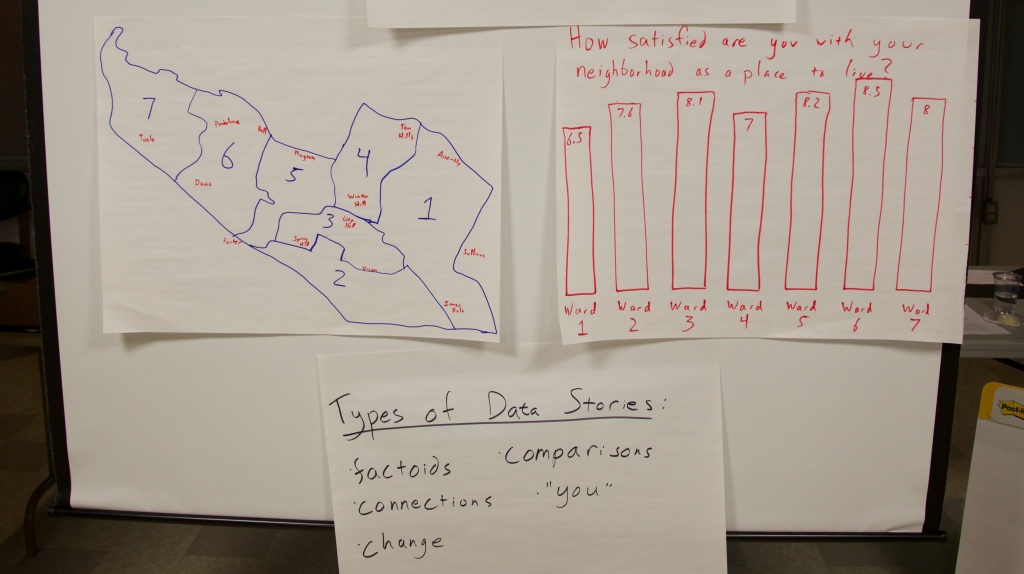
We talked about various types of stories that can be found in data, and discussed each in the form of:
The data say _____. We want to tell this story because ____.
Our Food Security Data
This quick exercise led right into examining the data at hand, about food security and related issues in Somerville. Emily introduced our dataset, which we had trimmed down to a 5 page handout. We broke out into groups and looked over the data. We asked people to write down stories they found on stickies, in the “data say ___, want to tell because ___” format.
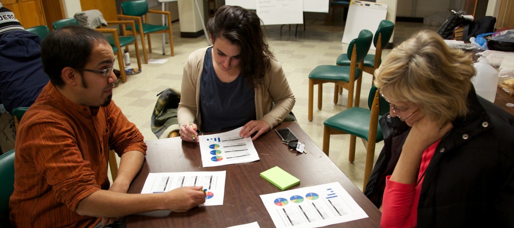
People definitely struggled with the limited data set we provided. A consistent issue is the balance between giving a full picture and telling a compelling story. Some participants wished they had more data, to have a richer picture of the real world situation. Others highlighted problems in the data collection methodology. That said, everyone understood the need to work with a smaller set of data to find striking stories to tell.
Story Selection
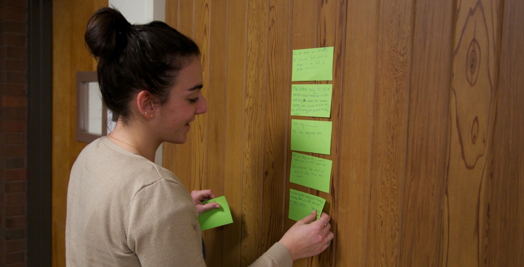
We all stuck our post-its on the wall and Emily led us in a discussion to find similarities and narrow in on one story to tell.
We came up with three categories:
- stories about vulnerable groups
- stories about people using SNAP, but more needing to sign up
- stories about existing barriers to food security (and how we have solutions to offer)
After collaboratively coming up with a set of criteria for the best story, the group narrowed in on the last set of stories. Focusing on barriers to food security, they came up with this data driven story to tell:
The data say that for many people food is not affordable and accessible because of the number of people living in poverty (or undocumented). We want to tell this story because there are resources in Somerville to help.
Next Steps
We’re still reading our pre-post evaluations and suggestions from the participants, so I don’t have much to say about that for now (read some more about our approach to evaluation on Emily’s blog). Meanwhile, we’ve got our next session scheduled for Jan 17th, and now we have a great story to turn into a compelling visual!
Curious to learn more about food security in Somerville?
Here are a few links if you are interested in this topic

4 thoughts on “Story Finding in Food Security Data”
Comments are closed.