Data Storytelling Studio – Final Projects

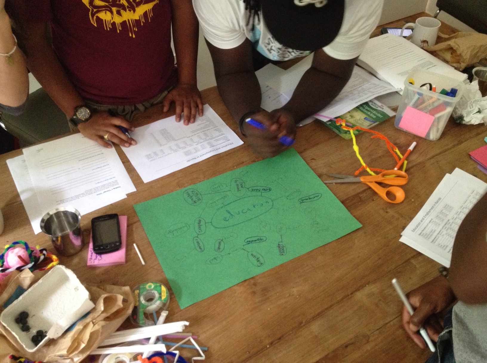
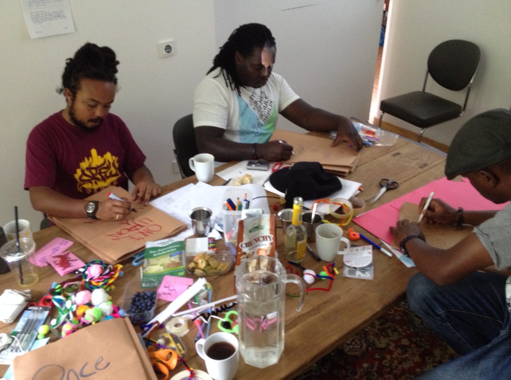
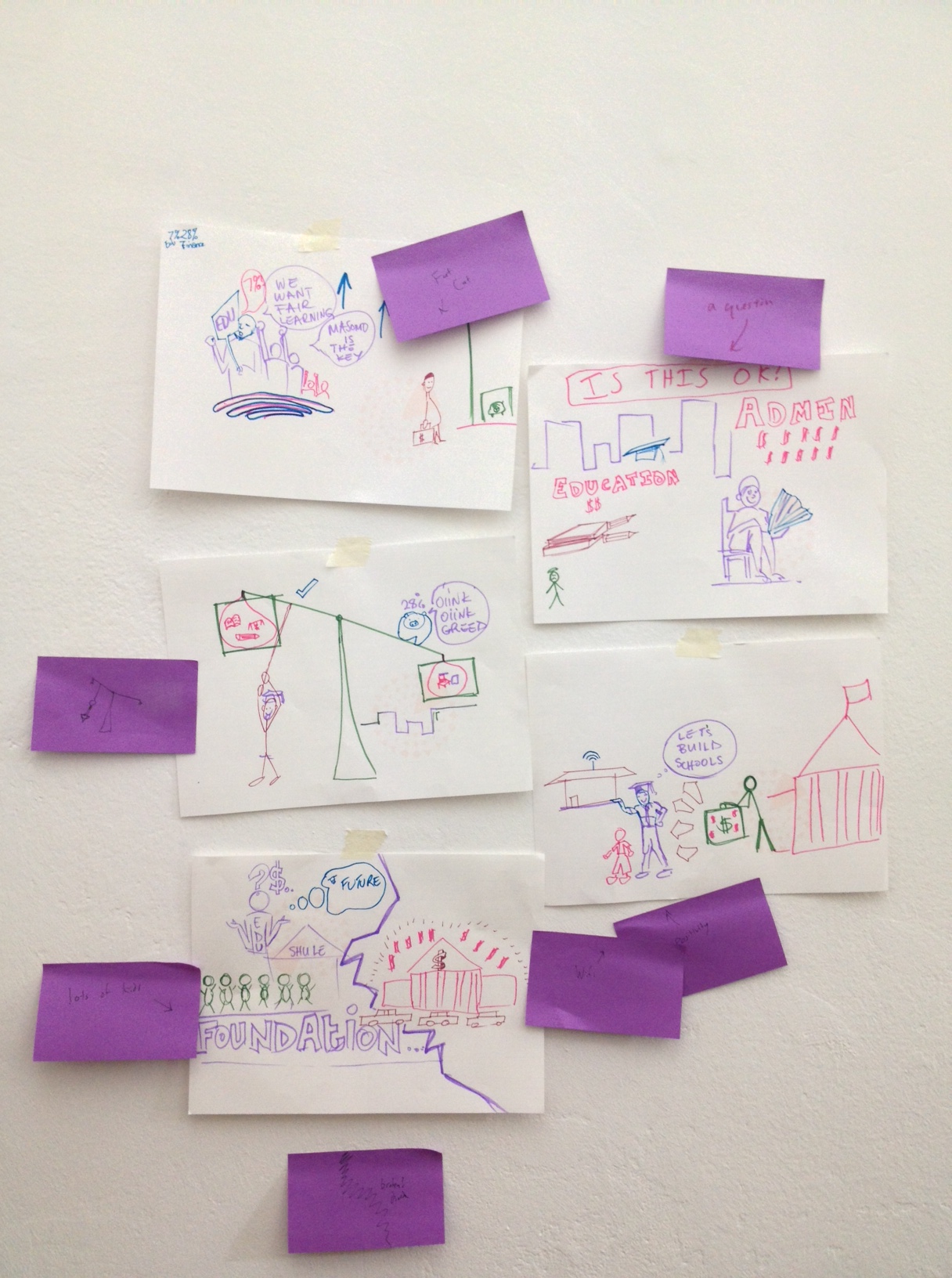
I recently wrapped up my first semester-long course at MIT, called the Data Storytelling Studio.  Students posted all their work on the course blog, but I wanted to share short summaries of their wonderful final projects!  All but one focused on the topic of food security.

Somerville Resources

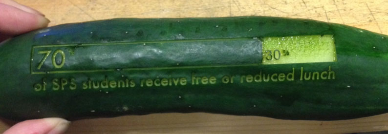
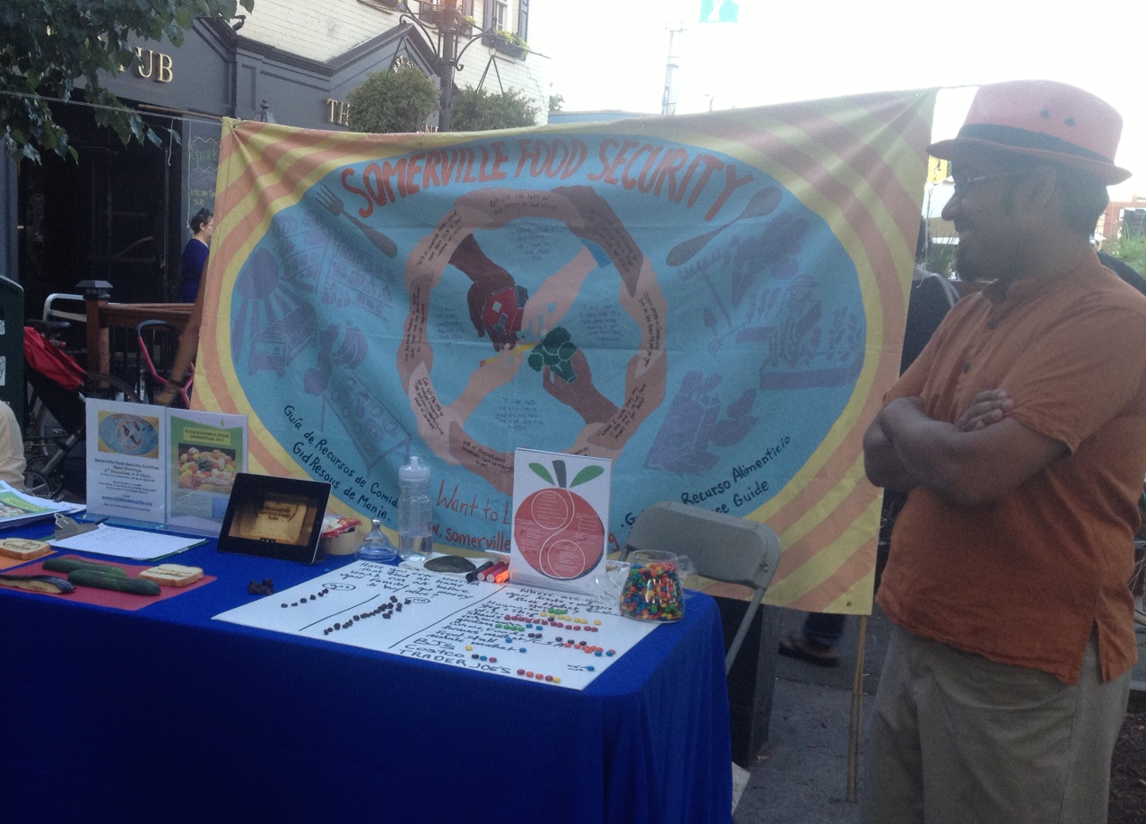
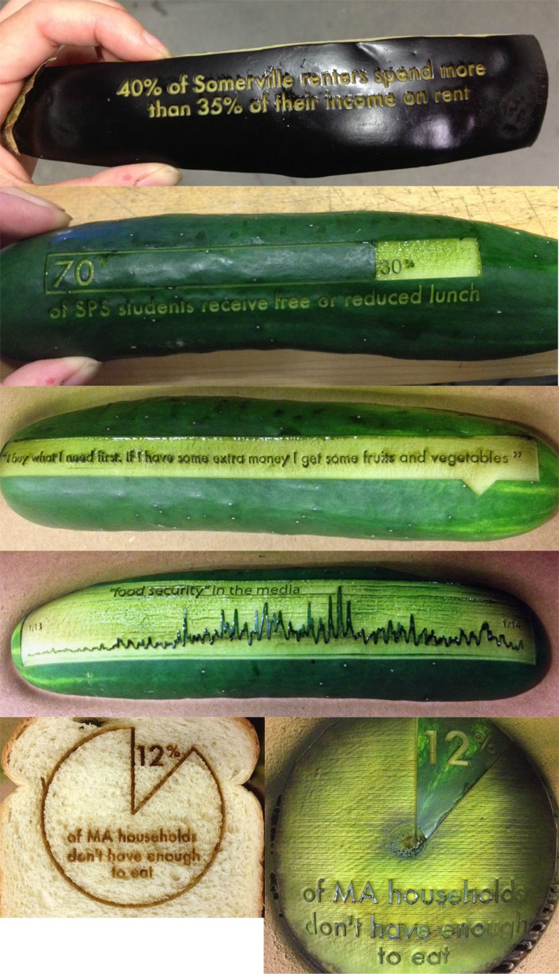
Tuyen Bui, Hayley Song, Deborah Chen worked with partners in Somerville, MA to create a short video about the challenge and community response to food insecurity among local youth.  They shot video with local programs and included “pop up” data about the problems.  The goal was to raise awareness about the problem and solutions to drive people to volunteer with the partners featured. Watch their movie, or read more about the Somerville Resources video.

2015-06-05_1220

SnapSim

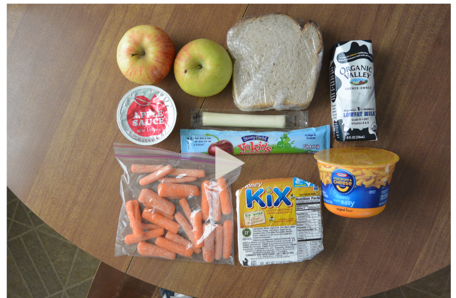
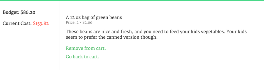
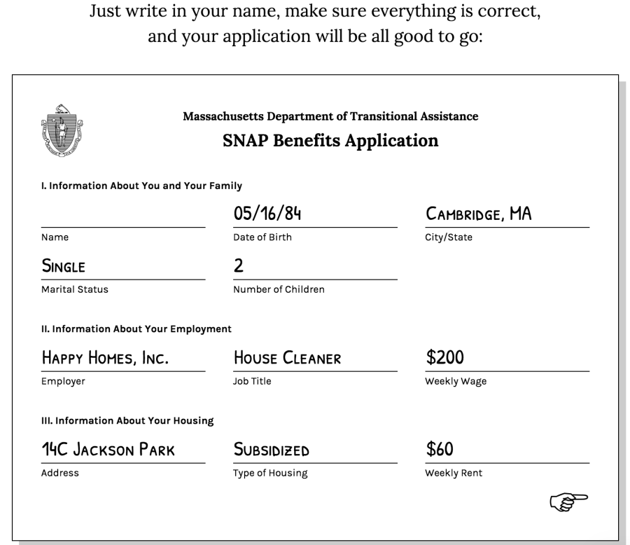
Danielle Man, Edwin Zhang, Harihar Subramanyam & Tami Forrester explored food pricing data, nutrition data, and SNAP benefit data in the hopes of building empathy with enrolled in SNAP.  They created an interactive text-based game that puts you in the role of a single parent on SNAP shopping for food for themself and their two children.  Play the game and see how you fare making hard decisions about what to buy for your family on a tight budget.  Read more about their SnapSim project.

2015-06-05_1227

SNAP Judgements

Mary Delaney and Stephen Suen worked with demographic data about SNAP participants, food nutrition data, and housing data.  They wanted to build empathy and understanding among college students for the difficult trade-offs those in SNAP have to make between health, happiness, and financial security.  Mary and Stephen created a text based game where you take on the persona of a SNAP participant and are forced to make decisions over time about what when to buy food and what to buy to feed your family. Play their game now, or read more about their SNAP Judgements project.

2015-06-05_1230

Drought Debunkers

Val Healy, Nolan Essigmann and Ceri Riley explored data about drought and water use in the United States.  Their goal was to tell a story to young college students about how individual conservation choices are largely symbolic in terms of environmental impact, and urge them to word on collective solutions that focus on agricultural and industrial water usage.  They created a web-scrolling infographic to tell their story. Read more about the Drought Debunkers project.

Art Crayon Toolkit

Laura Perovich & Desi Gonzalez looked at color use in famous paintings. Their goal was to build engagement with children around visual elements of art and spark their interests in the arts by connecting in novel ways.  They created a wonderful set of custom crayons that matched the color distributions in various paintings, and an activity book they play-tested with a small set of children.  Read more about their Art Crayon Toolkit.

People-Centered Approaches

I recently re-read the report on Big Data, Communities and Ethical Resilience: A Framework for Action from the Rockefeller Foundation’s 2013 Bellagio/PopTech Fellows.  Though kind of academic, It is well-worth your time (when you feel like getting head-y about this big data stuff).  I particularly enjoyed and wanted to share this paragraph, because it is written more eloquently than I’m able to:

Of primary importance is to focus on people-centered, community-driven approaches. The discourse of big data and community resilience often excludes local participation by less powerful or technically literate populations. As a result, external experts may reduce complex social problems like community resilience to terms that are suited to technological solutions. This crowds out local knowledge, participation and agency, which undermines trust, social connectedness and resilience. Clear public policy and corporate governance frameworks are needed to foster a generative and inclusive environment that is conducive to local communities participating in their own data projects.

I strongly agree with this.

Data Architectures @ Data On Purpose

I had the pleasure of recently presenting a half-day workshop at the Data On Purpose event hosted by Stanford’s Social Innovation Review.  The workshop was titled “Data Architectures”.  Despite the generic, hard to decipher title, we had over 100 people sign up!

workshop selfie!
participants talking to each other… time for a workshop selfie!

I broke the topic down to talk about four types of architectures:

  1. Architectures for Data Management & Storage
  2. Architectures for Data Security
  3. Architectures for Building a Data Culture
  4. Architectures for Data Use

Of course these all overlap, but I’ve found them to be useful lenses for focusing discussion and questions with non-profits that are trying to be more data-centeric in their work and data-informed in their decision making.

Here’s the Data Architectures visual presentation I gave:

2015-06-04_1547

Data Therapy @ Data Day (Central Mass)

I was invited this year again to speak at the Metropolitan Area Planning Council’s Data Day, this time in central Massachusetts in partnership with the Central Massachusetts Regional Planning Commission.  Attendees were a wide variety of folks from the central Massachusetts area – planners, city administrators, small non-profit staff, and more.  I focused on picking the right technique to tell your data-driven story.

Click to see the presentation from this workshop:

2015-06-04_1549

Talk Video: Data Analysis as Civic Engagement

Here’ s a video of a short talk I gave recently at the Harvard Data Across Scales conference.  As part of their Open Data and Civic Media panel, I spoke about Data Analysis as Civic Engagement.

The abstract and talk were written by Emily and myself:

Increasingly, open data efforts and data-driven decision making processes have created a power disparity between those that “speak data” and those that do not. While data-driven public policy decisions can increase the impact and efficacy of interventions, they leave many community members out of conversations and out of decision-making processes. In this session we will present case studies of the collaborative arts-based techniques the Connection Lab and the MIT Center for Civic Media have developed to bring these conversations back into the public sphere. These hands-on activities prepare community members without a background in data analysis to participate actively in the creation and public presentation of data-driven messaging. This offers a new model for civic engagement, bringing people together around data to create public interventions that alter the urban sphere, creating audience-appropriate messaging and increasing the data literacy of participants.

Getting Data to Answer Your Questions

I often introduce the idea that when you start with a dataset you should first start by asking your data some questions.  For instance, in this dataset about food waste in Massachusetts, students in my Data Storytelling Studio course brainstormed a number of questions they wanted ask:

  • if there more food waste in rich areas?
  • do more expensive restaurants waste more food?
  • do restaurants with more waste go out of business at a higher rate?
  • are certain towns more wasteful than others?

This process of asking questions help you move beyond the data you have, to getting the data you need to answer the questions you have.  This question-centric approach is critical to make sure you don’t fall victim to having your dataset in hand be a constraint that stops you from finding an interesting story.

askingn data questons

An Example of Getting More Data

So how do you go from these questions to more data?  I encourage folks to go “data shopping” (a term I enjoy stealing from my colleagues at the Tactical Technology Collective).  This involve taking each of your questions and thinking about what other data you need to answer it, and where you might get that data.  Returning to the food waste example above, to answer the question of whether more expensive restaurants waste more food, you need to categorize restaurants as expensive or not.  My students remembered that most restaurant review sites, like Yelp, have a dollar-bill scale that tells you how expensive a restaurant is.

How could you get that data? You could do it by hand, but that would take a while for all the restaurants in the food waste spreadsheet.  Instead, they pointed out that Yelp has an API, and you could write some software to query that and ask Yelp for the dollar-rating of each restaurant on the list.

Types of Data Sources

This examples uses one source of data – a private company.  There are, of course, others. Here’s the list I tend to introduce:

  • Private Companies – There is tons of data collected and stored by private companies, and sometimes they will give or sell it to you.
  • Governments – There is loads of official data collected by government agencies, and you have a right to the vast majority of it (depending on where you live).
  • Non-Profits or Advocacy Groups – Interest groups typically collect datasets to back up and inform the advocacy they are doing.
  • Crowdsourcing / Do-It-Yourself – Sometimes the data isn’t there, so you need to make it yourself!

That’s the list I use.  Am I missing a category?

Ways to Get Data

Fine, so there is data in a lot of places… how do we get it?  Here’s my list of techniques:

  • Download Open Data – Yes, sometimes the data is just out there waiting for you to find and download it.  This doesn’t mean it is usable, but it is often there.  Usually large non-profits and governments have big data repositories you can poke around.  Sometimes it will be stuck in a PDF or HTML table, but you can still get it out.
  • Ask For It – I mean it. Sometimes you just need to make a phone call and ask. A little social engineering goes a long way!
  • Scrape It – Far too often the data is out there, but not in a nicely usable form… you need to scrape it from a website.  Scraping involves taking taking data is scattered around a website and using a process to get it all in one place in the same format. Nowadays there are lots of tools to help you scrape websites.
  • Manually Collect It – If the data isn’t there, you gotta make it yourself.  This might involve crowd-sourced data collection, a focus group, or asking of social media.

Answering Your Questions

I introduce these two lists, of data sources and ways to get data, in order to support the data shopping process.  With a richer set of data in hand, you’re better positioned to find the most interested and meaningful stories in your data.

The Data Storytelling Studio

I’ve been radio silent for the last half year for two reasons.  Firstly, we had a new baby!  Secondly, I’ve been planning and am now teaching a semester long course at MIT for undergraduates and graduate students.  I’ve called this course the Data Storytelling Studio.  You can follow the course blog at http://cms631.datatherapy.org.  I’ll continue to blog here, but less frequently this semester.

I prefer not to share cute baby pictures online, but am happy to share pictures from the course!  I’ve sketched it out with my colleague Catherine D’Ignazio, assistant professor at Emerson college.  She is teaching a version tailored for journalists there, while I teach a diverse audience of MIT students (the course is offered by the Comparitive Media Studies / Writing program).  The course isn’t a programming or data science course; the focus is more on process, tools, and creative presentation.

I’ll be leading the students through an arc of five modules:

  1. Introduction – we begin by setting context and designing and painting a Data Mural together
  2. Finding and Analyzing Data
  3. Cleaning Data and Finding Stories
  4. Presenting Your Story
  5. Final Project

I’ve focused on the topic of food security for this semester, so most of the projects and assignments will focus on that.  In fact, our mural tells a story about Food For Free, a local organization that runs food rescue and other programming.  As you can see, we’re off to a great start!

IMG_6189

Lasers, Food & Data (Telling a Story About Food Security)

Can a vegetable tell a story about food access in Somerville?  Yep.

"70% of Somerville Public School students receive free or reduced lunch" - laser-cut onto a cucumber
“70% of Somerville Public School students receive free or reduced lunch” – laser-cut onto a cucumber

In public settings, it can be quite hard to get folks walking by interested in a data-driven argument about your cause.  We often argue that a creative data sculpture can grab their attention… like maybe a vegetable laser cut with some data about food security!

We’ve worked with the Somerville Food Security Coalition a few times, including for our first data mural pilot project!  Recently, we had a chance to come together again around their local data about food security at the Somerville Arts Council’s 2014 Ignite Festival.  The festival celebrates fire and food, which inspired us to laser cut some data onto food and see how people reacted!

ignite-food-data-table

Here’s all the veggies we cut – eggplant, cucumber, zucchini, bread, and watermelon:

laser-cut-veggies

In addition, we prompted folks to interact with two questions – both of which they could answer with M&Ms and raisins.  Asking folks to take an M&M survey is a highly effective way to get them to interact with their data!

https://twitter.com/rahulbot/status/498880294226001920

https://twitter.com/rahulbot/status/498883181714882560

Here’s a behind-the-scenes video showing the laser cutter in action:

This is cross-posted to the Civic Media blog.

Bringing Together Street Art and Data

We were recently awarded a Making All Voices Count grant with our friends at the Mtaani Initiative and Radar, focused on creative communication in Nairobi’s slums – we’re calling the initiative Sauti Ya Mtaa.

I strongly believe that data-driven advocacy is a great way to bring about change.  However, you have to find the right story to tell and the technique to tell it.  We’ve trying murals as a new way to tell data-driven stories, but none of our pilot projects worked with professional artists.  Street artists know the context and messages that will work in their community.  That’s why we’re so excited to have kicked off our collaboration with graffiti artists in Nairobi!  Over the next year we’re going to work together to develop local capacity to do innovative creative messaging to catalyze change in their communities.photo 4Sasha, Uhuru, Me, BankSlave and Swift9 met up in Berlin for 2 days for our first training (before the OKFest started).  Our goals included:

  • me learning how they work
  • them learning some of our facilitation techniques
  • designing a data mural to paint in Nairobi
  • planning the next steps in Nairobi

Training

We had a packed agenda over the two days!  We started off getting to know each other a little bit, and exploring some inspirational examples, including our data murals. http://www.pinterest.com/rahulbot/street-art-data-murals/ We kicked off our building exercises by running the data sculptures activity.  The artists liked the materials involved and thought people would respond to how playful it was. Next I introduced our story types and some data on education and employment from the Nairobi budget and SID report for Nairobi County (1).  We all looked for stories of different types.  The artists found the story type templates helpful, but struggled with the idea of saying something in the data was either a “factoid”, a “comparison” or something else.  This raised the great point of how we can get lost in the activities sometimes, stuck on trying to do them “correctly”, when in fact it didn’t matter exactly which type of story it was.  One artists said:

filling in a factoid story form appeared challenging at first but eventually after a while it proved to be a vital part in this whole process

Once we had a number of stories, we pulled some abstract ideas from them – “education”, “finance” and “rural”.  We did some word webs for these words together, to try and concretize them.  We put these on the wall, grabbed stickies, and drew any of the words that could be drawn.

photo 1   photo 2

The artists loved this activity, and immediately thought of ways it could be relevant for their workshops.  This process of coming up with symbols to represent abstract ideas fits well into past work in Nairobi (see the Vulture murals, for instance). One artist said:

this approach is fun and should be used all the time

With these words and the data stories in mind, we took some time to focus on visual narrative.  First we created storybooks to tell the data stories. The artists spent a little more time than I had hoped writing out their stories – I introduced it poorly and they had great feedback for how to present it as a comic book next time I try it:

Story Boooks are fun, but we could make it more interactive as a comic book set up rather than what I did (more writing and less illustrations)

photo 3To wrap up the design exercises did a pass around drawing for one story they liked most – about the relatively low percentage of budget funding going towards education.   One artists said:

the pass around drawing was fun and creative teamwork and saving on time to come up with a concrete concept which usually consumes more time

Another said:

it was fun and got everyone to participate

This led to a small set of drawings that all told the same story.photo 5I facilitated a discussion about what elements of the design they liked most, and exercised a little editorial control to generate a sketch of a mural to paint!mural designAfter all this we took a step back and discussed work the artists have done, and issues they cared about.  This led to a good conversation about how all the activities felt, how the might fit into work the context in Nairobi. One artists said:

What really got my attention was the structure and approach in general as a session

Next Steps

To close out the packed schedule, we squeezed in a discussion of next steps on the grant.  We plan to continue to converse via WhatsApp, and to set up monthly Skype checkins.  These channels for communication will feed activities over the next few months.

Notes:

(1) We used the Nairobi Full Budget FY 2013-2014 (online at the International Budget Partnership) and the 2009 SID report for Nairobi County.

Low-Tech Data at OKFest

Yesterday I co-led a “Low Tech Data” workshop at the 2014 Open Knowledge Festival with Gabi from the Tactical Technology Collective. We introduced the story types with examples and then did a quick story-finding activity.  After that we ran through the presentation techniques with examples and then did a presentation technique activity.  To finish, we sent folks out to test their creations with other OKFest attendees and gather feedback!

It was a quick pace, but folks had been thinking about data for the last two days so they were already in the right head-space to come along for the ride.  The participants (about 70 of them) were a split between folks that do more spreadsheet-y open data stuff and those that work with communities directly around data. This made for a interesting mix of comments when we asked folks to step back and think about how they might use these activities.  Some found it valuable for themselves, while others were very excited to try them out with their community partners ASAP.  Overall feedback was very positive and the energy of folks finding stories and making quick things to present them was great!  We didn’t get a chance to reflect on the low-tech nature of the whole process (ie. no computers involved), but it was fairly self-evident.

Here’s the presentation we used:

low-tech-data

Here are the handouts and worksheets:

Here are some of the quick things people made:

https://twitter.com/elenidigidiki/status/489768361811668993