Data-Driven Storytelling for Entrepreneurs

I just returned from a fascinating week in Belo Horizonte (Brazil), where we ran multiple workshops to build capacity to work with data in creative ways.  The trip was organized by the Office of Strategic Priorities of the State of Minas Gerais (they are members of the MIT Media Lab).  This post is one in a series about the workshops we ran there.

We’ve always included a diverse set of audiences in the Data Therapy workshops.  However, I’ve never had a chance to really connect with the entrepreneurial and startup communities.  This changed last Monday in Belo Horizonte, when we had a chance to run a workshops for members of the first class of startups accepted to the the SEED accelerator program run by the state (@SeedMG).  The government created the program to foster an ecosystem of innovation.  They host the in a startup-y co-working space, give them a little money, and offer them access to mentors and such for about 6 months.

IMG_3091

Content

We introduced them to our basic Data Therapy brand of story-finding and story-telling.  In addition, we introduced some evocative examples to think about a few ways business use data:

  • getting useful feedback
  • understanding product use
  • improving product use
  • validating assumptions
  • improving process
  • surprising and delighting customers

This workshop included two participatory components (both learnt from the Tactical Tech Collective last summer):

  • visualization reverse engineering – we hang up visualizations and have small groups walk around trying to identify things like audience, visual technique, data used, goals, etcIMG_3096
  • convince me – we introduce some sample data, select volunteers to play personas (like CEO, funder, potential customer), and have everyone try to use the data to convince them of goalIMG_3090

Here’s the presentation content, for any folks that might be interested.


Reflections

The group of about 15 entrepreneurs enjoyed the chance to focus on their data problems. In particular, the “convince me” activity sparked a great discussion about how and why data can be used to talk to different audiences.  This connected really well with their natural entrepreneurial instincts to hone in on customer personas and narrow focus.  A handful were particularly interested because they had presentations to make to potential investors that day!

IMG_3088

The SEED blog has a short writeup of our workshop in portuguese.

PS: You can tell it is a startup space, because they have ridiculous things like a giant pool of plastic balls you can play in!

IMG_3119

Workshops in Brazil

Data Therapy is heading off to Brazil for a series of workshops next week!

We’re excited to announce the partnership with the government of Minas Gerais, to deliver a series of workshops and paint a mural in Belo Horizonte.

conecta-banner-siteepe1We’ve worked with our partners in the office of Strategic Priorities and put together and agenda that include multiple workshops, public lectures, and a Data Mural (with youth at the PlugMinas school)!

Know someone in Brazil?  Send them this information and see if they can join us!

Sketching Data Driven Stories

Last fall Ethan Zuckerman and I were invited to co-teach a “data acquisition and visualization” module for graduate students in the MIT Comparative Media Students program.  The module was five sessions covering the following topics:

  1. Data visualization, from acquisition to storytelling. Deep dive on data “shopping” – the process of acquisition and interrogation
  2. Workshop on five methods of data scraping and cleaning
  3. A taxonomy of visualization, and sketches of the story we want to tell with data
  4. Workshop on Fusion Tables/Maps and Tableau, and lots of other tools for data visualization
  5. Mapping and Unmapping, the politics of data, and presentation of student work

For session 3, I wanted to dig in on ways to sketch a data-driven story and was reminded of an activity I participated in last summer at the 2013 Info-Activism Camp.  There was a track of visual presentation workshops facilitated by Angela MorelliTom Halsør and Mushon Zer Aviv.  One of the activities they ran felt perfect for this class – they led an activity to create a short paper story book that sketched out the data story.  The goal was to flesh out your story before doing all the work to make a final version.

They started by folding a piece of paper in a ‘zine.  Click here for the best instructions I’ve found online.  Here’s one I made based on data about where I spent my time at the Tactical Tech Camp:

As you can see, the folding created a short book.  Writing out my data story in this low-tech way forced me to focus on the narrative structure of my data story, rather than the data details or computational options.  Even if you know you’re going to present it as a single graphic, teasing apart the narrative is a crucial step in crafting a strong story.  This hands-on sketching exercise if one of the best ways I’ve seen the do that.

So I totally copied their technique and used it in session 3 of the module I was describing earlier (thanks you all!).  The students dove right into it, drawing the concepts they saw in their own data stories.  It worked pretty well, helping them pull apart the crucial way points in their story.

class

At a deeper level, this activity is another one for learning data literacy and data presentation that pulls from the world of the arts.  I’m constantly trying to build the toolbox of activities that can be used for my Data Therapy workshops, and this one just got added!  I strongly believe the arts is the most fertile ground to borrow from when creating engaging data literacy activities.  My underlying motivation is to push forward a better description of my half-formed “Popular Data” concept.

Have you tried this activity?  Are there others that spring to mind?

Towards a Concept of “Popular Data”

I was recently invited to give a Skype keynote for the first hackathon hosted by the state of Minas Gerais in Brazil.  The talk was a wonderful provocation to revisit the writing of another Brazilian I used to study – Paulo Freire and his vision of popular education.  This led me to wonder… what would a model of “popular data” look like? Answering this requires an agreement that there is a problem, and agreement that the problem merits a popular education approach.  This post is an exploration, so I end by proposing a few grounding principles for a concept of “popular data”.  Is this a useful concept?

The Problem

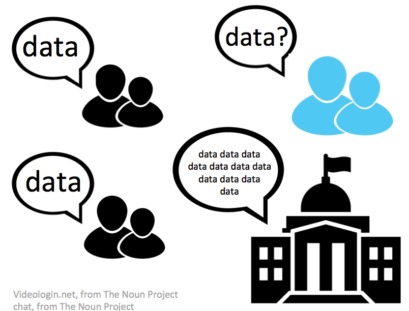
Governments large and small are speaking of open-data platforms and data-informed decision making.  They share with us a vision of responding to citizen concerns more accurately and efficiently based on data.  These governments are using the language of data.  Data is a language governments are speaking, but most people don’t understand This is the core problem that I address with my Data Therapy project.

speak data?

Can Popular Education Help?

If you don’t speak the language used by your government to make decisions, then you can’t participate in those decisions.  This disempowers people, and popular education is an approach for rectifying disempowering situations.  The city I live in, Somerville, MA, has a a program called “ResiStat” that is intended to 

bring data-driven discussions and decision-making to residents and promote civic engagement via the internet and regular community meetings

This data-centered effort can only engage those that already understand the charts, graphs, and terms they use.  Don’t get me wrong – they don’t deliver a dry academic lecture at their community meetings.  However, they do rapidly run through reams of data analysis with an expectation that most in the audience can handle the information-centered explanation.  This leaves out the many residents who don’t speak data at all.

What is Popular Education?

Philosophical definitions are always debated, but here are a few guiding principles most practitioners of popular education would adhere to:

  • participation from all parties
  • learner guided explorations
  • facilitation over teaching
  • accessibility to a diverse set of learners
  • focus on real problems in the community

If you consider this list a litmus test for governmental data programs, few (if any) would pass.  So how do we change this?

Popular Data?

Now that you’re (hopefully) on board with my problem statement, and the idea that popular education can help, lets play out how. Popular data is my name for engaging, participatory approaches to data-driven presentation and decision-making.  Not a great name, but from an academic point of view it puts my work in the right family tree so I’ll use it for now. How do you structure data programs to practice popular data? Lets run through each of the tenants listed above and look at some examples.

Participation from All Parties

Popular Data suggests a “big tent” approach; you should get everyone at the table.  For instance, far too many open-data initiatives end at the release of the data.  The smart ones realize they are the scaffolding for larger efforts, and make a strong effort to convene non-profits, constituents, and the data makers to the table in order to encourage activity around the data.  Sometimes this looks like a hackathon that makes sure to invite lots of segments of society (ie White House hackathon). Sometimes this looks like a presentation of results back to the people the data is about (ie. Somerville’s ResiStat meetings).  There are lots of ways to involve those in power positions and those outside of them.

Learner Guided Explorations

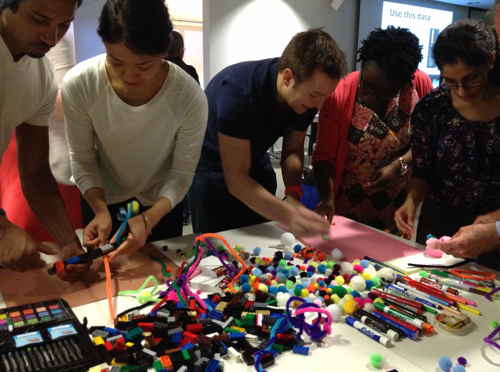
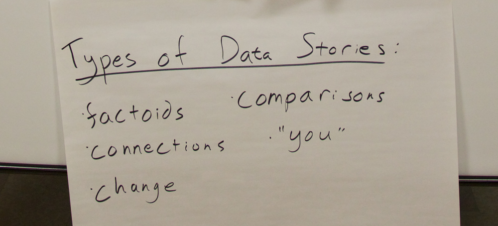
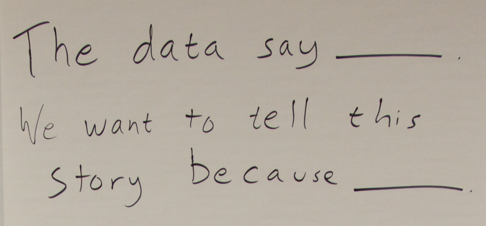
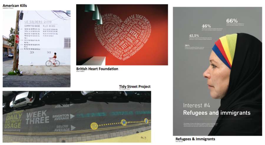
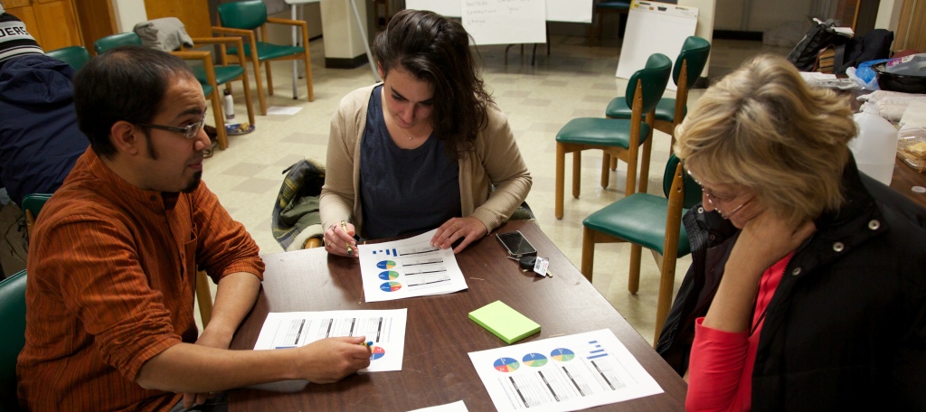
Most data presentations are about as engaging as a conversation with your dentist! You kind of have to do it, but it’s booooring. Flipping the model invites your audience to find their own stories in the data. My Data Murals work does just that – our initial “story-finding” workshop shares a small portion of the data about a topic and then lets teams of participants find stories they want to tell.  Participants own these stories and advocate for them.  That is an empowerment story – our evaluations show people come away feeling more capable of finding stories in data, and are less intimidated by data in general.

Facilitation Over Teaching

In my Data Therapy workshops I use a number of activities for building visual literacy. All of these are ways to facilitate a discussion of data presentation, and build a shared language for describing data.  When data scientists introduce ideas they too often fall back on big words.  These words alienate those who haven’t studied data.  My first step is to use language a normal person would use.  Then I help the group construct their own language for describing data, which they fully understand.

Accessibility to a Diverse Set of Learners

I spent years designing interactive museum exhibits. Museums are the hardest setting I’ve ever designed for.  At a museum you know nothing about your audience; your object has to support 30 second interactions with a single person, but also 1 hour interactions facilitated by a knowledgeable docent.  This is hard.  Really, really hard.  Data presentations and activities need to be designed the same way. I address this by starting simple, and building to complexity.  In data presentations I do break into small groups and seed each with one person that does speak data to help the other folks understand technical issues.

Focus on Real Problems in the Community

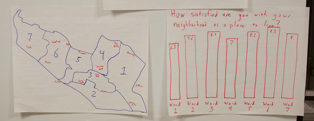
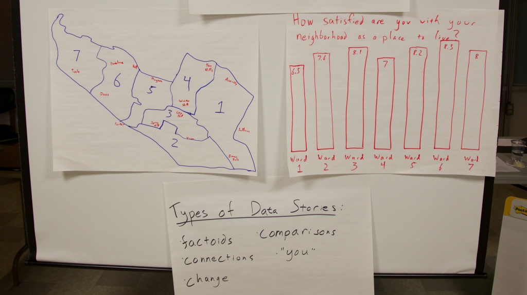
This one is easy! Make the data you are working with or presenting relevant to the communities you are working with. In the workshops I lead in the Boston area, I use the Somerville happiness survey as my silly example data set.  I wouldn’t do that for a group of public health wonks (I’d use something from the WHO).  People are naturally inclined to be engaged about the community they live in – no need to introduce data from some far off community they have no relation to.

Is this Useful?

Ok, so I’ve made my argument – I see every dataset as an opportunity for engagement.  Engagement with the public, the people the data is about, the people whole collected it, everyone. If you’re reading this, it’s up to you to use a Popular Data approach to seize the opportunity for engagement a dataset gives you.  I find this framework useful for structuring my data presentations and workshops.  Let me know what you think!  Am I just naming something obvious? Am I being too academic?

crossposted to my Civic Media blog

Activities for Building Visual Literacy

There are a lot of people talking about “Visual Literacy” right now. Shazna Nessa shared some thoughts from a journalistic point of view on the Mozilla Source blog recently.  Her discussion focused on how data visualizers should consider the limitations and affordances of visual depictions of information.  I’d like to offer a complementary response from a constructionist’s point of view. Certainly the journalists and new explainers  need to understand how to best use the tools at hand,  but in addition we can help the “audience” build visual literacy by helping them create their own visual presentations of their information. The creative act of telling an information-based story offers everyone the best way to understand the affordances of various visualization tools, in addition to making them more aware consumers of this new “visual grammer”.  So how do you do this? What kind of fun activities can we do with people help them work with and present information.

Build a Data Sculpture

One classic technique to exploring a new domain is to re-use more familiar materials in novel ways.  For instance, in my Data Therapy workshops I show up with a bin of craft materials and give people 5 minutes to create a physical “data sculpture” that depicts a tiny set of data I share (click to see some examples).

photo

This activity is fun, engaging, and raises many presentation issues!  Inevitably some people choose to focus on one  piece of data, while others try to show it in context.  People bring their own biases to it.  All of that makes for great fodder for the discussion I do right after each person shares what they made.

Reverse-Engineer Other People’s Work

Of course, taking stuff apart is just as much fun as building it!  Another activity that both I and my friends at  the Tactical Tech Collective us is something they call the “gallery”.  You hang up a bunch of examples of visualizations and have people move through them in groups (make sure to include examples for praise and examples for critique!).  Each group gets assigned one of these questions to answer for each piece in the gallery:

  • who is the intended audience?
  • what is the information being shared?
  • how would this make the audience feel?
  • what visual techniques does it use?
  • are their any ethical or reliability issues with the presentation?

gallery-shot

Each group writes their answers on a small sticky note that they stick under the piece, so they have the be concise. Then you let everyone wander for a bit, looking at the other groups’ responses.  The discussion afterwards is a fantastic opportunity to understand the questions one has to consider when creating visual presentations of information, and creates a shared language within the group for talking about their own work.

Remix  Other People’s Work

A great follow up to this activity is to pick one item and have people remix it (we did this at the the TTC Info-Activism Camp). What do I mean by “remix”? The idea is to take the topic and data it presents, and have a brainstorming session about how to craft an appropriate message for a specific audience:

  • an online community
  • people who disagree with the point
  • people who agree but you want to motivate to action
  • policy makers
  • people within the system being depicted

We broke participants into small groups and assigned each an audience to remix for.  People sketched out ideas quickly on paper and then shared them back with the group.  This let participants exercise the reflective muscle we developed in the gallery activity.

Think about Impact

You can do more than just LEGO bricks and pipe cleaners.  If you want to focus on evidence and persuasion, the Tactical Tech Collective has a great exercise I co-faciliated recently.  They first introduce an issue and some related information (for instance, the idea of conserving water and data about water use in home, industry, food production, etc.) Then a handful of participants are brought up to represent various audiences that are involved in the issue and you might want to influence (politicians, companies, food producers, citizens).  These audiences are lined up according to how much they care about the issue.  Then the fun part – everyone proposes, off the top of their heads, arguments that try to move folks.  So people make arguments to the audience representatives, and if the arguments is persuasive the person physically moves down the line to being “more convinced”.  I found that this kind of constructive brainstorming activity brought some of the abstract ideas about “influence” into the real world, making them actionable for people when they get back to their day jobs.

Why Making?

The common thread connecting  these activities is engaging people together around the process of visually presenting information. I’ve done all these activities a few times now, and have enjoyed the results after each one. People’s insights into visual presentations they see are directly connected to their experiences of producing their own.  I worry about statements that simple presentations of information are the “right” answer… I don’t disagree that they can be effective, but we can expect more of our audiences.  I believe giving people creative opportunities to build their own visualizations for their own cause is the way to do better.

Jer Thorp, a visualization expert I respect, recently wrote that to make all this data more human 

people need to understand and experience data ownership

I completely agree.  This will address the potentially disempowering nature of data for those that don’t “speak data”.  I hope these types of activities help bridge the gap between the “new explainers” and the so-called “data illiterate”.

Cross-posted to the MIT Center for Civic Media blog.

Going to Data Camp!

I recently attended the 2013 Info-Activism Camp as a facilitator on the “Curation” track.  The Tactical Technology Collaborative organized the event for over 100 information activists from around the world.  Everyone was there to learn about Evidence & Influence.  Yes, it was awesome.

I’ve mostly been working on Data Therapy in isolation, because I haven’t been able to find others working on capacity building for creative data presentation with community organizations. That all changed at an isolated camp in Northern Italy a few weeks ago!  I connected with a network of technologists, activists, and rabble-rousers that were thinking deeply about this topic.

IMG_5965
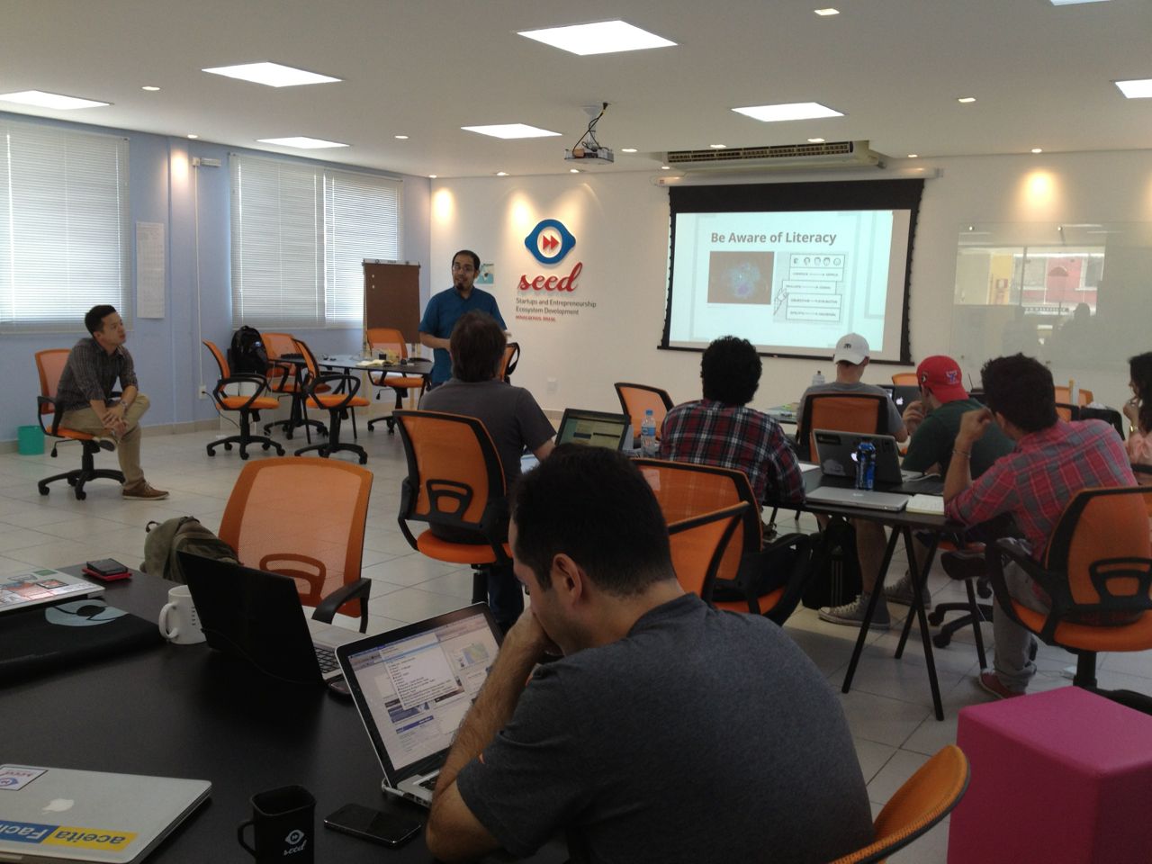
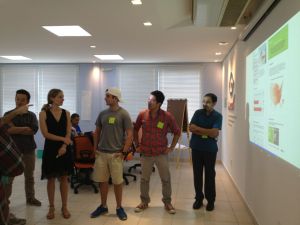
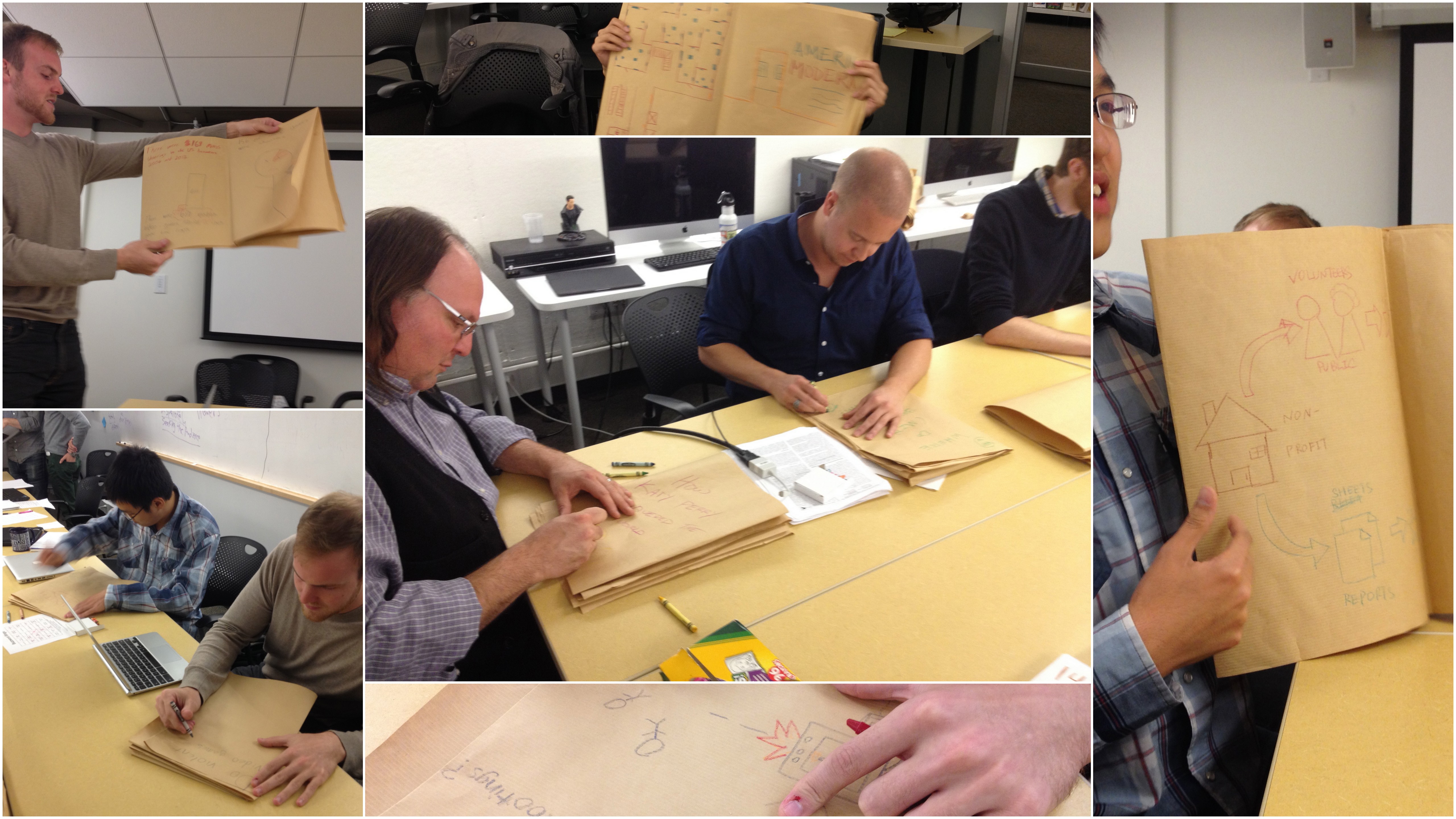
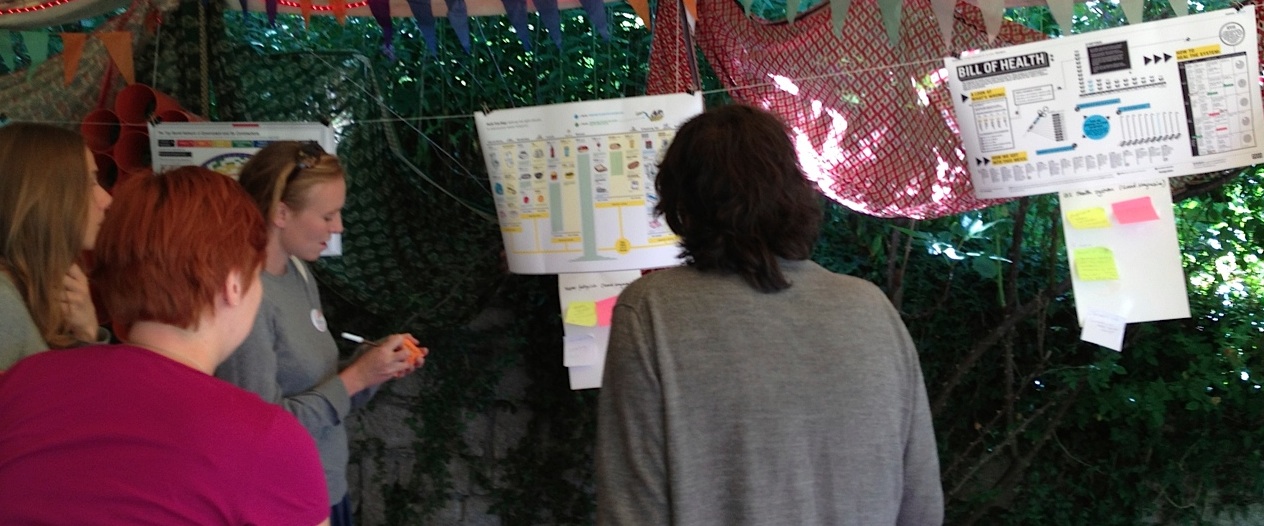
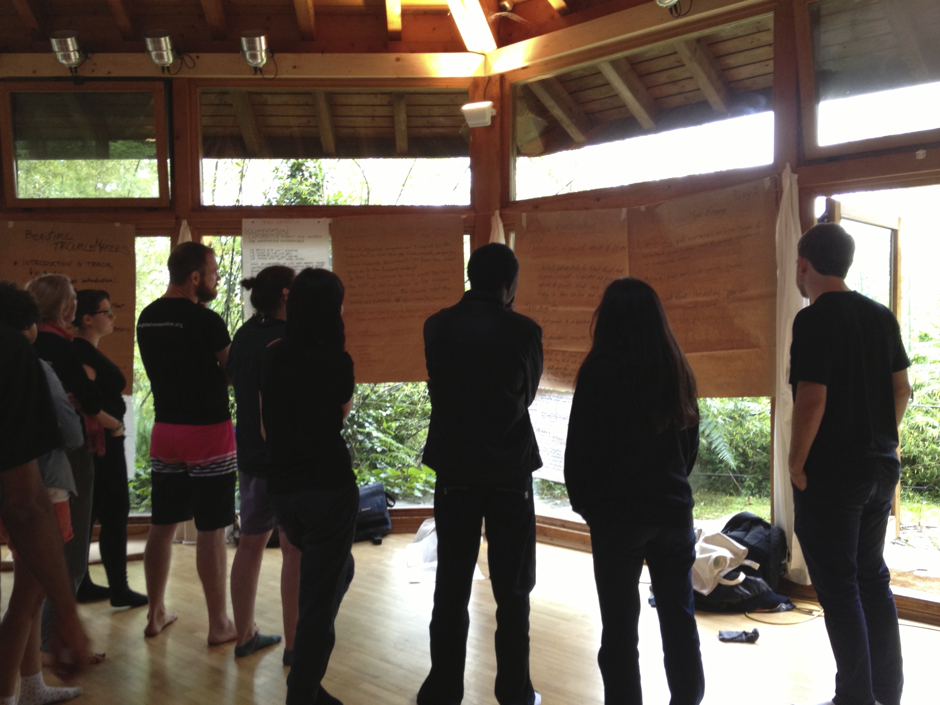
Attendees pondering which of the awesome sessions to attend after the morning circle.

What’s InfoActivism Camp?

What happens when you bring 100 information activists from around the world to a remote retreat in the north of Italy? We affectionally called it “organized chaos”.  The organizers, Tactical Tech, have been sharing best practices in information advocacy since 2003. They run events around the world, helping activists learn how to create compelling visuals that tell their stories and advocate for their causes. Their fantastic “Visualizing Information for Advocacy” guide will be coming out in extended book-form soon. They’ve done a handful of large-scale “Camp” gatherings, the last in Bangalore in 2009. It truly is camp – we all eat, sleep, play, and work together!

What is “Curation”?

IMG_5970
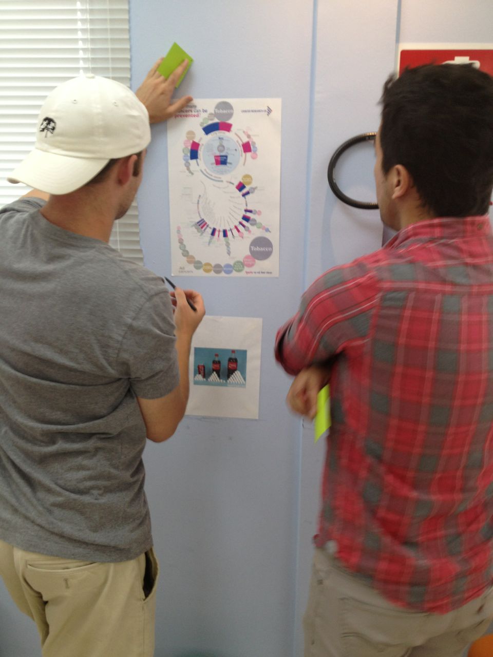
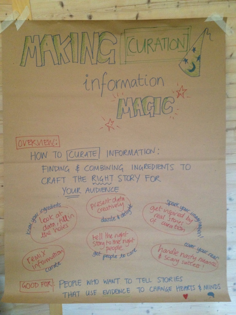
The large paper encouraging people to come join our curation & influence track.

I was invited to help facilitate the “Curation” track, which focused on how to use information to sway hearts and minds. You know, the easy stuff 🙂 I was excited because this parallels my Data Therapy work so closely, so I hoped to share and learn in equal parts! I worked with my co-facilitators, Stephanie Hankey (of TTC) and Tin Geber (from the Land Coalition), to create an agenda for the week that was tailored to the participants interests.

IMG_5993
Our framing questions.

Of course, this was just one of 4 tracks that filled the mornings. The afternoons were filled with peer-to-peer skill-shares, and hands-on labs that focused on skill building with particular tools (for visualization, digital security, data inestigation, etc).

Reflections

I found the event to be just the right mix of “organized chaos” – there was a strong skeleton that set the main areas of interest, but there was ample space to change things completely based on what was working and what people wanted to learn. This is a hard balance to strike in “emergent agendas” for events; I have been part of events that have gotten it wrong a few times. This felt different, because there was strong support and collaboration from other facilitators, and the participants too (many of whom took on faciliation duties during the week).

The groundwork was laid for many exciting collaborations, built on stiking similiraties between activists across the globe. Personally, I also came away with a great set of new activities, approaches, and examples for my Data Therapy workshops. Keep an eye on my Data Therapy blog to learn more about those, and upcoming workshops I plan to schedule.  It was a treat to directly help people again, and to be reminded that you can’t disconnect presentation from the influence you want to create.

Cross-posted to the Civic Media blog.

Data Day

I recently hosted a Data Therapy session at Data Day 2013.  The Data Day event is a fantastic local gathering of people using data to drive community change in the Boston area. This year the event brought together academic researchers, policy makers, local organizations, and regular interested folks for one day of conversations about how to tell stories with data.

2013-07-09_1149

In addition to these types of community building efforts, the MAPC and The Boston Foundation have been building out many data-analysis and data-presentation tools to help local folks:

I certainly have concerns about data-based decision making in the civic sphere (see my thoughts on data as disempowerment), but I have a stronger belief in the the potential of data to influence people and drive change.

My workshop was small, so I had a chance to focus on helping people with their data presentations problems.  I reviewed some case-studies of various techniques, and a process, to build a shared language around data presentation.  Then we broke out into groups to brainstorm possible solutions for people’s actual data presentation needs!

Activities to Rethink “Visualization”

In my Data Therapy workshops I focus on redefining what “data visualization” means.  Most people think of complicated pictures with dots and lines, or snappy info-graphics with big numbers.  I argue that more informal data presentation can help you engage your audience in the data story you are telling.  Towards that goal, I show up to workshops with a big box of craft materials – LEGOs, pipe cleaners, and more!

photo

Here are some pictures from last night’s NetSquared meetup.  I showed people a little bit of the data from the Somerville Happiness Survey.  Then I paired them up and gave them 5 minutes to turn the craft materials into a presentation of data. This activity serves as a great ice-breaker, and resets the boundaries of what counts as a data presentation.  More importantly, it’s fun. Let me know if you have ideas about other activities that I could use!

Helping a Community Find Stories in Their Data

My Data Mural work has led me into a new area – actually helping community groups find the stories they want to tell in their raw data.  Until now, all my data therapy work has focused on how to present the data-driven stories more creatively.  This post shares some of the techniques I’m trying out.

Step 1: Speak like a normal person

I know, it should be obvious, but too often when entering the realm of data-anything, we fall back into using big words.  That doesn’t fly when working with community groups that don’t have a shared meaning for those words. I tried to figure out how to use regular words to talk about the types of stories that you can look for.  I came up with this set to start with:

typesofdatastories

  • comparison: you see two pieces of data that are really interesting when compared to each other
  • factoid: you see one fact that jumps out at you as particularly interesting or startling
  • connection: you see a connection between two pieces of info – you can’t say one causes another, but they’re interesting when put together
  • personal: you have a compelling story or picture that is about one person
  • change: you see one of your measures changing over time

I used regular words to describe the types of data stories in order to make the activity less intimidating to non-data people. Many people nodded their heads as I described these categories (especially at the second workshop where I spoke about them better!).  I was inspired by the Data Stories section of the Data Journalism Handbook.

Step 2: Try it out together first

To come up with a shared definition of what these types of stories meant, I showed a few data points from an amusing data set – the Somerville “Happiness Survey” (raw data).

happiness-data

We quickly tried to find stories of each type in this tiny data set.  Practicing all together on a tiny dataset can create a shared language for finding stories in data. In the breakouts that followed this activity, I could hear people using some of these words with each other to talk about the data they were looking at.

Step 3: Use less data

Usually data analysis starts with a giant set of documents.  This model doesn’t really work for a small community group made up of people that aren’t data nerds.  For our “story-finding” workshops we culled down the full data they gave us, producing a 4-page data handout for people.  Limiting the data helped the community group not be overwhelmed by the task of finding a story they wanted to tell. We definitely made some “editorial” decisions that limited the stories they could find, but we did this with the help of a smaller group of our community partners so it wasn’t arbitrary.

So how did it go?

We scaffolded the story-finding around the idea of telling a story in our “The data say____” format.  This gave us a common way to talk about the stories with each other.  Just as importantly, this forced each person to justify why they thought it was a compelling story to tell in mural form.

thedatasaySo did we build the group’s capacity for data analysis?  Our pre-post survey did NOT show a noticeable increase in people’s self-assessed ease of finding stories in data. Damn. But wait… the answer is probably more nuanced than that.  They did say they came away with more knowledge about the topic the data was about.  They also said one of the most interesting things they learned was “telling data stories”, and in each of these two pilots they came out with a data-driven story that they wanted to tell.

Is exposure to data story-finding  a sufficient outcome?  Am I trying to do too much capacity building all at once?  I’m still pondering how to do this better, so please suggest any tips!

Curious about these pilots?  You can read some more on my collaborator Emily’s Connection Lab blog:

Cross-posted to the MIT Center for Civic Media blog.

Story Finding in Food Security Data

This post is about our first Data Mural pilot project.  Read more about our Data Mural idea for some background context.

Our first Data Mural pilot is in collaboration with the Community Action Board for Food Security in Somerville, MA.  I’m excited about this because that’s the town I live in, and food access is an issue I care a lot about!  After looking at all the data they sent us, we collected together a few pages of data that we used to hold a story-finding workshop last week. Here’s a summary of the workshop.

Introductions

We started with a discussion of the Data Mural process we have in mind, and then went through the agenda for the evening.   My collaborator (and wife) Emily led this part of the workshops.

HE3C6801
photo by Anand Varma

Inspirations

Then I introduced some striking examples of mural-like data presentations.  I pulled together four examples from the the pinterest board I’ve been using to track inspirations.

data mural inspirations

We discussed what stories they were telling, and why they were powerful or not.  The participants had some great thoughts about the power of these presentations, based on the audiences they were intended for.  We thought it was important to give us all a shared understanding of what kind of result the workshops are leading towards.

Finding stories in data

To develop a shared language and process for finding a story in data, I brought one chart from the Somerville Well-Being Survey for discussion.  It is a fun dataset, about how happy people in Somerville are.

HE3C6804
photo by Anand Varma

We talked about various types of stories that can be found in data, and discussed each in the form of:

The data say _____.  We want to tell this story because ____.

Our Food Security Data

This quick exercise led right into examining the data at hand, about food security and related issues in Somerville.  Emily introduced our dataset, which we had trimmed down to a 5 page handout.  We broke out into groups and looked over the data.  We asked people to write down stories they found on stickies, in the “data say ___, want to tell because ___” format.

HE3C6809
photo by Anand Varma

People definitely struggled with the limited data set we provided.  A consistent issue is the balance between giving a full picture and telling a compelling story.  Some participants wished they had more data, to have a richer picture of the real world situation.  Others highlighted problems in the data collection methodology.  That said, everyone understood the need to work with a smaller set of data to find striking stories to tell.

Story Selection

We all stuck our post-its on the wall and Emily led us in a discussion to find similarities and narrow in on one story to tell.

HE3C6827
photo by Anand Varma

We came up with three categories:

  • stories about vulnerable groups
  • stories about people using SNAP, but more needing to sign up
  • stories about existing barriers to food security (and how we have solutions to offer)

After collaboratively coming up with a set of criteria for the best story, the group narrowed in on the last set of stories.  Focusing on barriers to food security, they came up with this data driven story to tell:

The data say that for many people food is not affordable and accessible because of the number of people living in poverty (or undocumented).  We want to tell this story because there are resources in Somerville to help.

Next Steps

We’re still reading our pre-post evaluations and suggestions from the participants, so I don’t have much to say about that for now (read some more about our approach to evaluation on Emily’s blog).  Meanwhile, we’ve got our next session scheduled for Jan 17th, and now we have a great story to turn into a compelling visual!

Curious to learn more about food security in Somerville?

Here are a few links if you are interested in this topic