
Last fall Ethan Zuckerman and I were invited to co-teach a “data acquisition and visualization” module for graduate students in the MIT Comparative Media Students program. The module was five sessions covering the following topics:
- Data visualization, from acquisition to storytelling. Deep dive on data “shopping” – the process of acquisition and interrogation
- Workshop on five methods of data scraping and cleaning
- A taxonomy of visualization, and sketches of the story we want to tell with data
- Workshop on Fusion Tables/Maps and Tableau, and lots of other tools for data visualization
- Mapping and Unmapping, the politics of data, and presentation of student work
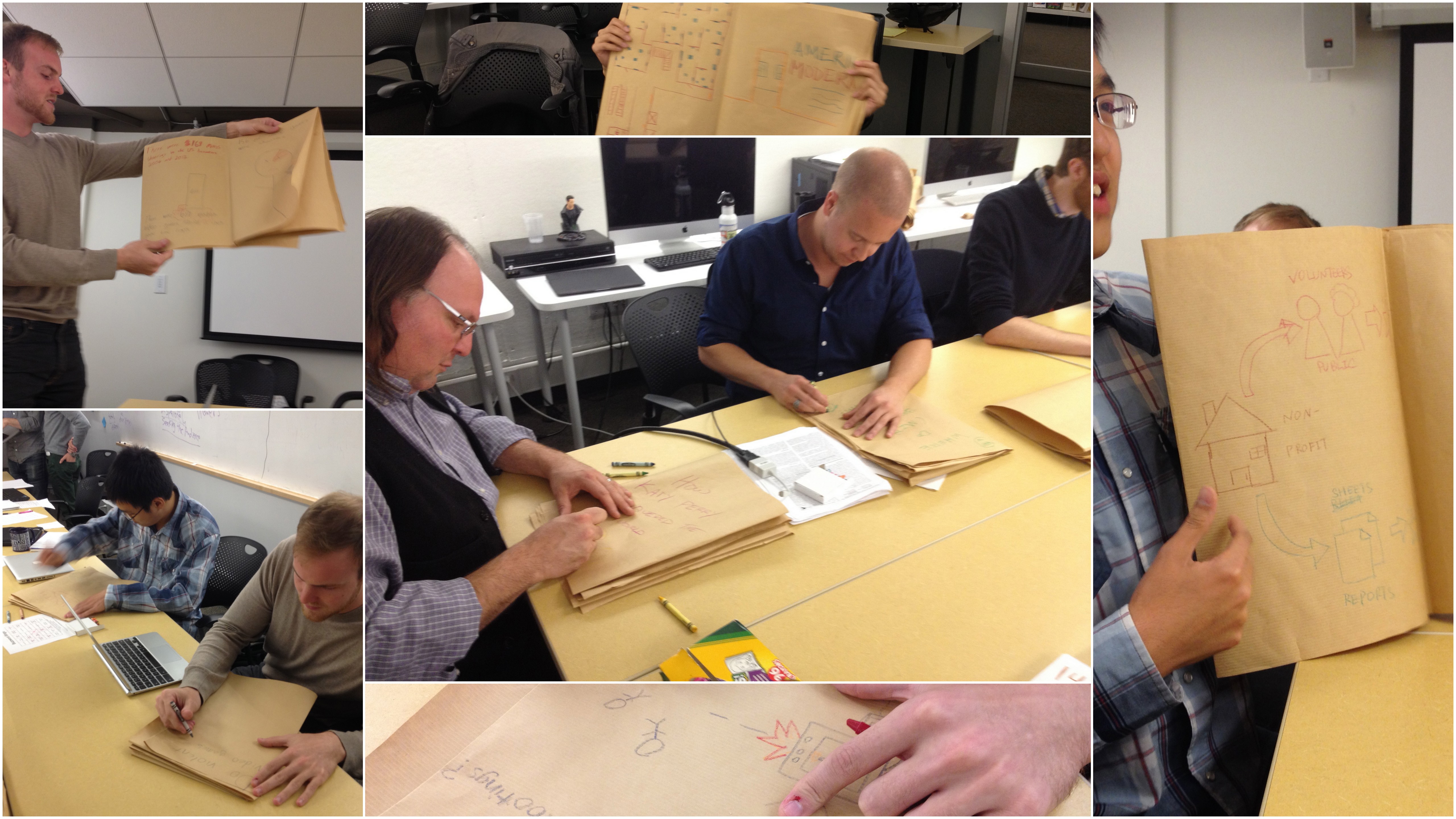
For session 3, I wanted to dig in on ways to sketch a data-driven story and was reminded of an activity I participated in last summer at the 2013 Info-Activism Camp. There was a track of visual presentation workshops facilitated by Angela Morelli, Tom Halsør and Mushon Zer Aviv. One of the activities they ran felt perfect for this class – they led an activity to create a short paper story book that sketched out the data story. The goal was to flesh out your story before doing all the work to make a final version.
They started by folding a piece of paper in a ‘zine. Click here for the best instructions I’ve found online. Here’s one I made based on data about where I spent my time at the Tactical Tech Camp:
As you can see, the folding created a short book. Writing out my data story in this low-tech way forced me to focus on the narrative structure of my data story, rather than the data details or computational options. Even if you know you’re going to present it as a single graphic, teasing apart the narrative is a crucial step in crafting a strong story. This hands-on sketching exercise if one of the best ways I’ve seen the do that.
So I totally copied their technique and used it in session 3 of the module I was describing earlier (thanks you all!). The students dove right into it, drawing the concepts they saw in their own data stories. It worked pretty well, helping them pull apart the crucial way points in their story.
At a deeper level, this activity is another one for learning data literacy and data presentation that pulls from the world of the arts. I’m constantly trying to build the toolbox of activities that can be used for my Data Therapy workshops, and this one just got added! I strongly believe the arts is the most fertile ground to borrow from when creating engaging data literacy activities. My underlying motivation is to push forward a better description of my half-formed “Popular Data” concept.
Have you tried this activity? Are there others that spring to mind?

2 thoughts on “Sketching Data Driven Stories”
Comments are closed.