
One of the things I emphasize in my workshop is building a toolbox of presentation techniques. With a toolbox ready at hand, it is a lot less intimidating to pick an appropriate technique for a specific audience and goal. I’ve defined my own list of techniques, but it by no means the only way to slice up the space.
One other particularly useful list comes from a classic academic paper called “Narrative Visualization: Telling Stories with Data” by Edward Segel, Jeffrey Heer (download it here). The paper meticulously reviews about 60 online visualization, mostly from newspapers, to define some recurring genres. If you can stomach the academic prose, the paper is worth a read.
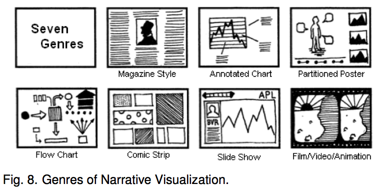
Their “genres” focus on 2-d visual presentations of data stories, to be expected based on the title of the paper and the examples they pull from. However, within that space it is a particularly wonderful list:
- magazine style: “an image embedded in a page of text”
- annotated chart: a traditional chart of graph with textual callouts highlighting specific data points
- partitioned poster: a “multiple view visualization”
- flow chart: a directed series of pieces of information
- comic strip: multiple frames in a linear path
- slide show: a series of visuals presented one at a time to assemble a narrative
- film/video/animation: fairly self-descriptive
These vary based on the number of “frames” (visuals) presented, and how they are shown over time. This list breaks down the set of techniques differently than I usually do, and that’s a nice thing so I thought I’d share it!
From there they move to a discussion of author- vs. reader-driven approaches. That’s a wonderful reminder to decide early on whether you are building an exploratory or explanatory presentation. Are you trying to tell a strong narrative, or showing information and letting the viewer take away a story?

One thought on “Building Your Toolbox of Techniques”
Comments are closed.