Talking Data with Museum Visitors

Last weekend I had the pleasure of running a data sculpture workshop for the public at the MIT museum’s Idea Hub. They offer hands on activities for museum visitors every Sunday, and after chatting we decided to try adding my activity to the lineup. With an amazing set of craft materials, and some one-page data prompts about MIT, we invited visitors to drop in and find data-driven stories they could tell by building simple sculptures.  The sheets included information about the amount of sleep students get, the cost of undergraduate education in the US, and happiness in Somerville.

It was so fun to be able to have his conversation with a random set of curious folks. As we built things we chatted about loads of topics related to data literacy. Some people dig into how you could find simple or complex stories in such small datasets. Others explored how to present the impact of the data, not the data itself. Some decided to use totally different data, related to their lives. This variety created a great set of evocative examples that made discussions later in the afternoon even richer.

I used to do a lot more museum works, so it was a pleasure to be back in that setting. Museums prime people’s brains to be curious, so it’s wonderful to offer an invitation i that space to discuss and explore a topic more deeply. Actually when I was a student here at MIT i volunteered at the museum, helping run robotics workshops for kids and adults with my good friend Stephanie Hunt. It felt great to be back!

I look forward to dropping in when the museum staff runs this on their own. Can’t wait to see how they make it even better.

Here is a list of some of the data sculptures people made:

Tools for Teachers

My background is in education, so I’m always excited when I get run a workshop for teachers.  Earlier this morning I had a chance to lead a workshop and conversation with 50 teachers from the Nord Anglia network of private schools, who have partnered with MIT Museum and the Cambridge Science Festival to think harder about STEAM education at various age levels.

IMG_3833

I introduced a number  of the activities I run, and the DataBasic.io suite. After each took a step back and asked participants to reflect on them as educators.  This created some wonderful conversations about everything from building critical data thinking to the inspirations I draw from formal arts education. I look forward to chances to work with these teachers more!

Here’s a link the slides I used.

Nord_Anglia_Workshop_-_Google_Slides

What Would Mulder Do?

The semester has started again at MIT, which means I’m teaching a new iteration of my Data Storytelling Studio course.  One of our first sessions focuses on learning to ask questions of your data… and this year that was a great change to use the new WTFcsv tool I created with Catherine D’Ignazio.

wtf-screenshotThe vast majority of the students decided to work with our fun UFO sample data.  They came up with some amazing questions to ask, with a lot of ideas about connecting it to other datasets.  A few focused in on potential correlations with sci-fi shows on TV (perhaps inspired by the recent reboot of the X Files).

One topic I reflected on with students at the close of the activity was that the majority of their questions, and the language they used to describe them, came from a point of view that doubted the legitimacy of these UFO sightings.  They wanted to “explain” the “real” reason for what people saw.  They were assuming that the sightings were people imagining what they saw was aliens, which of course couldn’t be true.

Now, with UFO sightings this isn’t especially offensive.  However, with datasets about more serious topics, it’s important to remember that we should approach them from an empathetic point of view.  If we want to understand data reported by people, we need to have empathy for where the data reporter is coming from, despite any biases or pre-existing notions we might have about the legitimacy of the what they say happened.

This isn’t to say that we shouldn’t be skeptical of data; by all means we should be!  However, if we only wear our skeptical hat we miss a whole variety of possible questions we could be asking our dataset.

So, when it comes to UFO sightings, be sure to wonder “What would Mulder do?” 🙂

Workshop: Communicating Impact in the Arts

I just had the pleasure of co-presenting a workshop for the National Guild for Community Arts Education with their Boston Ambassador, Kathe Swaback of Raw Art Works.  We focused on inspiring arts organizations to use their data to demonstrate their impact in creative ways.  The presentation I used is hosted on Prezi.com.

Communicating_Impact_in_the_Arts_by_Rahul_B_on_Prezi.png

I shared some powerful examples and helped them talk to each other about the challenges and successes in their organizations.

One challenge in our conversations was getting from mission, to outcomes, to ways to measure those outcomes and evaluate impact.  We took the approach of inspiring folks with ways they could communicate those data-stories once they had the data, rather than getting mired down in their individual outcome-identification processes.  The Guild is creating separate programs to help them do that, so I didn’t feel bad about taking this jump.

We practiced using different types of data presentation techniques using an excerpt from the MuralsArts PorchLight evaluation done by the Yale School of Medicine.  After scanning the handout, I assigned each small group a technique to use.

They came up with amazingly creative ways to tell the impact stories they saw in the data.  Everything from expressive data dancing, to participatory interviews where people move to answer questions!  I look forward to seeing how these organizations can adopt and try out some of these techniques.


Data Architectures @ Data On Purpose

I had the pleasure of recently presenting a half-day workshop at the Data On Purpose event hosted by Stanford’s Social Innovation Review.  The workshop was titled “Data Architectures”.  Despite the generic, hard to decipher title, we had over 100 people sign up!

workshop selfie!
participants talking to each other… time for a workshop selfie!

I broke the topic down to talk about four types of architectures:

  1. Architectures for Data Management & Storage
  2. Architectures for Data Security
  3. Architectures for Building a Data Culture
  4. Architectures for Data Use

Of course these all overlap, but I’ve found them to be useful lenses for focusing discussion and questions with non-profits that are trying to be more data-centeric in their work and data-informed in their decision making.

Here’s the Data Architectures visual presentation I gave:

2015-06-04_1547

Data Therapy @ Data Day (Central Mass)

I was invited this year again to speak at the Metropolitan Area Planning Council’s Data Day, this time in central Massachusetts in partnership with the Central Massachusetts Regional Planning Commission.  Attendees were a wide variety of folks from the central Massachusetts area – planners, city administrators, small non-profit staff, and more.  I focused on picking the right technique to tell your data-driven story.

Click to see the presentation from this workshop:

2015-06-04_1549

Bringing Together Street Art and Data

We were recently awarded a Making All Voices Count grant with our friends at the Mtaani Initiative and Radar, focused on creative communication in Nairobi’s slums – we’re calling the initiative Sauti Ya Mtaa.

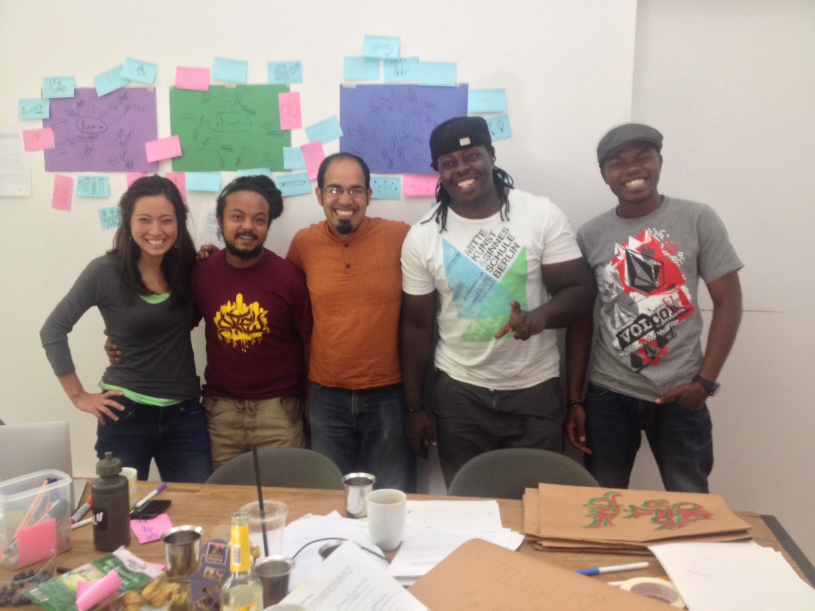
I strongly believe that data-driven advocacy is a great way to bring about change.  However, you have to find the right story to tell and the technique to tell it.  We’ve trying murals as a new way to tell data-driven stories, but none of our pilot projects worked with professional artists.  Street artists know the context and messages that will work in their community.  That’s why we’re so excited to have kicked off our collaboration with graffiti artists in Nairobi!  Over the next year we’re going to work together to develop local capacity to do innovative creative messaging to catalyze change in their communities.photo 4
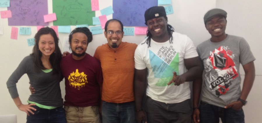
Sasha, Uhuru, Me, BankSlave and Swift9 met up in Berlin for 2 days for our first training (before the OKFest started).  Our goals included:

  • me learning how they work
  • them learning some of our facilitation techniques
  • designing a data mural to paint in Nairobi
  • planning the next steps in Nairobi

Training

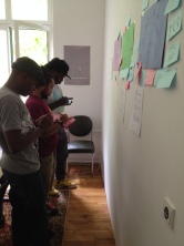
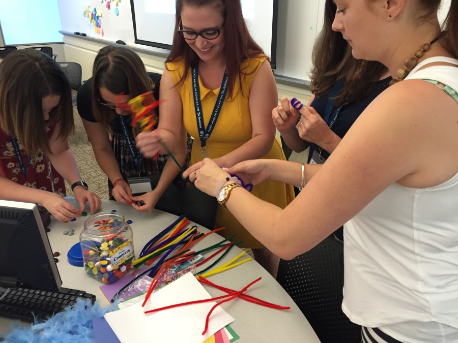
We had a packed agenda over the two days!  We started off getting to know each other a little bit, and exploring some inspirational examples, including our data murals. http://www.pinterest.com/rahulbot/street-art-data-murals/ We kicked off our building exercises by running the data sculptures activity.  The artists liked the materials involved and thought people would respond to how playful it was. Next I introduced our story types and some data on education and employment from the Nairobi budget and SID report for Nairobi County (1).  We all looked for stories of different types.  The artists found the story type templates helpful, but struggled with the idea of saying something in the data was either a “factoid”, a “comparison” or something else.  This raised the great point of how we can get lost in the activities sometimes, stuck on trying to do them “correctly”, when in fact it didn’t matter exactly which type of story it was.  One artists said:

filling in a factoid story form appeared challenging at first but eventually after a while it proved to be a vital part in this whole process

Once we had a number of stories, we pulled some abstract ideas from them – “education”, “finance” and “rural”.  We did some word webs for these words together, to try and concretize them.  We put these on the wall, grabbed stickies, and drew any of the words that could be drawn.

photo 1   photo 2

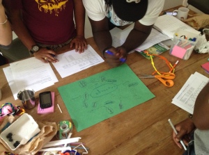
The artists loved this activity, and immediately thought of ways it could be relevant for their workshops.  This process of coming up with symbols to represent abstract ideas fits well into past work in Nairobi (see the Vulture murals, for instance). One artist said:

this approach is fun and should be used all the time

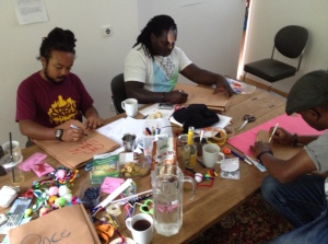
With these words and the data stories in mind, we took some time to focus on visual narrative.  First we created storybooks to tell the data stories. The artists spent a little more time than I had hoped writing out their stories – I introduced it poorly and they had great feedback for how to present it as a comic book next time I try it:

Story Boooks are fun, but we could make it more interactive as a comic book set up rather than what I did (more writing and less illustrations)

photo 3To wrap up the design exercises did a pass around drawing for one story they liked most – about the relatively low percentage of budget funding going towards education.   One artists said:

the pass around drawing was fun and creative teamwork and saving on time to come up with a concrete concept which usually consumes more time

Another said:

it was fun and got everyone to participate

This led to a small set of drawings that all told the same story.photo 5
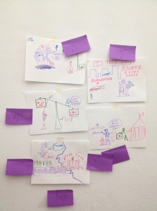
I facilitated a discussion about what elements of the design they liked most, and exercised a little editorial control to generate a sketch of a mural to paint!mural design
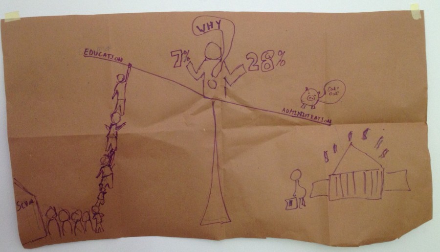
After all this we took a step back and discussed work the artists have done, and issues they cared about.  This led to a good conversation about how all the activities felt, how the might fit into work the context in Nairobi. One artists said:

What really got my attention was the structure and approach in general as a session

Next Steps

To close out the packed schedule, we squeezed in a discussion of next steps on the grant.  We plan to continue to converse via WhatsApp, and to set up monthly Skype checkins.  These channels for communication will feed activities over the next few months.

Notes:

(1) We used the Nairobi Full Budget FY 2013-2014 (online at the International Budget Partnership) and the 2009 SID report for Nairobi County.