I just wrapped up teaching a 3-week, 5 session module for MIT undergraduates on Data Scraping and Civic Visualizations (read more posts about it). As their final project I asked students to use some Boston-centric data to sketch a civic visualization. Here’s a quick overview of their final projects, which I think are a wonderful example of the diversity of things folks can produce in a short amount of time. Remember, these are sketches the students produced as their final projects… consider them prototypes and works-in-progress. I think you’ll agree they did amazing work in such a short amount of time!
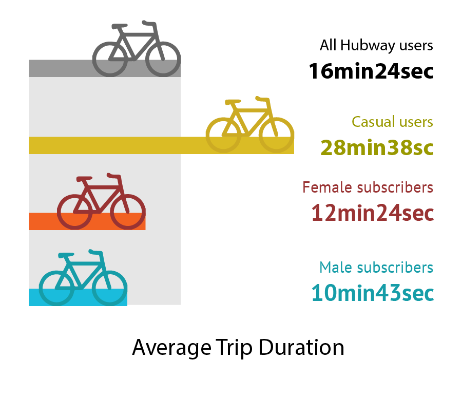
1.5 Million Hubway Trips
Ben Eysenbach and Yunjie Li dove into the Hubway bicycle sharing data release. They wanted to understand how people perceive biking and help planners and bike riders make smart decisions to support the urban biking system. Ben and Yunjie found that Google bicycle time estimates are significantly off for female riders, and built some novel warped maps to show distances as-the-bike-rides across the city. See more on their project website.
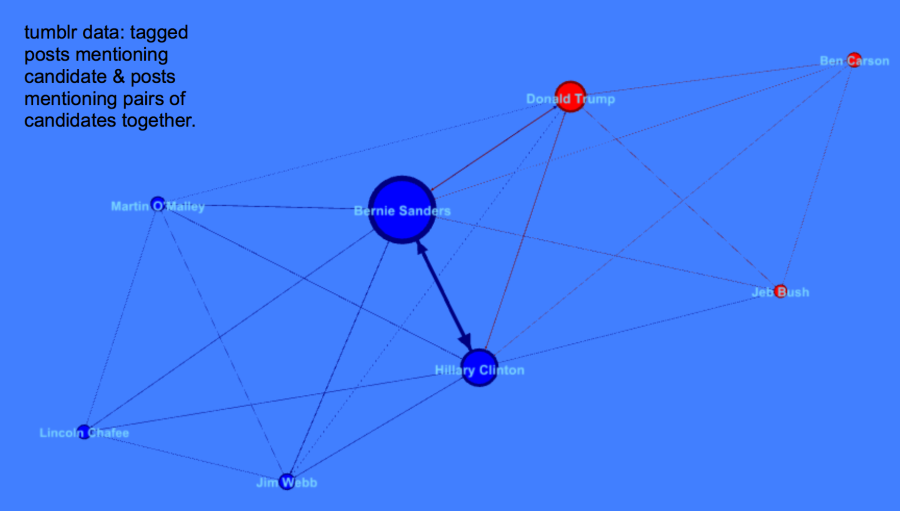
The Democratic Debate on Tumblr
Alyssa Smith, Claire Zhang, and Karliegh Moore collected and analyzed Tumbler posts about the first 2015 Democratic presidential debate. They wanted to help campaigns understand how to use Tumblr as a social media platform, and delve into how tags are used as comments vs. classification. Alyssa, Claire and Karliegh found Bernie Sanders, Hillary Clinton, and Donald Trump were the most discussed, with a heavy negative light on Trump.
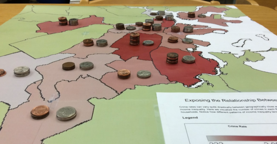
Crime and Income Rates in Boston
Arinze Okeke, Benjamin Reynolds and Christopher Rogers explored data sets about crime and income in Boston from the city’s open data portal and the US Census. They wanted to motivate people to think harder about income disparity and inform political debate to change policies to lower crime rates. Arinze, Ben and Chris created a novel map and data sculpture to use as a discussion piece in a real-world setting, stacking pennies to represent income rates on top of a printed heatmap of crime data.
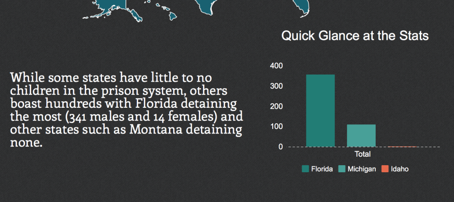
Should Our Children Be in Jail?
Andres Nater, Janelle Wellons and Lily Westort dug into data about children in actual prisons. They wanted to argue to people that juveniles are being placed in prisons at an alarming rate in many states in the US. Andres, Janelle and Lily created an inforgraphic that told a strong story about the impact of the cradle-to-prison pipeline.


You must be logged in to post a comment.