Empowering People With Data Workshop

I just ran a workshop for attendees at the 2017 UN World Data Forum in Cape Town, called Empowering People with Data: tips and tricks for creative data literacy”.  This was a great chance to connect my activities, and my work with Catherine D’Ignazio on DataBasic.io, to the non-profits and government statistical bureaus.  We’ll be doing more of this, as NGOs are coming to me more often to talk about helping them build their capacity to tell strong stories with their information.

img_5210
building a data sculpture (most materials were bought locally)

Many in the audience came up afterwards and were excited to bring the activities and approaches back to their organizations! Our fun activities were definitely new and novel for their world, and they immediately saw the value for many of the stakeholders they work with.

img_5221
sketching a story about lyrics found using our WordCounter tool

I’ve posted the slides on slideshare.net.  With examples including Praxis India, GoBoston2030, our data murals, and Peabody’s history quilt, I hope they created a richer set of inspirations for how to make working with data participatory and empowering!


UN Data Forum: Data and Algorithm (Live Blog)

This is a liveblog written by Rahul Bhargava at the 2017 UN World Data Forum.  This serves as a summary of what the speakers spoke about, not an exact recording.  With that in mind, any errors or omissions are likely my fault, not the speakers.

Capturing the 21st Century through Data and Algorithm

Dan Runde shares some guiding questions for the panel: Why do we measure stuff?  Do we have the tools to measure the right things? How do we handle changes in technology and methdology?  What about private data? What’s trustable?

Ola and Hans Rosling – President and Co-Founder of Gap Minder

Ola runs the educational non-profit Gap Minder. He begins with a live audience poll to check some facts. They have been asking these fact-based questions across the world. In different places people respond differently. For instance, on average women have far more schooling than people in Sweden, the US, and at a TED event think.  South Africa actually was closest to the real data. They call this the “ignorance project”.  They bring in Hans Rosling

Hans explains that just being famous wasn’t enough to change people’s beliefs. It turns out the big CEOs know the world best. Those that deal with big money have stronger instincts of learning how the world really is. This was shocking. There is no way to communicate the SDGs if we don’t measure the impacts of our communication.  Most women have access to contraceptives.  Most children receive the basic vaccines. The data statistical bureaus generate is to generate investment and GDP growth, not for just political decision making. We have to broaden who is intended to use this data. Media is a bad way to change their world view; they have to be taught it in school.

Pali Lehohla – Statistics South Africa

Minister Lehohla is the Statistician General for Statistics South Africa. He will connect migration, death, and longevity in South Africa.  He shares an interactive map of migration across the provinces.  He shows paths such as the Indians who worked at sugar plantations in the south east, moving to Gauteng. The white population makes money in Gauteng, and then moves to the Western Cape to enjoy their money.  These connect to the death rates in each of these provinces; for instance they are lower in Gauteng.  Death is exported from there.  Death rates are a function of how society is organized.

flvikk1l

Minister Lehohla walks through a Gap Minder chart of South African life expectancy. In 2008 or 2009 life expentency in South Africa rose very quickly, though income per person was flat.  In Gauteng and the Western Cape people live longer. You must avoid Free State because you’ll die younger.

Switching to child mortality, Minister Lehohla argues for geographic breakdowns of data to understand it better. In this animation after 2004 a lot of the data dissapears.  This is because municipalities changes, so they can’t compare the data well.  These political decisions cause statistical problems.

Talking about complexity is the task of statisticians. You have to project value-add.  Putting it in a narrative and explaining it is the task of the chief statistician of a country.  We have to organize ourselves in a way that helps us measure the SDGs.

Emmanuel Letouze – DataPop alliance

Manu is the director of the DataPop Alliance.  Manu will talk about statistical measurement and societal development in the age of data abundance and algorithmic analysis. There are number of rationales for measuring things. We think that measuring something means we care about it, and can have an effect on it. Is better data really the problem?

Manu doesn’t really measure his two children directly.  Even when you care deeply about something, it doesn’t mean you measure it. This is an important caveat in the theory of measurement. GDP was invented in the 1930s as a measurement of production.  This is a good example of something you measure because you want to change it. There are negative consequences to this of course. This was invented in an industrial, data-poor era. In the age of algorithm this makes little sense. For instance, GDP doesn’t capture the consumption of free data.

Now we know we need to measure other things. With data like hundreds of millions of credit card transactions you can identify cultures of people who behave similarly (ie. tribes). Manu believes in open algorithms to get around the worry of leaked data.  The OPAL architecture is an attempt to send open algorithms to operate on private sector data.

The outcomes and processes of measurement have to be more meaningful in this day and age.

Anne Jellema – World Wide Web Foundation

Ann is the director of the World Wide Web Foundation.  Gap Minder’s Ignorance Project shows just how disconnected people are from official data.   This can lead to apathy, distrust, resentment. For instance, people overestimate vastly the number of refugees that have entered their countries. It can lead to denial, like in South Africa in relation to the AIDS epidemic.  For instance, one of the outcomes of this conference is to include women’s unpaid care work in counts.  This will value women’s contributions in policy decisions.  Another example is including data on climate change.

Date can help improve people’s lives and improve the SDGs. The experience at the WWW Foundation shows that the benefits are far greater when people participate.  When they are involved in designing, collecting, and using data.  A project in Ivory Coast, with UN, Data2x, and Millennium Foundation showed this. They worked cross-sector to use data to tackle the real problems facing women there.  They not only used existing data, but found gaps in the data that would help if filled and openly available. For example, if clinic and hospitals could share information about shortages they could shift pregnant women to places where resources would be available, so pregnant women wouldn’t be turned away.  In the process of sharing and discussing data trust was built between government and NGO groups.

These are example of how CSOs can engage with government with data to solve problems and meet the SDG goals.  Unfortunately, the collection of data has been monopolized by the state, with no participation. The chief reason is accountability.  Technology allows a shift towards more participatory techniques.  However, the rise of big data could make this worse – Manu’s “elite capture”. The majority of data capture is controlled by the private sector now. This is our data, but it belongs to the companies now, and they are not accountable. This is a challenge we need to confront.

We have to open government data to a data commons.  Only 10% of non personally identifiable government data is fully open (source). The numbers are similarly low for sector-soecific basic data (health and education, environment, etc).  Government spending data is one of the least-open in the world. A lot is abilalbe online, but little of it is “fully open”.

In the US many civic decisions are being left to algorithms now.  We need to be able to interrogate and challenge thse, just as we can for standard governmental statistics.  This is critical for informed citizenship.

What does trust mean?

Manu: This is trust within society between different groups.  Another is the trust you build as you engage in data collection processes.  This is a strong rationale for national statistics.  Third is the trust in statistics themselves; in the outcomes. This allows a democratic debate about a shared agreement.

Pali: Trust is about integrity. Trust is also about justice.  We know we are fallible.  In the statistics community we are too gentle with each other. We need to confront our failures.  That is what builds trust.

Ola: Trust is a feeling, and emotion. I trust Pali, but I’m not sure why. This is also called confidence.  The over-confidence in this room is enormous.  We trust ourselves, even when we shouldn’t.  I know this because, as a white Caucasian male I speak to others and we trust each other.  This group just performed worse on my quiz than chimpanzees.

Anne: The latest Edelman global trust barometer indicate there is a implosion. This is at an all time low.  We have to hold ourselves responsible for starting to restore some of that.  We just saw the damage this can do.  So how do we rebuild trust.  One thing we learn form the open-source community is that the more people can be involved in interrogating something, the greater their trust.   This is the opposite of how statisticians think about process.  We should welcome contributions from others.

If you had a magic wand, what would you want to measure?

Manu: It is a matter of finding out what people care about. We don’t have good processes for this.  This matters as much, or more, than the outcome itself.

Pali: Public opinion is very flimsy, but it counts. It reflects inner-being and skepticism.  We need to understand this. In the last local government election in South Africa they measured physical things. When asked for opinions of satisfaction, they showed deep levels of dissatisfaction, out of line with the growth in physical things.

Ola: Knowledge. We’re not measuring the impact of our communication.  Asking voters how to do it is giving up our responsibility.  Measure yourself and your staff, and what you know. The activist score worse than anyone else in their own fields.  They exaggerate their world view of the problem. In the US 5% got a question about the extreme poverty rate of the world. They didn’t know it was decreasing. We need to point our fingers at ourselves first.

Anne: Gender data is vitally important.  Secondly I’d ask for joining up the existing data we already have.  This is how you unlock the power of data. This is a therapy session for us to confess our mistakes.

Q&A

(Missed it, sorry)


UN Data Forum: Data Advocacy Impact Panel (live blog)

This is a liveblog written by Rahul Bhargava at the 2017 UN World Data Forum.  This serves as a summary of what the speakers spoke about, not an exact recording.  With that in mind, any errors or omissions are likely my fault, not the speakers.

Data Advocacy: What works and what has impact?

This session will try to look at the same issue from different angles.

Shaida Badiie – Open Data Watch

Shaida Badiie is the Managing Director of Open Data Watch.  Defining “data advocacy” is tricky.  Shaida defines data advocacy as both promoting the use of data for a variety of purposes, and encouraging the production of data. Some examples can help.  First, Pali Lehohla, the statistician general of South Africa, is a success story.  His advocacy strives to leave no-one behind in the census.  Another success story is Project Everyone (who designing the SDG logos).  A third is about showcasing the benefits of data via case studies, from a variety of organizations (including Open Data Watch).  A fourth example is to be found in is advocating for institutional change.  A fifth example is people like Hans Rosling, who do an amazing job telling data stories through their passion and communication skills.  How can be develop more of these types of people?  Sixth – there are some champions for data in the political realm.  The last story, seventh, is a failure in funding for statistics.  The gap has been measured, published, and highlighted.  Investment in data is going down.  Shaida leaves us with a challenge – how can we advocate for more funding more effectively.  Data needs to be seen as essential to the effort for the SDGs to succeed.

Heli Mikkelä – Statistics Finland

Heli works for Statistics Finland, which has a history of over 150 years.  Usually these departments are more focused on production, versus how they are used. During the last few years this focus has shifted to more on the usage.  If you don’t produce what is relevant, you won’t get more resources.  This is how you prove you are useful.  You have to produce reliable, relevant, and timely statistics. They deliver a variety of services, from open data, to statistical literacy, to partnerships.  Recently there was a reduction in funding, and they had to choose what datasets to terminate.  At that point many organizations and people outside of the department stood up and advocated for maintaining funding because Statistics Finland produced content that was so useful. We have to recognize when data makes a different, and how it does.  We need to discuss this with those that aren’t so familiar with data.  Real important comes from inside; finding examples where data is relevant to people’s lives.

Dr. Albina Chuwa – Tanzania National Bureau of Statistics

Dr. Shuwa is the director general of the Tanzanian Bureau of Statistics. Our data is for the development of the people.  Data must have its own principles and standards, because it has to be comparable. We want data to operate within existing systems, so we can cut costs.  Each country has signed on the to Africa Data Consensus. Tanzania is setting up a national roadmap for SDGs, aligned with some of the cross-national agreements in regards to data. Data ecosystems help make this word.  Across Africa governments agreed to allocate 0.15% of budget to data production. Tanzania is working on an open-data policy, by default. This includes posting it to a governmental open data portal. With public data, accountability has increased.  Citizens are using data to challenge the government (job creation and tax collection are two examples).

Emily Curie Orio – Data2x

Emily Courey Pryor Is the director Data2x.  Their slogan is “without data equality, there is no gender equality.”  They focus on improving the production, availability, and use of gender focused data.  They want to build an advocacy movement for gender data.  There is a surge of support for this right now, due to longer term work and preparation. They started from a call from Hillary Clinton to address the black-hole of missing gender data.  Starting from that spark, they found that there wasn’t once place where everyone could go to get all the gender data that existed.  Data2x mapped the data gaps and formed partnerships with big agencies to try and fill thos gaps. While doing this they realized that they need an integrated advocacy campaign in parallel to achieve any uptake or sustainability.  The first thing they need is some champions that help to create this campaign – Hillary Clinton, Christine Lagarde, and others.  The second thing needed to create this movement is an engaged and intrigued media as well, with a growing number of articles highlighting the gender data gap. A third is good creative assets, such as their video has been a great tool to advocate to those within this community, and those outside. The fourth thing they need is engaged stakeholders.  Data2x is now working with stakeholders large and small.

From here, they need to:

  • engage data collections and producers
  • bolster policymaking champaigns
  • link gendar data to policy change
  • understand private sector data
  • develop advocacy approaches for multiple audiences

Tariq Khakar – World Bank

Tariq is the Global Data Editor at the World Bank.  The release of the free World Bank open data portal was a big shift, but that was just one piece of what the Bank does. In 2014, they did a study of PDF downloads and found a whole set had no downloads at all. This led to a reconsidering of how people wanted to consume information; there was momentum to repackage the information in more accessible ways. The key to advocacy is to stick in people’s head… like a song you can’t stop humming.  They started looking for nuggets like this. Tariq suddenly found a need to have their communications staff be able to make a good chart and write a good headline – like “Most Refugees don’t live in camps”.  Since training up, they’ve produced thousands of these charts and headlines with simple chart making tools.  That’s doing advocacy with data, specifically for the Bank’s mission to end poverty. Their “my favorite number” video series helps them tackle advocating for better data.  It includes the line that “we believe collecting data is giving voice to the poor”. To get something stuck in your head you need a convincing number ,and a strong and compelling story.

Q & A

They take a few questions, and then afterwards let the panelists respond.

Both Shaida and Dr. Chuwa mentioned the commitment of countries to designate budget for data generation, or data sur-charge.  Is this working? 

In Africa we have networks of women’s groups, like FemNet; are you working with them? Are you helping build their data literacy?

For Dr. Chuwa – how can we advocate for more data from federal statistical bureaus?  Especially datasets that can be politically sensitive.

PWC has done some work showing how businesses are aware of the SDGs, but most don’t know how to respond or act on them. PWC is starting to help national statistical offices respond too.  What can private companies like them do to help?

We have to look at how data impacts the lives of every individual?  How do we move from nicely smelling places and people to where change is needed?  We need to solve the problems today.

Dr. Chuwa tells a story about releasing maternal mortality rate data, where they partnered with a lot of organizations. In terms of funding and production, the government isn’t funding at that rate yet. They got a loan from the World Bank to cover the costs of data production. Tanzania has the OGP, so all the procurement contracts are available on the open data portal, except mining and land. They data visualization based on stakeholder needs.

Heli shares how they need advocacy to make changes on what is released.  Regarding what role private sector actors can take; one is funding, another is to be a consumer and give feedback.

Tariq comments that for private sector actors, partnering on production is good, or analysis and communication. There are more things they can do in the Bank in terms of investing in data in countries.  This doesn’t move up the national agenda for financing.  They even need to build up the commitment to data within themselves at the Bank.

Shaida has a number of examples of working with the private sector to test models.  We need to find some kind of continuous process for collaborating. One of the reasons we haven’t been as successful funding SDGs is that the new donors aren’t as interested in building long-lasting infrastructure for data. In terms of taking data to people – it needs to be a two-way street.  You have to make it clear why people should contribute data, and also how to disseminate it back to them.

Emily begins by mentioning that Data2x is already talking with FemNet and Civicus, on a project tracking SDGs for women and children.  In the private sector, one thing to add is the idea of data corporations investing in that field… namely funding the national statistics bureau or something.

Capacity building is a non-stop process.


UN Data Forum: Making Civil Society Data Literate (live blog)

This is a liveblog written by Rahul Bhargava at the 2017 UN World Data Forum.  This serves as a summary of what the speakers spoke about, not an exact recording.  With that in mind, any errors or omissions are likely my fault, not the speakers.

Developing a Collective Curriculum to make Civil Society Date Literate

Pim argues that making data meaningful requires interpretation. TO do this, people need to be data literate.  They begin by sharing a number of examples trying to demonstrate this.  For instance, news stories gloss over the important difference between correlation and causation is not grasped by most.   Another discussed how to do regression correctly.  These examples argue for the ability to derive meaning information from data. 

fmx3cphl

Brainstorming

The goal of this workshop is to develop a collective curriculum to make civil society more data literate. After a quick poll of the room, we can see that the room is a mix of policy advisors, statistical bureau staff, NGO workers, educators and more.

Pim Bellinga and Thijs Gillebaart run I Hate Statistics. Their goal is to make statistics sexy again.  They started this because many of thier friends were working on topics that required statistical work, but didn’t want to do it. As teachers, Pim found a need to build a tool to study online to meet individual student needs.  These online activities are then a measurable assessment tool for building data literacy. “This is the first time I get to feeling I am understanding statistics” said one student.  In general courses that use their tools see pass rates go up.  The are using this in universities across the Netherlands.

In addition to university students, they want to serve civil society anyone that reads something that is based on or contains data. Pim asks when civic society might engage with the SDG data.  A few audience responses:

  • In media when trying to tell a story about the current state of affairs we could use SDG data.
  • In governemental burueaus we can use the SDG data to make recommendations
  • In advocacy, we can use the SDG data to hold the government accountable.
  • Organizations can align their strategies to what the data say.

Pim asks who should become more data literate.  We break into small groups to brainstorm groups which you think should be more data literate.

iqnhayxl

After 10 minutes of grop brainstorming, Pim then asks us to think about 3 top categories – journalists, students and educators, and policy makers.  We split into three large groups to think about what these audiences need to know.  What specific skills or abilities do they need? We breakout again to discuss. The goal is to end up with a draft curriculum of how to build data literacy in each of these sectors.

es4bc4cl

Thijs visited each of the groups to look highlight a few of the specific abilities they came up with.

They have made a knowledge map of a large space of statitstical topics, to help drive the design of curriculum and assessment.

How I Hate Statistics Approaches Building Data Literacy

How does I Hate Statistics think we can best teach these skills at scale.  Explanations should be short, relevant, and at the right place.  Doing it online is a part that can help; it isn’t the whole solution.  You can teach people at their own pace and time.  You can use visuals, interactivity and stories – these are ingredients.

A guest comes up ot review a collaboration.  She works for a membership-driven online journalistic platform.  One of the topics covered is when and why polls can be helpful or hurtful. They are collaborating on that topic with I Hate Statistics on this.

Representation is one issue to pay attention to with polls, as are error margins.  Journalists report poll changes that are within the error margin.  I Hate Statistics is using the ingredients mentioned to build an interactive that conveys these issues to journalists. In three months there will be elections in the Netherlands, so this is relevant.The interactive simulates a random sample of vote polling.  Comparing this to actual results shows that sampling can produce very close results to the actual.  Their next step is to show a number of runs of sampling, each of which produces slight deviations.  These are called the “error margins”.  They hope this helps journalists learn that changes within the error margin don’t deserve big headlines.  This is an example of a short interactive explainer, that attacks one part of how to become data literate.

jejto5xl

Journalists are asking for data literacy education. They have developed visual stories, one example of which is a manager delivering organs to people who need them.  The need to decide between two routes. The manager suggests using GPS data to figure out which route is faster.  This brings in raw data.  Students start by summarizing to get insights.  Looking at the mean and mediam shows route 1 being faster in both.  They choose route 1 and all the drivers take it.

Two or three weeks later, they get a call that the drivers delivered the organ too late.  In fat after the decision there have been many more too-late deliveries.  Going back to the raw data, charting a histogram shows that the spread was bigger on route 1, meaning there were many more late deliveries even thought the medan and median showed it lower.  Variation is as important a summary as mean/median.

These types of stories can motivate people to think about statistical data.

Q & A

Let’s not forget secondary impacts. For instance, what about the driver’s attitude when taking route 1; like perhaps it is the highway and more stressful.  How do we measure and respond to that?

We should try to influence people’s behaviors.

The two examples are short interactives.  Coherence and transparability are two important ideas – how do we bring those in?  Perhaps a next module could ask those questions?  This could get into questions like “how is the data collected?”.   How can your short segments help people increase their understanding?

This is a great question and challenge.  Super short lessons are necessarily neglecting some things.  We need to connect these short ideas together so they become a curriculum.

We can’t build one collective curriculum for everyone. We have to adapt the bits and pieces that exist to each target group.

UN Data Forum – Data Literacy: What, Why and How? (liveblog)

This is a liveblog written by Rahul Bhargava at the 2017 UN World Data Forum.  This serves as a summary of what the speakers spoke about, not an exact recording.  With that in mind, any errors or omissions are likely my fault, not the speakers. 

This panel has four speakers on the topic of data literacy, with an emphasis on front-line, practical things.

Empowering Future Users through Data Literacy – Professor Delia North

Dean and Head of Math, Statistics and Computer Science in Universty of Kwazulu-Natal Durban.  She wants to spread the message of empowering people (a theme for this session).  Prof North, teaching over 30 years, works on curriculum design for school level teacher training.  She has a passion for statics and youth, at the national level in addition to within her university.

The need to maintain a competitive economy drives the need for statistical literacy from basic operations, to the PhD level.  All citizens need basic statistical literacy, for basic citizenship; best to accomplish this while they are in school. Professionals need competence to use statistics effectively in the workplace. Specialists need to continually improve their practice.  University tends to think everyone is on the path to becoming a mathematical statistician, but this is an old-fashioned approach.  This isn’t developing them as “consumers” of statistics.

Statistics is often introduced as “hidden” inside of mathematics, so this is what people in South Africa think about.  That doesn’t identify it as a job opportunity to learners. In addition, statisticians are poor at marketing their discipline. It is viewed as difficult, boring and confusing.  There is a shortage of skills, and an overestimation of ability.  The best statisticians go to industry, so universities are left understaffed.  There are “too few enablers” of statistical literacy.

Data used to be scarce, but now it is everywhere.  This requires a rethink of the way we introduce statistics. This involves bringing in more data, and teaching with new methods.  Students need to be actively involved with working with large datasets.  This is an opportunity, not a threat. The questions we ask on our assessments are calculator-driven, not focused on analytical thinking.

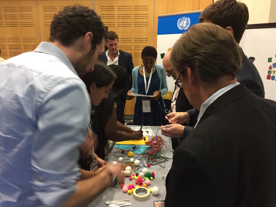
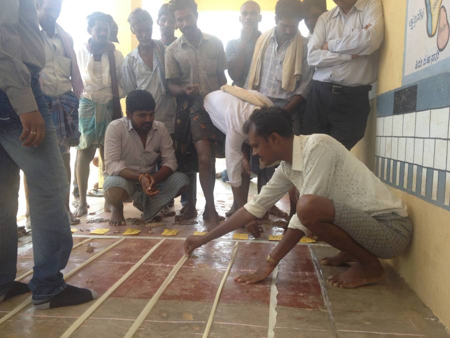
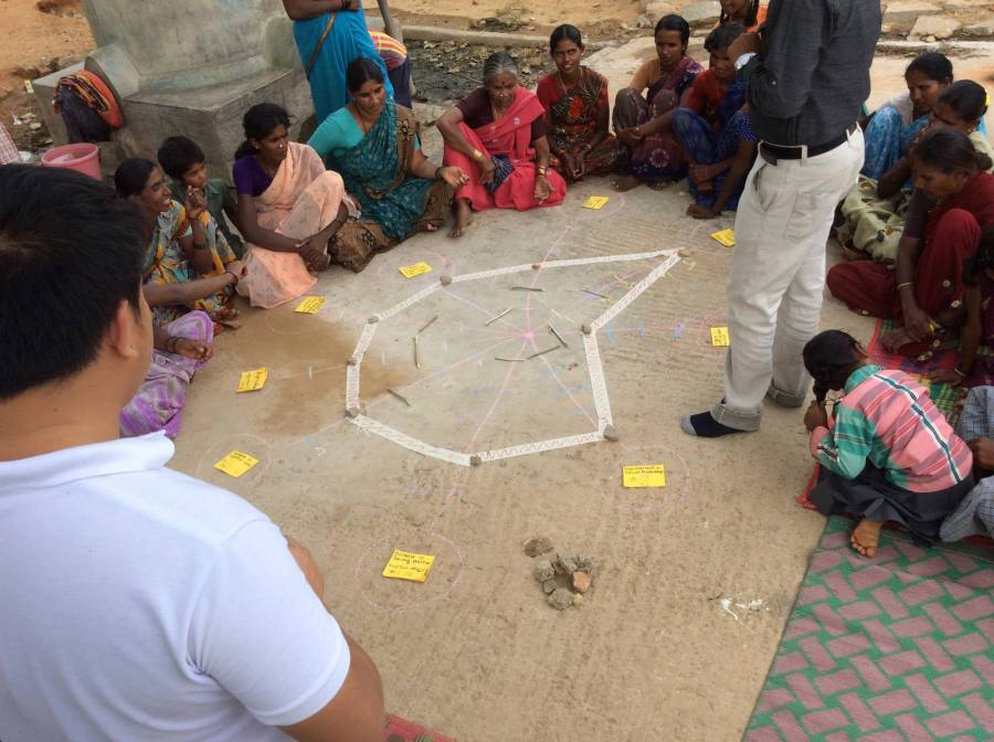
Data literacy is an essential part of statical literacy.  Decisions based on data should be part of the statistical literacy training. Statistics should be an applied mathematics applied within another discipline.  For example, they collected rubbish with children and had them track the amount and graph it. You can’t keep it trapped in mathematics classes.  You have to make learning these concepts fun!  Engaging workshops can radically change how empowered a group of teachers feels to introduce statistics.  They want to learn new teaching methods.  You have to teach them at the beginning to introduce things in the right way.

Empowering Users in Situ – Dr. Sati Naidu 

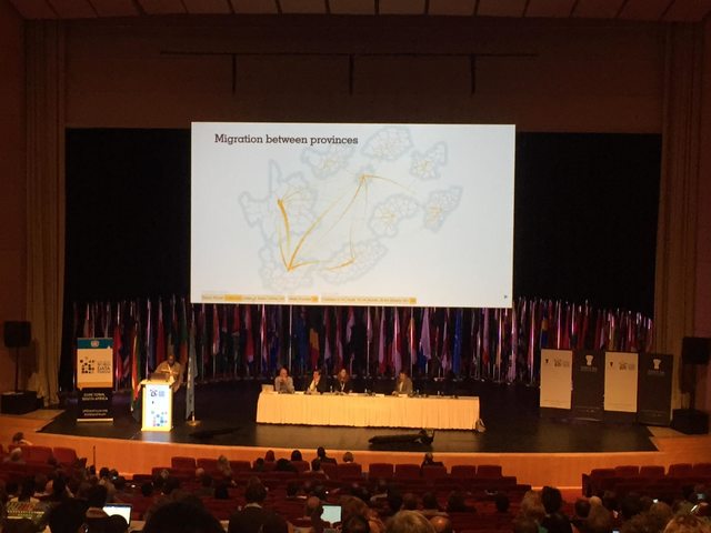
Executive Manager for Staekholder Relations for Statistics South Africa.  Stats SA has moved away from selling the data to helping people use the data for making evidence-making decisions. In 1996 South Africa did its first census. The first CD they produced cost 100,000 USD.  Now data collection is scattered across all the departments.  That should all be available on one platform to drive decision making.  They set up CRUISE, to merge a course for statistics, GIS, planning, and economics all together.  Dr. Naidu attended this course and learned much about a geographic approach to statistics.  Mapping can reveal patterns that are otherwise hidden in traditional analytical means.  This is demonstrated with a powerful set of maps that show the incidence of HIV/AIDS over time across Africa.

Now Stats SA creates GIS to create a platform to combine geometry, shape-files, and more. This lets them create thematic maps very easily. They offer trainings on these tools throughout South Africa.

Another example is looking at piped water over time, to see an increase.  With the map you can see which areas improved, and look for patterns in those with low or high services.  You can run hotspot analysis to look at unemployment data. You can do geospatial analysis to look for outliers and then look for causes.

When data is non-stationary you can’t just use traditional statistical analysis. For instance new houses are much more expensive than old houses in most of Cape Town. But in one area, new houses are very cheap because of the location.  So in one part of town there is a positive correlation, and in another there is a negative one.  You can find this with geographically weighted regression (GWR), while it would be hidden in a traditional regression.

Stats SA has all the official data.  Now they want to engage with private providers to make their data available.  We need to change from Big Data to Open Data, to go from its size to how it is used.

Data Literacy for Capacity Building – Dr. Blandina Kilama

Dr. Kilama works for REPOA on Poverty Research in Tanzania. REPOA is a think-thank in Tanzania that undertakes policy research.  She also teaches statistics part-time, and will share some of her learnings from there.

The stakeholders vary form Policy Makers, to Academia, to Media, to CSOs. Tanzania, has agriculture, This matters when politicians and others often conflate things like employment and productivity when talking about growth. Most African countries are seeing growth from productivity, not from labor.  For instance, agriculture, industry and services contribute roughly equally in terms of the economy.  However, more than 70% of the labour force works in agriculture.

This capacity causes problems sometimes.  For instance REPOA produced some poverty maps that were used by policy makers, leading to reactions of surprise and accusations.  Spatial analysis helped them explain this better, but showing how districts next o cities experience growth, while districts next to refugee camps showed lack of growth.

For media, REPOA builds in flexibility. They do half-day trainings, and make topics relevant for their current work.  These fit the media workers schedules, between their morning checkins and afternoon deadlines.

The challenges include weak numerical literacy, a shift in policies, and a lack of time. In Tanzania there is a common saying “we are all scared of numbers.”  This attitude is a real social challenge to conquer; the stakeholders have a deep fear of numbers. Policies need to shift to include the idea that people providing the data are protected, and experience benefits from it.

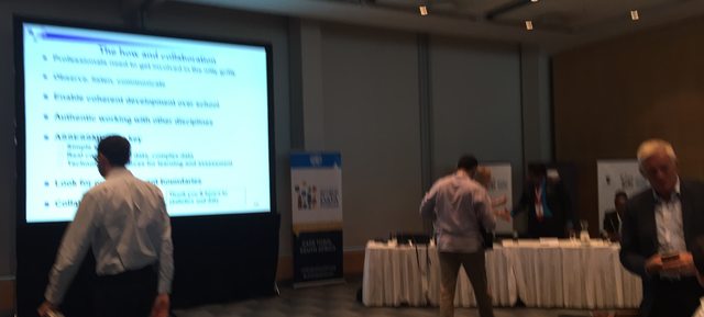
Data and Statistics: the sciences, the literacies and collaboration – Professor Helen MacGillivray

Dr. MacGillivray is a high-level mathematical statistician, and heavily involved with teacher training. Works in Australia, but is the incoming President of International Statistics Institute.  This is a big topic, and the challenges reflect that.

In Australia, the people involved in teaching are the ones thinking about what is data literacy, and what is data science. There are valuable lessons in the decades of work on building statistical literacy.  The include work within the other disciples.  Some tidbits include the idea that descriptions are better than definitions, and that discussion is essential, but diagrammatic representations are not.

Statistical literacy focusing on understanding, consuming information, and interpreting and critically thinking about. This differs at grade levels. The curricula has an aim of helping you look behind the data, ask why it is presented, and what questions can be asked.

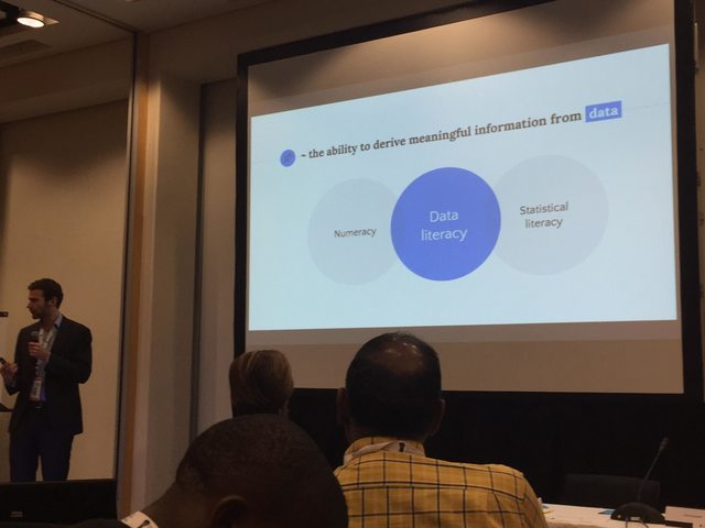
With data literacy there aren’t many definitions around. The ones that exist vary. Some split this between information literacy and data management.

Why is this important?  It is for everyone to the extent appropriate for their level of education, training, and work. This is very contextual, so it is a constant learning.

How do you do this?  Models at the governmental level are actually decades old.  The emphasis is on the problems, the plan, getting the data, analyzing, and then discussions and interpretation.  Dr. MacGillivray, in her workshops with teachers, encourages them to not think about the problem and the answer.  This work is much wider than that.   At the professional level, current approaches lead statisticians to think that they should NOT be involved with the collection of data; that somehow that gets their hands dirty.  They think it is a waste of a statisticians valuable time.  Nothing could be further form the truth.

In terms of penetration, there is lots of practice, but current teaching methods are still buried in old practices. They need to use complex, many-variabled datasets.  This leads to impediments for data literacy and data science.  Instead of a misplaced focus on calculation as in staticialy literacy education, in data science education there is a misplaced focus on coding.

affabv7l

Q & A

How about grassroots data literacy – what school do I send my students to?  can students analyze air quality?  Part of data literacy is knowing data is important for decisions making.

Prof North responds about the import of sourcing of data, what it is, where it came from, why it was collected is critical. Now we try to use household data that is from the world of the student.  You can use larger datasets, but still from the world of the student.

In terms of data availability, is there a way to asses the data literacy levels of different countries? How can we do better outreach?

Prof Naidu responds that, In terms of dissemination, now Stats SA takes the data to the people.  They have huge publicity campaigns to argue for collection; and then takes the results back to the people.

The SDGs combine social, economic, and environmental measurements. The average person on the street that is the target for behavior change, needs to understand the links between the three.  Where does scientific literacy come into this?

Prof MacGillivray reminds us that this is an old question, because these literacies operate within context in other fields.  We have to work with other disciplines and their educations.  Prof North adds that at her university they implemented practices that try to involve the other disciplines.  So if a student came in for help from another department, they involved the supervisor.  Dr. Kilama adds that in her country collecting the environmental data collection is the challenge they face.

Using data literacy as a means to protect poeple from fake statistics.  VIsualization can make bad statistics very acceptable.  We need to educate people about how to differentiate between good data and good-looking data.

This is the focus of the critical approaches.

Regarding adaptability for developing countries, places where connectivity is quite low?  Can we use radio for this?

This is our perspective from the Netherlands, so we don’t have good approaches already. Perhaps other people in the room do.

Data Haves and Data Have-Nots

This week I’m at the Data Literacy Conference in France. One of the reasons I’m super excited about this because it is a gathering of people I’ve been wanting to talk to for years! Although there are tons of conferences about data, they are few conferences focused on the literacy aspect, so I thank Fing for putting this together.  Catherine D’Ignazio and I both presented a talk and workshop.  You see can see our slides for our talk about Bridging the Gap Between Data Haves and Data Haven-Nots.  It focused on describing how to help two audiences:

  1. We want to help those in power, the “Data-Haves”, learn how to present their data in more appropriate ways.
  2. We want to help those that don’t usually have power, the “Data Have-Nots”, build their capacity to use data to create change in the world around them.

Too often we focus on just the second goal, ignoring the needs of those that have the data.

ctcbz-bxyaauulw

We also ran a workshop for about 20 attendees, focused on how our DataBasic activities can help build data literacy in a variety of ways.

Overall the conference was a wonderful gathering of like-minded individuals.  Catherine and live-blogged the plenary talks:

Tools for Teachers

My background is in education, so I’m always excited when I get run a workshop for teachers.  Earlier this morning I had a chance to lead a workshop and conversation with 50 teachers from the Nord Anglia network of private schools, who have partnered with MIT Museum and the Cambridge Science Festival to think harder about STEAM education at various age levels.

IMG_3833

I introduced a number  of the activities I run, and the DataBasic.io suite. After each took a step back and asked participants to reflect on them as educators.  This created some wonderful conversations about everything from building critical data thinking to the inspirations I draw from formal arts education. I look forward to chances to work with these teachers more!

Here’s a link the slides I used.

Nord_Anglia_Workshop_-_Google_Slides

Using Data for More than Operations

While at Stanford to talk about “ethical data” I had a chance to read through the latest issue of the Stanford Social Innovation Review within the walls where it is published.  One particular article, Using Data for Action and Impact by Jim Fruchterman, caught my eye.  Jim lays out an argument for using data to streamline operational efficiencies and monitoring and evaluation within non-profit organizations.  This hit one of my pet peeves, so I’m motivated to write a short response arguing for a more expansive approach to thinking about non-profit’s use of data.

This idea that data is confined to operational efficiency creates a missed opportunity for organizations working in the social good sector. When giving talks and running workshops  with non-profits I often argue for three potential uses of data – improving operations, spreading the message, and bringing people together. Jim, who’s work at Benetech I respect greatly, misses an opportunity here to broaden the business case to include the latter two.Data_Architecures_Workshop___SSIR_Data_on_Purpose

Data presents non-profits with an opportunity to engage the people they serve in an empowering and capacity-buiding way, reinforcing their efforts towards improving conditions on whatever issue they work on. Jim’s “data supply chain” presents the data as a product of the organization’s work, to be passed up the funding ladder for consumption at each level. This extractive model needs to be rethought (as Catherine D’Ignazio and I have argued).  The data collected by non-profits can be used to bring the audiences they serve together to collaboratively improve their programs and outcomes.  Think, for example, about the potential impacts for the Riders for Health organization he discusses if they brought drivers together to analyze the data about their routes and distances.  I wonder about the potential impacts of empowering the drivers to analyze the data themselves and take ownership of the conclusions.

Skeptical that you could bring people with low data literacy together to analyze data and find a story in it?  That is precisely a problem I’ve been working on with my Data Mural work. We have a process, scaffolded by many hands-on activities, that leads a collaborative groups through analyzing some data to find a story they want to tell, designing a visual to tell that data-driven story, and paint it as a mural.  We’ve worked with people around the world to do this.  Picking it apart leaves us with a growing toolkit of activities being used by people around the world.

Still skeptical that you can bring people together around data in rural, uneducated settings? My colleague Anushka Shah recently shared with me the amazing work of Praxis India. They’ve brought people together in various settings to analyze data in sophisticated ways that make sense because they rely on physical mappings to represent the data.

10648582_10154595083945290_8278261691487553342_o
Charting crop production and rainfall trends over time.
10661624_10154595081990290_4122872920084994817_o
Yes, that looks like a radar chart to me too.

These examples illustrate that the social good non-profits can deliver with data is not constrained to operational efficiencies.  We need to highlight these types of examples to move away from a story about data and monitoring, to one about data and empowerment.  In particular, thought leaders like SSIR and Jim Fruchterman should push for a broader set of examples of how data can be used in line with the social good mission of non-profits around the world.

Cross-posted to the civic.mit.edu blog.

Practicing Data Science Responsibly

I recently gave a short talk at a Data Science event put on by Deloitte here in Boston.  Here’s a short write up of my talk.

Data science and big data driven decisions are already baked into business culture across many fields.  The technology and applications are far ahead of our reflections about intent, appropriateness, and responsibility.  I want to focus on that word here, which I steal from my friends in the humanitarian field.  What are our responsibilities when it comes to practicing data science?  Here are a few examples of why this matters, and my recommendations for what to do about it.


People Think Algorithms are Neutral

I’d be surprised if you hadn’t heard about the flare-up about Facebook’s trending news feed recently.  After breaking on Gizmodo if has been covered widely.  I don’t want to debate the question of whether this is a “responsible” example or not.  I do want to focus on what it reveals about the public’s perception of data science and technology.  People got upset, because they assumed it was produced by a neutral algorithm, and this person that spoke with Gizmodo said it was biased (against conservative news outlets).  The general public thinks algorithms are neutral, and this is a big problem.

Deloitte_Responsible_Data_Talk.png

Algorithms are artifacts of the cultural and social contexts of their creators and the world in which they operate.  Using geographic data about population in the Boston area?  Good luck separating that from the long history of redlining that created a racially segregated distribution of ownership.  To be responsible we have to acknowledge and own that fact.  Algorithms and data are not neutral third parties that operate outside of our world’s built-in assumptions and history.

Some Troubling Examples

Lets flesh this out a bit more with some examples.  First I look to Joy Boulamwini, a student colleague of mine in the Civic Media group at the MIT Media Lab.   Joy is starting to write about “InCoding” – documenting the history of biases baked into the technologies around us, and proposing interventions to remedy them. One example is facial recognition software, which has consistently been trained on white male faces; to the point where she has to literally done a white-face mask to have the software recognize her.  This just the tip of the iceberg in computer science, which has a long history of leaving out entire potential populations of users.

Deloitte_Responsible_Data_Talk.png

Another example is a classic one from Latanya Sweeney at Harvard.  In 2013 She discovered a racial bias trained into the operation Google’s AdWords platform.  When she searched for names that are more commonly given to African Americans (liked her own), the system popped up ads asking if the user wanted to do background checks or look for criminal records.  This is an example of the algorithm reflecting built-in biases of the population using it, who believed that these names were more likely to be associated with criminal activity.

My third example comes from an open data release by the New York City taxi authority.  They anonymized and then released a huge set of data about cab rides in the city.  Some enterprising researchers realized that they had done a poor job of anonymizing the taxi medallion ids, and were able to de-anonymize the dataset.  From there, Anthony Tockar was able to find strikingly juicy personal details about riders and their destinations.

A Pattern of Responsibility

Taking a step back form these three examples I see a useful pattern for thinking about what it means to practice data science with responsibility.  You need to be responsible in your data creation, data impacts, and data use.  I’ll explain each of those ideas.

Deloitte_Responsible_Data_Talk.png

Being responsible in your data collection means acknowledging the assumptions and biases baked into your data and your analysis.  Too often these get thrown away while assessing the comparative performance between various models trained by a data scientist.  Some examples where this has failed?  Joy’s InCoding example is one of course, as is the classic Facebook “social contagion” study. A more troubling one is the poor methodology used by US NSA’s SkyNet program.

Being responsible in your data impacts means thinking about how your work will operate in the social context of its publication and use.  Will the models you trained come with a disclaimer identifying the populations you weren’t able to get data from?  What are secondary impacts that you can mitigate against now, before they come back to  bite you?  The discriminatory behavior of the Google AdWords results I mentioned earlier is one example. Another is the dynamic pricing used by the Princeton Review disproportionately effecting Asian Americans.  A third are the racially correlated trends revealed in where Amazon offers same-day delivery (particularly in Boston).

Being responsible in your data use means thinking about how others could capture and use your data for their purposes, perhaps out of line with your goals and comfort zone.  The de-anonymization of NYC taxi records I mentioned already is one example of this.  Another is the recent harvesting and release of OKCupid dating profiles by researchers who considered it “public” data.

Leadership and Guidelines

The problem here is that we have little leadership and few guidelines for how to address these issues in responsible ways.  I have yet to find an handbook for a field that scaffolds how to think about these concerns. As I’ve said, the technology is far ahead of our reflections on it together.  However, that doesn’t mean that they aren’t smart people thinking about this.

Deloitte_Responsible_Data_Talk.png

In 2014 the White House brought together a team to create their report on Big Data: Seizing Opportunities, Preserving Values.  The title itself reveals their acknowledgement of the threat some of these approaches have for the public good.  Their recommendations include a number of things:

  • extending the consumer bill of rights
  • passing stronger data breach legislation
  • protecting student centered data
  • identifying discrimination
  • revising the Electronic Communications Privacy Act

Legislations isn’t strong in this area yet (at least here in the US), but be aware that it is coming down the pipe.  Your organization needs to be pro-active here, not reactive.

Just two weeks ago, the Council on Big Data, Ethics and Society released their “Perspectives” report.  This amazing group of individuals was brought together to create this report by a federal NSF grant.  Their recommendations span policy, pedagogy, network building, and area for future work.  The include things like:

  • new ethics review standards
  • data-aware grant making
  • case studies & curricula
  • spaces to talk about this
  • standards for data-sharing

These two reports are great reading to prime yourself on the latest high-level thinking coming out of more official US bodies.

So What Should We Do?

I’d synthesize all this into four recommendations for a business audience.

Deloitte_Responsible_Data_Talk.png

Define and maintain our organization’s values.  Data science work shouldn’t operate in a vacuum.  Your organizational goals, ethics, and values should apply to that work as well. Go back to your shared principles to decide what “responsible” data science means for you.

Do algorithmic QA (quality and assurance).  In software development, the QA team is separate from the developers, and can often translate between the  languages of technical development and customer needs.  This model can server data science work well.  Algorithmic QA can discover some of the pitfalls the creators of models might not.

Set up internal and and external review boards. It can be incredibly useful to have a central place where decisions are made about what data science work is responsible and what isn’t for your organization.  We discussed models for this at a recent Stanford event I was part of.

Innovate with others in your field to create norms.  This stuff is very new, and we are all trying to figure it out together.  Create spaces to meet and discuss your approaches to this with others in your industry.  Innovate together to stay ahead of regulation and legislation.

These four recommendations capture the fundamentals of how I think businesses need to be responding to the push to do data science in responsible ways.

This post is cross-posted to the civic.mit.edu website.

Talking Visualization Literacy at RDFViz

Just yesterday at I was in a room of amazing friends, new and old, talking about what responsible data visualization might be.  Organizing by the Engine Room as part of their series of Responsible Data Forums (RDF), this #RDFViz event brought  together 30 data scientists, community activists, designers, artists and visualization experts to tease apart a plan of action for creating norms for a responsible practice of data visualization.

Here’s a write up of how we tackled that in the small group I led about what that means when building visual literacy.

Building Literacy for Responsible Visualization

Scan_Jan_15_pdf__page_1_of_5_
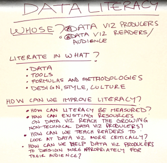
I’ve written a bunch about data literacy and the variety of ways I try to build it with community groups, but we received strict instructions to focus this conversation on visualization.  That was hard!  So we started off by making sure we understood the audiences we were talking about  – people who make visualizations and people who see/read them.  So many ways to think about this… so many questions we could address… we were lost for a bit about where to even start!

We decided to pick four guiding questions to propose to ourselves and all of you, and then answer them by sketching about quick suggestions for things that might help.

  • How can visual literacy for data be measured?
  • How can existing resources for data visualization read the growing non-technical data visualization producers?
  • How can we teach readers to look at data visualization more critically?
  • How can we help data visualization producers to design more appropriately for their audiences?

A difficult set of questions, but our group of four dove into them unafraid!  Here’s a quick run-down on each.  For the record, I only worked on two of these, so I hope I do justice to the other two I didn’t directly dig into.

Measuring Visual Literacy

Scan_Jan_15_pdf__page_3_of_5_.png

This is a tricky task, fraught with cultural assumptions.  We began by defining it down to the dominant visual form for representing data – namely classic charts and graphs.  This simplified the question a little, but of course buys into power dynamics and all that stuff that comes along with it.

Our idea was to create an interactive survey/game that asks people to read and reason about visualizations.  Of course this draws on a lot of existing research into visual- and data-literacy, but in that body of work we don’t have an agreed-upon set of questions to assess this.  So we came up with the following topics, and example questions as a thing to think about.

  1. Can you read it?  This topic tried to address the question of basic visual comprehension of classic charting.  The example question would show something like a bar chart and ask “What is the highest value?”.
  2. What would you do? This topic digs into making reasoned judgements about personal decisions based on information show in a visual form.  The example question is a line chart showing vaccination rates over time going down and people getting measles going up; asking “Would you vaccinate your children?”.
  3. What can you tell? Another topic to address is making judgements about whether data shows a pattern or not.  The example question would show a statement like “Police kill women more than men – true or false?” and the answers could be “true”, “false” and “can’t tell”.
  4. What’s the message? More complex combinations of charts and graphs are often trying to deliver a message to the reader.  Here we could show a small infographic that documents corruption somewhere.  Then we’d ask “What is the message on this graphic?” with possible answers of “corruption is rampant”, “corruption happens” and “public funds are too high”.

There are just four topics, and we know there are more.  We’re excited about this survey, and hope to find time and funds to review existing surveys that assess various types of literacies so we can build a good tool to help people measure these types of literacies in various communities!

Choosing the Right Visualization for Your Audience

Scan_Jan_15_pdf__page_2_of_5_.png
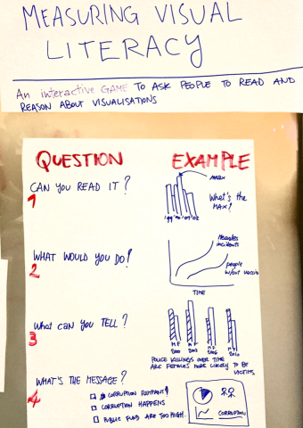
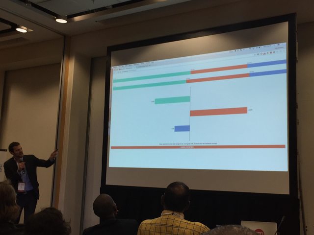
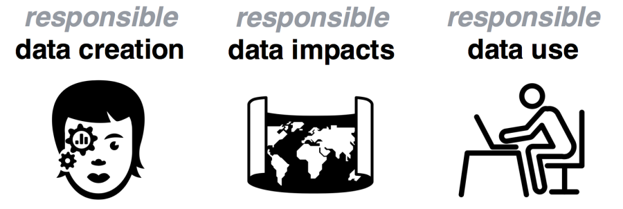
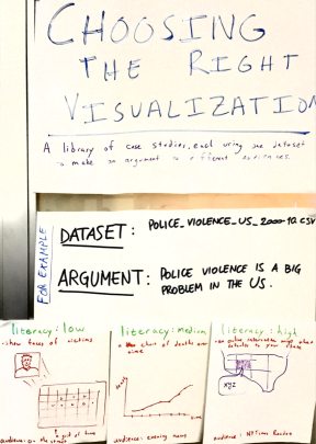
We have a vast, and growing array of visualization techniques available to us, but few guidelines on how to use them appropriately for different audiences.  This is problematic, and a responsible version of data visualization should respect where and audience is coming from and their visual literacy.  With that in mind, we propose to create a library of case studies where each one creates different visualizations from the same dataset, making the same argument, for different audiences.

For example, we sketched out ways to argue that police violence is endemic in the US, based on a theoretical dataset that captures all police-related killings.  For a low visual literacy individual (maybe a 10-year old kid) you could start by showing a face of one victim, and then zoom out to a grid of all the victims to show scale of the problem while still humanizing it. For the medium literacy audience (those that watch the evening news each night on tv), you could show a line chart of killings by year.  For a high literacy audience (reading the New York Times) you could do an interactive map that shows killings around the reader’s location as they compare to nation-wide trends.

You could imagine a library of many of these, which we think would help people think about what is appropriate for various audiences.  I’m excited to assign this to students in my Data Storytelling Studio course as an assignment!

Learning to Read A Data Visualization

Scan_Jan_15_pdf__page_4_of_5_.png
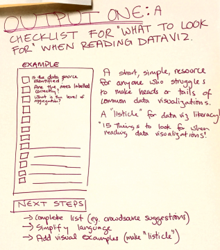
Our idea here was to create a quick how-to guide that lists things you should ask when reading a data visualization.  Imagine a listicle called “15 Things to Check in any Data Visualization”!  The problem here is that people aren’t being introduced to the critical techniques for reading visualization, to identify when one is being irresponsible.

Some things that might on this list include:

  • Is the data source identified?
  • Are the axes labelled correctly?
  • What is the level of aggregation?

This list could expose some of the common techniques for creating misleading visualizations.  Next steps?  We’d like to crowd source the completion of the list to make sure we don’t miss any important ideas.

Helping Non-Experts Learn to Make Data Visualizations

Scan_Jan_15_pdf__page_5_of_5_.png
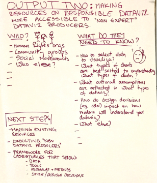
This is a huge problem.  The hype around data visualization continues to grow, and more and more tools are being created to help non-experts make them.  Unfortunately, the materials we use to help these newcomers into the field haven’t kept pace with the huge rise in interest!

We proposed to address this by better defining what these new audience need to know.  They include:

  • human rights organizations
  • community groups
  • social movements

And more!  A brief brainstorm resulted in this list of things they are trying to learn:

  • how to select the right data to visualize?
  • what types of charts are best suited to understand what types of data?
  • what cultural assumptions are reflected in what types of dataviz?
  • how do design decisions (eg. color) impact on how readers will understand your data visualization?

This is just a preliminary list of course.

Rounding it Up

Problem solved!

Just kidding… we have a lot of work to do if we want to build a responsible approach to literacies about data visualization. These four suggestions from our small working group at the RDFViz event are just that – suggestions. However, the space to approach this from a responsible point of view, and the conversations and disagreements were invaluable!


Many thanks to the organizers and funders, including our facilitator Mushon Zer-Aviv, our organizers at the Engine Room, our hosts at ThoughtWorks, Data & Society and Data-Pop Alliance, and our sponsors at Open Society Foundations and Tableau Foundation.  This is cross-posted to the MIT Center for Civic Media website.