
Recently our local TV station and arts council did an interview with Emily about the Data Mural with did with Groundwork Somerville youth at their South St. urban farm. Here’s the interview video:
Category: data-mural
My Data Mural work has led me into a new area – actually helping community groups find the stories they want to tell in their raw data. Until now, all my data therapy work has focused on how to present the data-driven stories more creatively. This post shares some of the techniques I’m trying out.
Step 1: Speak like a normal person
I know, it should be obvious, but too often when entering the realm of data-anything, we fall back into using big words. That doesn’t fly when working with community groups that don’t have a shared meaning for those words. I tried to figure out how to use regular words to talk about the types of stories that you can look for. I came up with this set to start with:
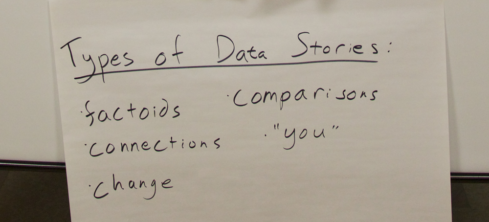
- comparison: you see two pieces of data that are really interesting when compared to each other
- factoid: you see one fact that jumps out at you as particularly interesting or startling
- connection: you see a connection between two pieces of info – you can’t say one causes another, but they’re interesting when put together
- personal: you have a compelling story or picture that is about one person
- change: you see one of your measures changing over time
I used regular words to describe the types of data stories in order to make the activity less intimidating to non-data people. Many people nodded their heads as I described these categories (especially at the second workshop where I spoke about them better!). I was inspired by the Data Stories section of the Data Journalism Handbook.
Step 2: Try it out together first
To come up with a shared definition of what these types of stories meant, I showed a few data points from an amusing data set – the Somerville “Happiness Survey” (raw data).
We quickly tried to find stories of each type in this tiny data set. Practicing all together on a tiny dataset can create a shared language for finding stories in data. In the breakouts that followed this activity, I could hear people using some of these words with each other to talk about the data they were looking at.
Step 3: Use less data
Usually data analysis starts with a giant set of documents. This model doesn’t really work for a small community group made up of people that aren’t data nerds. For our “story-finding” workshops we culled down the full data they gave us, producing a 4-page data handout for people. Limiting the data helped the community group not be overwhelmed by the task of finding a story they wanted to tell. We definitely made some “editorial” decisions that limited the stories they could find, but we did this with the help of a smaller group of our community partners so it wasn’t arbitrary.
So how did it go?
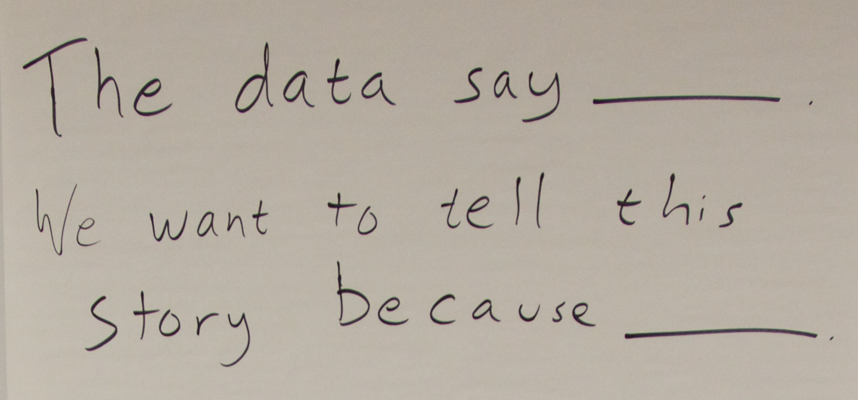
We scaffolded the story-finding around the idea of telling a story in our “The data say____” format. This gave us a common way to talk about the stories with each other. Just as importantly, this forced each person to justify why they thought it was a compelling story to tell in mural form.
 So did we build the group’s capacity for data analysis? Our pre-post survey did NOT show a noticeable increase in people’s self-assessed ease of finding stories in data. Damn. But wait… the answer is probably more nuanced than that. They did say they came away with more knowledge about the topic the data was about. They also said one of the most interesting things they learned was “telling data stories”, and in each of these two pilots they came out with a data-driven story that they wanted to tell.
Is exposure to data story-finding a sufficient outcome? Am I trying to do too much capacity building all at once? I’m still pondering how to do this better, so please suggest any tips!
Curious about these pilots? You can read some more on my collaborator Emily’s Connection Lab blog:
Cross-posted to the MIT Center for Civic Media blog.
This post is about our first Data Mural pilot project. Read more about our Data Mural idea for some background context.
Our first Data Mural pilot is in collaboration with the Community Action Board for Food Security in Somerville, MA. I’m excited about this because that’s the town I live in, and food access is an issue I care a lot about! After looking at all the data they sent us, we collected together a few pages of data that we used to hold a story-finding workshop last week. Here’s a summary of the workshop.
Introductions
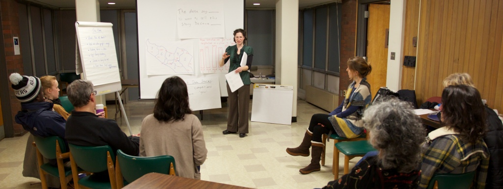
We started with a discussion of the Data Mural process we have in mind, and then went through the agenda for the evening. My collaborator (and wife) Emily led this part of the workshops.
Inspirations
Then I introduced some striking examples of mural-like data presentations. I pulled together four examples from the the pinterest board I’ve been using to track inspirations.
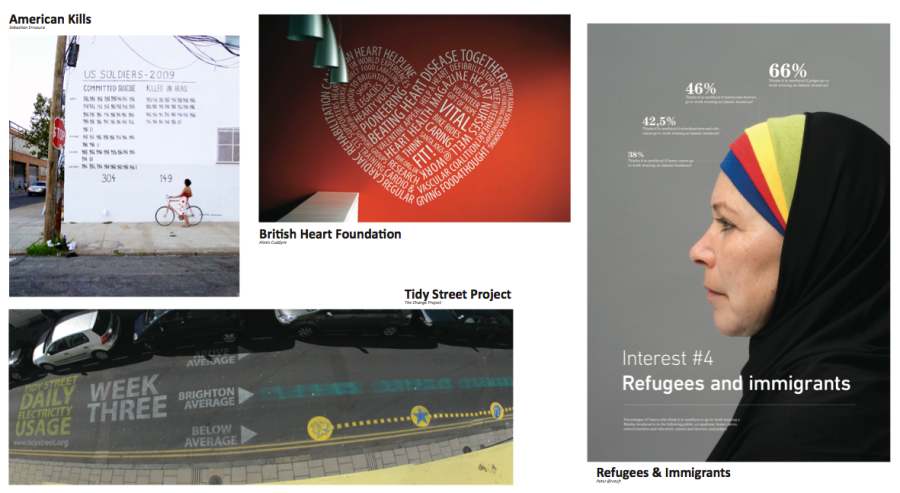
We discussed what stories they were telling, and why they were powerful or not. The participants had some great thoughts about the power of these presentations, based on the audiences they were intended for. We thought it was important to give us all a shared understanding of what kind of result the workshops are leading towards.
Finding stories in data
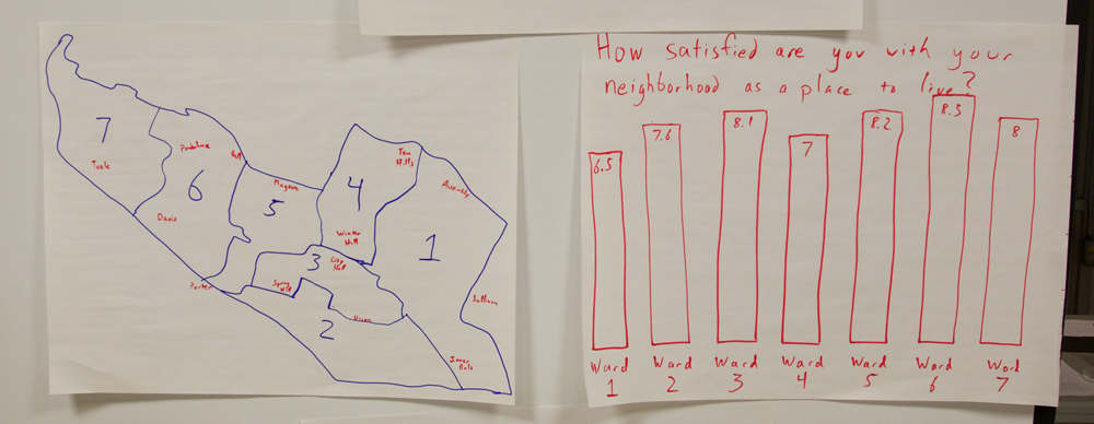
To develop a shared language and process for finding a story in data, I brought one chart from the Somerville Well-Being Survey for discussion. It is a fun dataset, about how happy people in Somerville are.
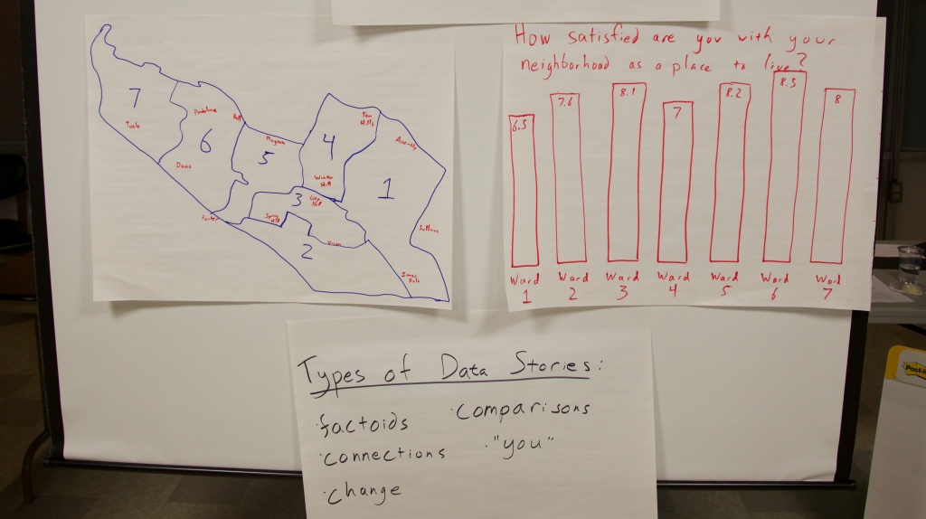
We talked about various types of stories that can be found in data, and discussed each in the form of:
The data say _____. We want to tell this story because ____.
Our Food Security Data
This quick exercise led right into examining the data at hand, about food security and related issues in Somerville. Emily introduced our dataset, which we had trimmed down to a 5 page handout. We broke out into groups and looked over the data. We asked people to write down stories they found on stickies, in the “data say ___, want to tell because ___” format.
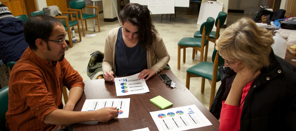
People definitely struggled with the limited data set we provided. A consistent issue is the balance between giving a full picture and telling a compelling story. Some participants wished they had more data, to have a richer picture of the real world situation. Others highlighted problems in the data collection methodology. That said, everyone understood the need to work with a smaller set of data to find striking stories to tell.
Story Selection
We all stuck our post-its on the wall and Emily led us in a discussion to find similarities and narrow in on one story to tell.

We came up with three categories:
- stories about vulnerable groups
- stories about people using SNAP, but more needing to sign up
- stories about existing barriers to food security (and how we have solutions to offer)
After collaboratively coming up with a set of criteria for the best story, the group narrowed in on the last set of stories. Focusing on barriers to food security, they came up with this data driven story to tell:
The data say that for many people food is not affordable and accessible because of the number of people living in poverty (or undocumented). We want to tell this story because there are resources in Somerville to help.
Next Steps
We’re still reading our pre-post evaluations and suggestions from the participants, so I don’t have much to say about that for now (read some more about our approach to evaluation on Emily’s blog). Meanwhile, we’ve got our next session scheduled for Jan 17th, and now we have a great story to turn into a compelling visual!
Curious to learn more about food security in Somerville?
Here are a few links if you are interested in this topic
I want to flesh out what we have in mind for this Data Mural a bit. We just ran our first tiny pilot, collaborating with Doctors for Global Health to create a portable mural (read more in my blog post in the Civic Media site). I want to write here a bit more here about the larger Data Mural project we’ve just started.

Our goal is to work with community members to pilot the collaborative creation of public art pieces that represent and explore health data about their communities.
Vibrant data about community health too often sits on computers and in the hands of academics. This project will put data in the hands of the people who live the information. We want to work with people to create pieces of art that generate ongoing public conversation and catalyze action to improve health.
Murals are used to inspire political change all over the world and data visualizations are created regularly by academics and news agencies to share large sets of information with the public in digestible ways. Our project seeks to harness the history and power of public murals and experiential learning to engage community members directly in public data presentation for the first time.
The process we envision involves:
- a facilitated set of conversations that leads a small group through the exploration of existing data to identify stories that the data tell
- narrowing the list of possible stories to choose one that the group feels should be told publicly
- exercises to generate visual images that can help tell the story
- collaborative creation of a single visual image that will become a mural
- a series of group painting sessions involving the large community
- an unveiling of the mural, accompanied by a public discussion of the mural and the data-driven story it tells
In short, we’re not quite sure what a Data Mural is yet, but we like the direction we’re going! We’re reaching out to local community groups to find an excited partner to try out this richer version of the pilot we just did. Drop me a line if you’re interested!

You must be logged in to post a comment.